- Published on
How To Create A timeline With Tailwind CSS In 5 Easy Steps
- What is Tailwind CSS?
- The description of timeline ui component
- Why use Tailwind CSS to create a timeline ui component?
- The preview of timeline ui component
- The source code of timeline ui component
- How to create a timeline with Tailwind CSS?
- Step 1: Set up the HTML structure
- Step 2: Style the container element
- Step 3: Style the event elements
- Step 4: Style the line connecting each event
- Step 5: Style the event date element
- Conclusion
What is Tailwind CSS?
Tailwind CSS is a utility-first CSS framework that gives you the ability to create custom designs without writing any CSS. It provides a set of pre-defined classes that you can use to style your HTML elements. Tailwind CSS is highly customizable and can be used to create any design you can imagine.
The description of timeline ui component
A timeline is a graphical representation of a sequence of events. It is commonly used to display a series of events in chronological order. A timeline UI component can be used to display a series of events, such as milestones, achievements, or historical events.
Why use Tailwind CSS to create a timeline ui component?
Tailwind CSS is the perfect tool for creating a timeline UI component because it provides a set of pre-defined classes that you can use to style your HTML elements. This makes it easy to create a custom design without writing any CSS. Tailwind CSS is also highly customizable, so you can easily modify the design to fit your needs.
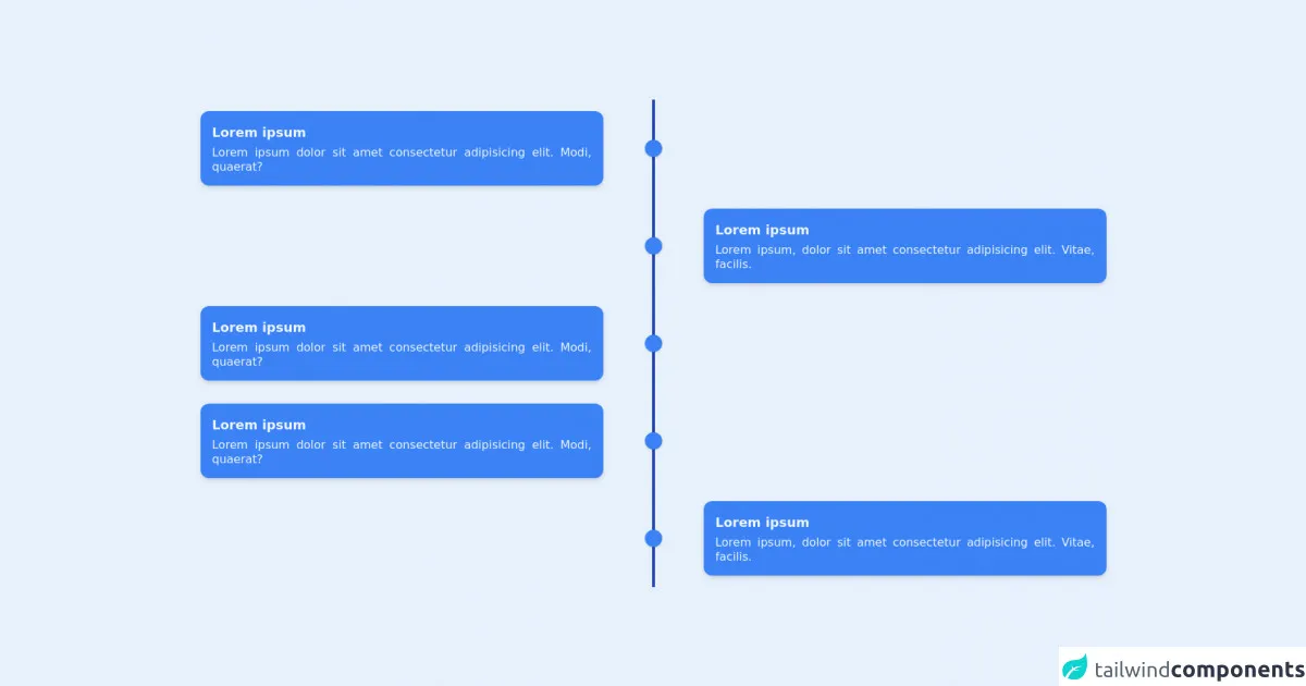
The preview of timeline ui component
To create a timeline UI component with Tailwind CSS, you can use a combination of flexbox and CSS grid. The timeline will be displayed vertically, with each event displayed as a row. The timeline will also include a line connecting each event.
Free download of the timeline's source code
The source code of timeline ui component
To create a timeline UI component with Tailwind CSS, you can use the following HTML and CSS code:
<div class="container">
          <div
            class="flex flex-col md:grid grid-cols-9 mx-auto p-2 text-blue-50"
          >
            <!-- left -->
            <div class="flex flex-row-reverse md:contents">
              <div
                class="bg-blue-500 col-start-1 col-end-5 p-4 rounded-xl my-4 ml-auto shadow-md"
              >
                <h3 class="font-semibold text-lg mb-1">Lorem ipsum</h3>
                <p class="leading-tight text-justify">
                  Lorem ipsum dolor sit amet consectetur adipisicing elit. Modi,
                  quaerat?
                </p>
              </div>
              <div class="col-start-5 col-end-6 md:mx-auto relative mr-10">
                <div class="h-full w-6 flex items-center justify-center">
                  <div class="h-full w-1 bg-blue-800 pointer-events-none"></div>
                </div>
                <div
                  class="w-6 h-6 absolute top-1/2 -mt-3 rounded-full bg-blue-500 shadow"
                ></div>
              </div>
            </div>
            <!-- right -->
            <div class="flex md:contents">
              <div class="col-start-5 col-end-6 mr-10 md:mx-auto relative">
                <div class="h-full w-6 flex items-center justify-center">
                  <div class="h-full w-1 bg-blue-800 pointer-events-none"></div>
                </div>
                <div
                  class="w-6 h-6 absolute top-1/2 -mt-3 rounded-full bg-blue-500 shadow"
                ></div>
              </div>
              <div
                class="bg-blue-500 col-start-6 col-end-10 p-4 rounded-xl my-4 mr-auto shadow-md"
              >
                <h3 class="font-semibold text-lg mb-1">Lorem ipsum</h3>
                <p class="leading-tight text-justify">
                  Lorem ipsum, dolor sit amet consectetur adipisicing elit.
                  Vitae, facilis.
                </p>
              </div>
            </div>
            <!-- left -->
            <div class="flex flex-row-reverse md:contents">
              <div
                class="bg-blue-500 col-start-1 col-end-5 p-4 rounded-xl my-4 ml-auto shadow-md"
              >
                <h3 class="font-semibold text-lg mb-1">Lorem ipsum</h3>
                <p class="leading-tight text-justify">
                  Lorem ipsum dolor sit amet consectetur adipisicing elit. Modi,
                  quaerat?
                </p>
              </div>
              <div class="col-start-5 col-end-6 md:mx-auto relative mr-10">
                <div class="h-full w-6 flex items-center justify-center">
                  <div class="h-full w-1 bg-blue-800 pointer-events-none"></div>
                </div>
                <div
                  class="w-6 h-6 absolute top-1/2 -mt-3 rounded-full bg-blue-500 shadow"
                ></div>
              </div>
            </div>
            <!-- right -->
            <div class="flex md:contents">
              <div class="col-start-5 col-end-6 mr-10 md:mx-auto relative">
                <div class="h-full w-6 flex items-center justify-center">
                  <div class="h-full w-1 bg-blue-800 pointer-events-none"></div>
                </div>
                <div
                  class="w-6 h-6 absolute top-1/2 -mt-3 rounded-full bg-blue-500 shadow"
                ></div>
              </div>
              <div
                class="bg-blue-500 col-start-6 col-end-10 p-4 rounded-xl my-4 mr-auto shadow-md"
              >
                <h3 class="font-semibold text-lg mb-1">Lorem ipsum</h3>
                <p class="leading-tight text-justify">
                  Lorem ipsum, dolor sit amet consectetur adipisicing elit.
                  Vitae, facilis.
                </p>
              </div>
            </div>
          </div>
        </div>
How to create a timeline with Tailwind CSS?
Here are the 5 easy steps to create a timeline UI component with Tailwind CSS:
Step 1: Set up the HTML structure
The first step is to set up the HTML structure for the timeline. You will need to create a container element to hold the timeline and a series of event elements to display each event. Here is an example of the HTML structure:
<div class="timeline">
  <div class="event">
    <div class="event-date">May 1, 2021</div>
    <div class="event-title">Event 1</div>
    <div class="event-description">Lorem ipsum dolor sit amet, consectetur adipiscing elit.</div>
  </div>
  <div class="event">
    <div class="event-date">May 2, 2021</div>
    <div class="event-title">Event 2</div>
    <div class="event-description">Lorem ipsum dolor sit amet, consectetur adipiscing elit.</div>
  </div>
  <div class="event">
    <div class="event-date">May 3, 2021</div>
    <div class="event-title">Event 3</div>
    <div class="event-description">Lorem ipsum dolor sit amet, consectetur adipiscing elit.</div>
  </div>
</div>
Step 2: Style the container element
The next step is to style the container element to display the timeline vertically. You can use flexbox to achieve this. Here is an example of the CSS code:
.timeline {
  display: flex;
  flex-direction: column;
  align-items: center;
}
Step 3: Style the event elements
The next step is to style the event elements to display each event as a row. You can use CSS grid to achieve this. Here is an example of the CSS code:
.event {
  display: grid;
  grid-template-columns: 1fr 4fr;
  grid-gap: 1rem;
  margin-bottom: 2rem;
}
Step 4: Style the line connecting each event
The next step is to style the line connecting each event. You can use a pseudo-element to achieve this. Here is an example of the CSS code:
.event::before {
  content: "";
  position: absolute;
  top: 0;
  left: 50%;
  transform: translateX(-50%);
  height: 100%;
  width: 2px;
  background-color: #ccc;
}
Step 5: Style the event date element
The final step is to style the event date element to display the date of each event. You can use Tailwind CSS utility classes to achieve this. Here is an example of the CSS code:
.event-date {
  font-size: 1.2rem;
  font-weight: bold;
  color: #666;
  text-align: center;
  padding: 0.5rem;
  background-color: #f2f2f2;
  border-radius: 0.5rem;
}
Conclusion
Creating a timeline UI component with Tailwind CSS is easy and straightforward. By using a combination of flexbox and CSS grid, you can create a custom design without writing any CSS. With Tailwind CSS, you can easily modify the design to fit your needs. So, start creating your own timeline UI component with Tailwind CSS today!