- Published on
What You Need To Create A Timeline With Tailwind CSS
- What is Tailwind CSS?
- The description of Timeline UI component
- Why use Tailwind CSS to create a Timeline UI component?
- The preview of Timeline UI component
- The source code of Timeline UI component
- How to create a Timeline with Tailwind CSS?
- Conclusion
What is Tailwind CSS?
Tailwind CSS is a utility-first CSS framework that allows developers to quickly build custom user interfaces. It provides a set of pre-defined CSS classes that can be used to style HTML elements. Tailwind CSS is highly customizable and can be configured to match your project's design system.
The description of Timeline UI component
A timeline is a graphical representation of events that occur over time. It is commonly used to display a chronological sequence of events. A timeline UI component is a user interface element that displays a timeline.
A timeline UI component typically consists of a series of events arranged in chronological order. Each event is represented by a card or a block that contains information about the event, such as the date, time, and description.
Why use Tailwind CSS to create a Timeline UI component?
Tailwind CSS provides a set of pre-defined CSS classes that can be used to style HTML elements. This makes it easy to create a timeline UI component without having to write custom CSS code.
Tailwind CSS also allows you to customize the appearance of your timeline UI component by modifying the pre-defined CSS classes or creating your own custom classes.
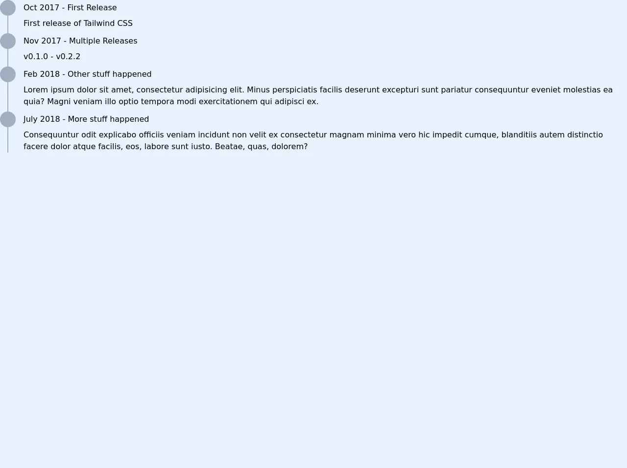
The preview of Timeline UI component
Free download of the Timeline's source code
The source code of Timeline UI component
<div class="relative w-1/2 m-8">
  <div class="border-r-2 border-gray-500 absolute h-full top-0" style="left: 15px"></div>
  <ul class="list-none m-0 p-0">
    <li class="mb-2">
      <div class="flex items-center mb-1">
        <div class="bg-gray-500 rounded-full h-8 w-8"></div>
        <div class="flex-1 ml-4 font-medium">Oct 2017 - First Release</div>
      </div>
      <div class="ml-12">
        First release of Tailwind CSS
      </div>
    </li>
    <li class="mb-2">
      <div class="flex items-center mb-1">
        <div class="bg-gray-500 rounded-full h-8 w-8"></div>
        <div class="flex-1 ml-4 font-medium">Nov 2017 - Multiple Releases</div>
      </div>
      <div class="ml-12">
        v0.1.0 - v0.2.2
      </div>
    </li>
    <li class="mb-2">
      <div class="flex items-center mb-1">
        <div class="bg-gray-500 rounded-full h-8 w-8"></div>
        <div class="flex-1 ml-4 font-medium">Feb 2018 - Other stuff happened</div>
      </div>
      <div class="ml-12">
        Lorem ipsum dolor sit amet, consectetur adipisicing elit. Minus perspiciatis facilis deserunt excepturi sunt pariatur consequuntur eveniet molestias ea quia? Magni veniam illo optio tempora modi exercitationem qui adipisci ex.
      </div>
    </li>
    <li class="mb-2">
      <div class="flex items-center mb-1">
        <div class="bg-gray-500 rounded-full h-8 w-8"></div>
        <div class="flex-1 ml-4 font-medium">July 2018 - More stuff happened</div>
      </div>
      <div class="ml-12">
        Consequuntur odit explicabo officiis veniam incidunt non velit ex consectetur magnam minima vero hic impedit cumque, blanditiis autem distinctio facere dolor atque facilis, eos, labore sunt iusto. Beatae, quas, dolorem?
      </div>
    </li>
  </ul>
</div>
How to create a Timeline with Tailwind CSS?
To create a timeline UI component with Tailwind CSS, you will need to follow these steps:
- Create a container element for your timeline.
- Create a series of event elements inside the container element.
- Apply the pre-defined Tailwind CSS classes to style the event elements.
Here is an example of how to create a simple timeline UI component with Tailwind CSS:
<div class="timeline">
  <div class="event">
    <div class="event-date">January 1, 2022</div>
    <div class="event-description">Lorem ipsum dolor sit amet, consectetur adipiscing elit.</div>
  </div>
  <div class="event">
    <div class="event-date">February 1, 2022</div>
    <div class="event-description">Sed do eiusmod tempor incididunt ut labore et dolore magna aliqua.</div>
  </div>
  <div class="event">
    <div class="event-date">March 1, 2022</div>
    <div class="event-description">Ut enim ad minim veniam, quis nostrud exercitation ullamco laboris nisi ut aliquip ex ea commodo consequat.</div>
  </div>
</div>
In this example, we have created a container element with the class "timeline" and three event elements with the class "event". Each event element contains a date element with the class "event-date" and a description element with the class "event-description".
We can then apply pre-defined Tailwind CSS classes to style these elements. For example, we can use the "bg-gray-100" class to set the background color of the event elements to gray and the "border-l-4" class to add a left border to the event elements.
<div class="timeline">
  <div class="event bg-gray-100 border-l-4">
    <div class="event-date">January 1, 2022</div>
    <div class="event-description">Lorem ipsum dolor sit amet, consectetur adipiscing elit.</div>
  </div>
  <div class="event bg-gray-100 border-l-4">
    <div class="event-date">February 1, 2022</div>
    <div class="event-description">Sed do eiusmod tempor incididunt ut labore et dolore magna aliqua.</div>
  </div>
  <div class="event bg-gray-100 border-l-4">
    <div class="event-date">March 1, 2022</div>
    <div class="event-description">Ut enim ad minim veniam, quis nostrud exercitation ullamco laboris nisi ut aliquip ex ea commodo consequat.</div>
  </div>
</div>
In this example, we have added the "bg-gray-100" and "border-l-4" classes to the event elements to style them.
Conclusion
Tailwind CSS is a powerful CSS framework that makes it easy to create custom user interfaces. With Tailwind CSS, you can quickly create a timeline UI component by applying pre-defined CSS classes to your HTML elements.
By following the steps outlined in this article, you can create a simple timeline UI component with Tailwind CSS. However, Tailwind CSS is highly customizable, and you can create more complex and unique timeline UI components by modifying the pre-defined CSS classes or creating your own custom classes.