- Published on
3 Things You Must Know To Create A Team page With Tailwind CSS
- What is Tailwind CSS?
- The description of Team page ui component
- Why use Tailwind CSS to create a Team page ui component?
- The preview of Team page ui component
- The source code of Team page ui component
- How to create a Team page with Tailwind CSS?
- 1. Use Flexbox and Grid for Layout
- 2. Use Tailwind's Pre-defined Classes for Styling
- 3. Use Responsive Design
- Conclusion
What is Tailwind CSS?
Tailwind CSS is a utility-first CSS framework that helps developers create responsive and customizable user interfaces quickly. It provides a set of pre-defined CSS classes that can be used to style HTML elements, making it easy to create complex layouts without writing custom CSS.
The description of Team page ui component
A team page is a common UI component used on websites to showcase the members of a team or organization. It typically includes a photo, name, title, and a brief bio for each team member.
Why use Tailwind CSS to create a Team page ui component?
Tailwind CSS is an excellent choice for creating a team page UI component because it provides a wide range of pre-defined classes that can be used to style the various elements of the component quickly. This means that developers can create a custom team page quickly without having to write custom CSS from scratch.
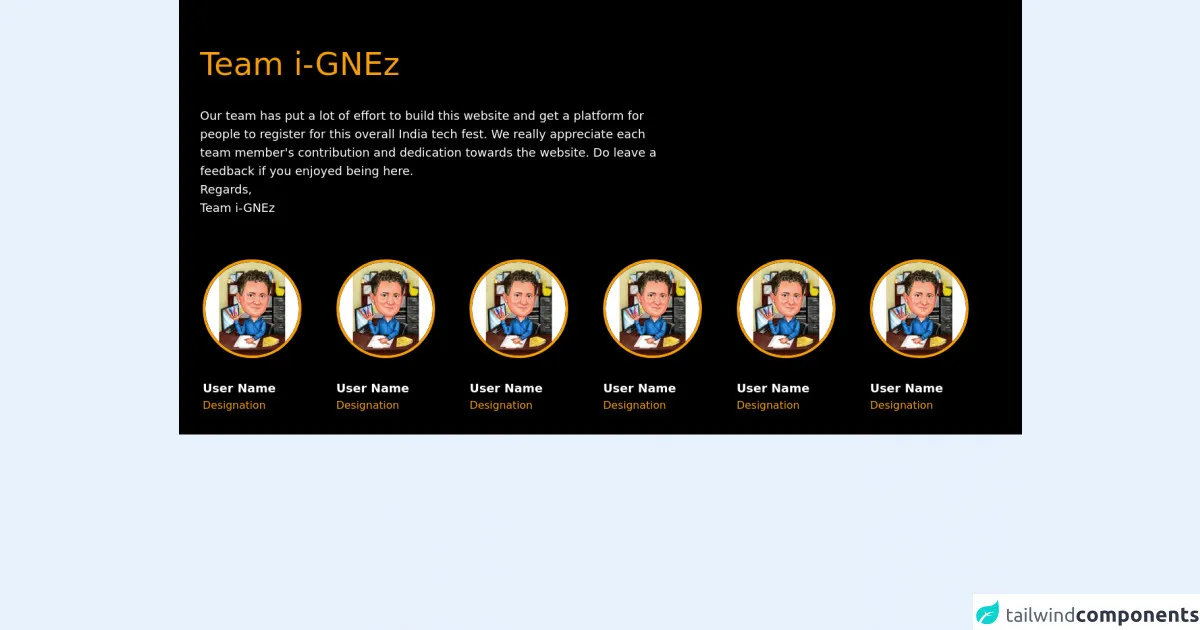
The preview of Team page ui component
To create a team page with Tailwind CSS, we will use a combination of flexbox and grid to create a responsive layout that looks great on all screen sizes. We will also use some of Tailwind's pre-defined classes to style the various elements of the team page.
Free download of the Team page's source code
The source code of Team page ui component
To create a team page with Tailwind CSS, we will use HTML and CSS. We will use a combination of flexbox and grid to create a responsive layout that looks great on all screen sizes. We will also use some of Tailwind's pre-defined classes to style the various elements of the team page.
<section>
	<div class="py-4 bg-black text-white">

		<div class="mx-auto flex flex-col md:flex-row">
			<div class="flex flex-col w-full lg:w-3/5 p-8">
				<h1 class="text-3xl md:text-5xl text-yellow-500 my-4 leading-relaxed md:leading-snug">Team i-GNEz
				</h1>
				<div class="font-sans text-sm md:text-lg my-2 md:my-4">Our team has put a lot of effort to build this
					website
					and get a platform for people to register for this overall India tech fest. We really appreciate
					each team member's contribution and dedication towards the website.
					Do leave a feedback if you enjoyed being here. <br>
					<p>Regards,</p>
					<p>Team i-GNEz</p>
				</div>
			</div>
		</div>


		<div class="flex flex-wrap text-center md:text-left px-8 md:px-4 lg:px-8">

			<div class="my-4 px-1 w-1/2 md:w-1/3 lg:w-1/6 overflow-hiddden">
				<div>
					<img class="border-4 border-yellow-500 rounded-full transition duration-500 hover:border-white mx-auto md:mx-0 w-24 md:w-auto"
                        src="https://user-images.githubusercontent.com/54521023/152726300-b03e134b-ff5c-40bf-a982-e01d825b4b68.png"
                        alt="user-avatar">
					<p class="text-lg mt-4 md:mt-8"><b>User Name</b></p>
					<p class="text-yellow-500">Designation</p>
				</div>
			</div>

			<div class="my-4 px-1 w-1/2 md:w-1/3 lg:w-1/6">
				<div>
					<img class="border-4 border-yellow-500 rounded-full transition duration-500 hover:border-white mx-auto md:mx-0 w-24 md:w-auto"
                        src="https://user-images.githubusercontent.com/54521023/152726300-b03e134b-ff5c-40bf-a982-e01d825b4b68.png"
                        alt="user-avatar">
					<p class="text-lg mt-4 md:mt-8"><b>User Name</b></p>
					<p class="text-yellow-500">Designation</p>
				</div>
			</div>

		</div>
	</div>

</section>
How to create a Team page with Tailwind CSS?
Here are the three things you must know to create a team page with Tailwind CSS:
1. Use Flexbox and Grid for Layout
To create the layout for the team page, we will use a combination of flexbox and grid. Flexbox will be used to align the team member cards horizontally, and grid will be used to create a responsive layout that looks great on all screen sizes.
2. Use Tailwind's Pre-defined Classes for Styling
Tailwind CSS provides a wide range of pre-defined classes that can be used to style the various elements of the team page. We will use classes like bg-white, text-gray-900, rounded-lg, and shadow-md to style the team member cards.
3. Use Responsive Design
To ensure that the team page looks great on all screen sizes, we will use responsive design. We will use Tailwind's pre-defined classes like sm:grid-cols-2, md:grid-cols-3, and lg:grid-cols-4 to create a responsive grid that adjusts to the screen size.
Conclusion
Creating a team page with Tailwind CSS is easy and straightforward. By using a combination of flexbox, grid, and Tailwind's pre-defined classes, developers can create a custom team page quickly without having to write custom CSS from scratch. With Tailwind CSS, creating responsive and customizable user interfaces has never been easier.