- Published on
6 Ideas To Help You Build A Tailwind CSS dropdown With Tailwind CSS Like A Pro
- What is Tailwind CSS?
- The description of Tailwind CSS dropdown ui component
- Why use Tailwind CSS to create a Tailwind CSS dropdown ui component?
- The preview of Tailwind CSS dropdown ui component
- The source code of Tailwind CSS dropdown ui component
- How to create a Tailwind CSS dropdown with Tailwind CSS?
- 1. Use the dropdown component
- 2. Customize the dropdown component
- 3. Use the dropdown-right class
- 4. Use the dropdown-up class
- 5. Use the dropdown-divider class
- 6. Use the dropdown-header class
- Conclusion
What is Tailwind CSS?
Tailwind CSS is a utility-first CSS framework that allows you to quickly build custom designs without writing any CSS. It provides a set of pre-defined classes that you can use to style your HTML elements. Tailwind CSS is highly customizable and can be used with any front-end framework or library.
The description of Tailwind CSS dropdown ui component
A dropdown is a UI component that allows users to select an option from a list of options. A Tailwind CSS dropdown is a dropdown that is styled using Tailwind CSS classes.
Why use Tailwind CSS to create a Tailwind CSS dropdown ui component?
Tailwind CSS makes it easy to create custom UI components without writing any CSS. It provides a set of pre-defined classes that you can use to style your HTML elements. Using Tailwind CSS to create a Tailwind CSS dropdown UI component will save you time and effort.
The preview of Tailwind CSS dropdown ui component
To create a Tailwind CSS dropdown, you will need to use a combination of HTML and Tailwind CSS classes. Here is a preview of what a Tailwind CSS dropdown could look like:
Free download of the Tailwind CSS dropdown's source code
The source code of Tailwind CSS dropdown ui component
Here is the source code for a basic Tailwind CSS dropdown:
<!-- This is an example component -->
<div class="max-w-lg mx-auto">
<button class="text-white bg-blue-700 hover:bg-blue-800 focus:ring-4 focus:ring-blue-300 font-medium rounded-lg text-sm px-4 py-2.5 text-center inline-flex items-center" type="button" data-dropdown-toggle="dropdown">Dropdown button <svg class="w-4 h-4 ml-2" fill="none" stroke="currentColor" viewBox="0 0 24 24" xmlns="http://www.w3.org/2000/svg"><path stroke-linecap="round" stroke-linejoin="round" stroke-width="2" d="M19 9l-7 7-7-7"></path></svg></button>
<!-- Dropdown menu -->
<div class="hidden bg-white text-base z-50 list-none divide-y divide-gray-100 rounded shadow my-4" id="dropdown">
<div class="px-4 py-3">
<span class="block text-sm">Bonnie Green</span>
<span class="block text-sm font-medium text-gray-900 truncate">[email protected]</span>
</div>
<ul class="py-1" aria-labelledby="dropdown">
<li>
<a href="#" class="text-sm hover:bg-gray-100 text-gray-700 block px-4 py-2">Dashboard</a>
</li>
<li>
<a href="#" class="text-sm hover:bg-gray-100 text-gray-700 block px-4 py-2">Settings</a>
</li>
<li>
<a href="#" class="text-sm hover:bg-gray-100 text-gray-700 block px-4 py-2">Earnings</a>
</li>
<li>
<a href="#" class="text-sm hover:bg-gray-100 text-gray-700 block px-4 py-2">Sign out</a>
</li>
</ul>
</div>
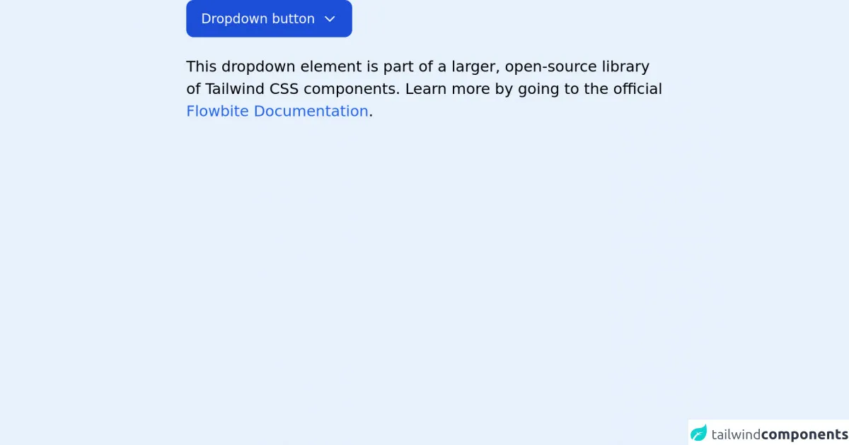
<p class="mt-5">This dropdown element is part of a larger, open-source library of Tailwind CSS components. Learn more by going to the official <a class="text-blue-600 hover:underline" href="https://flowbite.com/docs/getting-started/introduction/" target="_blank">Flowbite Documentation</a>.</p>
</div>
<script src="https://unpkg.com/@themesberg/flowbite@latest/dist/flowbite.bundle.js"></script>
How to create a Tailwind CSS dropdown with Tailwind CSS?
Here are 6 ideas to help you build a Tailwind CSS dropdown with Tailwind CSS like a pro:
1. Use the dropdown component
Tailwind CSS provides a dropdown component that you can use to create a dropdown. The dropdown component consists of a button and a dropdown menu. Here is an example of how to use the dropdown component:
<div class="dropdown">
  <button class="dropdown-toggle btn btn-primary" type="button" id="dropdownMenuButton" data-toggle="dropdown" aria-haspopup="true" aria-expanded="false">
    Dropdown button
  </button>
  <div class="dropdown-menu" aria-labelledby="dropdownMenuButton">
    <a class="dropdown-item" href="#">Action</a>
    <a class="dropdown-item" href="#">Another action</a>
    <a class="dropdown-item" href="#">Something else here</a>
  </div>
</div>
2. Customize the dropdown component
You can customize the dropdown component by adding Tailwind CSS classes to the button and the dropdown menu. Here is an example of how to customize the dropdown component:
<div class="dropdown">
  <button class="bg-blue-500 hover:bg-blue-700 text-white font-bold py-2 px-4 rounded dropdown-toggle btn btn-primary" type="button" id="dropdownMenuButton" data-toggle="dropdown" aria-haspopup="true" aria-expanded="false">
    Dropdown button
  </button>
  <div class="dropdown-menu bg-gray-200" aria-labelledby="dropdownMenuButton">
    <a class="dropdown-item" href="#">Action</a>
    <a class="dropdown-item" href="#">Another action</a>
    <a class="dropdown-item" href="#">Something else here</a>
  </div>
</div>
3. Use the dropdown-right class
You can use the dropdown-right class to position the dropdown menu to the right of the button. Here is an example of how to use the dropdown-right class:
<div class="dropdown">
  <button class="dropdown-toggle btn btn-primary" type="button" id="dropdownMenuButton" data-toggle="dropdown" aria-haspopup="true" aria-expanded="false">
    Dropdown button
  </button>
  <div class="dropdown-menu dropdown-right" aria-labelledby="dropdownMenuButton">
    <a class="dropdown-item" href="#">Action</a>
    <a class="dropdown-item" href="#">Another action</a>
    <a class="dropdown-item" href="#">Something else here</a>
  </div>
</div>
4. Use the dropdown-up class
You can use the dropdown-up class to position the dropdown menu above the button. Here is an example of how to use the dropdown-up class:
<div class="dropdown">
  <button class="dropdown-toggle btn btn-primary" type="button" id="dropdownMenuButton" data-toggle="dropdown" aria-haspopup="true" aria-expanded="false">
    Dropdown button
  </button>
  <div class="dropdown-menu dropdown-up" aria-labelledby="dropdownMenuButton">
    <a class="dropdown-item" href="#">Action</a>
    <a class="dropdown-item" href="#">Another action</a>
    <a class="dropdown-item" href="#">Something else here</a>
  </div>
</div>
5. Use the dropdown-divider class
You can use the dropdown-divider class to add a divider between dropdown items. Here is an example of how to use the dropdown-divider class:
<div class="dropdown">
  <button class="dropdown-toggle btn btn-primary" type="button" id="dropdownMenuButton" data-toggle="dropdown" aria-haspopup="true" aria-expanded="false">
    Dropdown button
  </button>
  <div class="dropdown-menu" aria-labelledby="dropdownMenuButton">
    <a class="dropdown-item" href="#">Action</a>
    <a class="dropdown-item" href="#">Another action</a>
    <div class="dropdown-divider"></div>
    <a class="dropdown-item" href="#">Something else here</a>
  </div>
</div>
6. Use the dropdown-header class
You can use the dropdown-header class to add a header to the dropdown menu. Here is an example of how to use the dropdown-header class:
<div class="dropdown">
  <button class="dropdown-toggle btn btn-primary" type="button" id="dropdownMenuButton" data-toggle="dropdown" aria-haspopup="true" aria-expanded="false">
    Dropdown button
  </button>
  <div class="dropdown-menu" aria-labelledby="dropdownMenuButton">
    <h6 class="dropdown-header">Dropdown header</h6>
    <a class="dropdown-item" href="#">Action</a>
    <a class="dropdown-item" href="#">Another action</a>
    <a class="dropdown-item" href="#">Something else here</a>
  </div>
</div>
Conclusion
In conclusion, Tailwind CSS is a powerful CSS framework that can help you create custom UI components quickly and easily. By using the dropdown component and customizing it with Tailwind CSS classes, you can create a Tailwind CSS dropdown that looks great and is easy to use. Try out these 6 ideas and see how they can help you build a Tailwind CSS dropdown like a pro.