- Published on
How To Make A Tailwind CSS FAB buttons With Tailwind CSS In 6 Easy Steps?
- What is Tailwind CSS?
- The description of Tailwind CSS FAB buttons ui component
- Why use Tailwind CSS to create a Tailwind CSS FAB buttons ui component?
- The preview of Tailwind CSS FAB buttons ui component.
- The source code of Tailwind CSS FAB buttons ui component.
- How to create a Tailwind CSS FAB buttons with Tailwind CSS?
- Step 1: Create the HTML markup
- Step 2: Add the FAB button styles
- Step 3: Add the FAB button size
- Step 4: Add the FAB button shadow
- Step 5: Add the FAB button hover styles
- Step 6: Add the FAB button click styles
- Conclusion
What is Tailwind CSS?
Tailwind CSS is a utility-first CSS framework that allows developers to rapidly build user interfaces. It provides a set of pre-defined CSS classes that can be used to style HTML elements. Tailwind CSS is highly customizable and allows developers to create unique designs without writing any custom CSS.
The description of Tailwind CSS FAB buttons ui component
FAB (Floating Action Button) buttons are a popular UI component used in mobile and web applications. They are circular buttons that float above the content and are used to perform primary actions. Tailwind CSS provides a set of pre-defined classes that can be used to create FAB buttons.
Why use Tailwind CSS to create a Tailwind CSS FAB buttons ui component?
Tailwind CSS provides a set of pre-defined classes that can be used to create FAB buttons. This makes it easy for developers to create FAB buttons without writing any custom CSS. Tailwind CSS is also highly customizable, which means that developers can easily modify the appearance of FAB buttons to match their design requirements.
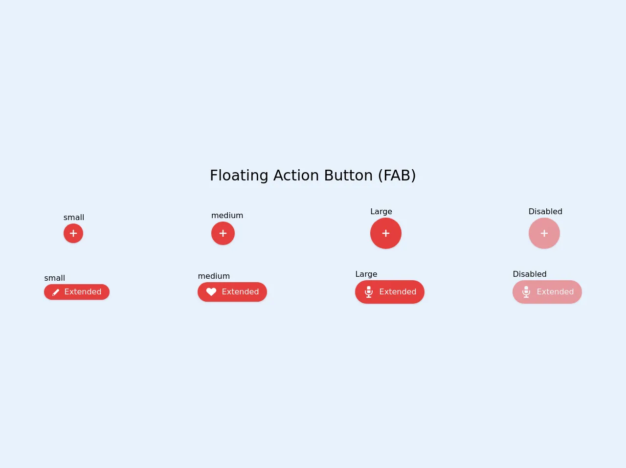
The preview of Tailwind CSS FAB buttons ui component.
FAB buttons are circular buttons that float above the content. They are used to perform primary actions. Tailwind CSS provides a set of pre-defined classes that can be used to create FAB buttons.
Free download of the Tailwind CSS FAB buttons's source code
The source code of Tailwind CSS FAB buttons ui component.
Tailwind CSS provides a set of pre-defined classes that can be used to create FAB buttons. These classes can be used to modify the appearance of FAB buttons.
<div class="w-screen h-screen flex justify-center items-center">
  <div class="grid grid-flow-row gap-10 w-full">
    <div>
      <p class="text-center text-3xl">Floating Action Button (FAB)</p>
    </div>
    <div class="flex items-center justify-around">
      <div class="">
        <p>small</p>
        <button
                class="p-0 w-10 h-10 bg-red-600 rounded-full hover:bg-red-700 active:shadow-lg mouse shadow transition ease-in duration-200 focus:outline-none">
          <svg viewBox="0 0 20 20" enable-background="new 0 0 20 20" class="w-6 h-6 inline-block">
            <path fill="#FFFFFF" d="M16,10c0,0.553-0.048,1-0.601,1H11v4.399C11,15.951,10.553,16,10,16c-0.553,0-1-0.049-1-0.601V11H4.601
                                    C4.049,11,4,10.553,4,10c0-0.553,0.049-1,0.601-1H9V4.601C9,4.048,9.447,4,10,4c0.553,0,1,0.048,1,0.601V9h4.399
                                    C15.952,9,16,9.447,16,10z" />
          </svg>
        </button>
      </div>
      <div class="">
        <p>medium</p>
        <button
                class="p-0 w-12 h-12 bg-red-600 rounded-full hover:bg-red-700 active:shadow-lg mouse shadow transition ease-in duration-200 focus:outline-none">
          <svg viewBox="0 0 20 20" enable-background="new 0 0 20 20" class="w-6 h-6 inline-block">
            <path fill="#FFFFFF" d="M16,10c0,0.553-0.048,1-0.601,1H11v4.399C11,15.951,10.553,16,10,16c-0.553,0-1-0.049-1-0.601V11H4.601
                                    C4.049,11,4,10.553,4,10c0-0.553,0.049-1,0.601-1H9V4.601C9,4.048,9.447,4,10,4c0.553,0,1,0.048,1,0.601V9h4.399
                                    C15.952,9,16,9.447,16,10z" />
          </svg>
        </button>
      </div>
      <div class="">
        <p>Large</p>
        <button
                class="p-0 w-16 h-16 bg-red-600 rounded-full hover:bg-red-700 active:shadow-lg mouse shadow transition ease-in duration-200 focus:outline-none">
          <svg viewBox="0 0 20 20" enable-background="new 0 0 20 20" class="w-6 h-6 inline-block">
            <path fill="#FFFFFF" d="M16,10c0,0.553-0.048,1-0.601,1H11v4.399C11,15.951,10.553,16,10,16c-0.553,0-1-0.049-1-0.601V11H4.601
                                    C4.049,11,4,10.553,4,10c0-0.553,0.049-1,0.601-1H9V4.601C9,4.048,9.447,4,10,4c0.553,0,1,0.048,1,0.601V9h4.399
                                    C15.952,9,16,9.447,16,10z" />
          </svg>
        </button>
      </div>
      <div class="">
        <p>Disabled</p>
        <button
                class="cursor-not-allowed opacity-50 p-0 w-16 h-16 bg-red-600 rounded-full mouse shadow transition ease-in duration-200 focus:outline-none">
          <svg viewBox="0 0 20 20" enable-background="new 0 0 20 20" class="w-6 h-6 inline-block">
            <path fill="#FFFFFF" d="M16,10c0,0.553-0.048,1-0.601,1H11v4.399C11,15.951,10.553,16,10,16c-0.553,0-1-0.049-1-0.601V11H4.601
                                    C4.049,11,4,10.553,4,10c0-0.553,0.049-1,0.601-1H9V4.601C9,4.048,9.447,4,10,4c0.553,0,1,0.048,1,0.601V9h4.399
                                    C15.952,9,16,9.447,16,10z" />
          </svg>
        </button>
      </div>
    </div>
    <div class="flex items-center justify-around">
      <div class="">
        <p>small</p>
        <button
                class="text-white px-4 w-auto h-8 bg-red-600 rounded-full hover:bg-red-700 active:shadow-lg mouse shadow transition ease-in duration-200 focus:outline-none">
          <svg viewBox="0 0 20 20" enable-background="new 0 0 20 20" class="w-4 h-4 inline-block mr-1">
            <path fill="#FFFFFF" d="M17.561,2.439c-1.442-1.443-2.525-1.227-2.525-1.227L8.984,7.264L2.21,14.037L1.2,18.799l4.763-1.01
                                    l6.774-6.771l6.052-6.052C18.788,4.966,19.005,3.883,17.561,2.439z M5.68,17.217l-1.624,0.35c-0.156-0.293-0.345-0.586-0.69-0.932
                                    c-0.346-0.346-0.639-0.533-0.932-0.691l0.35-1.623l0.47-0.469c0,0,0.883,0.018,1.881,1.016c0.997,0.996,1.016,1.881,1.016,1.881
                                    L5.68,17.217z"/>
          </svg>
          <span>Extended</span>
        </button>
      </div>
      <div class="">
        <p>medium</p>
        <button
                class="text-white px-4 w-auto h-10 bg-red-600 rounded-full hover:bg-red-700 active:shadow-lg mouse shadow transition ease-in duration-200 focus:outline-none">
          <svg viewBox="0 0 20 20" enable-background="new 0 0 20 20" class="w-6 h-6 inline-block mr-1">
            <path fill="#FFFFFF" d="M17.19,4.155c-1.672-1.534-4.383-1.534-6.055,0L10,5.197L8.864,4.155c-1.672-1.534-4.382-1.534-6.054,0
                                    c-1.881,1.727-1.881,4.52,0,6.246L10,17l7.19-6.599C19.07,8.675,19.07,5.881,17.19,4.155z"/>
          </svg>
          <span>Extended</span>
        </button>
      </div>
      <div class="">
        <p>Large</p>
        <button
                class="text-white px-4 w-auto h-12 bg-red-600 rounded-full hover:bg-red-700 active:shadow-lg mouse shadow transition ease-in duration-200 focus:outline-none">
          <svg viewBox="0 0 20 20" enable-background="new 0 0 20 20" class="w-6 h-6 inline-block mr-1">
            <path fill="#FFFFFF" d="M16.399,7.643V10.4c0,2.236-1.643,4.629-5.399,4.959V18h2.6c0.22,0,0.4,0.18,0.4,0.4v1.2
                                    c0,0.221-0.181,0.4-0.4,0.4H6.4C6.18,20,6,19.82,6,19.6v-1.2C6,18.18,6.18,18,6.399,18H9v-2.641c-3.758-0.33-5.4-2.723-5.4-4.959
                                    V7.643c0-0.221,0.18-0.4,0.4-0.4h0.6c0.22,0,0.4,0.18,0.4,0.4V10.4c0,1.336,1.053,3.6,5,3.6c3.946,0,5-2.264,5-3.6V7.643
                                    c0-0.221,0.18-0.4,0.399-0.4H16C16.22,7.242,16.399,7.422,16.399,7.643z M10,12c2.346,0,3-0.965,3-1.6V7.242H7V10.4
                                    C7,11.035,7.652,12,10,12z M13,1.6C13,0.963,12.346,0,10,0C7.652,0,7,0.963,7,1.6v4.242h6V1.6z"/>
          </svg>
          <span>Extended</span>
        </button>
      </div>
      <div class="">
        <p>Disabled</p>
        <button
                class="cursor-not-allowed opacity-50 text-white px-4 w-auto h-12 bg-red-600 rounded-full mouse shadow transition ease-in duration-200 focus:outline-none">
          <svg viewBox="0 0 20 20" enable-background="new 0 0 20 20" class="w-6 h-6 inline-block mr-1">
            <path fill="#FFFFFF" d="M16.399,7.643V10.4c0,2.236-1.643,4.629-5.399,4.959V18h2.6c0.22,0,0.4,0.18,0.4,0.4v1.2
                                    c0,0.221-0.181,0.4-0.4,0.4H6.4C6.18,20,6,19.82,6,19.6v-1.2C6,18.18,6.18,18,6.399,18H9v-2.641c-3.758-0.33-5.4-2.723-5.4-4.959
                                    V7.643c0-0.221,0.18-0.4,0.4-0.4h0.6c0.22,0,0.4,0.18,0.4,0.4V10.4c0,1.336,1.053,3.6,5,3.6c3.946,0,5-2.264,5-3.6V7.643
                                    c0-0.221,0.18-0.4,0.399-0.4H16C16.22,7.242,16.399,7.422,16.399,7.643z M10,12c2.346,0,3-0.965,3-1.6V7.242H7V10.4
                                    C7,11.035,7.652,12,10,12z M13,1.6C13,0.963,12.346,0,10,0C7.652,0,7,0.963,7,1.6v4.242h6V1.6z"/>
          </svg>
          <span>Extended</span>
        </button>
      </div>
    </div>
  </div>
</div>
How to create a Tailwind CSS FAB buttons with Tailwind CSS?
In this tutorial, we will create a simple FAB button using Tailwind CSS. We will use the following six steps to create the FAB button:
Step 1: Create the HTML markup
The first step is to create the HTML markup for the FAB button. We will create a div element with the class "fixed" and "bottom-0" to position the FAB button at the bottom of the page. We will also create a button element with the class "bg-blue-500" to set the background color of the FAB button.
<div class="fixed bottom-0">
  <button class="bg-blue-500">+</button>
</div>
Step 2: Add the FAB button styles
The next step is to add the FAB button styles using Tailwind CSS classes. We will add the "rounded-full" class to make the button circular. We will also add the "text-white" class to set the text color to white.
<div class="fixed bottom-0">
  <button class="bg-blue-500 rounded-full text-white">+</button>
</div>
Step 3: Add the FAB button size
The next step is to add the size of the FAB button. We will use the "w-16" and "h-16" classes to set the width and height of the button to 16 pixels.
<div class="fixed bottom-0">
  <button class="bg-blue-500 rounded-full text-white w-16 h-16">+</button>
</div>
Step 4: Add the FAB button shadow
The next step is to add a shadow to the FAB button. We will use the "shadow-lg" class to add a shadow to the button.
<div class="fixed bottom-0">
  <button class="bg-blue-500 rounded-full text-white w-16 h-16 shadow-lg">+</button>
</div>
Step 5: Add the FAB button hover styles
The next step is to add hover styles to the FAB button. We will use the "hover:bg-blue-600" class to change the background color of the button when it is hovered over.
<div class="fixed bottom-0">
  <button class="bg-blue-500 rounded-full text-white w-16 h-16 shadow-lg hover:bg-blue-600">+</button>
</div>
Step 6: Add the FAB button click styles
The final step is to add click styles to the FAB button. We will use the "active:bg-blue-700" class to change the background color of the button when it is clicked.
<div class="fixed bottom-0">
  <button class="bg-blue-500 rounded-full text-white w-16 h-16 shadow-lg hover:bg-blue-600 active:bg-blue-700">+</button>
</div>
Conclusion
In this tutorial, we learned how to create a simple FAB button using Tailwind CSS. We used pre-defined classes to style the button and customize its appearance. Tailwind CSS makes it easy to create unique designs without writing any custom CSS.