- Published on
6 Easy Ways To Create A Tailwind Css box shadow scale With Tailwind CSS Without Even Thinking About It
- What is Tailwind CSS?
- The description of Tailwind Css box shadow scale ui component
- Why use Tailwind CSS to create a Tailwind Css box shadow scale ui component?
- The preview of Tailwind Css box shadow scale ui component
- The source code of Tailwind Css box shadow scale ui component
- How to create a Tailwind Css box shadow scale with Tailwind CSS?
- Conclusion
Are you looking for a simple way to create a box shadow scale for your UI components? Look no further than Tailwind CSS! In this article, we'll walk through six easy ways to create a Tailwind Css box shadow scale without even thinking about it.
What is Tailwind CSS?
Tailwind CSS is a utility-first CSS framework that allows you to quickly and easily build custom user interfaces. It provides a set of pre-defined classes that you can use to style your HTML elements without writing any CSS code.
The description of Tailwind Css box shadow scale ui component
A box shadow is a visual effect that creates the illusion of depth and dimensionality for an element. The Tailwind CSS box shadow scale UI component allows you to easily add box shadows to your UI components.
Why use Tailwind CSS to create a Tailwind Css box shadow scale ui component?
Using Tailwind CSS to create a box shadow scale UI component has several benefits:
- Tailwind CSS provides pre-defined classes for box shadows, making it easy to add them to your UI components.
- Tailwind CSS allows you to customize the box shadow properties, such as color, size, and blur, without writing any CSS code.
- Tailwind CSS is lightweight and easy to use, making it a great choice for front-end developers who want to quickly build custom user interfaces.
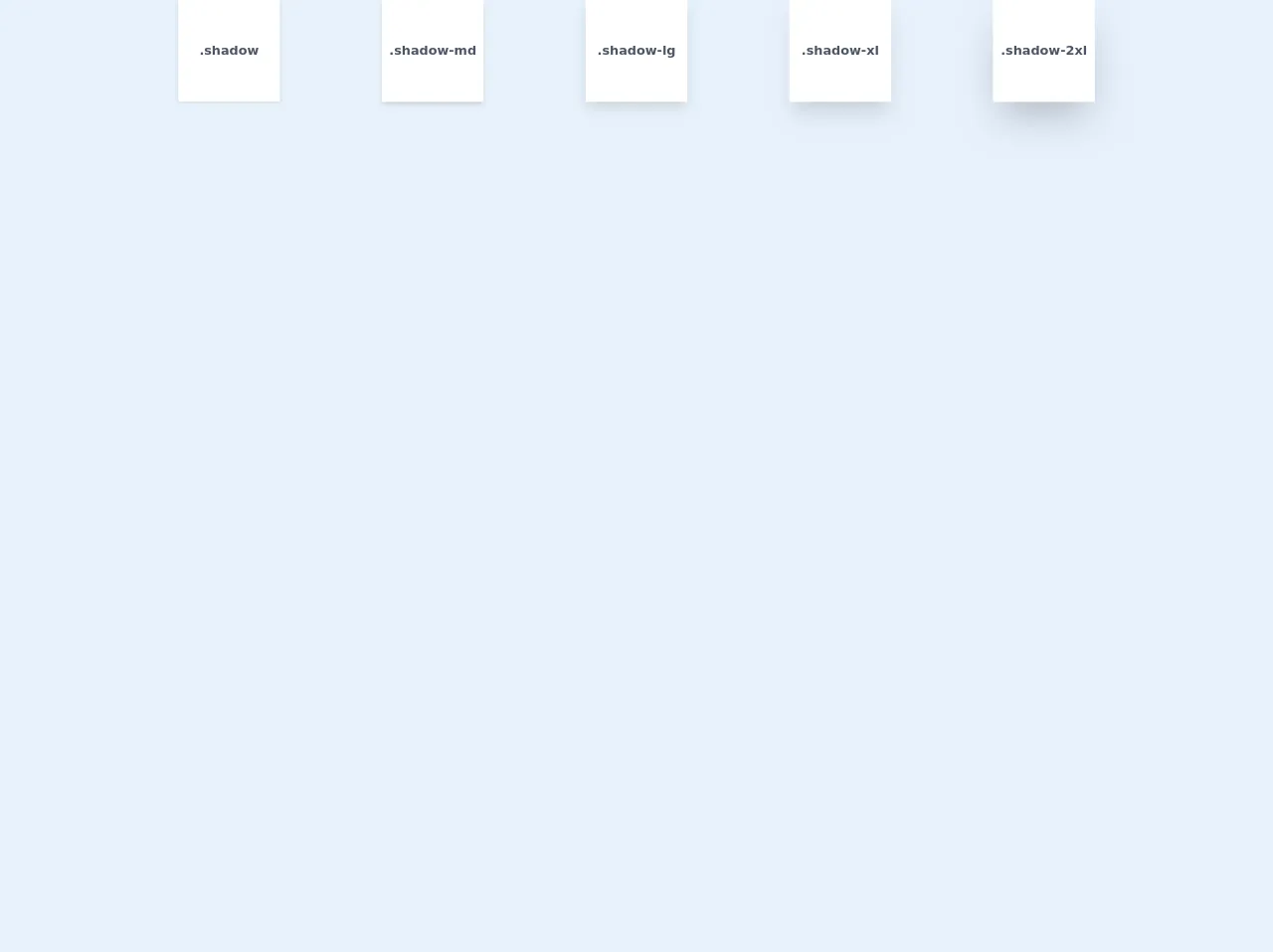
The preview of Tailwind Css box shadow scale ui component
To create a Tailwind Css box shadow scale UI component, you can use the following classes:
shadow-xs: Adds a small box shadow to the element.shadow-sm: Adds a medium box shadow to the element.shadow: Adds a large box shadow to the element.shadow-md: Adds an extra-large box shadow to the element.shadow-lg: Adds a double-extra-large box shadow to the element.shadow-xl: Adds a triple-extra-large box shadow to the element.shadow-2xl: Adds a quadruple-extra-large box shadow to the element.
Free download of the Tailwind Css box shadow scale's source code
The source code of Tailwind Css box shadow scale ui component
To create a Tailwind Css box shadow scale UI component, you can use the following HTML and Tailwind CSS classes:
<div class="bg-white rounded-lg p-4 shadow-lg">
  <h1 class="text-2xl font-bold mb-2">Hello, world!</h1>
  <p class="text-gray-700">Lorem ipsum dolor sit amet, consectetur adipiscing elit.</p>
</div>
.bg-white {
  background-color: #fff;
}
.rounded-lg {
  border-radius: 0.5rem;
}
.p-4 {
  padding: 1rem;
}
.shadow-lg {
  box-shadow: 0 10px 15px -3px rgba(0, 0, 0, 0.1), 0 4px 6px -2px rgba(0, 0, 0, 0.05);
}
.text-2xl {
  font-size: 1.5rem;
}
.font-bold {
  font-weight: 700;
}
.mb-2 {
  margin-bottom: 0.5rem;
}
.text-gray-700 {
  color: #4a5568;
}
<div class="w-full h-64 flex justify-around">
  <div class="h-32 w-32 bg-white flex items-center justify-center text-gray-700 font-semibold shadow">.shadow</div>
  <div class="h-32 w-32 bg-white flex items-center justify-center text-gray-700 font-semibold shadow-md">.shadow-md</div>
  <div class="h-32 w-32 bg-white flex items-center justify-center text-gray-700 font-semibold shadow-lg">.shadow-lg</div>
  <div class="h-32 w-32 bg-white flex items-center justify-center text-gray-700 font-semibold shadow-xl">.shadow-xl</div>
  <div class="h-32 w-32 bg-white flex items-center justify-center text-gray-700 font-semibold shadow-2xl">.shadow-2xl</div>
</div>
How to create a Tailwind Css box shadow scale with Tailwind CSS?
To create a Tailwind Css box shadow scale with Tailwind CSS, follow these six easy steps:
- Add the
bg-whiteclass to your HTML element to set the background color to white. - Add the
rounded-lgclass to your HTML element to add rounded corners to the element. - Add the
p-4class to your HTML element to add padding to the element. - Add one of the
shadow-*classes to your HTML element to add a box shadow to the element. Choose the class based on the size of the box shadow you want to add. - Add any additional Tailwind CSS classes to customize the element's appearance, such as font size or font weight.
- Repeat steps 1-5 for any additional UI components you want to add a box shadow to.
Conclusion
In conclusion, creating a Tailwind Css box shadow scale UI component is easy and straightforward with Tailwind CSS. By using pre-defined classes and customizable properties, you can quickly add box shadows to your UI components without writing any CSS code. Give it a try and see how easy it is to create beautiful and functional user interfaces with Tailwind CSS.