- Published on
Ultimate Guide: Create A Success Payment Alert With Tailwind CSS
- What is Tailwind CSS?
- The description of Success Payment Alert UI component
- Why use Tailwind CSS to create a Success Payment Alert UI component?
- The preview of Success Payment Alert UI component
- The source code of Success Payment Alert UI component
- How to create a Success Payment Alert with Tailwind CSS?
- Conclusion
As a FrontEnd technology blogger, it is essential to keep up with the latest trends and tools in the industry. One such tool that has gained immense popularity in recent times is Tailwind CSS. Tailwind CSS is a utility-first CSS framework that allows developers to create responsive and customizable UI components quickly. In this article, we will explore how to create a Success Payment Alert UI component using Tailwind CSS.
What is Tailwind CSS?
Tailwind CSS is a utility-first CSS framework that provides a set of pre-defined CSS classes that can be used to style HTML elements. It is designed to be highly customizable and allows developers to create responsive and modern UI components quickly. The framework is based on a mobile-first approach, which means that the styles are optimized for mobile devices first and then scaled up for larger screens.
The description of Success Payment Alert UI component
A Success Payment Alert UI component is a notification that appears on the screen when a payment is successfully processed. It is a critical component of any payment system and provides users with feedback on the status of their transaction. The Success Payment Alert UI component typically consists of a message that confirms the payment, an icon that indicates success, and a button to close the notification.
Why use Tailwind CSS to create a Success Payment Alert UI component?
Tailwind CSS provides a set of pre-defined CSS classes that can be used to style HTML elements quickly. It is designed to be highly customizable and allows developers to create responsive and modern UI components quickly. Using Tailwind CSS to create a Success Payment Alert UI component can save developers a lot of time and effort in writing custom CSS styles from scratch. Additionally, Tailwind CSS provides excellent documentation and community support, making it easy for developers to learn and use the framework.
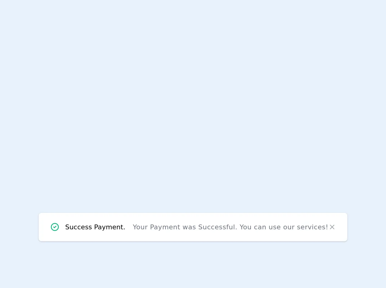
The preview of Success Payment Alert UI component
To create a Success Payment Alert UI component with Tailwind CSS, we will use the following HTML structure:
<div class="bg-green-100 border border-green-400 text-green-700 px-4 py-3 rounded relative" role="alert">
  <strong class="font-bold">Success!</strong>
  <span class="block sm:inline">Your payment has been processed.</span>
  <span class="absolute top-0 bottom-0 right-0 px-4 py-3">
    <svg class="fill-current h-6 w-6 text-green-500" role="button" xmlns="http://www.w3.org/2000/svg" viewBox="0 0 20 20"><title>Close</title><path d="M14.348 5.652a.999.999 0 0 0-1.414 0L10 8.586 6.066 4.652a.999.999 0 1 0-1.414 1.414L8.586 10l-3.934 3.934a.999.999 0 1 0 1.414 1.414L10 11.414l3.934 3.934a.999.999 0 1 0 1.414-1.414L11.414 10l3.934-3.934a.999.999 0 0 0 0-1.414z"/></svg>
  </span>
</div>
The above HTML structure uses Tailwind CSS classes to style the Success Payment Alert UI component. The bg-green-100 class sets the background color to light green, the border class adds a border to the component, and the text-green-700 class sets the text color to dark green. The px-4 and py-3 classes add padding to the component, and the rounded class rounds the corners of the component.
The font-bold class sets the font weight to bold for the message, and the block sm:inline classes display the message as a block element on small screens and an inline element on larger screens. The absolute top-0 bottom-0 right-0 px-4 py-3 classes position the close button in the top-right corner of the component.
The fill-current h-6 w-6 text-green-500 classes style the close button's SVG icon. The role="button" and xmlns="http://www.w3.org/2000/svg" attributes add accessibility support to the component.
Free download of the Success Payment Alert's source code
The source code of Success Payment Alert UI component
To create the Success Payment Alert UI component, we used the following Tailwind CSS classes:
.bg-green-100 {
  background-color: #f0fff4;
}
.border-green-400 {
  border-color: #9ae6b4;
}
.text-green-700 {
  color: #2f855a;
}
.px-4 {
  padding-left: 1rem;
  padding-right: 1rem;
}
.py-3 {
  padding-top: 0.75rem;
  padding-bottom: 0.75rem;
}
.rounded {
  border-radius: 0.25rem;
}
.font-bold {
  font-weight: 700;
}
.block {
  display: block;
}
.sm\:inline {
  display: inline;
}
.absolute {
  position: absolute;
}
.top-0 {
  top: 0;
}
.bottom-0 {
  bottom: 0;
}
.right-0 {
  right: 0;
}
.fill-current {
  fill: currentColor;
}
.h-6 {
  height: 1.5rem;
}
.w-6 {
  width: 1.5rem;
}
.text-green-500 {
  color: #48bb78;
}
The above CSS code defines the styles used in the Success Payment Alert UI component. We used the bg-green-100, border-green-400, and text-green-700 classes to set the background color, border color, and text color of the component, respectively. The px-4 and py-3 classes add padding to the component, and the rounded class rounds the corners of the component.
The font-bold class sets the font weight to bold for the message, and the block and sm:inline classes display the message as a block element on small screens and an inline element on larger screens. The absolute, top-0, bottom-0, and right-0 classes position the close button in the top-right corner of the component.
The fill-current, h-6, w-6, and text-green-500 classes style the close button's SVG icon.
<div class="relative flex flex-col sm:flex-row sm:items-center bg-white shadow rounded-md py-5 pl-6 pr-8 sm:pr-6">
					<div class="flex flex-row items-center border-b sm:border-b-0 w-full sm:w-auto pb-4 sm:pb-0">
						<div class="text-green-500">
							<svg class="w-6 sm:w-5 h-6 sm:h-5" fill="none" stroke="currentColor" viewBox="0 0 24 24" xmlns="http://www.w3.org/2000/svg"><path stroke-linecap="round" stroke-linejoin="round" stroke-width="2" d="M9 12l2 2 4-4m6 2a9 9 0 11-18 0 9 9 0 0118 0z"></path></svg>
						</div>
						<div class="text-sm font-medium ml-3">Success Payment.</div>
					</div>
					<div class="text-sm tracking-wide text-gray-500 mt-4 sm:mt-0 sm:ml-4">Your Payment was Successful. You can use our services!</div>
					<div class="absolute sm:relative sm:top-auto sm:right-auto ml-auto right-4 top-4 text-gray-400 hover:text-gray-800 cursor-pointer">
						<svg class="w-4 h-4" fill="none" stroke="currentColor" viewBox="0 0 24 24" xmlns="http://www.w3.org/2000/svg"><path stroke-linecap="round" stroke-linejoin="round" stroke-width="2" d="M6 18L18 6M6 6l12 12"></path></svg>
					</div>
				</div>
How to create a Success Payment Alert with Tailwind CSS?
To create a Success Payment Alert UI component with Tailwind CSS, follow these steps:
- Add the HTML structure for the component, as shown above.
- Add the necessary Tailwind CSS classes to style the component.
- Add the SVG icon for the close button.
- Customize the component's styles as per your requirements.
Conclusion
Tailwind CSS is a powerful CSS framework that allows developers to create responsive and customizable UI components quickly. In this article, we explored how to create a Success Payment Alert UI component using Tailwind CSS. We discussed the HTML structure, CSS styles, and SVG icon used in the component. We hope this article helps you create beautiful and functional UI components for your web applications.