- Published on
How To Make A Reset password With Tailwind CSS From Scratch
- What is Tailwind CSS?
- The description of Reset password ui component
- Why use Tailwind CSS to create a Reset password ui component?
- The preview of Reset password ui component
- The source code of Reset password ui component
- How to create a Reset password with Tailwind CSS?
- Conclusion
What is Tailwind CSS?
Tailwind CSS is a utility-first CSS framework that allows developers to easily create responsive and customizable user interfaces. It provides a wide range of pre-built classes that can be used to style HTML elements without writing any custom CSS.
The description of Reset password ui component
The Reset password ui component is an essential feature for any web application that requires user authentication. It allows users to reset their password if they forget it or want to change it for security reasons. The Reset password ui component typically includes a form with fields for the user's email address and a new password, as well as a submit button.
Why use Tailwind CSS to create a Reset password ui component?
Tailwind CSS is an excellent choice for creating a Reset password ui component because it allows developers to quickly and easily style the component without writing any custom CSS. The framework provides a wide range of pre-built classes that can be used to style HTML elements, making it easy to create a responsive and customizable user interface.
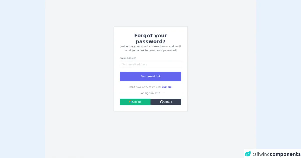
The preview of Reset password ui component
To create a Reset password ui component with Tailwind CSS, we will use a form with two input fields and a submit button. The form will be styled using Tailwind CSS classes to create a clean and modern design.
Free download of the Reset password's source code
The source code of Reset password ui component
The source code for the Reset password ui component can be found below.
<div class="flex justify-center min-h-screen bg-gray-100 antialiased">
<div class="container sm:mt-40 mt-24 my-auto max-w-md border-2 border-gray-200 p-3 bg-white">
<!-- header -->
<div class="text-center m-6">
<h1 class="text-3xl font-semibold text-gray-700">Forgot your password?</h1>
<p class="text-gray-500">Just enter your email address below and we'll send you a link to reset your password!</p>
</div>
<!-- sign-in -->
<div class="m-6">
<form class="mb-4">
<div class="mb-6">
<label for="email" class="block mb-2 text-sm text-gray-600 dark:text-gray-400">Email Address</label>
<input type="email" name="email" id="email" placeholder="Your email address" class="w-full px-3 py-2 placeholder-gray-300 border border-gray-300 rounded-md focus:outline-none focus:ring focus:ring-indigo-100 focus:border-indigo-300 dark:bg-gray-700 dark:text-white dark:placeholder-gray-500 dark:border-gray-600 dark:focus:ring-gray-900 dark:focus:border-gray-500" />
</div>
<div class="mb-6">
<button type="button" class="w-full px-3 py-4 text-white bg-indigo-500 rounded-md hover:bg-indigo-600 focus:outline-none duration-100 ease-in-out">Send reset link</button>
</div>
<p class="text-sm text-center text-gray-400">
Don't have an account yet?
<a href="#!" class="font-semibold text-indigo-500 focus:text-indigo-600 focus:outline-none focus:underline">Sign up</a>.
</p>
</form>
<!-- seperator -->
<div class="flex flex-row justify-center mb-8">
<span class="absolute bg-white px-4 text-gray-500">or sign-in with</span>
<div class="w-full bg-gray-200 mt-3 h-px"></div>
</div>
<!-- alternate sign-in -->
<div class="flex flex-row gap-2">
<button class="bg-green-500 text-white w-full p-2 flex flex-row justify-center gap-2 items-center rounded-sm hover:bg-green-600 duration-100 ease-in-out">
<svg xmlns="http://www.w3.org/2000/svg" xmlns:xlink="http://www.w3.org/1999/xlink" class="w-5" viewBox="0 0 48 48"><defs><path id="a" d="M44.5 20H24v8.5h11.8C34.7 33.9 30.1 37 24 37c-7.2 0-13-5.8-13-13s5.8-13 13-13c3.1 0 5.9 1.1 8.1 2.9l6.4-6.4C34.6 4.1 29.6 2 24 2 11.8 2 2 11.8 2 24s9.8 22 22 22c11 0 21-8 21-22 0-1.3-.2-2.7-.5-4z"/></defs><clipPath id="b"><use xlink:href="#a" overflow="visible"/></clipPath><path clip-path="url(#b)" fill="#FBBC05" d="M0 37V11l17 13z"/><path clip-path="url(#b)" fill="#EA4335" d="M0 11l17 13 7-6.1L48 14V0H0z"/><path clip-path="url(#b)" fill="#34A853" d="M0 37l30-23 7.9 1L48 0v48H0z"/><path clip-path="url(#b)" fill="#4285F4" d="M48 48L17 24l-4-3 35-10z"/></svg>
Google
</button>
<button class="bg-gray-700 text-white w-full p-2 flex flex-row justify-center gap-2 items-center rounded-sm hover:bg-gray-800 duration-100 ease-in-out">
<svg xmlns="http://www.w3.org/2000/svg" xmlns:xlink="http://www.w3.org/1999/xlink" aria-hidden="true" role="img" class="w-5" preserveAspectRatio="xMidYMid meet" viewBox="0 0 24 24"><g fill="none"><path fill-rule="evenodd" clip-rule="evenodd" d="M12 0C5.37 0 0 5.37 0 12c0 5.31 3.435 9.795 8.205 11.385c.6.105.825-.255.825-.57c0-.285-.015-1.23-.015-2.235c-3.015.555-3.795-.735-4.035-1.41c-.135-.345-.72-1.41-1.23-1.695c-.42-.225-1.02-.78-.015-.795c.945-.015 1.62.87 1.845 1.23c1.08 1.815 2.805 1.305 3.495.99c.105-.78.42-1.305.765-1.605c-2.67-.3-5.46-1.335-5.46-5.925c0-1.305.465-2.385 1.23-3.225c-.12-.3-.54-1.53.12-3.18c0 0 1.005-.315 3.3 1.23c.96-.27 1.98-.405 3-.405s2.04.135 3 .405c2.295-1.56 3.3-1.23 3.3-1.23c.66 1.65.24 2.88.12 3.18c.765.84 1.23 1.905 1.23 3.225c0 4.605-2.805 5.625-5.475 5.925c.435.375.81 1.095.81 2.22c0 1.605-.015 2.895-.015 3.3c0 .315.225.69.825.57A12.02 12.02 0 0 0 24 12c0-6.63-5.37-12-12-12z" fill="currentColor"/></g></svg>
Github
</button>
</div>
</div>
</div>
</div>
How to create a Reset password with Tailwind CSS?
To create a Reset password ui component with Tailwind CSS, follow the steps below:
- Create a new HTML file and add the following code to create the form:
<form class="w-full max-w-sm mx-auto mt-10">
  <div class="mb-4">
    <label class="block text-gray-700 font-bold mb-2" for="email">
      Email Address
    </label>
    <input
      class="shadow appearance-none border rounded w-full py-2 px-3 text-gray-700 leading-tight focus:outline-none focus:shadow-outline"
      id="email"
      type="email"
      placeholder="Email Address"
    />
  </div>
  <div class="mb-6">
    <label class="block text-gray-700 font-bold mb-2" for="password">
      New Password
    </label>
    <input
      class="shadow appearance-none border rounded w-full py-2 px-3 text-gray-700 leading-tight focus:outline-none focus:shadow-outline"
      id="password"
      type="password"
      placeholder="New Password"
    />
  </div>
  <div class="flex items-center justify-between">
    <button
      class="bg-blue-500 hover:bg-blue-700 text-white font-bold py-2 px-4 rounded focus:outline-none focus:shadow-outline"
      type="button"
    >
      Reset Password
    </button>
  </div>
</form>
- Save the file and open it in a web browser to see the Reset password ui component in action.
Conclusion
In this article, we have learned how to create a Reset password ui component with Tailwind CSS. The framework provides a wide range of pre-built classes that can be used to style HTML elements, making it easy to create a responsive and customizable user interface. By following the steps outlined in this article, you can create a Reset password ui component for your web application in no time.