- Published on
The Ultimate Guide To Help You Build A Wizard Steps Bar with Tailwind CSS With Tailwind CSS
- What is Tailwind CSS?
- The description of Wizard Steps Bar with Tailwind CSS ui component
- Why use Tailwind CSS to create a Wizard Steps Bar with Tailwind CSS ui component?
- The preview of Wizard Steps Bar with Tailwind CSS ui component
- The source code of Wizard Steps Bar with Tailwind CSS ui component
- How to create a Wizard Steps Bar with Tailwind CSS with Tailwind CSS?
- Conclusion
What is Tailwind CSS?
Tailwind CSS is a utility-first CSS framework that helps developers to create custom designs quickly. It provides a set of pre-defined CSS classes that can be used to style HTML elements. Tailwind CSS is highly customizable and can be used to create complex designs without writing custom CSS.
The description of Wizard Steps Bar with Tailwind CSS ui component
A wizard steps bar is a UI component that is used to display the progress of a multi-step process. It usually consists of a horizontal bar with steps that indicate the progress of the process. The wizard steps bar is a common UI component in web applications that require users to complete a multi-step process, such as a registration form or a checkout process.
Why use Tailwind CSS to create a Wizard Steps Bar with Tailwind CSS ui component?
Tailwind CSS provides a set of pre-defined CSS classes that can be used to create a wizard steps bar quickly. It also provides a highly customizable framework that allows developers to create a wizard steps bar that matches the design of their application. Using Tailwind CSS to create a wizard steps bar can save developers time and effort, as they do not need to write custom CSS.
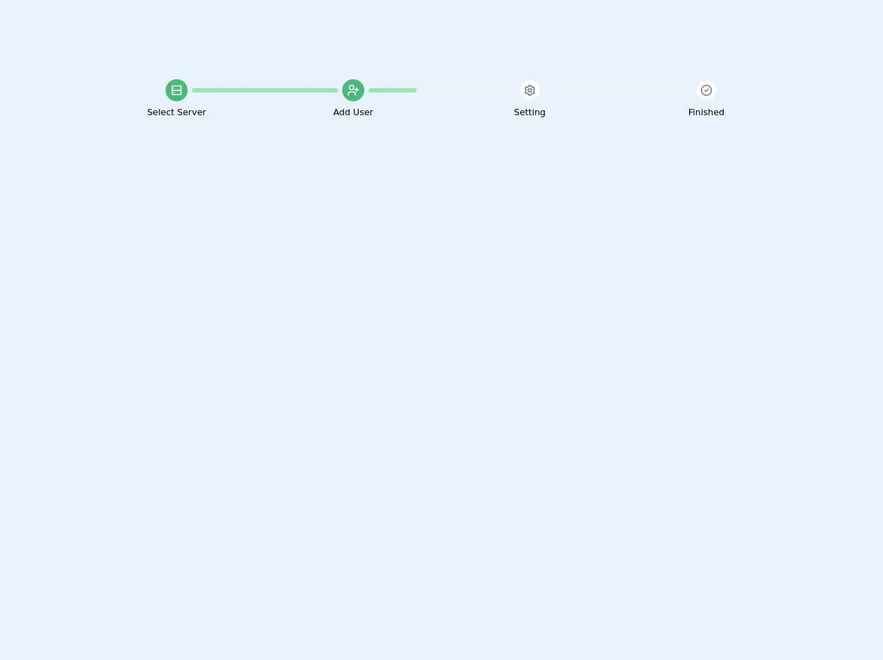
The preview of Wizard Steps Bar with Tailwind CSS ui component
To create a wizard steps bar with Tailwind CSS, we can use the flex and justify-between classes to create a horizontal bar. We can then use the rounded-full class to create circular steps and the bg-gray-300 class to set the background color of the steps. Finally, we can use the text-gray-500 class to set the color of the step numbers.
Free download of the Wizard Steps Bar with Tailwind CSS's source code
The source code of Wizard Steps Bar with Tailwind CSS ui component
To create a wizard steps bar with Tailwind CSS, we can use the following HTML and CSS code:
<div class="flex justify-between">
  <div class="flex items-center">
    <div class="rounded-full bg-gray-300 h-6 w-6 flex items-center justify-center">
      <span class="text-gray-500 text-sm font-medium">1</span>
    </div>
    <div class="ml-3 text-sm font-medium text-gray-500">Step 1</div>
  </div>
  <div class="flex items-center">
    <div class="rounded-full bg-gray-300 h-6 w-6 flex items-center justify-center">
      <span class="text-gray-500 text-sm font-medium">2</span>
    </div>
    <div class="ml-3 text-sm font-medium text-gray-500">Step 2</div>
  </div>
  <div class="flex items-center">
    <div class="rounded-full bg-gray-300 h-6 w-6 flex items-center justify-center">
      <span class="text-gray-500 text-sm font-medium">3</span>
    </div>
    <div class="ml-3 text-sm font-medium text-gray-500">Step 3</div>
  </div>
</div>
.rounded-full {
  border-radius: 9999px;
}
<div class="w-full py-6">
  <div class="flex">
    <div class="w-1/4">
      <div class="relative mb-2">
        <div class="w-10 h-10 mx-auto bg-green-500 rounded-full text-lg text-white flex items-center">
          <span class="text-center text-white w-full">
            <svg class="w-full fill-current" xmlns="http://www.w3.org/2000/svg" viewBox="0 0 24 24" width="24" height="24">
              <path class="heroicon-ui" d="M5 3h14a2 2 0 0 1 2 2v14a2 2 0 0 1-2 2H5a2 2 0 0 1-2-2V5c0-1.1.9-2 2-2zm14 8V5H5v6h14zm0 2H5v6h14v-6zM8 9a1 1 0 1 1 0-2 1 1 0 0 1 0 2zm0 8a1 1 0 1 1 0-2 1 1 0 0 1 0 2z"/>
            </svg>
          </span>
        </div>
      </div>

      <div class="text-xs text-center md:text-base">Select Server</div>
    </div>

    <div class="w-1/4">
      <div class="relative mb-2">
        <div class="absolute flex align-center items-center align-middle content-center" style="width: calc(100% - 2.5rem - 1rem); top: 50%; transform: translate(-50%, -50%)">
          <div class="w-full bg-gray-200 rounded items-center align-middle align-center flex-1">
            <div class="w-0 bg-green-300 py-1 rounded" style="width: 100%;"></div>
          </div>
        </div>

        <div class="w-10 h-10 mx-auto bg-green-500 rounded-full text-lg text-white flex items-center">
          <span class="text-center text-white w-full">
            <svg class="w-full fill-current" xmlns="http://www.w3.org/2000/svg" viewBox="0 0 24 24" width="24" height="24">
              <path class="heroicon-ui" d="M19 10h2a1 1 0 0 1 0 2h-2v2a1 1 0 0 1-2 0v-2h-2a1 1 0 0 1 0-2h2V8a1 1 0 0 1 2 0v2zM9 12A5 5 0 1 1 9 2a5 5 0 0 1 0 10zm0-2a3 3 0 1 0 0-6 3 3 0 0 0 0 6zm8 11a1 1 0 0 1-2 0v-2a3 3 0 0 0-3-3H7a3 3 0 0 0-3 3v2a1 1 0 0 1-2 0v-2a5 5 0 0 1 5-5h5a5 5 0 0 1 5 5v2z"/>
            </svg>
          </span>
        </div>
      </div>

      <div class="text-xs text-center md:text-base">Add User</div>
    </div>

    <div class="w-1/4">
      <div class="relative mb-2">
        <div class="absolute flex align-center items-center align-middle content-center" style="width: calc(100% - 2.5rem - 1rem); top: 50%; transform: translate(-50%, -50%)">
          <div class="w-full bg-gray-200 rounded items-center align-middle align-center flex-1">
            <div class="w-0 bg-green-300 py-1 rounded" style="width: 33%;"></div>
          </div>
        </div>

        <div class="w-10 h-10 mx-auto bg-white border-2 border-gray-200 rounded-full text-lg text-white flex items-center">
          <span class="text-center text-gray-600 w-full">
            <svg class="w-full fill-current" xmlns="http://www.w3.org/2000/svg" viewBox="0 0 24 24" width="24" height="24">
              <path class="heroicon-ui" d="M9 4.58V4c0-1.1.9-2 2-2h2a2 2 0 0 1 2 2v.58a8 8 0 0 1 1.92 1.11l.5-.29a2 2 0 0 1 2.74.73l1 1.74a2 2 0 0 1-.73 2.73l-.5.29a8.06 8.06 0 0 1 0 2.22l.5.3a2 2 0 0 1 .73 2.72l-1 1.74a2 2 0 0 1-2.73.73l-.5-.3A8 8 0 0 1 15 19.43V20a2 2 0 0 1-2 2h-2a2 2 0 0 1-2-2v-.58a8 8 0 0 1-1.92-1.11l-.5.29a2 2 0 0 1-2.74-.73l-1-1.74a2 2 0 0 1 .73-2.73l.5-.29a8.06 8.06 0 0 1 0-2.22l-.5-.3a2 2 0 0 1-.73-2.72l1-1.74a2 2 0 0 1 2.73-.73l.5.3A8 8 0 0 1 9 4.57zM7.88 7.64l-.54.51-1.77-1.02-1 1.74 1.76 1.01-.17.73a6.02 6.02 0 0 0 0 2.78l.17.73-1.76 1.01 1 1.74 1.77-1.02.54.51a6 6 0 0 0 2.4 1.4l.72.2V20h2v-2.04l.71-.2a6 6 0 0 0 2.41-1.4l.54-.51 1.77 1.02 1-1.74-1.76-1.01.17-.73a6.02 6.02 0 0 0 0-2.78l-.17-.73 1.76-1.01-1-1.74-1.77 1.02-.54-.51a6 6 0 0 0-2.4-1.4l-.72-.2V4h-2v2.04l-.71.2a6 6 0 0 0-2.41 1.4zM12 16a4 4 0 1 1 0-8 4 4 0 0 1 0 8zm0-2a2 2 0 1 0 0-4 2 2 0 0 0 0 4z"/>
            </svg>
          </span>
        </div>
      </div>

      <div class="text-xs text-center md:text-base">Setting</div>
    </div>

    <div class="w-1/4">
      <div class="relative mb-2">
        <div class="absolute flex align-center items-center align-middle content-center" style="width: calc(100% - 2.5rem - 1rem); top: 50%; transform: translate(-50%, -50%)">
          <div class="w-full bg-gray-200 rounded items-center align-middle align-center flex-1">
            <div class="w-0 bg-green-300 py-1 rounded" style="width: 0%;"></div>
          </div>
        </div>

        <div class="w-10 h-10 mx-auto bg-white border-2 border-gray-200 rounded-full text-lg text-white flex items-center">
          <span class="text-center text-gray-600 w-full">
            <svg class="w-full fill-current" xmlns="http://www.w3.org/2000/svg" viewBox="0 0 24 24" width="24" height="24">
              <path class="heroicon-ui" d="M12 22a10 10 0 1 1 0-20 10 10 0 0 1 0 20zm0-2a8 8 0 1 0 0-16 8 8 0 0 0 0 16zm-2.3-8.7l1.3 1.29 3.3-3.3a1 1 0 0 1 1.4 1.42l-4 4a1 1 0 0 1-1.4 0l-2-2a1 1 0 0 1 1.4-1.42z"/>
            </svg>
          </span>
        </div>
      </div>

      <div class="text-xs text-center md:text-base">Finished</div>
    </div>
  </div>
</div>
How to create a Wizard Steps Bar with Tailwind CSS with Tailwind CSS?
To create a wizard steps bar with Tailwind CSS, follow these steps:
- Create a
divelement with theflexandjustify-betweenclasses. This will create a horizontal bar with equal spacing between the steps.
<div class="flex justify-between">
  <!-- Steps will be added here -->
</div>
- For each step, create a
divelement with theflexanditems-centerclasses. This will create a container for the step number and label.
<div class="flex items-center">
  <!-- Step number and label will be added here -->
</div>
- Inside the step container, create a
divelement with therounded-full,bg-gray-300,h-6, andw-6classes. This will create a circular step with a gray background.
<div class="rounded-full bg-gray-300 h-6 w-6 flex items-center justify-center">
  <!-- Step number will be added here -->
</div>
- Inside the step container, create a
divelement with theml-3,text-sm,font-medium, andtext-gray-500classes. This will create a label for the step.
<div class="ml-3 text-sm font-medium text-gray-500">Step 1</div>
Repeat steps 2-4 for each step in the wizard.
(Optional) Customize the styles of the wizard steps bar by modifying the pre-defined Tailwind CSS classes or adding custom CSS.
Conclusion
In conclusion, Tailwind CSS is a powerful CSS framework that can be used to create complex UI components quickly. The wizard steps bar is a common UI component in web applications that require users to complete a multi-step process. By using Tailwind CSS to create a wizard steps bar, developers can save time and effort, as they do not need to write custom CSS. With the help of this guide, you can create a wizard steps bar with Tailwind CSS in just a few simple steps.