- Published on
Learn How To Make A Steam Featured Game Card With Tailwind CSS from the Pros
- What is Tailwind CSS?
- The description of Steam Featured Game Card ui component
- Why use Tailwind CSS to create a Steam Featured Game Card ui component?
- The preview of Steam Featured Game Card ui component
- The source code of Steam Featured Game Card ui component
- How to create a Steam Featured Game Card with Tailwind CSS?
- Conclusion
Are you a FrontEnd developer looking for a way to create a stunning Steam Featured Game Card? Look no further than Tailwind CSS. In this article, we’ll show you how to create a Steam Featured Game Card using Tailwind CSS.
What is Tailwind CSS?
Tailwind CSS is a utility-first CSS framework that allows you to quickly and easily create custom designs. With Tailwind CSS, you can create complex layouts and designs without writing a single line of CSS. Tailwind CSS provides a set of pre-designed classes that you can use to create your own custom designs.
The description of Steam Featured Game Card ui component
The Steam Featured Game Card is a UI component that displays information about a game, including the game’s title, image, and price. The Steam Featured Game Card is designed to be eye-catching and visually appealing, making it an excellent choice for displaying featured games on a website or in an app.
Why use Tailwind CSS to create a Steam Featured Game Card ui component?
Tailwind CSS is an excellent choice for creating a Steam Featured Game Card UI component because it provides a set of pre-designed classes that you can use to create your own custom designs quickly and easily. With Tailwind CSS, you can create complex layouts and designs without writing a single line of CSS.
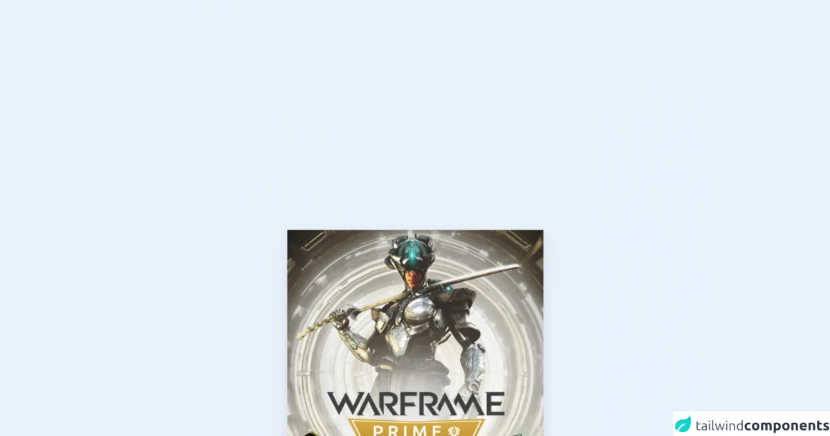
The preview of Steam Featured Game Card ui component
To create a Steam Featured Game Card UI component using Tailwind CSS, you’ll need to use a combination of HTML and CSS. Here’s a preview of what the Steam Featured Game Card UI component will look like:
Free download of the Steam Featured Game Card's source code
The source code of Steam Featured Game Card ui component
To create a Steam Featured Game Card UI component using Tailwind CSS, you’ll need to use a combination of HTML and CSS. Here’s the source code for the Steam Featured Game Card UI component:
<!-- This is an example component -->
<div>
<div class="group
overflow-hidden
relative shadow-lg max-w-xs">
<a href="#" class="absolute z-10 top-0 bottom-0 left-0 right-0"><a />
<img
class="block group-hover:opacity-40 transition-opacity duration-700"
src="https://cdn.cloudflare.steamstatic.com/steam/apps/230410/hero_capsule.jpg?t=1637183731"
/>
<div
class="absolute bg-black flex items-center group-hover:-top-0 group-hover:opacity-100 duration-700 top-full right-0 w-full opacity-0 h-1/2 transition-all">
<div class=""
style="background-image: url("https://cdn.cloudflare.steamstatic.com/steam/apps/230410/ss_2d79448091149a8cc790b62e7422615a011d015a.600x338.jpg?t=1637183731");">
<video class="w-full" autoplay loop="" preload="none" muted="muted">
<source
src="https://cdn.cloudflare.steamstatic.com/steam/apps/256860783/microtrailer.webm?t=1637095595?v=3"
type="video/webm">
</video>
</div>
</div>
<div class="absolute bg-gradient-to-br duration-700 from-green-800 to-blue-800 text-white block left-0 right-0 top-full text-base h-1/2 w-full opacity-50
transition-all group-hover:top-1/2 group-hover:opacity-100">
<div class="py-4 text-xs px-7">
<div class="text-xl font-bold">Warframe</div>
<div class="overflow-ellipsis overflow-hidden whitespace-nowrap">
<span class="uppercase text-gray-400 whitespace-nowrap text-xs md:text-sm">Developer:</span>
<span class="whitespace-nowrap overflow-hidden overflow-ellipsis relative z-20">
<a href="https://store.steampowered.com/developer/DigitalExtremes?snr=1_4_600__629">Digital Extremes</a> </span>
</div>
<div class="whitespace-nowrap overflow-hidden overflow-ellipsis relative z-20">
<span class="uppercase text-gray-400 whitespace-nowrap text-xs md:text-sm">Publisher:</span>
<span class="whitespace-nowrap overflow-hidden overflow-ellipsis relative z-20">
<a href="https://store.steampowered.com/publisher/DigitalExtremes?snr=1_4_600__629">Digital Extremes</a> </span>
</div>
<div class="whitespace-nowrap overflow-hidden overflow-ellipsis relative z-20">
<span class="uppercase text-gray-400 whitespace-nowrap text-xs md:text-sm">All Reviews:</span>
<span class="whitespace-nowrap overflow-hidden overflow-ellipsis relative z-20">
<span class="text-positive">
Very Positive </span>
<span class="text-gray-300">(2,912)</span>
</span>
</div>
</div>
<div class="absolute left-0 pl-7 pt-1">
<button href="https://store.steampowered.com/app/230410/Warframe/" class="px-4 text-base block text-green-300 rounded-sm border-2 border-opacity-20 bg-gradient-to-b duration-700 from-green-400 to-green-800">
Install now
</button>
</div>
</div>
</div>
</div>
How to create a Steam Featured Game Card with Tailwind CSS?
To create a Steam Featured Game Card UI component using Tailwind CSS, follow these steps:
- Create a new HTML file and add the necessary HTML markup for the Steam Featured Game Card UI component.
- Add the necessary Tailwind CSS classes to the HTML markup to style the Steam Featured Game Card UI component.
- Customize the design of the Steam Featured Game Card UI component using Tailwind CSS classes.
Here’s an example of the HTML markup you’ll need to create a Steam Featured Game Card UI component:
<div class="max-w-sm rounded overflow-hidden shadow-lg">
  <img class="w-full" src="game-image.jpg" alt="Game Title">
  <div class="px-6 py-4">
    <div class="font-bold text-xl mb-2">Game Title</div>
    <p class="text-gray-700 text-base">
      Lorem ipsum dolor sit amet, consectetur adipisicing elit. Voluptatibus quia, nulla! Maiores et perferendis eaque, exercitationem praesentium nihil.
    </p>
  </div>
  <div class="px-6 py-4">
    <span class="inline-block bg-gray-200 rounded-full px-3 py-1 text-sm font-semibold text-gray-700 mr-2">$19.99</span>
    <button class="bg-blue-500 hover:bg-blue-700 text-white font-bold py-2 px-4 rounded">
      Add to Cart
    </button>
  </div>
</div>
In this example, we’ve used a combination of HTML and Tailwind CSS classes to create a Steam Featured Game Card UI component. We’ve used classes like max-w-sm, rounded, overflow-hidden, shadow-lg, font-bold, text-xl, text-gray-700, bg-gray-200, rounded-full, px-3, py-1, text-sm, font-semibold, bg-blue-500, hover:bg-blue-700, text-white, font-bold, py-2, px-4, and rounded to style the Steam Featured Game Card UI component.
Conclusion
Creating a Steam Featured Game Card UI component using Tailwind CSS is easy and straightforward. With Tailwind CSS, you can create complex layouts and designs without writing a single line of CSS. By following the steps outlined in this article, you can create a stunning Steam Featured Game Card UI component that will impress your users.