- Published on
Best Ways To Build A Statistic With Tailwind CSS
- What is Tailwind CSS?
- The description of Statistic ui component
- Why use Tailwind CSS to create a Statistic ui component?
- The preview of Statistic ui component
- The source code of Statistic ui component
- How to create a Statistic with Tailwind CSS?
- Conclusion
What is Tailwind CSS?
Tailwind CSS is a utility-first CSS framework that allows developers to quickly build custom user interfaces. It provides a set of pre-defined classes that can be used to style HTML elements without having to write custom CSS. Tailwind CSS is highly customizable and can be configured to meet the specific needs of a project.
The description of Statistic ui component
A statistic is a UI component that displays numerical data in a visually appealing way. It is commonly used to show metrics such as sales, revenue, or user engagement. A statistic typically consists of a number, a label, and an icon or image.
Why use Tailwind CSS to create a Statistic ui component?
Tailwind CSS is an excellent choice for creating a statistic UI component because it provides a wide range of utility classes that can be used to style the component quickly. It also allows developers to customize the component's appearance by modifying the pre-defined classes or creating new ones.
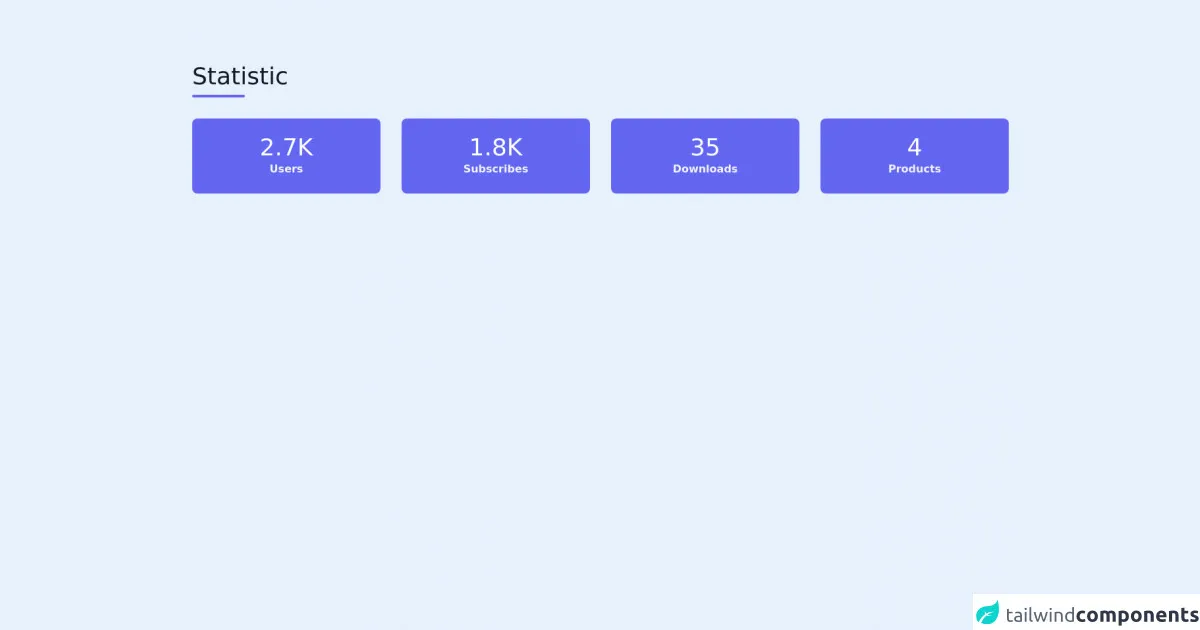
The preview of Statistic ui component
Free download of the Statistic's source code
The source code of Statistic ui component
To create a statistic UI component with Tailwind CSS, we can use the following HTML structure:
<section class="text-gray-600 body-font">
  <div class="container px-5 py-24 mx-auto">
    <div class="flex flex-wrap w-full mb-8">
      <div class="w-full mb-6 lg:mb-0">
        <h1 class="sm:text-4xl text-5xl font-medium title-font mb-2 text-gray-900">Statistic</h1>
        <div class="h-1 w-20 bg-indigo-500 rounded"></div>
      </div>
    </div>
    <div class="flex flex-wrap -m-4 text-center">
      <div class="p-4 sm:w-1/4 w-1/2">
        <div class="bg-indigo-500 rounded-lg p-2 xl:p-6">
            <h2 class="title-font font-medium sm:text-4xl text-3xl text-white">2.7K</h2>
            <p class="leading-relaxed text-gray-100 font-bold">Users</p>
        </div>
      </div>
      <div class="p-4 sm:w-1/4 w-1/2">
        <div class="bg-indigo-500 rounded-lg p-2 xl:p-6">
            <h2 class="title-font font-medium sm:text-4xl text-3xl text-white">1.8K</h2>
            <p class="leading-relaxed text-gray-100 font-bold">Subscribes</p>
        </div>
      </div>
      <div class="p-4 sm:w-1/4 w-1/2">
        <div class="bg-indigo-500 rounded-lg p-2 xl:p-6">
            <h2 class="title-font font-medium sm:text-4xl text-3xl text-white">35</h2>
            <p class="leading-relaxed text-gray-100 font-bold">Downloads</p>
        </div>
      </div>
      <div class="p-4 sm:w-1/4 w-1/2">
        <div class="bg-indigo-500 rounded-lg p-2 xl:p-6">
            <h2 class="title-font font-medium sm:text-4xl text-3xl text-white">4</h2>
            <p class="leading-relaxed text-gray-100 font-bold">Products</p>
        </div>
      </div>
    </div>
  </div>
</section>
In this structure, we have used Tailwind CSS classes to style the component's background, border, padding, and font size, weight, and color. We have also used classes to align the content horizontally and vertically.
How to create a Statistic with Tailwind CSS?
To create a statistic UI component with Tailwind CSS, follow these steps:
- Create a new HTML file and add the above HTML structure to it.
- Replace the
srcattribute of theimgelement with the URL of the icon or image you want to use. - Replace the text "Statistic Label" with the label you want to use.
- Replace the text "Statistic Number" with the number you want to display.
- Customize the component's appearance by modifying the pre-defined classes or creating new ones.
Conclusion
Tailwind CSS is an excellent choice for creating a statistic UI component because it provides a wide range of utility classes that can be used to style the component quickly. It also allows developers to customize the component's appearance by modifying the pre-defined classes or creating new ones. By following the steps outlined in this article, you can create a beautiful and functional statistic UI component with Tailwind CSS.