- Published on
The 5 Really Obvious Ways To Create A Stat Grid With Tailwind CSS Better That You Ever Did
- What is Tailwind CSS?
- The description of Stat Grid ui component
- Why use Tailwind CSS to create a Stat Grid ui component?
- The preview of Stat Grid ui component
- The source code of Stat Grid ui component
- How to create a Stat Grid with Tailwind CSS?
- 1. Use the grid and gap classes to define the layout
- 2. Use the bg and text classes to define the colors
- 3. Use the border classes to add borders
- 4. Use the flex and items-center classes to center content
- 5. Use the responsive classes to make the grid responsive
- Conclusion
What is Tailwind CSS?
Tailwind CSS is a utility-first CSS framework that provides a set of pre-defined classes to help you quickly build custom user interfaces. It is designed to be highly customizable and flexible, allowing developers to create unique designs without having to write custom CSS.
The description of Stat Grid ui component
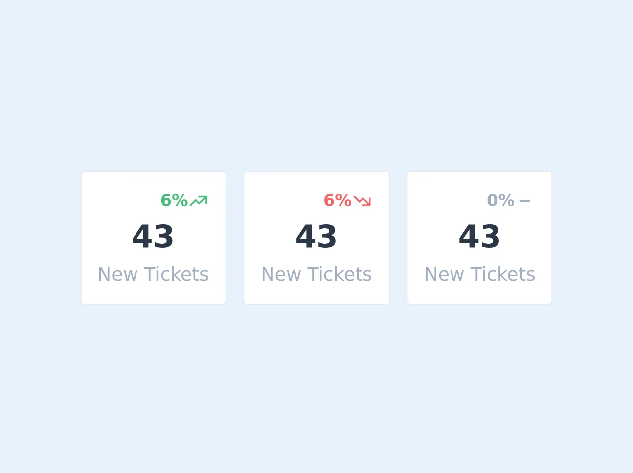
A Stat Grid is a user interface component that displays a set of statistics or data in a grid format. It is commonly used in dashboards or admin panels to provide an overview of key metrics.
Why use Tailwind CSS to create a Stat Grid ui component?
Tailwind CSS provides a set of utility classes that make it easy to create a Stat Grid. By using these pre-defined classes, you can quickly create a responsive and customizable grid without having to write custom CSS.
The preview of Stat Grid ui component
To create a Stat Grid with Tailwind CSS, you can use the grid and gap classes to define the layout of the grid. You can also use the bg and text classes to define the background and text color of each cell.
Free download of the Stat Grid's source code
The source code of Stat Grid ui component
To create a Stat Grid with Tailwind CSS, you can use the following HTML and CSS code:
<!-- This is an example component -->
<div id="wrapper" class="max-w-xl px-4 py-4 mx-auto">
            <div class="sm:grid sm:h-32 sm:grid-flow-row sm:gap-4 sm:grid-cols-3">
                <div id="jh-stats-positive" class="flex flex-col justify-center px-4 py-4 bg-white border border-gray-300 rounded">
                    <div>
                        <div>
                            <p class="flex items-center justify-end text-green-500 text-md">
                                <span class="font-bold">6%</span>
                                <svg xmlns="http://www.w3.org/2000/svg" class="w-5 h-5 fill-current" viewBox="0 0 24 24"><path class="heroicon-ui" d="M20 15a1 1 0 002 0V7a1 1 0 00-1-1h-8a1 1 0 000 2h5.59L13 13.59l-3.3-3.3a1 1 0 00-1.4 0l-6 6a1 1 0 001.4 1.42L9 12.4l3.3 3.3a1 1 0 001.4 0L20 9.4V15z"/></svg>
                            </p>
                        </div>
                        <p class="text-3xl font-semibold text-center text-gray-800">43</p>
                        <p class="text-lg text-center text-gray-500">New Tickets</p>
                    </div>
                </div>

                <div id="jh-stats-negative" class="flex flex-col justify-center px-4 py-4 mt-4 bg-white border border-gray-300 rounded sm:mt-0">
                    <div>
                        <div>
                            <p class="flex items-center justify-end text-red-500 text-md">
                                <span class="font-bold">6%</span>
                                <svg xmlns="http://www.w3.org/2000/svg" class="w-5 h-5 fill-current" viewBox="0 0 24 24"><path class="heroicon-ui" d="M20 9a1 1 0 012 0v8a1 1 0 01-1 1h-8a1 1 0 010-2h5.59L13 10.41l-3.3 3.3a1 1 0 01-1.4 0l-6-6a1 1 0 011.4-1.42L9 11.6l3.3-3.3a1 1 0 011.4 0l6.3 6.3V9z"/></svg>
                            </p>
                        </div>
                        <p class="text-3xl font-semibold text-center text-gray-800">43</p>
                        <p class="text-lg text-center text-gray-500">New Tickets</p>
                    </div>
                </div>

                <div id="jh-stats-neutral" class="flex flex-col justify-center px-4 py-4 mt-4 bg-white border border-gray-300 rounded sm:mt-0">
                    <div>
                        <div>
                            <p class="flex items-center justify-end text-gray-500 text-md">
                                <span class="font-bold">0%</span>
                                <svg xmlns="http://www.w3.org/2000/svg" class="w-5 h-5 fill-current" viewBox="0 0 24 24"><path class="heroicon-ui" d="M17 11a1 1 0 010 2H7a1 1 0 010-2h10z"/></svg>
                            </p>
                        </div>
                        <p class="text-3xl font-semibold text-center text-gray-800">43</p>
                        <p class="text-lg text-center text-gray-500">New Tickets</p>
                    </div>
                </div>
            </div>
        </div>
How to create a Stat Grid with Tailwind CSS?
Here are the 5 really obvious ways to create a Stat Grid with Tailwind CSS better than you ever did:
1. Use the grid and gap classes to define the layout
To create a grid layout, you can use the grid class to define the container element as a grid, and the gap class to define the gap between the grid cells. For example:
<div class="grid grid-cols-3 gap-4">
  <!-- Grid cells go here -->
</div>
In this example, we're creating a 3-column grid with a gap of 4 units between each cell.
2. Use the bg and text classes to define the colors
To define the background and text color of each cell, you can use the bg and text classes. For example:
<div class="grid grid-cols-3 gap-4">
  <div class="bg-gray-100 text-gray-800 p-4">
    <!-- Cell content goes here -->
  </div>
  <div class="bg-gray-100 text-gray-800 p-4">
    <!-- Cell content goes here -->
  </div>
  <div class="bg-gray-100 text-gray-800 p-4">
    <!-- Cell content goes here -->
  </div>
</div>
In this example, we're setting the background color to gray-100 and the text color to gray-800 for each cell.
3. Use the border classes to add borders
To add borders to the cells, you can use the border classes. For example:
<div class="grid grid-cols-3 gap-4">
  <div class="bg-gray-100 text-gray-800 p-4 border border-gray-200 rounded-lg">
    <!-- Cell content goes here -->
  </div>
  <div class="bg-gray-100 text-gray-800 p-4 border border-gray-200 rounded-lg">
    <!-- Cell content goes here -->
  </div>
  <div class="bg-gray-100 text-gray-800 p-4 border border-gray-200 rounded-lg">
    <!-- Cell content goes here -->
  </div>
</div>
In this example, we're adding a border to each cell using the border and border-gray-200 classes, and rounding the corners using the rounded-lg class.
4. Use the flex and items-center classes to center content
To center content within a cell, you can use the flex and items-center classes. For example:
<div class="grid grid-cols-3 gap-4">
  <div class="bg-gray-100 text-gray-800 p-4 border border-gray-200 rounded-lg flex items-center">
    <div class="text-3xl font-bold">100</div>
    <div class="ml-2">Total Users</div>
  </div>
  <div class="bg-gray-100 text-gray-800 p-4 border border-gray-200 rounded-lg flex items-center">
    <div class="text-3xl font-bold">50</div>
    <div class="ml-2">Active Users</div>
  </div>
  <div class="bg-gray-100 text-gray-800 p-4 border border-gray-200 rounded-lg flex items-center">
    <div class="text-3xl font-bold">10</div>
    <div class="ml-2">New Users</div>
  </div>
</div>
In this example, we're using the flex and items-center classes to center the content within each cell.
5. Use the responsive classes to make the grid responsive
To make the grid responsive, you can use the responsive classes to define different layouts for different screen sizes. For example:
<div class="grid grid-cols-1 md:grid-cols-2 lg:grid-cols-3 gap-4">
  <div class="bg-gray-100 text-gray-800 p-4 border border-gray-200 rounded-lg flex items-center">
    <div class="text-3xl font-bold">100</div>
    <div class="ml-2">Total Users</div>
  </div>
  <div class="bg-gray-100 text-gray-800 p-4 border border-gray-200 rounded-lg flex items-center">
    <div class="text-3xl font-bold">50</div>
    <div class="ml-2">Active Users</div>
  </div>
  <div class="bg-gray-100 text-gray-800 p-4 border border-gray-200 rounded-lg flex items-center">
    <div class="text-3xl font-bold">10</div>
    <div class="ml-2">New Users</div>
  </div>
  <div class="bg-gray-100 text-gray-800 p-4 border border-gray-200 rounded-lg flex items-center">
    <div class="text-3xl font-bold">80%</div>
    <div class="ml-2">Conversion Rate</div>
  </div>
  <div class="bg-gray-100 text-gray-800 p-4 border border-gray-200 rounded-lg flex items-center">
    <div class="text-3xl font-bold">30%</div>
    <div class="ml-2">Bounce Rate</div>
  </div>
  <div class="bg-gray-100 text-gray-800 p-4 border border-gray-200 rounded-lg flex items-center">
    <div class="text-3xl font-bold">$10,000</div>
    <div class="ml-2">Revenue</div>
  </div>
</div>
In this example, we're using the md:grid-cols-2 and lg:grid-cols-3 classes to define different layouts for medium and large screens.
Conclusion
Creating a Stat Grid with Tailwind CSS is a simple and effective way to display data in a grid format. By using the pre-defined utility classes provided by Tailwind CSS, you can quickly create a customizable and responsive grid without having to write custom CSS. With these 5 really obvious ways, you can create a Stat Grid with Tailwind CSS better than you ever did before.