- Published on
Beginners Guide: Build A Statistic cards With Tailwind CSS
- What is Tailwind CSS?
- The Description of Statistic Cards UI Component
- Why Use Tailwind CSS to Create a Statistic Cards UI Component?
- The Preview of Statistic Cards UI Component
- The Source Code of Statistic Cards UI Component
- How to Create a Statistic Cards with Tailwind CSS?
- Step 1: Create the HTML Markup
- Step 2: Add Tailwind CSS Classes
- Step 3: Customize the Card
- Conclusion
What is Tailwind CSS?
Tailwind CSS is a utility-first CSS framework that allows developers to rapidly build custom user interfaces. It provides a set of pre-defined CSS classes that can be used to style HTML elements. Tailwind CSS is highly customizable and allows developers to create unique designs without writing any custom CSS.
The Description of Statistic Cards UI Component
Statistic cards are a popular UI component used to display numerical data in a visually appealing way. They are commonly used in dashboards, admin panels, and data visualization applications. A statistic card typically consists of a title, a value, and an icon or image.
Why Use Tailwind CSS to Create a Statistic Cards UI Component?
Tailwind CSS provides a set of pre-defined classes that can be used to create a statistic card quickly and easily. The classes can be combined to create custom styles and layouts. This makes it an ideal choice for beginners who want to create a statistic card without writing any custom CSS.
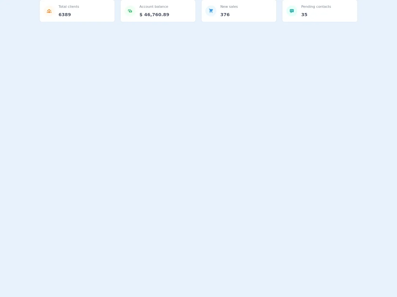
The Preview of Statistic Cards UI Component
To create a statistic card with Tailwind CSS, we will use a combination of classes to style the HTML elements. The result will be a visually appealing statistic card that displays numerical data in a clear and concise way.
Free download of the Statistic cards's source code
The Source Code of Statistic Cards UI Component
The source code for a statistic card with Tailwind CSS is relatively simple. We will use a combination of HTML and Tailwind CSS classes to create the card.
<div class="grid gap-6 mb-8 md:grid-cols-2 xl:grid-cols-4">
  <div
    class="min-w-0 rounded-lg shadow-xs overflow-hidden bg-white dark:bg-gray-800"
  >
    <div class="p-4 flex items-center">
      <div
        class="p-3 rounded-full text-orange-500 dark:text-orange-100 bg-orange-100 dark:bg-orange-500 mr-4"
      >
        <svg fill="currentColor" viewBox="0 0 20 20" class="w-5 h-5">
          <path
            d="M13 6a3 3 0 11-6 0 3 3 0 016 0zM18 8a2 2 0 11-4 0 2 2 0 014 0zM14 15a4 4 0 00-8 0v3h8v-3zM6 8a2 2 0 11-4 0 2 2 0 014 0zM16 18v-3a5.972 5.972 0 00-.75-2.906A3.005 3.005 0 0119 15v3h-3zM4.75 12.094A5.973 5.973 0 004 15v3H1v-3a3 3 0 013.75-2.906z"
          ></path>
        </svg>
      </div>
      <div>
        <p class="mb-2 text-sm font-medium text-gray-600 dark:text-gray-400">
          Total clients
        </p>
        <p class="text-lg font-semibold text-gray-700 dark:text-gray-200">
          6389
        </p>
      </div>
    </div>
  </div>
  <div
    class="min-w-0 rounded-lg shadow-xs overflow-hidden bg-white dark:bg-gray-800"
  >
    <div class="p-4 flex items-center">
      <div
        class="p-3 rounded-full text-green-500 dark:text-green-100 bg-green-100 dark:bg-green-500 mr-4"
      >
        <svg fill="currentColor" viewBox="0 0 20 20" class="w-5 h-5">
          <path
            fill-rule="evenodd"
            d="M4 4a2 2 0 00-2 2v4a2 2 0 002 2V6h10a2 2 0 00-2-2H4zm2 6a2 2 0 012-2h8a2 2 0 012 2v4a2 2 0 01-2 2H8a2 2 0 01-2-2v-4zm6 4a2 2 0 100-4 2 2 0 000 4z"
            clip-rule="evenodd"
          ></path>
        </svg>
      </div>
      <div>
        <p class="mb-2 text-sm font-medium text-gray-600 dark:text-gray-400">
          Account balance
        </p>
        <p class="text-lg font-semibold text-gray-700 dark:text-gray-200">
          $ 46,760.89
        </p>
      </div>
    </div>
  </div>
  <div
    class="min-w-0 rounded-lg shadow-xs overflow-hidden bg-white dark:bg-gray-800"
  >
    <div class="p-4 flex items-center">
      <div
        class="p-3 rounded-full text-blue-500 dark:text-blue-100 bg-blue-100 dark:bg-blue-500 mr-4"
      >
        <svg fill="currentColor" viewBox="0 0 20 20" class="w-5 h-5">
          <path
            d="M3 1a1 1 0 000 2h1.22l.305 1.222a.997.997 0 00.01.042l1.358 5.43-.893.892C3.74 11.846 4.632 14 6.414 14H15a1 1 0 000-2H6.414l1-1H14a1 1 0 00.894-.553l3-6A1 1 0 0017 3H6.28l-.31-1.243A1 1 0 005 1H3zM16 16.5a1.5 1.5 0 11-3 0 1.5 1.5 0 013 0zM6.5 18a1.5 1.5 0 100-3 1.5 1.5 0 000 3z"
          ></path>
        </svg>
      </div>
      <div>
        <p class="mb-2 text-sm font-medium text-gray-600 dark:text-gray-400">
          New sales
        </p>
        <p class="text-lg font-semibold text-gray-700 dark:text-gray-200">
          376
        </p>
      </div>
    </div>
  </div>
  <div
    class="min-w-0 rounded-lg shadow-xs overflow-hidden bg-white dark:bg-gray-800"
  >
    <div class="p-4 flex items-center">
      <div
        class="p-3 rounded-full text-teal-500 dark:text-teal-100 bg-teal-100 dark:bg-teal-500 mr-4"
      >
        <svg fill="currentColor" viewBox="0 0 20 20" class="w-5 h-5">
          <path
            fill-rule="evenodd"
            d="M18 5v8a2 2 0 01-2 2h-5l-5 4v-4H4a2 2 0 01-2-2V5a2 2 0 012-2h12a2 2 0 012 2zM7 8H5v2h2V8zm2 0h2v2H9V8zm6 0h-2v2h2V8z"
            clip-rule="evenodd"
          ></path>
        </svg>
      </div>
      <div>
        <p class="mb-2 text-sm font-medium text-gray-600 dark:text-gray-400">
          Pending contacts
        </p>
        <p class="text-lg font-semibold text-gray-700 dark:text-gray-200">35</p>
      </div>
    </div>
  </div>
</div>
How to Create a Statistic Cards with Tailwind CSS?
To create a statistic card with Tailwind CSS, follow these steps:
Step 1: Create the HTML Markup
The first step is to create the HTML markup for the statistic card. We will use a combination of HTML elements and Tailwind CSS classes to create the card.
<div class="bg-white rounded-lg shadow-md p-4">
  <div class="flex items-center">
    <div class="rounded-full bg-blue-100 p-3">
      <i class="fas fa-users text-blue-500"></i>
    </div>
    <div class="ml-4">
      <p class="text-gray-500 font-semibold">Total Users</p>
      <p class="text-2xl font-bold">1,234</p>
    </div>
  </div>
</div>
In the above code, we have created a div element with the classes bg-white, rounded-lg, shadow-md, and p-4. This will create a white background with rounded corners and a shadow effect. Inside this div, we have created another div element with the classes flex and items-center. This will create a flex container with the items-center property, which will center the child elements vertically.
Inside the second div, we have created a div element with the classes rounded-full, bg-blue-100, and p-3. This will create a blue circle with a light blue background and some padding. Inside this div, we have added an icon using the Font Awesome library.
After the icon, we have created another div element with the class ml-4. This will add some left margin to the element. Inside this div, we have added two p elements. The first p element has the classes text-gray-500 and font-semibold. This will create a gray text with a bold font. The second p element has the classes text-2xl and font-bold. This will create a large text with a bold font.
Step 2: Add Tailwind CSS Classes
Now that we have created the HTML markup, we can add Tailwind CSS classes to style the card. We will use a combination of classes to create a visually appealing card.
<div class="bg-white rounded-lg shadow-md p-4">
  <div class="flex items-center">
    <div class="rounded-full bg-blue-100 p-3">
      <i class="fas fa-users text-blue-500"></i>
    </div>
    <div class="ml-4">
      <p class="text-gray-500 font-semibold">Total Users</p>
      <p class="text-2xl font-bold">1,234</p>
    </div>
  </div>
</div>
In the above code, we have added the following classes:
bg-white: This will set the background color of the card to white.rounded-lg: This will add rounded corners to the card.shadow-md: This will add a shadow effect to the card.flex: This will create a flex container for the child elements.items-center: This will center the child elements vertically.rounded-full: This will create a circular shape for the icon container.bg-blue-100: This will set the background color of the icon container to light blue.p-3: This will add some padding to the icon container.text-gray-500: This will set the color of the firstpelement to gray.font-semibold: This will make the text of the firstpelement bold.text-2xl: This will set the font size of the secondpelement to extra large.font-bold: This will make the text of the secondpelement bold.
Step 3: Customize the Card
Tailwind CSS allows developers to customize the card by adding or removing classes. For example, if you want to change the color of the icon, you can use the text-red-500 class to set the color to red. If you want to change the background color of the card, you can use the bg-gray-100 class to set the color to gray.
Conclusion
In this article, we have learned how to create a statistic card with Tailwind CSS. We have seen how Tailwind CSS provides a set of pre-defined classes that can be used to create custom user interfaces quickly and easily. We have also seen how to customize the card by adding or removing classes. With Tailwind CSS, developers can create unique and visually appealing designs without writing any custom CSS.