- Published on
Learn How To Make A Start Jumbotron With Tailwind CSS from the Pros
- What is Tailwind CSS?
- The description of Start Jumbotron UI component
- Why use Tailwind CSS to create a Start Jumbotron UI component?
- The preview of Start Jumbotron UI component
- The source code of Start Jumbotron UI component
- How to create a Start Jumbotron with Tailwind CSS?
- Step 1: Set up your HTML
- Step 2: Add Tailwind CSS
- Step 3: Style your HTML
- Step 4: Preview your Start Jumbotron
- Conclusion
Are you looking to create a stunning Start Jumbotron UI component for your website? Look no further than Tailwind CSS! In this article, we'll walk you through the process of creating a Start Jumbotron using Tailwind CSS, step-by-step.
What is Tailwind CSS?
Tailwind CSS is a utility-first CSS framework that allows you to quickly and easily create custom designs without having to write custom CSS. It provides a set of pre-defined classes that you can use to style your HTML elements. With Tailwind CSS, you can create beautiful, responsive designs in a fraction of the time it would take to write custom CSS.
The description of Start Jumbotron UI component
A Start Jumbotron is a UI component that is commonly used on landing pages or homepages to highlight a key message or call to action. It typically consists of a large, full-width banner with a clear, concise message and a prominent call-to-action button.
Why use Tailwind CSS to create a Start Jumbotron UI component?
Tailwind CSS is the perfect tool for creating a Start Jumbotron UI component because it allows you to quickly and easily style your HTML elements using pre-defined classes. This means that you don't have to spend hours writing custom CSS to achieve the desired look and feel. Additionally, Tailwind CSS is highly customizable, so you can easily tweak the design to match your brand's style guide.
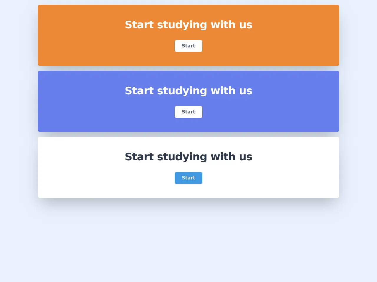
The preview of Start Jumbotron UI component
To give you an idea of what a Start Jumbotron UI component looks like, here's a preview:
Free download of the Start Jumbotron's source code
The source code of Start Jumbotron UI component
To create a Start Jumbotron UI component using Tailwind CSS, you'll need to write some HTML and CSS code. Here's an example of what the code might look like:
<!-- Bg orange -->
    <div class="max-w-screen-lg bg-orange-500 shadow-2xl rounded-lg mx-auto text-center py-12 mt-4">
        <h2 class="text-3xl leading-9 font-bold tracking-tight text-white sm:text-4xl sm:leading-10">
            Start studying with us
        </h2>
        <div class="mt-8 flex justify-center">
            <div class="inline-flex rounded-md bg-white shadow">
                <a href="#" class="text-gray-700 font-bold py-2 px-6">
                    Start
                </a>
            </div>
        </div>
    </div>

    <!-- Bg indigo -->
    <div class="max-w-screen-lg bg-indigo-500 shadow-2xl rounded-lg mx-auto text-center py-12 mt-4">
        <h2 class="text-3xl leading-9 font-bold tracking-tight text-white sm:text-4xl sm:leading-10">
            Start studying with us
        </h2>
        <div class="mt-8 flex justify-center">
            <div class="inline-flex rounded-md bg-white shadow">
                <a href="#" class="text-gray-700 font-bold py-2 px-6">
                    Start
                </a>
            </div>
        </div>
    </div>

    <!-- Bg white -->
    <div class="max-w-screen-lg bg-white shadow-2xl rounded-lg mx-auto text-center py-12 mt-4">
        <h2 class="text-3xl leading-9 font-bold tracking-tight text-gray-800 sm:text-4xl sm:leading-10">
            Start studying with us
        </h2>
        <div class="mt-8 flex justify-center">
            <div class="inline-flex rounded-md bg-blue-500 shadow">
                <a href="#" class="text-gray-200 font-bold py-2 px-6">
                    Start
                </a>
            </div>
        </div>
    </div>
How to create a Start Jumbotron with Tailwind CSS?
Now that you understand the benefits of using Tailwind CSS to create a Start Jumbotron UI component, let's dive into the step-by-step process of creating one.
Step 1: Set up your HTML
The first step is to set up your HTML. Start by creating a new HTML file and adding the following code:
<div class="bg-gray-800">
  <div class="max-w-screen-xl mx-auto py-12 px-4 sm:px-6 lg:py-16 lg:px-8">
    <h2 class="text-3xl font-extrabold tracking-tight text-white sm:text-4xl">
      <span class="block">Ready to dive in?</span>
      <span class="block">Start your free trial today.</span>
    </h2>
    <div class="mt-8 flex justify-center">
      <div class="inline-flex rounded-md shadow">
        <a href="#" class="inline-flex items-center justify-center px-5 py-3 border border-transparent text-base font-medium rounded-md text-white bg-indigo-600 hover:bg-indigo-700">
          Get started
        </a>
      </div>
    </div>
  </div>
</div>
This code creates a basic HTML structure for your Start Jumbotron UI component.
Step 2: Add Tailwind CSS
Next, you'll need to add the Tailwind CSS framework to your project. You can do this by including the following code in the head of your HTML file:
<link rel="stylesheet" href="https://unpkg.com/tailwindcss@latest/dist/tailwind.min.css">
This code will include the latest version of the Tailwind CSS framework in your project.
Step 3: Style your HTML
Now that you have your HTML and CSS set up, it's time to start styling your Start Jumbotron UI component. You can do this by adding Tailwind CSS classes to your HTML elements.
Here's an example of how you can style the background color of your Start Jumbotron:
<div class="bg-gray-800">
This code sets the background color of your Start Jumbotron to gray.
Here's an example of how you can style the font size and color of your headline:
<h2 class="text-3xl font-extrabold tracking-tight text-white sm:text-4xl">
This code sets the font size to 3xl, the font weight to extrabold, and the text color to white.
Here's an example of how you can style your call-to-action button:
<a href="#" class="inline-flex items-center justify-center px-5 py-3 border border-transparent text-base font-medium rounded-md text-white bg-indigo-600 hover:bg-indigo-700">
This code sets the background color of your button to indigo, the text color to white, and adds a hover effect when the button is hovered over.
Step 4: Preview your Start Jumbotron
Once you've finished styling your Start Jumbotron UI component, it's time to preview it in your browser. Simply open your HTML file in your preferred browser and you should see your Start Jumbotron displayed on the page.
Conclusion
In conclusion, creating a Start Jumbotron UI component using Tailwind CSS is a quick and easy process that can save you a lot of time and effort. With Tailwind CSS, you can create beautiful, responsive designs in a fraction of the time it would take to write custom CSS. So why not give it a try and see how it can help you create stunning UI components for your website?