- Published on
Ways To Make A Social Media Buttons With Tailwind CSS In 60 Minutes
- What is Tailwind CSS?
- The description of Social Media Buttons ui component
- Why use Tailwind CSS to create a Social Media Buttons ui component?
- The preview of Social Media Buttons ui component.
- The source code of Social Media Buttons ui component.
- How to create a Social Media Buttons with Tailwind CSS?
- Step 1: Set up a new HTML file
- Step 2: Create the social media buttons
- Step 3: Preview the social media buttons
- Conclusion
As a FrontEnd technology blogger, creating UI components is a crucial part of our job. Social media buttons are a common UI component that is used on almost every website. In this article, we will explore how to create social media buttons with Tailwind CSS in just 60 minutes.
What is Tailwind CSS?
Tailwind CSS is a utility-first CSS framework that helps you to create custom designs quickly. It provides a set of pre-defined classes that you can use to style your HTML elements. Tailwind CSS is a popular choice among developers because of its flexibility, ease of use, and customization options.
The description of Social Media Buttons ui component
Social media buttons are a set of icons that represent various social media platforms such as Facebook, Twitter, Instagram, etc. These buttons are used on websites to encourage users to share content on their social media profiles.
Why use Tailwind CSS to create a Social Media Buttons ui component?
Tailwind CSS provides a set of pre-defined classes that you can use to create social media buttons quickly. Instead of writing custom CSS, you can use Tailwind CSS classes to style your buttons. This saves you time and effort and allows you to focus on creating other parts of your website.
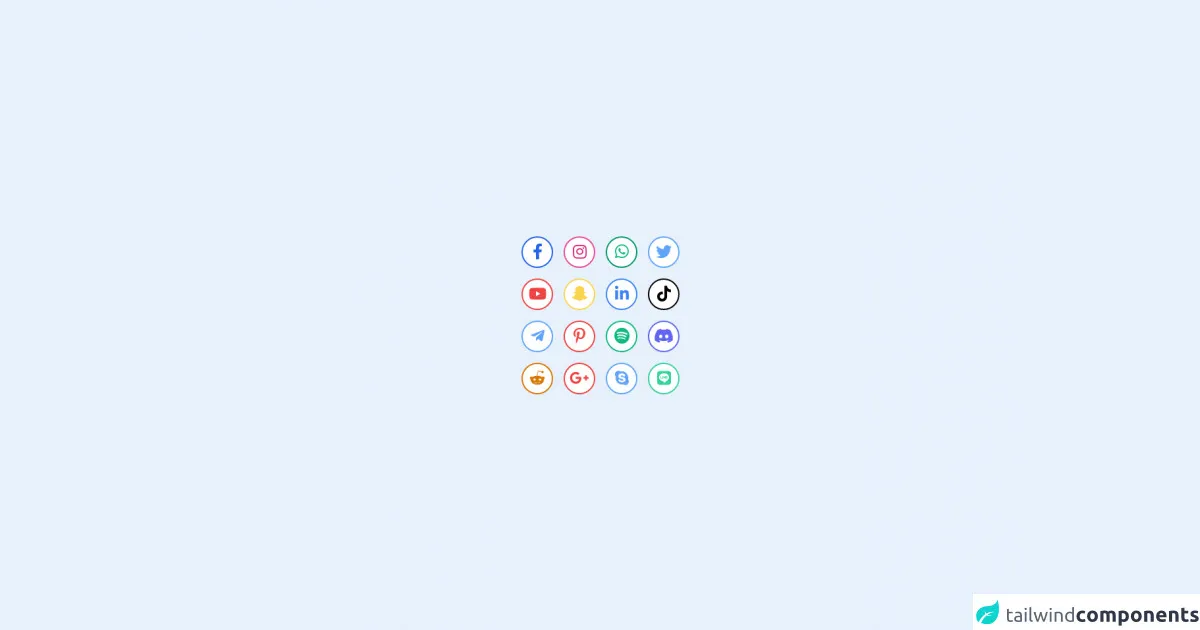
The preview of Social Media Buttons ui component.
Creating social media buttons with Tailwind CSS is a straightforward process. You can use the following classes to create buttons for various social media platforms:
- Facebook:
bg-blue-600 hover:bg-blue-700 text-white font-bold py-2 px-4 rounded - Twitter:
bg-blue-400 hover:bg-blue-500 text-white font-bold py-2 px-4 rounded - Instagram:
bg-pink-600 hover:bg-pink-700 text-white font-bold py-2 px-4 rounded - LinkedIn:
bg-blue-800 hover:bg-blue-900 text-white font-bold py-2 px-4 rounded - YouTube:
bg-red-600 hover:bg-red-700 text-white font-bold py-2 px-4 rounded
You can use these classes to create buttons for other social media platforms as well. Simply change the background color and text color to match the brand colors of the social media platform.
Free download of the Social Media Buttons's source code
The source code of Social Media Buttons ui component.
Creating social media buttons with Tailwind CSS is a simple process. You can use the following HTML code to create buttons for various social media platforms:
<a href="#" class="bg-blue-600 hover:bg-blue-700 text-white font-bold py-2 px-4 rounded">Facebook</a>

<a href="#" class="bg-blue-400 hover:bg-blue-500 text-white font-bold py-2 px-4 rounded">Twitter</a>

<a href="#" class="bg-pink-600 hover:bg-pink-700 text-white font-bold py-2 px-4 rounded">Instagram</a>

<a href="#" class="bg-blue-800 hover:bg-blue-900 text-white font-bold py-2 px-4 rounded">LinkedIn</a>

<a href="#" class="bg-red-600 hover:bg-red-700 text-white font-bold py-2 px-4 rounded">YouTube</a>
You can modify the classes to create buttons for other social media platforms as well. Simply change the background color and text color to match the brand colors of the social media platform.
<!DOCTYPE html>
<html>
<head>
  <meta charset="utf-8">
  <title></title>
  <meta name="viewport" content="width=device-width, initial-scale=1.0">
  <script src="https://unpkg.com/@popperjs/core@2/dist/umd/popper.min.js"></script>
<script src="https://unpkg.com/tippy.js@6/dist/tippy-bundle.umd.js"></script>
  <link rel="stylesheet" href="tailwind.css">
   <link
      rel="stylesheet"
      href="https://use.fontawesome.com/releases/v5.15.4/css/all.css"
      integrity="sha384-DyZ88mC6Up2uqS4h/KRgHuoeGwBcD4Ng9SiP4dIRy0EXTlnuz47vAwmeGwVChigm"
      crossorigin="anonymous"
    />
</head>
<body>
<div class="w-screen h-screen flex items-center justify-center">
<div class="grid grid-cols-4 gap-4">
  <!--Facebook Button -->

    <button id="facebook" class="bg-white  sticky duration-500 border-2 border-blue-600 fixed  w-12 transform hover:-translate-y-3   h-12 text-2xl rounded-full hover:bg-blue-600 hover:text-white text-blue-600 ">
      <i class="fab fa-facebook-f"></i>
  </button>


 <!--İnstagram Button -->

   <button id="instagram" class=" border-2 hover:border-0 border-pink-500 bg-gradient-to-b text-2xl hover:from-indigo-600 hover:via-pink-600 hover:to-yellow-500 min-w-wull hover:text-white bg-white text-pink-600 w-12 h-12  transform hover:-translate-y-3 rounded-full duration-500 ">
    <i class="fab fa-instagram"></i>
  </button>


  <!--Whatsapp Button -->
  <button id="whatsapp" class="bg-white duration-500    w-12 h-12 border-2 rounded-full border-green-600 transform hover:-translate-y-3  text-2xl text-green-500 hover:bg-green-600 hover:text-white">
    <i class="fab fa-whatsapp"></i>
  </button>


  <!--Twitter Button -->
  <button id="twitter" class="bg-white  transform hover:-translate-y-3  border-2 w-12 h-12 rounded-full duration-500 text-blue-400 border-blue-400 hover:bg-blue-400 hover:text-white text-2xl">
    <i class="fab fa-twitter"></i>
  </button>

  <!--YouTube Button -->
  <button id="youtube" class="bg-white transform hover:-translate-y-3  border-2 w-12 h-12 rounded-full duration-500 text-red-500 border-red-500 hover:bg-red-500 hover:text-white text-2xl">
    <i class="fab fa-youtube"></i>
  </button>

   <!--Snapchat Button-->
   <button id="snapchat" class="bg-white transform hover:-translate-y-3  border-2 w-12 h-12 rounded-full duration-500 text-yellow-300 border-yellow-300 hover:bg-yellow-300 hover:text-white text-2xl">
    <i class="fab fa-snapchat-ghost"></i>
  </button>

   <!--Linkedin Button-->
  <button id="linkedin" class="bg-white transform hover:-translate-y-3  border-2 w-12 h-12 rounded-full duration-500 text-blue-500 border-blue-500  hover:bg-blue-500 hover:text-white text-2xl">
    <i class="fab fa-linkedin-in"></i>
  </button>

   <!--Tiktok Button-->
  <button id="tiktok" class="bg-white transform hover:-translate-y-3  border-2 w-12 h-12 rounded-full duration-500 text-black border-black hover:bg-black hover:text-white text-2xl">
   <i class="fab fa-tiktok"></i>
  </button>

  <!--Twitter Button -->
  <button id="telegram" class="bg-white  transform hover:-translate-y-3  border-2 w-12 h-12 rounded-full duration-500 text-blue-400 border-blue-400 hover:bg-blue-400 hover:text-white text-2xl">
    <i class="fab fa-telegram-plane"></i>
  </button>

  <!--Pinterest Button -->
  <button id="pinterest" class="bg-white transform hover:-translate-y-3  border-2 w-12 h-12 rounded-full duration-500 text-red-500 border-red-500 hover:bg-red-500 hover:text-white text-2xl">
    <i class="fab fa-pinterest-p"></i>
  </button>

  <!--Spotify Button -->
  <button id="spotify" class="bg-white transform hover:-translate-y-3  border-2 w-12 h-12 rounded-full duration-500 text-green-500 border-green-500 hover:bg-green-500 hover:text-white text-2xl">
    <i class="fab fa-spotify"></i>
  </button>

  <!--Discord Button -->
  <button id="discord" class="bg-white transform hover:-translate-y-3  border-2 w-12 h-12 rounded-full duration-500 text-indigo-500 border-indigo-500 hover:bg-indigo-500 hover:text-white text-2xl">
    <i class="fab fa-discord"></i>
  </button>


  <!--Reddit Button -->
  <button id="reddit" class="bg-white transform hover:-translate-y-3  border-2 w-12 h-12 rounded-full duration-500 text-yellow-600 border-yellow-600 hover:bg-yellow-600 hover:text-white text-2xl">
    <i class="fab fa-reddit-alien"></i>
  </button>

   <!--Google Plus Button -->
  <button id="googleplus" class="bg-white transform hover:-translate-y-3  border-2 w-12 h-12 rounded-full duration-500 text-red-500 border-red-500 hover:bg-red-500 hover:text-white text-2xl">
    <i class="fab fa-google-plus-g"></i>
  </button>

  <!--Skype Button -->
  <button id="skype" class="bg-white  transform hover:-translate-y-3  border-2 w-12 h-12 rounded-full duration-500 text-blue-400 border-blue-400 hover:bg-blue-400 hover:text-white text-2xl">
    <i class="fab fa-skype"></i>
  </button>

  <!--Line Button -->
  <button id="line" class="bg-white transform hover:-translate-y-3  border-2 w-12 h-12 rounded-full duration-500 text-green-400 border-green-400 hover:bg-green-400 hover:text-white text-2xl">
    <i class="fab fa-line"></i>
  </button>


</div>


  <script>
    tippy('#facebook',{
      content:'Facebook',
      animation:'fade',
      delay:[200,200]
    });
    tippy('#instagram',{
      content:'Instagram',
      animation:'fade',
      delay:[200,200]
    });
     tippy('#whatsapp',{
      content:'Whatsapp',
      animation:'fade',
      delay:[200,200]
    });
    tippy('#twitter',{
      content:'Twitter',
      animation:'fade',
      delay:[200,200]
    });
    tippy('#youtube',{
      content:'Youtube',
      animation:'fade',
      placement: 'left-start',
      delay:[200,200]
    });
    tippy('#telegram',{
      content:'Telegram',
      animation:'fade',
      placement: 'left-start',
      delay:[200,200]
    });
    tippy('#reddit',{
      content:'Reddit',
      animation:'fade',
      placement: 'bottom',
      delay:[200,200]
    });
    tippy('#googleplus',{
      content:'Google +',
      animation:'fade',
      placement: 'bottom',
      delay:[200,200]
    });
    tippy('#skype',{
      content:'Skype',
      animation:'fade',
      placement: 'bottom',
      delay:[200,200]
    });
    tippy('#line',{
      content:'Line',
      animation:'fade',
      placement: 'bottom',
      delay:[200,200]
    });
    tippy('#discord',{
      content:'Discord',
      animation:'fade',
      placement: 'right-start',
      delay:[200,200]
    });
    tippy('#tiktok',{
      content:'Tiktok',
      animation:'fade',
      placement: 'right-start',
      delay:[200,200]
    });
    tippy('#linkedin',{
      content:'Linkedin',
      animation:'fade',
      placement: 'top',
      delay:[200,200]
    });
     tippy('#snapchat',{
      content:'Snapchat',
      animation:'fade',
      placement: 'top',
      delay:[200,200]
    });
    tippy('#pinterest',{
      content:'Pinterest',
      animation:'fade',
      placement: 'bottom',
      delay:[200,200],
    });
    tippy('#spotify',{
      content:'Spotify',
      animation:'fade',
      placement: 'bottom',
      delay:[200,200]
    });


  </script>

</div>
</body>
</html>
How to create a Social Media Buttons with Tailwind CSS?
Now that we have seen the preview and source code of social media buttons, let's dive into creating them step by step.
Step 1: Set up a new HTML file
Create a new HTML file and add the following code:
<!DOCTYPE html>
<html lang="en">
<head>
    <meta charset="UTF-8">
    <title>Social Media Buttons</title>
    <link rel="stylesheet" href="https://cdn.jsdelivr.net/npm/[email protected]/dist/tailwind.min.css">
</head>
<body>
    <h1>Social Media Buttons</h1>
</body>
</html>
This code sets up a basic HTML file with a title and includes the Tailwind CSS stylesheet.
Step 2: Create the social media buttons
Add the following code to create social media buttons:
<div class="flex justify-center space-x-4">
    <a href="#" class="bg-blue-600 hover:bg-blue-700 text-white font-bold py-2 px-4 rounded">Facebook</a>

    <a href="#" class="bg-blue-400 hover:bg-blue-500 text-white font-bold py-2 px-4 rounded">Twitter</a>

    <a href="#" class="bg-pink-600 hover:bg-pink-700 text-white font-bold py-2 px-4 rounded">Instagram</a>

    <a href="#" class="bg-blue-800 hover:bg-blue-900 text-white font-bold py-2 px-4 rounded">LinkedIn</a>

    <a href="#" class="bg-red-600 hover:bg-red-700 text-white font-bold py-2 px-4 rounded">YouTube</a>
</div>
This code creates a container div with the flex and justify-center classes to center the buttons horizontally. The space-x-4 class adds a margin between the buttons. Each button is an anchor tag with the appropriate Tailwind CSS classes to style it.
Step 3: Preview the social media buttons
Save the HTML file and open it in your browser. You should see the social media buttons displayed on the page.
Conclusion
In this article, we have explored how to create social media buttons with Tailwind CSS in just 60 minutes. We have seen the preview and source code of the social media buttons and learned how to create them step by step. Tailwind CSS is a powerful tool that can help you create custom designs quickly and efficiently. I hope this article has been helpful in your journey to becoming a better FrontEnd developer.