- Published on
6 Easy Ways To Create A Simple Vertical Timeline With Tailwind CSS
- What is Tailwind CSS?
- The description of Simple Vertical Timeline ui component
- Why use Tailwind CSS to create a Simple Vertical Timeline ui component?
- The preview of Simple Vertical Timeline ui component
- The source code of Simple Vertical Timeline ui component
- How to create a Simple Vertical Timeline with Tailwind CSS?
- Step 1: Create the HTML structure
- Step 2: Style the container element
- Step 3: Style the event nodes
- Conclusion
What is Tailwind CSS?
Tailwind CSS is a utility-first CSS framework that allows developers to rapidly build custom user interfaces. It provides a set of pre-defined CSS classes that can be used to style HTML elements. With Tailwind CSS, developers can easily create complex designs without writing any custom CSS.
The description of Simple Vertical Timeline ui component
A vertical timeline is a user interface component that displays a list of events in chronological order. It is a popular design pattern for displaying a series of events or milestones. A simple vertical timeline consists of a vertical line and a series of nodes that represent events.
Why use Tailwind CSS to create a Simple Vertical Timeline ui component?
Tailwind CSS provides a set of pre-defined CSS classes that can be used to create a simple vertical timeline. With Tailwind CSS, developers can easily customize the design of the timeline by modifying the pre-defined classes. This saves time and effort compared to writing custom CSS from scratch.
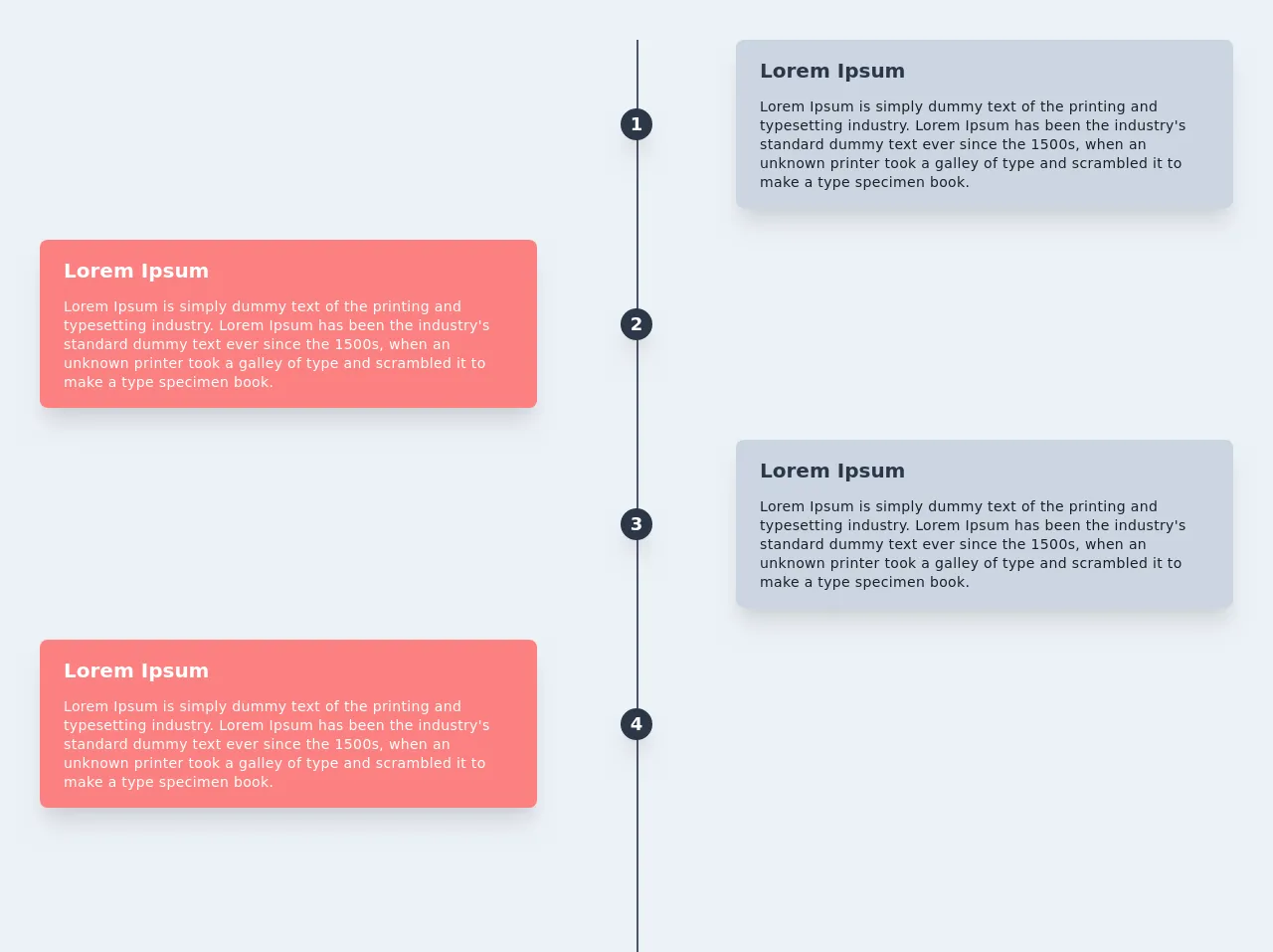
The preview of Simple Vertical Timeline ui component
To create a simple vertical timeline with Tailwind CSS, we will use a combination of HTML and CSS. The HTML structure consists of a container element that holds a series of nodes. The CSS styles are applied to the container element and the nodes to create the vertical line and the event nodes.
Free download of the Simple Vertical Timeline's source code
The source code of Simple Vertical Timeline ui component
To create a simple vertical timeline with Tailwind CSS, we will use a combination of HTML and CSS. The HTML structure consists of a container element that holds a series of nodes. The CSS styles are applied to the container element and the nodes to create the vertical line and the event nodes.
<div class="container bg-gray-200 mx-auto w-full h-full">
  <div class="relative wrap overflow-hidden p-10 h-full">
    <div class="border-2-2 absolute border-opacity-20 border-gray-700 h-full border" style="left: 50%"></div>
    <!-- right timeline -->
    <div class="mb-8 flex justify-between items-center w-full right-timeline">
      <div class="order-1 w-5/12"></div>
      <div class="z-20 flex items-center order-1 bg-gray-800 shadow-xl w-8 h-8 rounded-full">
        <h1 class="mx-auto font-semibold text-lg text-white">1</h1>
      </div>
      <div class="order-1 bg-gray-400 rounded-lg shadow-xl w-5/12 px-6 py-4">
        <h3 class="mb-3 font-bold text-gray-800 text-xl">Lorem Ipsum</h3>
        <p class="text-sm leading-snug tracking-wide text-gray-900 text-opacity-100">Lorem Ipsum is simply dummy text of the printing and typesetting industry. Lorem Ipsum has been the industry's standard dummy text ever since the 1500s, when an unknown printer took a galley of type and scrambled it to make a type specimen book.</p>
      </div>
    </div>

    <!-- left timeline -->
    <div class="mb-8 flex justify-between flex-row-reverse items-center w-full left-timeline">
      <div class="order-1 w-5/12"></div>
      <div class="z-20 flex items-center order-1 bg-gray-800 shadow-xl w-8 h-8 rounded-full">
        <h1 class="mx-auto text-white font-semibold text-lg">2</h1>
      </div>
      <div class="order-1 bg-red-400 rounded-lg shadow-xl w-5/12 px-6 py-4">
        <h3 class="mb-3 font-bold text-white text-xl">Lorem Ipsum</h3>
        <p class="text-sm font-medium leading-snug tracking-wide text-white text-opacity-100">Lorem Ipsum is simply dummy text of the printing and typesetting industry. Lorem Ipsum has been the industry's standard dummy text ever since the 1500s, when an unknown printer took a galley of type and scrambled it to make a type specimen book.</p>
      </div>
    </div>

    <!-- right timeline -->
    <div class="mb-8 flex justify-between items-center w-full right-timeline">
      <div class="order-1 w-5/12"></div>
      <div class="z-20 flex items-center order-1 bg-gray-800 shadow-xl w-8 h-8 rounded-full">
        <h1 class="mx-auto font-semibold text-lg text-white">3</h1>
      </div>
      <div class="order-1 bg-gray-400 rounded-lg shadow-xl w-5/12 px-6 py-4">
        <h3 class="mb-3 font-bold text-gray-800 text-xl">Lorem Ipsum</h3>
        <p class="text-sm leading-snug tracking-wide text-gray-900 text-opacity-100">Lorem Ipsum is simply dummy text of the printing and typesetting industry. Lorem Ipsum has been the industry's standard dummy text ever since the 1500s, when an unknown printer took a galley of type and scrambled it to make a type specimen book.</p>
      </div>
    </div>

    <!-- left timeline -->
    <div class="mb-8 flex justify-between flex-row-reverse items-center w-full left-timeline">
      <div class="order-1 w-5/12"></div>
      <div class="z-20 flex items-center order-1 bg-gray-800 shadow-xl w-8 h-8 rounded-full">
        <h1 class="mx-auto text-white font-semibold text-lg">4</h1>
      </div>
      <div class="order-1 bg-red-400 rounded-lg shadow-xl w-5/12 px-6 py-4">
        <h3 class="mb-3 font-bold text-white text-xl">Lorem Ipsum</h3>
        <p class="text-sm font-medium leading-snug tracking-wide text-white text-opacity-100">Lorem Ipsum is simply dummy text of the printing and typesetting industry. Lorem Ipsum has been the industry's standard dummy text ever since the 1500s, when an unknown printer took a galley of type and scrambled it to make a type specimen book.</p>
      </div>
    </div>
  </div>
</div>
How to create a Simple Vertical Timeline with Tailwind CSS?
Step 1: Create the HTML structure
The first step is to create the HTML structure for the vertical timeline. We will use an unordered list element to hold the event nodes. Each event node will consist of a date, a title, and a description.
<ul class="timeline">
  <li>
    <div class="timeline-date">2022-01-01</div>
    <div class="timeline-content">
      <h3 class="timeline-title">Event Title</h3>
      <p class="timeline-description">Event Description</p>
    </div>
  </li>
  <li>
    <div class="timeline-date">2022-01-02</div>
    <div class="timeline-content">
      <h3 class="timeline-title">Event Title</h3>
      <p class="timeline-description">Event Description</p>
    </div>
  </li>
  <li>
    <div class="timeline-date">2022-01-03</div>
    <div class="timeline-content">
      <h3 class="timeline-title">Event Title</h3>
      <p class="timeline-description">Event Description</p>
    </div>
  </li>
</ul>
Step 2: Style the container element
The next step is to style the container element to create the vertical line. We will use the border-left property to create the line and the list-style-type property to remove the bullet points from the list.
.timeline {
  list-style-type: none;
  padding: 0;
  position: relative;
}

.timeline:before {
  content: '';
  position: absolute;
  top: 0;
  bottom: 0;
  left: 20px;
  width: 2px;
  background-color: #ddd;
  transform: translateX(-50%);
}

.timeline li {
  margin-bottom: 50px;
  position: relative;
}
Step 3: Style the event nodes
The final step is to style the event nodes to create the circles and the content. We will use the position property to position the circles and the content, and the border-radius property to create the circles.
.timeline-date {
  position: absolute;
  top: 0;
  left: -110px;
  width: 100px;
  text-align: right;
  font-size: 14px;
  font-weight: bold;
}

.timeline-content {
  position: relative;
  margin-left: 30px;
  margin-bottom: 20px;
}

.timeline-title {
  margin-top: 0;
  font-size: 18px;
}

.timeline-description {
  margin-bottom: 0;
  font-size: 14px;
}

.timeline li:before {
  content: '';
  position: absolute;
  top: 0;
  left: -10px;
  width: 20px;
  height: 20px;
  border-radius: 50%;
  background-color: #fff;
  border: 2px solid #ddd;
}

.timeline li:after {
  content: '';
  position: absolute;
  top: 10px;
  left: -5px;
  width: 10px;
  height: 10px;
  border-radius: 50%;
  background-color: #ddd;
}
Conclusion
In this article, we have learned how to create a simple vertical timeline with Tailwind CSS. We have seen how Tailwind CSS can be used to rapidly build custom user interfaces without writing any custom CSS. By following the steps outlined in this article, developers can easily create a simple vertical timeline for their web applications.