- Published on
How To Build A Simple UI KIT With Tailwind CSS In 5 Easy Steps
- What is Tailwind CSS?
- The description of Simple UI KIT ui component
- Why use Tailwind CSS to create a Simple UI KIT ui component?
- The preview of Simple UI KIT ui component
- The source code of Simple UI KIT ui component
- How to create a Simple UI KIT with Tailwind CSS?
- Step 1: Install Tailwind CSS
- Step 2: Create a new project
- Step 3: Configure Tailwind CSS
- Step 4: Create UI components
- Step 5: Use UI components in your project
- Conclusion
As a FrontEnd technology blogger, I am excited to share with you how to build a Simple UI KIT with Tailwind CSS in just 5 easy steps. Tailwind CSS is a utility-first CSS framework that provides a set of pre-defined CSS classes to help you build responsive and customizable UI components quickly. With Tailwind CSS, you can easily create a Simple UI KIT that can be used across different projects. Let's get started!
What is Tailwind CSS?
Tailwind CSS is a utility-first CSS framework that provides a set of pre-defined CSS classes to help you build responsive and customizable UI components quickly. Unlike other CSS frameworks that come with pre-designed UI components, Tailwind CSS focuses on providing low-level utility classes that can be combined to create custom UI components.
The description of Simple UI KIT ui component
A Simple UI KIT is a collection of UI components that can be used across different projects. It includes basic UI components such as buttons, forms, typography, and icons. A Simple UI KIT can help you save time and effort by providing pre-designed UI components that can be easily customized to fit your project's needs.
Why use Tailwind CSS to create a Simple UI KIT ui component?
Tailwind CSS is a great choice for creating a Simple UI KIT because it provides a set of pre-defined utility classes that can be used to create custom UI components quickly. With Tailwind CSS, you don't have to worry about writing custom CSS code for each UI component. Instead, you can use pre-defined utility classes to style your UI components.
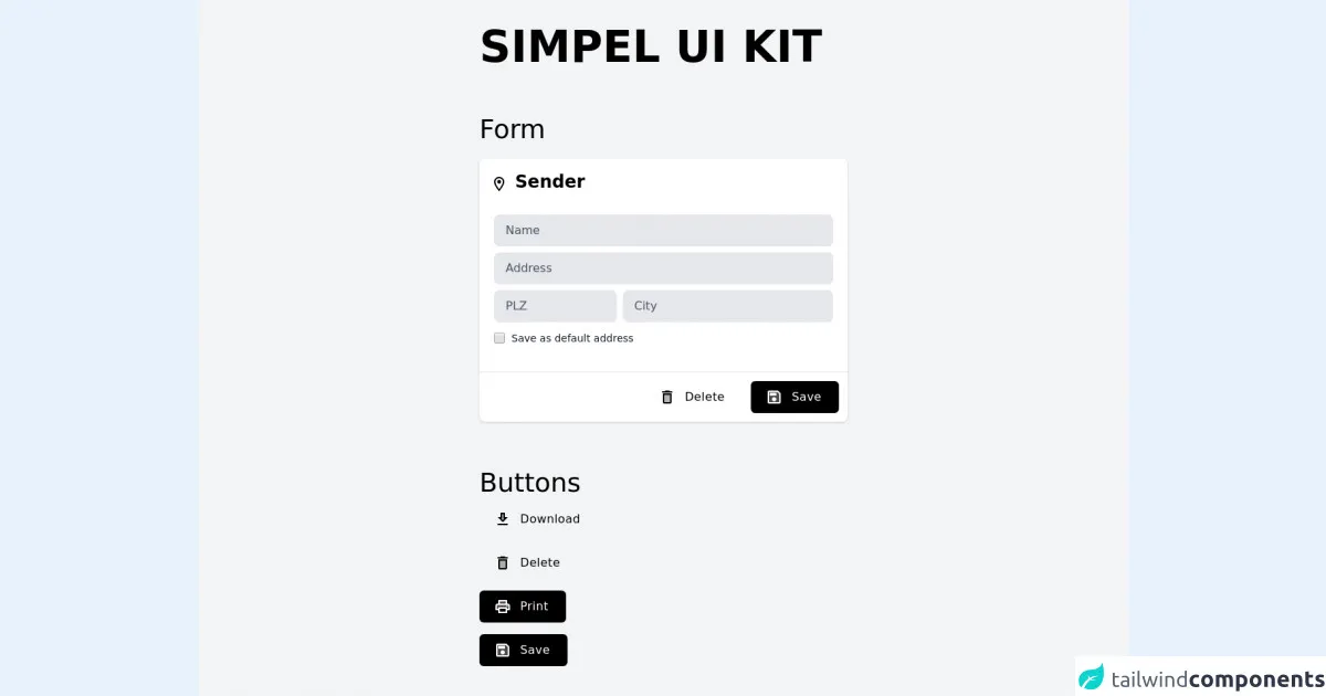
The preview of Simple UI KIT ui component
A Simple UI KIT includes basic UI components such as buttons, forms, typography, and icons. Here's a preview of what the Simple UI KIT looks like:
Free download of the Simple UI KIT's source code
The source code of Simple UI KIT ui component
Here's the source code for the Simple UI KIT:
<div class="flex h-screen bg-gray-100">
   <div class="m-auto">
      <div>
        <h1 class="text-6xl uppercase font-extrabold">Simpel ui kit</h1>

        <p class="text-4xl font-light pt-16">Form</p>


        <div class="mt-5 bg-white rounded-lg shadow">
            <div class="flex">
               <div class="flex-1 py-5 pl-5 overflow-hidden">
                  <svg class="inline align-text-top" height="24px" viewBox="0 0 24 24" width="24px" xmlns="http://www.w3.org/2000/svg" fill="#000000">
                     <g>
                        <path d="m4.88889,2.07407l14.22222,0l0,20l-14.22222,0l0,-20z" fill="none" id="svg_1" stroke="null"></path>
                        <path d="m7.07935,0.05664c-3.87,0 -7,3.13 -7,7c0,5.25 7,13 7,13s7,-7.75 7,-13c0,-3.87 -3.13,-7 -7,-7zm-5,7c0,-2.76 2.24,-5 5,-5s5,2.24 5,5c0,2.88 -2.88,7.19 -5,9.88c-2.08,-2.67 -5,-7.03 -5,-9.88z" id="svg_2"></path>
                        <circle cx="7.04807" cy="6.97256" r="2.5" id="svg_3"></circle>
                     </g>
                  </svg>
                  <h1 class="inline text-2xl font-semibold leading-none">Sender</h1>
               </div>
            </div>
            <div class="px-5 pb-5">
               <input placeholder="Name" class=" text-black placeholder-gray-600 w-full px-4 py-2.5 mt-2 text-base   transition duration-500 ease-in-out transform border-transparent rounded-lg bg-gray-200  focus:border-blueGray-500 focus:bg-white dark:focus:bg-gray-800 focus:outline-none focus:shadow-outline focus:ring-2 ring-offset-current ring-offset-2 ring-gray-400"><input placeholder="Address" class=" text-black placeholder-gray-600 w-full px-4 py-2.5 mt-2 text-base   transition duration-500 ease-in-out transform border-transparent rounded-lg bg-gray-200  focus:border-blueGray-500 focus:bg-white dark:focus:bg-gray-800 focus:outline-none focus:shadow-outline focus:ring-2 ring-offset-current ring-offset-2 ring-gray-400">
               <div class="flex">
                  <div class="flex-grow w-1/4 pr-2"><input placeholder="PLZ" class=" text-black placeholder-gray-600 w-full px-4 py-2.5 mt-2 text-base   transition duration-500 ease-in-out transform border-transparent rounded-lg bg-gray-200  focus:border-blueGray-500 focus:bg-white dark:focus:bg-gray-800 focus:outline-none focus:shadow-outline focus:ring-2 ring-offset-current ring-offset-2 ring-gray-400"></div>
                  <div class="flex-grow"><input placeholder="City" class=" text-black placeholder-gray-600 w-full px-4 py-2.5 mt-2 text-base   transition duration-500 ease-in-out transform border-transparent rounded-lg bg-gray-200  focus:border-blueGray-500 focus:bg-white dark:focus:bg-gray-800 focus:outline-none focus:shadow-outline focus:ring-2 ring-offset-current ring-offset-2 ring-gray-400"></div>
               </div>
               <div class="flex items-center pt-3"><input type="checkbox" class="w-4 h-4 text-black bg-gray-300 border-none rounded-md focus:ring-transparent"><label for="safeAdress" class="block ml-2 text-sm text-gray-900">Save as default address</label></div>
            </div>

            <div class="px-5 ">
            </div>
            <hr class="mt-4">
            <div class="flex flex-row-reverse p-3">
               <div class="flex-initial pl-3">
                  <button type="button" class="flex items-center px-5 py-2.5 font-medium tracking-wide text-white capitalize   bg-black rounded-md hover:bg-gray-800  focus:outline-none focus:bg-gray-900  transition duration-300 transform active:scale-95 ease-in-out">
                     <svg xmlns="http://www.w3.org/2000/svg" height="24px" viewBox="0 0 24 24" width="24px" fill="#FFFFFF">
                        <path d="M0 0h24v24H0V0z" fill="none"></path>
                        <path d="M5 5v14h14V7.83L16.17 5H5zm7 13c-1.66 0-3-1.34-3-3s1.34-3 3-3 3 1.34 3 3-1.34 3-3 3zm3-8H6V6h9v4z" opacity=".3"></path>
                        <path d="M17 3H5c-1.11 0-2 .9-2 2v14c0 1.1.89 2 2 2h14c1.1 0 2-.9 2-2V7l-4-4zm2 16H5V5h11.17L19 7.83V19zm-7-7c-1.66 0-3 1.34-3 3s1.34 3 3 3 3-1.34 3-3-1.34-3-3-3zM6 6h9v4H6z"></path>
                     </svg>
                     <span class="pl-2 mx-1">Save</span>
                  </button>
               </div>
               <div class="flex-initial">
                  <button type="button" class="flex items-center px-5 py-2.5 font-medium tracking-wide text-black capitalize rounded-md  hover:bg-red-200 hover:fill-current hover:text-red-600  focus:outline-none  transition duration-300 transform active:scale-95 ease-in-out">
                     <svg xmlns="http://www.w3.org/2000/svg" height="24px" viewBox="0 0 24 24" width="24px">
                        <path d="M0 0h24v24H0V0z" fill="none"></path>
                        <path d="M8 9h8v10H8z" opacity=".3"></path>
                        <path d="M15.5 4l-1-1h-5l-1 1H5v2h14V4zM6 19c0 1.1.9 2 2 2h8c1.1 0 2-.9 2-2V7H6v12zM8 9h8v10H8V9z"></path>
                     </svg>
                     <span class="pl-2 mx-1">Delete</span>
                  </button>
               </div>
            </div>
         </div>

         <p class="text-4xl font-light pt-16">Buttons</p>

        <div class="py-2">
        <button type="button" class="flex items-center px-5 py-2.5 font-medium tracking-wide text-black capitalize rounded-md  hover:bg-gray-300  focus:outline-none  transition duration-300 transform active:scale-95 ease-in-out"><svg xmlns="http://www.w3.org/2000/svg" enable-background="new 0 0 24 24" height="24px" viewBox="0 0 24 24" width="24px" fill="#000000"><g><rect fill="none" height="24" width="24"></rect></g><g><g><polygon opacity=".3" points="14.17,11 13,11 13,5 11,5 11,11 9.83,11 12,13.17"></polygon><rect height="2" width="14" x="5" y="18"></rect><path d="M19,9h-4V3H9v6H5l7,7L19,9z M11,11V5h2v6h1.17L12,13.17L9.83,11H11z"></path></g></g></svg><span class="pl-2 mx-1 text-black">Download</span></button>
        </div>

        <div class="py-2">
        <button type="button" class="flex items-center px-5 py-2.5 font-medium tracking-wide text-black capitalize rounded-md  hover:bg-red-200 hover:fill-current hover:text-red-600  focus:outline-none  transition duration-300 transform active:scale-95 ease-in-out">
                     <svg xmlns="http://www.w3.org/2000/svg" height="24px" viewBox="0 0 24 24" width="24px">
                        <path d="M0 0h24v24H0V0z" fill="none"></path>
                        <path d="M8 9h8v10H8z" opacity=".3"></path>
                        <path d="M15.5 4l-1-1h-5l-1 1H5v2h14V4zM6 19c0 1.1.9 2 2 2h8c1.1 0 2-.9 2-2V7H6v12zM8 9h8v10H8V9z"></path>
                     </svg>
                     <span class="pl-2 mx-1">Delete</span>
                  </button>
        </div>

        <div class="py-2">
  	    <button type="button" class="flex items-center px-5 py-2.5 font-medium tracking-wide text-white capitalize   bg-black rounded-md hover:bg-gray-800  focus:outline-none focus:bg-gray-900  transition duration-300 transform active:scale-95 ease-in-out"><svg xmlns="http://www.w3.org/2000/svg" height="24px" viewBox="0 0 24 24" width="24px" fill="#FFFFFF"><path d="M0 0h24v24H0V0z" fill="none"></path><path d="M8 5h8v3H8z" opacity=".3"></path><circle cx="18" cy="11.5" r="1"></circle><path d="M19 8h-1V3H6v5H5c-1.66 0-3 1.34-3 3v6h4v4h12v-4h4v-6c0-1.66-1.34-3-3-3zM8 5h8v3H8V5zm8 14H8v-4h8v4zm4-4h-2v-2H6v2H4v-4c0-.55.45-1 1-1h14c.55 0 1 .45 1 1v4z"></path><path d="M6 13h12v2h2v-4c0-.55-.45-1-1-1H5c-.55 0-1 .45-1 1v4h2v-2zm12-2.5c.55 0 1 .45 1 1s-.45 1-1 1-1-.45-1-1 .45-1 1-1z" opacity=".3"></path></svg><span class="pl-2 mx-1">Print</span></button>
</div>

        <div class="py-2">
        <button type="button" class="flex items-center px-5 py-2.5 font-medium tracking-wide text-white capitalize   bg-black rounded-md hover:bg-gray-800  focus:outline-none focus:bg-gray-900  transition duration-300 transform active:scale-95 ease-in-out">
                     <svg xmlns="http://www.w3.org/2000/svg" height="24px" viewBox="0 0 24 24" width="24px" fill="#FFFFFF">
                        <path d="M0 0h24v24H0V0z" fill="none"></path>
                        <path d="M5 5v14h14V7.83L16.17 5H5zm7 13c-1.66 0-3-1.34-3-3s1.34-3 3-3 3 1.34 3 3-1.34 3-3 3zm3-8H6V6h9v4z" opacity=".3"></path>
                        <path d="M17 3H5c-1.11 0-2 .9-2 2v14c0 1.1.89 2 2 2h14c1.1 0 2-.9 2-2V7l-4-4zm2 16H5V5h11.17L19 7.83V19zm-7-7c-1.66 0-3 1.34-3 3s1.34 3 3 3 3-1.34 3-3-1.34-3-3-3zM6 6h9v4H6z"></path>
                     </svg>
                     <span class="pl-2 mx-1">Save</span>
                  </button>
</div>
      </div>
   </div>
</div>
How to create a Simple UI KIT with Tailwind CSS?
Now that we know what a Simple UI KIT is and why Tailwind CSS is a great choice for creating one, let's dive into the 5 easy steps to create a Simple UI KIT with Tailwind CSS.
Step 1: Install Tailwind CSS
The first step is to install Tailwind CSS. You can install Tailwind CSS using npm or yarn. Here's how to install Tailwind CSS using npm:
npm install tailwindcss
Step 2: Create a new project
The next step is to create a new project. You can create a new project using your favorite code editor or IDE. For this tutorial, we'll be using Visual Studio Code.
Step 3: Configure Tailwind CSS
The next step is to configure Tailwind CSS. You can configure Tailwind CSS by creating a tailwind.config.js file in the root directory of your project. Here's an example configuration:
module.exports = {
  purge: [],
  darkMode: false, // or 'media' or 'class'
  theme: {
    extend: {},
  },
  variants: {
    extend: {},
  },
  plugins: [],
}
Step 4: Create UI components
The next step is to create UI components using Tailwind CSS utility classes. You can create UI components such as buttons, forms, typography, and icons using pre-defined utility classes. Here's an example button component:
<button class="bg-blue-500 hover:bg-blue-700 text-white font-bold py-2 px-4 rounded">
  Button
</button>
Step 5: Use UI components in your project
The final step is to use the UI components in your project. You can use the UI components by copying and pasting the HTML code into your project. Here's an example of how to use the button component:
<!DOCTYPE html>
<html>
  <head>
    <title>My Project</title>
    <link rel="stylesheet" href="tailwind.css">
  </head>
  <body>
    <button class="bg-blue-500 hover:bg-blue-700 text-white font-bold py-2 px-4 rounded">
      Button
    </button>
  </body>
</html>
Conclusion
In this tutorial, we learned how to build a Simple UI KIT with Tailwind CSS in just 5 easy steps. We also learned what a Simple UI KIT is, why Tailwind CSS is a great choice for creating one, and how to create UI components using Tailwind CSS utility classes. With Tailwind CSS, you can easily create a Simple UI KIT that can be used across different projects.