- Published on
6 Tips To Make A Simple Pricing section With Tailwind CSS
- What is Tailwind CSS?
- The description of Simple Pricing section ui component
- Why use Tailwind CSS to create a Simple Pricing section ui component?
- The preview of Simple Pricing section ui component
- The source code of Simple Pricing section ui component
- How to create a Simple Pricing section with Tailwind CSS?
- 1. Define the pricing plans
- 2. Use a grid system
- 3. Style the pricing plans
- 4. Add icons or images
- 5. Style the call-to-action button
- 6. Make it responsive
- Conclusion
What is Tailwind CSS?
Tailwind CSS is a utility-first CSS framework that provides a set of pre-defined classes for styling web pages. It is designed to make it easier for developers to create responsive and customizable user interfaces. Tailwind CSS is gaining popularity among developers because of its simplicity and flexibility.
The description of Simple Pricing section ui component
A Simple Pricing section is a commonly used user interface component in websites and applications that offer products or services. It typically includes a list of pricing plans, features, and a call-to-action button. The goal of a Simple Pricing section is to help users understand the different pricing options and choose the one that best fits their needs.
Why use Tailwind CSS to create a Simple Pricing section ui component?
Tailwind CSS provides a set of pre-defined classes that can be used to create a Simple Pricing section quickly and easily. The pre-defined classes include styles for typography, colors, spacing, and more. Using Tailwind CSS can save developers time and effort in creating a Simple Pricing section from scratch.
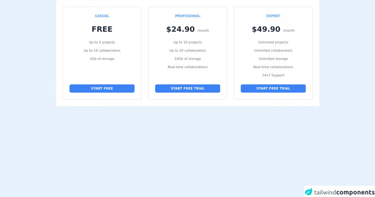
The preview of Simple Pricing section ui component
A Simple Pricing section typically includes a list of pricing plans, features, and a call-to-action button. Here is an example of what a Simple Pricing section could look like:
Free download of the Simple Pricing section's source code
The source code of Simple Pricing section ui component
To create a Simple Pricing section with Tailwind CSS, you can use a combination of HTML and Tailwind CSS classes. Here is an example of the source code for a Simple Pricing section:
<div class="bg-white dark:bg-gray-800">
    <div class="container px-6 py-8 mx-auto">
        <div class="flex flex-col items-center justify-center space-y-8 lg:-mx-4 lg:flex-row lg:items-stretch lg:space-y-0">
            <div class="flex flex-col w-full max-w-sm p-8 space-y-8 text-center bg-white border-2 border-gray-200 rounded-lg lg:mx-4 dark:bg-gray-800 dark:border-gray-700">
                <div class="flex-shrink-0">
                    <h2 class="inline-flex items-center justify-center px-2 font-semibold tracking-tight text-blue-400 uppercase rounded-lg bg-gray-50 dark:bg-gray-700">
                        Casual
                    </h2>
                </div>
                <div class="flex-shrink-0">
                    <span
                        class="pt-2 text-4xl font-bold text-gray-800 uppercase dark:text-gray-100"
                    >
                        Free
                    </span>
                </div>
                <ul class="flex-1 space-y-4">
                    <li class="text-gray-500 dark:text-gray-400">
                        Up to 5 projects
                    </li>
                    <li class="text-gray-500 dark:text-gray-400">
                        Up to 10 collaborators
                    </li>
                    <li class="text-gray-500 dark:text-gray-400">
                        2Gb of storage
                    </li>
                </ul>

                <button
                    class="inline-flex items-center justify-center px-4 py-2 font-semibold text-white uppercase transition-colors bg-blue-500 rounded-lg hover:bg-blue-700 focus:outline-none"
                >
                    Start free
                </button>
            </div>

            <div class="flex flex-col w-full max-w-sm p-8 space-y-8 text-center bg-white border-2 border-gray-200 rounded-lg lg:mx-4 dark:bg-gray-800 dark:border-gray-700">
                <div class="flex-shrink-0">
                    <h2
                        class="inline-flex items-center justify-center px-2 font-semibold tracking-tight text-blue-400 uppercase rounded-lg bg-gray-50 dark:bg-gray-700"
                    >
                        Profesional
                    </h2>
                </div>
                <div class="flex-shrink-0">
                    <span
                        class="pt-2 text-4xl font-bold text-gray-800 uppercase dark:text-gray-100"
                    >
                        $24.90
                    </span>
                    <span class="text-gray-500 dark:text-gray-400">
                        /month
                    </span>
                </div>
                <ul class="flex-1 space-y-4">
                    <li class="text-gray-500 dark:text-gray-400">
                        Up to 10 projects
                    </li>
                    <li class="text-gray-500 dark:text-gray-400">
                        Up to 20 collaborators
                    </li>
                    <li class="text-gray-500 dark:text-gray-400">
                        10Gb of storage
                    </li>
                    <li class="text-gray-500 dark:text-gray-400">
                        Real-time collaborations
                    </li>
                </ul>

                <button
                    class="inline-flex items-center justify-center px-4 py-2 font-semibold text-white uppercase transition-colors bg-blue-500 rounded-lg hover:bg-blue-700 focus:outline-none"
                >
                    Start free trial
                </button>
            </div>

            <div class="flex flex-col w-full max-w-sm p-8 space-y-8 text-center bg-white border-2 border-gray-200 rounded-lg lg:mx-4 dark:bg-gray-800 dark:border-gray-700">
                <div class="flex-shrink-0">
                    <h2
                        class="inline-flex items-center justify-center px-2 font-semibold tracking-tight text-blue-400 uppercase rounded-lg bg-gray-50 dark:bg-gray-700"
                    >
                        Expert
                    </h2>
                </div>
                <div class="flex-shrink-0">
                    <span
                        class="pt-2 text-4xl font-bold text-gray-800 uppercase dark:text-gray-100"
                    >
                        $49.90
                    </span>
                    <span class="text-gray-500 dark:text-gray-400">
                        /month
                    </span>
                </div>
                <ul class="flex-1 space-y-4">
                    <li class="text-gray-500 dark:text-gray-400">
                        Unlimited projects
                    </li>
                    <li class="text-gray-500 dark:text-gray-400">
                        Unlimited collaborators
                    </li>
                    <li class="text-gray-500 dark:text-gray-400">
                        Unlimited storage
                    </li>
                    <li class="text-gray-500 dark:text-gray-400">
                        Real-time collaborations
                    </li>
                    <li class="text-gray-500 dark:text-gray-400">
                        24x7 Support
                    </li>
                </ul>

                <button
                    class="inline-flex items-center justify-center px-4 py-2 font-semibold text-white uppercase transition-colors bg-blue-500 rounded-lg hover:bg-blue-700 focus:outline-none"
                >
                    Start free trial
                </button>
            </div>
        </div>
    </div>
</div>
How to create a Simple Pricing section with Tailwind CSS?
Here are six tips for creating a Simple Pricing section with Tailwind CSS:
1. Define the pricing plans
The first step in creating a Simple Pricing section is to define the pricing plans. This typically includes a list of different plans, each with its own price, features, and benefits.
2. Use a grid system
Tailwind CSS provides a grid system that can be used to create a layout for the Simple Pricing section. The grid system allows you to define the number of columns and rows, as well as the spacing between them.
3. Style the pricing plans
Once you have defined the pricing plans and the grid system, you can start styling the pricing plans using Tailwind CSS classes. This includes setting the font size, font weight, color, and background color.
4. Add icons or images
To make the Simple Pricing section more visually appealing, you can add icons or images to each pricing plan. This can help users understand the features and benefits of each plan more easily.
5. Style the call-to-action button
The call-to-action button is an important element of the Simple Pricing section. It should be styled in a way that makes it stand out and encourages users to click on it. This includes setting the font size, font weight, color, and background color.
6. Make it responsive
Finally, it is important to make the Simple Pricing section responsive so that it looks good on different screen sizes. Tailwind CSS provides a set of pre-defined classes for creating responsive layouts, such as sm: for small screens and md: for medium screens.
Conclusion
Creating a Simple Pricing section with Tailwind CSS is a quick and easy way to add a commonly used user interface component to your website or application. By following these six tips, you can create a Simple Pricing section that is visually appealing, easy to understand, and responsive.