- Published on
How to Make A Simple Pagination With Tailwind CSS?
- What is Tailwind CSS?
- The description of Simple Pagination ui component
- Why use Tailwind CSS to create a Simple Pagination ui component?
- The preview of Simple Pagination ui component
- The source code of Simple Pagination ui component
- How to create a Simple Pagination with Tailwind CSS?
- Step 1: Create the HTML structure
- Step 2: Add Tailwind CSS classes
- Step 3: Customize the styles
- Conclusion
What is Tailwind CSS?
Tailwind CSS is a utility-first CSS framework that provides a set of pre-defined CSS classes to help developers quickly build responsive and customizable user interfaces. It allows developers to focus on the functionality of their application rather than spending time on writing custom CSS code.
The description of Simple Pagination ui component
Pagination is a common UI component used in many web applications to break down large sets of data into smaller, more manageable chunks. Simple Pagination is a basic UI component that allows users to navigate through pages of content. It typically includes links to the previous and next pages, as well as a set of numbered links to individual pages.
Why use Tailwind CSS to create a Simple Pagination ui component?
Tailwind CSS provides a set of pre-defined classes that can be used to quickly and easily create a Simple Pagination UI component. By using Tailwind CSS, developers can focus on the functionality of their application rather than spending time on writing custom CSS code. Additionally, Tailwind CSS provides a responsive design that can be easily customized to fit the needs of any project.
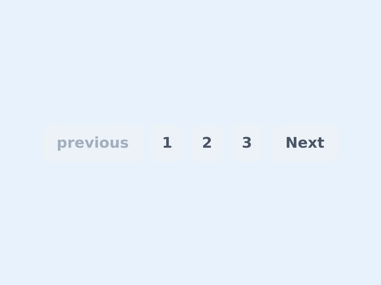
The preview of Simple Pagination ui component
To create a Simple Pagination UI component with Tailwind CSS, we will be using a combination of HTML and CSS code. The HTML code will define the structure of the component, and the CSS code will define the styles applied to the component.
Free download of the Simple Pagination's source code
The source code of Simple Pagination ui component
To create a Simple Pagination UI component with Tailwind CSS, we will be using a combination of HTML and CSS code. The HTML code will define the structure of the component, and the CSS code will define the styles applied to the component.
<ul class="flex">
        <li class="mx-1 px-3 py-2 bg-gray-200 text-gray-500 rounded-lg">
            <a class="flex items-center font-bold" href="#">
                <span class="mx-1">previous</span>
            </a>
        </li>
        <li class="mx-1 px-3 py-2 bg-gray-200 text-gray-700 hover:bg-gray-700 hover:text-gray-200 rounded-lg">
            <a class="font-bold" href="#">1</a>
        </li>
        <li class="mx-1 px-3 py-2 bg-gray-200 text-gray-700 hover:bg-gray-700 hover:text-gray-200 rounded-lg">
            <a class="font-bold" href="#">2</a>
        </li>
        <li class="mx-1 px-3 py-2 bg-gray-200 text-gray-700 hover:bg-gray-700 hover:text-gray-200 rounded-lg">
            <a class="font-bold" href="#">3</a>
        </li>
        <li class="mx-1 px-3 py-2 bg-gray-200 text-gray-700 hover:bg-gray-700 hover:text-gray-200 rounded-lg">
            <a class="flex items-center font-bold" href="#">
                <span class="mx-1">Next</span>
            </a>
        </li>
    </ul>
How to create a Simple Pagination with Tailwind CSS?
To create a Simple Pagination UI component with Tailwind CSS, follow these steps:
Step 1: Create the HTML structure
The first step is to create the HTML structure of the Simple Pagination UI component. This can be done using a combination of HTML and Tailwind CSS classes.
<div class="flex justify-center">
  <nav class="flex rounded-md shadow">
    <a href="#" class="px-3 py-2 bg-white border border-gray-300 rounded-l-md font-medium text-gray-500 hover:bg-gray-50 focus:outline-none focus:ring-2 focus:ring-offset-2 focus:ring-indigo-500">Previous</a>
    <a href="#" class="px-3 py-2 bg-white border border-gray-300 font-medium text-gray-700 hover:bg-gray-50 focus:outline-none focus:ring-2 focus:ring-offset-2 focus:ring-indigo-500">1</a>
    <a href="#" class="px-3 py-2 bg-white border border-gray-300 font-medium text-gray-700 hover:bg-gray-50 focus:outline-none focus:ring-2 focus:ring-offset-2 focus:ring-indigo-500">2</a>
    <a href="#" class="px-3 py-2 bg-white border border-gray-300 font-medium text-gray-700 hover:bg-gray-50 focus:outline-none focus:ring-2 focus:ring-offset-2 focus:ring-indigo-500">3</a>
    <a href="#" class="px-3 py-2 bg-white border border-gray-300 font-medium text-gray-700 hover:bg-gray-50 focus:outline-none focus:ring-2 focus:ring-offset-2 focus:ring-indigo-500">Next</a>
  </nav>
</div>
Step 2: Add Tailwind CSS classes
The next step is to add Tailwind CSS classes to the HTML structure to style the Simple Pagination UI component. In the above HTML code, we have used several Tailwind CSS classes such as flex, justify-center, rounded-md, shadow, px-3, py-2, bg-white, border, border-gray-300, rounded-l-md, font-medium, text-gray-500, hover:bg-gray-50, focus:outline-none, focus:ring-2, focus:ring-offset-2, and focus:ring-indigo-500.
Step 3: Customize the styles
The final step is to customize the styles of the Simple Pagination UI component to fit the needs of your project. This can be done by modifying the existing Tailwind CSS classes or by adding new classes to the HTML structure.
Conclusion
In this article, we have learned how to create a Simple Pagination UI component using Tailwind CSS. By using Tailwind CSS, developers can quickly and easily create responsive and customizable UI components without spending time on writing custom CSS code. With Tailwind CSS, developers can focus on the functionality of their application and deliver a better user experience.