- Published on
Imagine You Make A Simple Modal With Tailwind CSS Like An Expert. Follow These 6 Steps To Get There
- What is Tailwind CSS?
- The description of Simple Modal UI component
- Why use Tailwind CSS to create a Simple Modal UI component?
- The preview of Simple Modal UI component
- The source code of Simple Modal UI component
- How to create a Simple Modal with Tailwind CSS?
- Step 1: Create the HTML structure
- Step 2: Add the Tailwind CSS classes
- Step 3: Add the JavaScript code
- Step 4: Add the modal trigger button
- Step 5: Add the modal content
- Step 6: Customize the Simple Modal UI component
- Conclusion
As a FrontEnd technology blogger, I always try to find the easiest and most efficient way to create UI components. And today, I want to share with you how to create a Simple Modal UI component with Tailwind CSS. In this article, I will guide you through the process of creating a Simple Modal UI component step by step. So, let's get started.
What is Tailwind CSS?
Tailwind CSS is a utility-first CSS framework that helps you to create custom designs without leaving your HTML. It provides a set of pre-defined classes that you can use to style your UI components. With Tailwind CSS, you can easily create responsive designs, and it also helps you to reduce your CSS file size.
The description of Simple Modal UI component
A Simple Modal UI component is a popup window that appears on top of the current page and displays some information or asks for user input. It is a common UI component that you can see on many websites and applications.
Why use Tailwind CSS to create a Simple Modal UI component?
Tailwind CSS provides a set of pre-defined classes that you can use to create a Simple Modal UI component. It also helps you to create responsive designs without writing any custom CSS. With Tailwind CSS, you can easily customize the appearance of your Simple Modal UI component by changing the pre-defined classes.
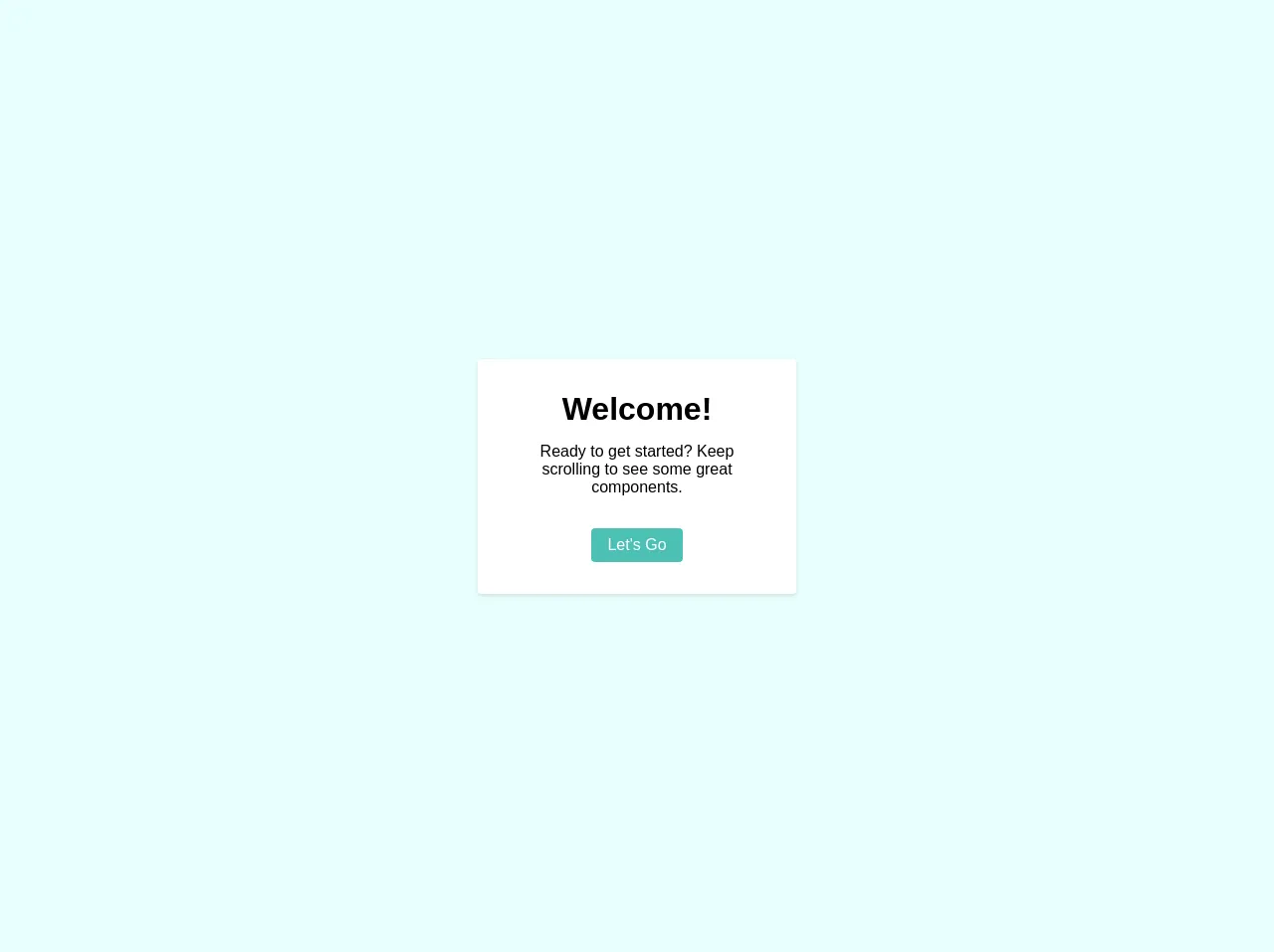
The preview of Simple Modal UI component
To give you an idea of what we will be creating, here is a preview of the Simple Modal UI component:
Free download of the Simple Modal's source code
The source code of Simple Modal UI component
Before we start creating the Simple Modal UI component, let's take a look at the source code:
<div class="h-screen w-full flex flex-col items-center justify-center bg-teal-lightest font-sans">
	<div v-if="modal.visible" @click.self="modal.visible = false" class="h-screen w-full absolute flex items-center justify-center bg-modal">
        <div class="bg-white rounded shadow p-8 m-4 max-w-xs max-h-full text-center overflow-y-scroll">
            <div class="mb-4">
                <h1>Welcome!</h1>
            </div>
            <div class="mb-8">
                <p>Ready to get started? Keep scrolling to see some great components.</p>
            </div>
            <div class="flex justify-center">
                <button class="flex-no-shrink text-white py-2 px-4 rounded bg-teal hover:bg-teal-dark">Let's Go</button>
            </div>
        </div>
    </div>
</div>
How to create a Simple Modal with Tailwind CSS?
Now that we have seen the preview and source code of the Simple Modal UI component let's start creating it step by step.
Step 1: Create the HTML structure
First, we need to create the HTML structure of the Simple Modal UI component. We will use a div element with a class of "modal" to create the modal window. Inside the modal div, we will create another div element with a class of "modal-content" to hold the content of the modal.
<div class="modal">
  <div class="modal-content">
    <!-- Modal content goes here -->
  </div>
</div>
Step 2: Add the Tailwind CSS classes
Next, we need to add the Tailwind CSS classes to style the Simple Modal UI component. We will use the following classes:
fixed: To position the modal window fixed on the screen.inset-0: To make the modal window cover the entire screen.bg-gray-900: To give the modal window a dark background color.opacity-50: To make the background semi-transparent.flex: To make the modal window a flex container.items-center: To vertically center the modal window.justify-center: To horizontally center the modal window.py-12: To add padding to the top and bottom of the modal window.px-4: To add padding to the left and right of the modal window.sm:px-6: To add more padding to the left and right of the modal window on small screens.lg:px-8: To add even more padding to the left and right of the modal window on large screens.hidden: To hide the modal window by default.overflow-y-auto: To add a scrollbar to the modal window content.
<div class="modal fixed inset-0 bg-gray-900 opacity-50 flex items-center justify-center">
  <div class="modal-content bg-white rounded-lg px-4 py-12 sm:px-6 lg:px-8 hidden overflow-y-auto">
    <!-- Modal content goes here -->
  </div>
</div>
Step 3: Add the JavaScript code
Now, we need to add the JavaScript code to show and hide the Simple Modal UI component. We will use the following code:
const modal = document.querySelector('.modal');
const modalContent = document.querySelector('.modal-content');

function showModal() {
  modal.classList.remove('hidden');
}

function hideModal() {
  modal.classList.add('hidden');
}

modal.addEventListener('click', hideModal);
modalContent.addEventListener('click', function(event) {
  event.stopPropagation();
});

document.addEventListener('keydown', function(event) {
  if (event.key === 'Escape') {
    hideModal();
  }
});
This code adds event listeners to the modal and modal content elements to show and hide the modal window. It also adds an event listener to the document object to hide the modal window when the user presses the "Escape" key.
Step 4: Add the modal trigger button
Next, we need to add a button to trigger the Simple Modal UI component. We will use a button element with a class of "modal-trigger" and an onclick attribute to show the modal window.
<button class="modal-trigger" onclick="showModal()">Open Modal</button>
Step 5: Add the modal content
Finally, we need to add the content of the Simple Modal UI component. We will use a div element with some text and a button to close the modal window.
<div class="modal-content bg-white rounded-lg px-4 py-12 sm:px-6 lg:px-8 hidden overflow-y-auto">
  <h2 class="text-lg font-medium text-gray-900">Modal Title</h2>
  <p class="mt-2 text-sm text-gray-500">Modal Content</p>
  <div class="mt-4">
    <button class="modal-close" onclick="hideModal()">Close</button>
  </div>
</div>
Step 6: Customize the Simple Modal UI component
Now that we have created the Simple Modal UI component, we can customize it by changing the Tailwind CSS classes. For example, we can change the background color of the modal window by changing the bg-gray-900 class to bg-blue-500. We can also change the text color of the modal content by adding a text-gray-100 class to the modal-content element.
Conclusion
In this article, we have learned how to create a Simple Modal UI component with Tailwind CSS. We have seen the preview and source code of the Simple Modal UI component, and we have created it step by step. We have also learned how to customize the Simple Modal UI component by changing the Tailwind CSS classes. I hope this article has been helpful to you, and you can use this knowledge to create more UI components with Tailwind CSS.