- Published on
6 Incredibly Easy Ways To Build A Simple blog With Tailwind CSS Better While Spending Less
- What is Tailwind CSS?
- The description of Simple blog UI component
- Why use Tailwind CSS to create a Simple blog UI component?
- The preview of Simple blog UI component
- The source code of Simple blog UI component
- How to create a Simple blog with Tailwind CSS?
- 1. Use pre-built templates
- 2. Use pre-built components
- 3. Customize your colors
- 4. Use responsive design
- 5. Use typography
- 6. Use animations
- Conclusion
Are you looking to build a simple blog with a beautiful user interface? Look no further than Tailwind CSS, a utility-first CSS framework that can help you create stunning designs with minimal effort. In this article, we'll explore six easy ways to build a simple blog with Tailwind CSS that will save you time and money.
What is Tailwind CSS?
Tailwind CSS is a utility-first CSS framework that allows you to quickly build user interfaces by composing small, responsive utility classes. It's designed to be highly customizable and easy to use, making it a popular choice for developers who want to create beautiful designs without spending hours writing CSS code.
The description of Simple blog UI component
A simple blog UI component typically consists of a header, a navigation bar, a content area, and a footer. The header and footer contain branding and copyright information, while the navigation bar allows users to navigate to different areas of the blog. The content area contains blog posts, images, and other media.
Why use Tailwind CSS to create a Simple blog UI component?
Tailwind CSS is an excellent choice for creating a simple blog UI component because it allows you to quickly and easily style your components without writing a lot of CSS code. With Tailwind, you can use pre-built utility classes to style your components, which saves you time and effort.
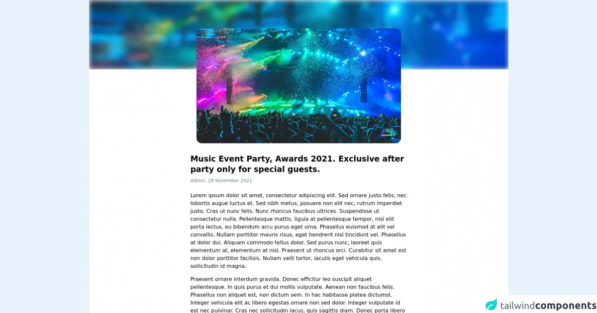
The preview of Simple blog UI component
Creating a simple blog UI component with Tailwind CSS is easy. You can use pre-built utility classes to style your components, which saves you time and effort. Here's a preview of what your simple blog UI component might look like:
Free download of the Simple blog's source code
The source code of Simple blog UI component
To create a simple blog UI component with Tailwind CSS, you'll need to write some HTML and CSS code. Here's an example of what your code might look like:
<style>
  .pt-\[17\%\] {
    padding-top: 17%;
  }
  .mt-\[-10\%\] {
    margin-top: -10%;
  }
  .pt-\[56\.25\%\] {
    padding-top: 56.25%;
  }
</style>

<main class="relative container mx-auto bg-white px-4">
  <div class="relative -mx-4 top-0 pt-[17%] overflow-hidden">
    <img class="absolute inset-0 object-cover object-top w-full h-full filter blur" src="https://images.unsplash.com/photo-1514525253161-7a46d19cd819?ixid=MnwxMjA3fDB8MHxzZWFyY2h8OHx8Y29uY2VydCUyMHBvc3RlcnxlbnwwfHwwfHw%3D&ixlib=rb-1.2.1&auto=format&fit=crop&w=1200&q=80" alt="" />
  </div>

  <div class="mt-[-10%] w-1/2 mx-auto">
    <div class="relative pt-[56.25%] overflow-hidden rounded-2xl">
      <img class="w-full h-full absolute inset-0 object-cover" src="https://images.unsplash.com/photo-1514525253161-7a46d19cd819?ixid=MnwxMjA3fDB8MHxzZWFyY2h8OHx8Y29uY2VydCUyMHBvc3RlcnxlbnwwfHwwfHw%3D&ixlib=rb-1.2.1&auto=format&fit=crop&w=1200&q=80" alt="" />
    </div>
  </div>

  <article class="max-w-prose mx-auto py-8">
    <h1 class="text-2xl font-bold">Music Event Party, Awards 2021. Exclusive after party only for special guests.</h1>
    <h2 class="mt-2 text-sm text-gray-500">Admin, 28 November 2021</h2>

    <p class="mt-6">Lorem ipsum dolor sit amet, consectetur adipiscing elit. Sed ornare justo felis, nec lobortis augue luctus et. Sed nibh metus, posuere non elit nec, rutrum imperdiet justo. Cras ut nunc felis. Nunc rhoncus faucibus ultrices. Suspendisse ut consectetur nulla. Pellentesque mattis, ligula at pellentesque tempor, nisl elit porta lectus, eu bibendum arcu purus eget urna. Phasellus euismod at elit vel convallis. Nullam porttitor mauris risus, eget hendrerit nisl tincidunt vel. Phasellus at dolor dui. Aliquam commodo tellus dolor. Sed purus nunc, laoreet quis elementum at, elementum at nisl. Praesent ut rhoncus orci. Curabitur sit amet est non dolor porttitor facilisis. Nullam velit tortor, iaculis eget vehicula quis, sollicitudin id magna.</p>
    <p class="mt-4">Praesent ornare interdum gravida. Donec efficitur leo suscipit aliquet pellentesque. In quis purus et dui mollis vulputate. Aenean non faucibus felis. Phasellus non aliquet est, non dictum sem. In hac habitasse platea dictumst. Integer vehicula elit ac libero egestas ornare non sed dolor. Integer vulputate id est nec pulvinar. Cras nec sollicitudin lacus, quis sagittis diam. Donec porta libero ac lorem semper, eget porttitor quam fermentum. Ut tincidunt feugiat sem, nec aliquam mi tincidunt non.</p>
    <p class="mt-4">Etiam accumsan leo sem, sit amet faucibus ex convallis fermentum. Nunc tristique, eros eget rutrum accumsan, dolor quam varius nisl, ut euismod arcu urna a lectus. Mauris at dapibus metus. Vestibulum ipsum lorem, dictum vitae sapien eget, rutrum rhoncus sapien. Vivamus a nisi ut risus porta ultricies. Etiam mollis massa odio, non eleifend leo ullamcorper in. Sed ultricies, magna id fermentum volutpat, lorem orci placerat mauris, et molestie ipsum mauris sed sapien. Aliquam nulla lorem, pretium ut interdum dapibus, suscipit at metus. Proin consequat euismod consequat. Aenean placerat turpis et pretium condimentum. Nunc hendrerit tellus semper suscipit dignissim. Nullam fringilla, sem nec volutpat tincidunt, ex eros congue diam, quis venenatis mauris urna et dolor. Vivamus aliquam euismod eros vel pulvinar. Cras arcu augue, rutrum nec velit sit amet, aliquet lobortis leo. Donec placerat, libero in blandit mattis, turpis nisl varius urna, ac pellentesque dui nisi sit amet dui.</p>
    <p class="mt-4">Lorem ipsum dolor sit amet, consectetur adipiscing elit. Nulla vel sapien nisi. Sed molestie quis odio ut facilisis. Duis porttitor turpis at sollicitudin ornare. Aenean vitae nulla justo. In egestas consequat sem, dapibus gravida velit. Nullam dictum, ligula vel porttitor vestibulum, est enim lobortis erat, eget rutrum nunc ex at mauris. Nunc nec laoreet ipsum. Sed vel est a eros sagittis vulputate. Proin cursus ut mauris vel commodo. Sed non sapien metus.</p>
    <p class="mt-4">Nunc aliquet maximus ante, quis malesuada orci sagittis vel. Nunc non porta purus, ultricies rhoncus nulla. Aenean laoreet tortor nec risus fringilla posuere. Quisque eu lacinia dolor, in luctus leo. Aenean non turpis ac ipsum fermentum faucibus. Pellentesque fringilla ante a ex mollis, non scelerisque orci tempor. Sed non dapibus dolor, ac euismod turpis. Integer eu quam nibh. Ut suscipit lacinia sollicitudin. Pellentesque habitant morbi tristique senectus et netus et malesuada fames ac turpis egestas. Maecenas rutrum vestibulum mauris, sed mattis tellus maximus in. Nullam imperdiet enim nec nisi euismod, ut accumsan odio gravida. Nunc eu augue a dui porta fringilla sed at ex. Cras pellentesque suscipit porttitor. Nunc non ullamcorper nibh. Praesent purus libero, congue non laoreet sed, dapibus vel turpis.</p>
  </article>
</main>
How to create a Simple blog with Tailwind CSS?
Now that you understand the basics of Tailwind CSS and how it can help you create a simple blog UI component, let's dive into the six easy ways to build a simple blog with Tailwind CSS:
1. Use pre-built templates
One of the easiest ways to build a simple blog with Tailwind CSS is to use pre-built templates. There are many templates available online that you can use as a starting point for your blog. Simply download the template, customize it to your liking, and you're ready to go.
2. Use pre-built components
Another easy way to build a simple blog with Tailwind CSS is to use pre-built components. Tailwind CSS provides a library of pre-built components that you can use to quickly create your blog. These components include buttons, forms, cards, and more.
3. Customize your colors
Tailwind CSS makes it easy to customize the colors of your blog. You can use pre-defined color classes or create your own custom colors using the built-in color palette. This allows you to create a unique look for your blog that matches your brand.
4. Use responsive design
With Tailwind CSS, you can easily create a responsive design for your blog. This means that your blog will look great on any device, whether it's a desktop computer, tablet, or smartphone. You can use pre-built responsive classes or create your own custom breakpoints to ensure that your blog looks great on all devices.
5. Use typography
Typography is an important aspect of any blog design. With Tailwind CSS, you can easily customize your typography using pre-built classes or by creating your own custom typography styles. This allows you to create a unique look for your blog that matches your brand.
6. Use animations
Finally, you can use animations to add some visual interest to your blog. Tailwind CSS provides a library of pre-built animation classes that you can use to animate your components. This allows you to create a dynamic and engaging user experience for your readers.
Conclusion
Building a simple blog with Tailwind CSS is easy and fun. By using pre-built templates and components, customizing your colors and typography, and using responsive design and animations, you can create a beautiful and engaging blog that your readers will love. So what are you waiting for? Start building your simple blog with Tailwind CSS today!