- Published on
How To Make A Simple Badges With Tailwind CSS From Scratch
- What is Tailwind CSS?
- The description of Simple Badges UI component
- Why use Tailwind CSS to create a Simple Badges UI component?
- The preview of Simple Badges UI component
- The source code of Simple Badges UI component
- How to create a Simple Badges with Tailwind CSS?
- Conclusion
What is Tailwind CSS?
Tailwind CSS is a utility-first CSS framework that provides a set of pre-defined classes to help you quickly build your website or application. It allows you to create custom designs without writing any CSS code. Tailwind CSS is easy to use and highly customizable, making it a popular choice among developers.
The description of Simple Badges UI component
A badge is a small UI component that displays information, such as a status or a label. Simple badges are often used to highlight important information or to indicate the status of a particular item. In this tutorial, we will create a simple badge using Tailwind CSS.
Why use Tailwind CSS to create a Simple Badges UI component?
Tailwind CSS provides a set of pre-defined classes that make it easy to create custom designs without writing any CSS code. This makes it an ideal choice for creating simple badges. With Tailwind CSS, you can easily customize the size, color, and style of your badges.
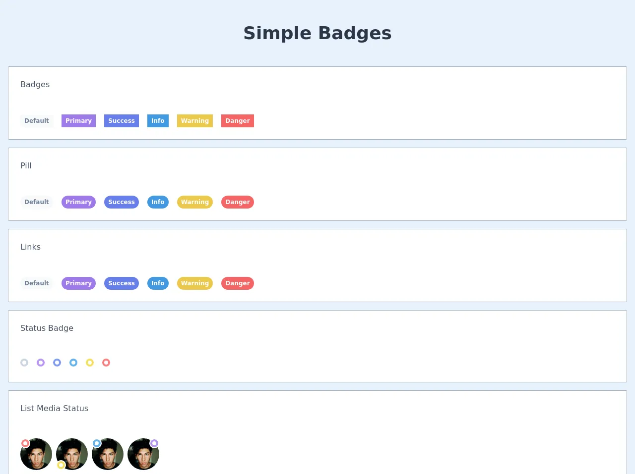
The preview of Simple Badges UI component
In this tutorial, we will create a simple badge using Tailwind CSS. The badge will have a rounded shape and a solid background color. We will also add some text to the badge to indicate its purpose.
Free download of the Simple Badges's source code
The source code of Simple Badges UI component
To create the simple badge, we will use HTML and Tailwind CSS classes. We will create a div element with a class of "bg-blue-500 rounded-full px-2 py-1 text-white", which will give the badge a blue background color, rounded corners, and white text. We will also add some text to the badge using the "text-xs" class.
<header>
      <div class="text-center text-4xl text-gray-800 font-bold mx-auto my-10">
        Simple Badges
      </div>
    </header>

    <main class="px-4 flex-grow flex justify-center items-center text-center container mx-auto  grid row-gap-4 grid-cols-1 w-full">

      <div class="grid grid-cols-1 gap-4 w-full bg-white p-6 border border-gray-500 rounded-sm">

        <div class="mb-8 text-left">
          <h2 class="text-gray-700">Badges</h2>
        </div>
        <div class="text-left">
            <span class="inline-block rounded-min text-gray-600 bg-gray-100 px-2 py-1 text-xs font-bold mr-3">Default</span>
            <span class="inline-block rounded-min text-white bg-purple-500 px-2 py-1 text-xs font-bold mr-3">Primary</span>
            <span class="inline-block rounded-min text-white bg-indigo-500 px-2 py-1 text-xs font-bold mr-3">Success</span>
            <span class="inline-block rounded-min text-white bg-blue-500 px-2 py-1 text-xs font-bold mr-3">Info</span>
            <span class="inline-block rounded-min text-white bg-yellow-500 px-2 py-1 text-xs font-bold mr-3">Warning</span>
            <span class="inline-block rounded-min text-white bg-red-500 px-2 py-1 text-xs font-bold mr-3">Danger</span>
        </div>

      </div>

      <div class="grid grid-cols-1 gap-4 w-full bg-white p-6 border border-gray-500 rounded-sm">

        <div class="mb-8 text-left">
          <h2 class="text-gray-700">Pill</h2>
        </div>
        <div class="text-left">
            <span class="inline-block rounded-full text-gray-600 bg-gray-100 px-2 py-1 text-xs font-bold mr-3">Default</span>
            <span class="inline-block rounded-full text-white bg-purple-500 px-2 py-1 text-xs font-bold mr-3">Primary</span>
            <span class="inline-block rounded-full text-white bg-indigo-500 px-2 py-1 text-xs font-bold mr-3">Success</span>
            <span class="inline-block rounded-full text-white bg-blue-500 px-2 py-1 text-xs font-bold mr-3">Info</span>
            <span class="inline-block rounded-full text-white bg-yellow-500 px-2 py-1 text-xs font-bold mr-3">Warning</span>
            <span class="inline-block rounded-full text-white bg-red-500 px-2 py-1 text-xs font-bold mr-3">Danger</span>
        </div>

      </div>

      <div class="grid grid-cols-1 gap-4 w-full bg-white p-6 border border-gray-500 rounded-sm">

        <div class="mb-8 text-left">
          <h2 class="text-gray-700">Links</h2>
        </div>
        <div class="text-left">
            <a href="#" class="inline-block rounded-full text-gray-600 bg-gray-100 px-2 py-1 text-xs font-bold mr-3">Default</a>
            <a href="#" class="inline-block rounded-full text-white bg-purple-500 px-2 py-1 text-xs font-bold mr-3">Primary</a>
            <a href="#" class="inline-block rounded-full text-white bg-indigo-500 px-2 py-1 text-xs font-bold mr-3">Success</a>
            <a href="#" class="inline-block rounded-full text-white bg-blue-500 px-2 py-1 text-xs font-bold mr-3">Info</a>
            <a href="#" class="inline-block rounded-full text-white bg-yellow-500 px-2 py-1 text-xs font-bold mr-3">Warning</a>
            <a href="#" class="inline-block rounded-full text-white bg-red-500 px-2 py-1 text-xs font-bold mr-3">Danger</a>
        </div>

      </div>

      <div class="grid grid-cols-1 gap-4 w-full bg-white p-6 border border-gray-500 rounded-sm">

        <div class="mb-8 text-left">
          <h2 class="text-gray-700">Status Badge</h2>
        </div>
        <div class="text-left">
            <span href="#" class="inline-block rounded-full bg-white border-4 border-gray-400 p-1 text-xs font-bold mr-3"></span>
            <span href="#" class="inline-block rounded-full bg-white border-4 border-purple-400 p-1 text-xs font-bold mr-3"></span>
            <span href="#" class="inline-block rounded-full bg-white border-4 border-indigo-400 p-1 text-xs font-bold mr-3"></span>
            <span href="#" class="inline-block rounded-full bg-white border-4 border-blue-400 p-1 text-xs font-bold mr-3"></span>
            <span href="#" class="inline-block rounded-full bg-white border-4 border-yellow-400 p-1 text-xs font-bold mr-3"></span>
            <span href="#" class="inline-block rounded-full bg-white border-4 border-red-400 p-1 text-xs font-bold mr-3"></span>
        </div>

      </div>

      <div class="grid grid-cols-1 gap-4 w-full bg-white p-6 border border-gray-500 rounded-sm">

        <div class="mb-8 text-left">
          <h2 class="text-gray-700">List Media Status</h2>
        </div>

        <ul class="inline-block">

          <li>
            <div class="relative float-left mr-2 flex">
              <img src="https://images.unsplash.com/photo-1499996860823-5214fcc65f8f?ixlib=rb-1.2.1&ixid=eyJhcHBfaWQiOjEyMDd9&auto=format&fit=crop&w=1404&q=80" alt="" class="rounded-full w-16 h-16 object-cover">
              <div class="top-0 absolute rounded-full w-5 h-5 bg-white inline-block flex justify-center items-center">
                <span href="#" class="inline-block rounded-full bg-white border-4 border-red-400 p-1 text-xs"></span>
              </div>
            </div>
          </li>

          <li>
            <div class="relative float-left mr-2 flex">
              <img src="https://images.unsplash.com/photo-1499996860823-5214fcc65f8f?ixlib=rb-1.2.1&ixid=eyJhcHBfaWQiOjEyMDd9&auto=format&fit=crop&w=1404&q=80" alt="" class="rounded-full w-16 h-16 object-cover">
              <div class="bottom-0 absolute rounded-full w-5 h-5 bg-white inline-block flex justify-center items-center">
                <span href="#" class="inline-block rounded-full bg-white border-4 border-yellow-400 p-1 text-xs"></span>
              </div>
            </div>
          </li>

          <li>
            <div class="relative float-left mr-2 flex">
              <img src="https://images.unsplash.com/photo-1499996860823-5214fcc65f8f?ixlib=rb-1.2.1&ixid=eyJhcHBfaWQiOjEyMDd9&auto=format&fit=crop&w=1404&q=80" alt="" class="rounded-full w-16 h-16 object-cover">
              <div class="left-0 absolute rounded-full w-5 h-5 bg-white inline-block flex justify-center items-center">
                <span href="#" class="inline-block rounded-full bg-white border-4 border-blue-400 p-1 text-xs"></span>
              </div>
            </div>
          </li>

          <li>
            <div class="relative float-left mr-2 flex">
              <img src="https://images.unsplash.com/photo-1499996860823-5214fcc65f8f?ixlib=rb-1.2.1&ixid=eyJhcHBfaWQiOjEyMDd9&auto=format&fit=crop&w=1404&q=80" alt="" class="rounded-full w-16 h-16 object-cover">
              <div class="right-0 absolute rounded-full w-5 h-5 bg-white inline-block flex justify-center items-center">
                <span href="#" class="inline-block rounded-full bg-white border-4 border-purple-400 p-1 text-xs"></span>
              </div>
            </div>
          </li>

        </ul>

      </div>

    </main>
How to create a Simple Badges with Tailwind CSS?
To create a simple badge with Tailwind CSS, follow the steps below:
- Create a div element with a class of "bg-blue-500 rounded-full px-2 py-1 text-white".
- Add some text to the badge using the "text-xs" class.
Here is the HTML code for the simple badge:
<div class="bg-blue-500 rounded-full px-2 py-1 text-white text-xs">
  New
</div>
In the code above, we have created a div element with a class of "bg-blue-500 rounded-full px-2 py-1 text-white". This will give the badge a blue background color, rounded corners, and white text. We have also added the text "New" to the badge using the "text-xs" class.
You can customize the badge by changing the classes used in the div element. For example, you can change the background color by using a different color class, such as "bg-red-500" or "bg-green-500". You can also change the size of the badge by adjusting the padding values.
Conclusion
In this tutorial, we have learned how to create a simple badge using Tailwind CSS. We have seen how Tailwind CSS provides a set of pre-defined classes that make it easy to create custom designs without writing any CSS code. By following the steps outlined in this tutorial, you can easily create your own badges with Tailwind CSS.