- Published on
How To Create A Sign in form With Tailwind CSS From Scratch
- What is Tailwind CSS?
- The description of Sign in form UI component
- Why use Tailwind CSS to create a Sign in form UI component?
- The preview of Sign in form UI component
- The source code of Sign in form UI component
- How to create a Sign in form with Tailwind CSS?
- Conclusion
In this tutorial, we will learn how to create a sign in form with Tailwind CSS from scratch. We will cover what Tailwind CSS is, the description of the sign in form UI component, why we should use Tailwind CSS to create a sign in form UI component, the preview and source code of the sign in form UI component, and finally, how to create a sign in form with Tailwind CSS.
What is Tailwind CSS?
Tailwind CSS is a utility-first CSS framework that allows you to rapidly build custom user interfaces. It provides a set of pre-defined CSS classes that you can use to style your HTML elements. With Tailwind CSS, you can create responsive and mobile-first designs without writing any custom CSS.
The description of Sign in form UI component
A sign in form is a UI component that allows users to log in to a website or application. It typically consists of two input fields for the user's email or username and password, and a submit button to log in.
Why use Tailwind CSS to create a Sign in form UI component?
Tailwind CSS makes it easy to create a sign in form UI component from scratch. It provides a set of pre-defined CSS classes that you can use to style your HTML elements. With Tailwind CSS, you can create a responsive and mobile-first design without writing any custom CSS.
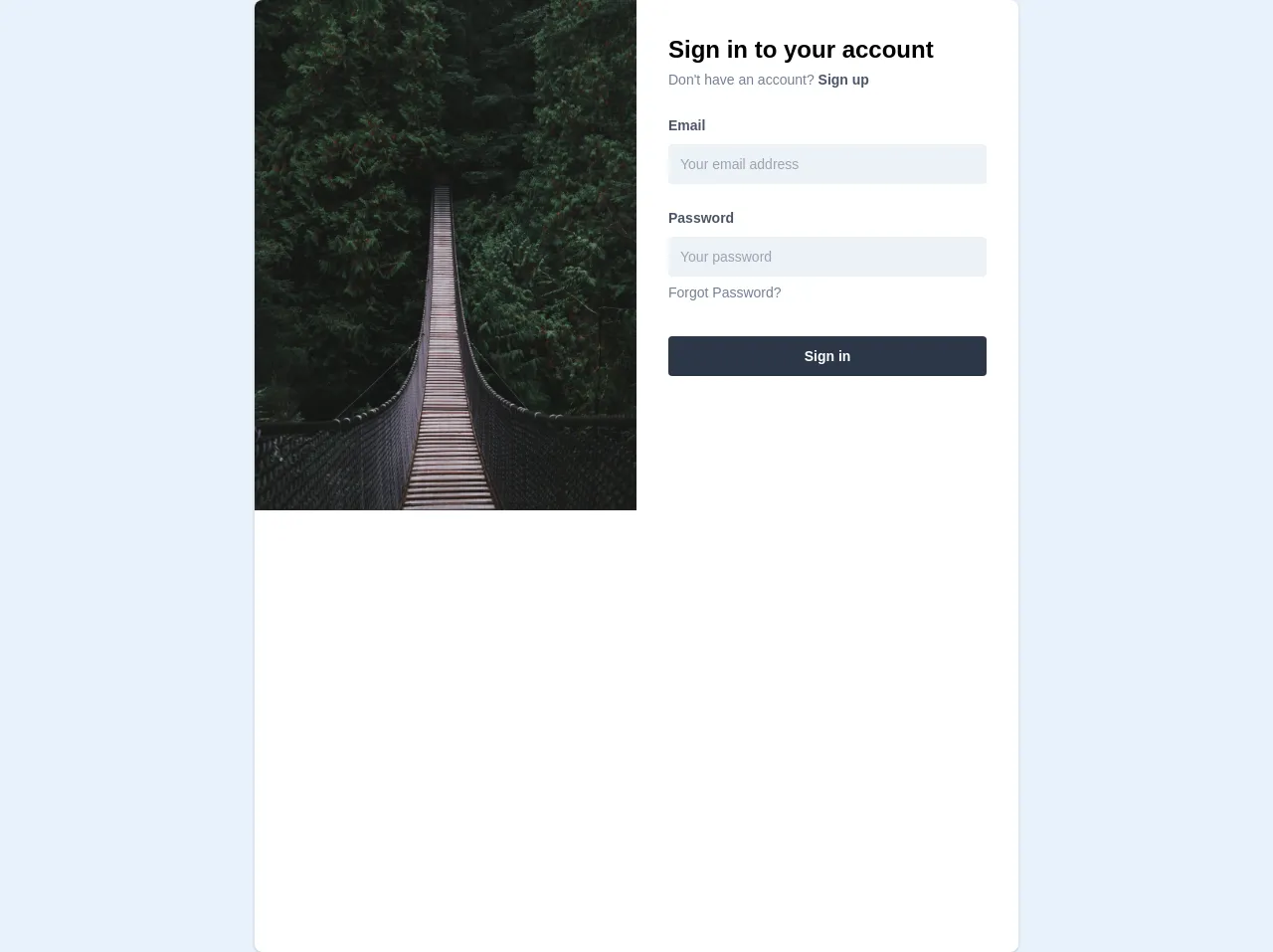
The preview of Sign in form UI component
To create a sign in form UI component with Tailwind CSS, we will use the following HTML structure:
<div class="bg-white shadow-md rounded px-8 pt-6 pb-8 mb-4 flex flex-col my-2">
  <div class="-mx-3 md:flex mb-6">
    <div class="md:w-1/2 px-3 mb-6 md:mb-0">
      <label class="block uppercase tracking-wide text-gray-700 text-xs font-bold mb-2" for="grid-email">
        Email
      </label>
      <input class="appearance-none block w-full bg-gray-200 text-gray-700 border border-gray-200 rounded py-3 px-4 mb-3 leading-tight focus:outline-none focus:bg-white" id="grid-email" type="email" placeholder="Email">
    </div>
    <div class="md:w-1/2 px-3">
      <label class="block uppercase tracking-wide text-gray-700 text-xs font-bold mb-2" for="grid-password">
        Password
      </label>
      <input class="appearance-none block w-full bg-gray-200 text-gray-700 border border-gray-200 rounded py-3 px-4 mb-3 leading-tight focus:outline-none focus:bg-white" id="grid-password" type="password" placeholder="Password">
    </div>
  </div>
  <div class="flex items-center justify-between">
    <button class="bg-blue-500 hover:bg-blue-700 text-white font-bold py-2 px-4 rounded focus:outline-none focus:shadow-outline" type="button">
      Sign In
    </button>
    <a class="inline-block align-baseline font-bold text-sm text-blue-500 hover:text-blue-800" href="#">
      Forgot Password?
    </a>
  </div>
</div>
Free download of the Sign in form's source code
The source code of Sign in form UI component
To create a sign in form UI component with Tailwind CSS, we will use the following HTML structure:
<div class="bg-white shadow-md rounded px-8 pt-6 pb-8 mb-4 flex flex-col my-2">
  <div class="-mx-3 md:flex mb-6">
    <div class="md:w-1/2 px-3 mb-6 md:mb-0">
      <label class="block uppercase tracking-wide text-gray-700 text-xs font-bold mb-2" for="grid-email">
        Email
      </label>
      <input class="appearance-none block w-full bg-gray-200 text-gray-700 border border-gray-200 rounded py-3 px-4 mb-3 leading-tight focus:outline-none focus:bg-white" id="grid-email" type="email" placeholder="Email">
    </div>
    <div class="md:w-1/2 px-3">
      <label class="block uppercase tracking-wide text-gray-700 text-xs font-bold mb-2" for="grid-password">
        Password
      </label>
      <input class="appearance-none block w-full bg-gray-200 text-gray-700 border border-gray-200 rounded py-3 px-4 mb-3 leading-tight focus:outline-none focus:bg-white" id="grid-password" type="password" placeholder="Password">
    </div>
  </div>
  <div class="flex items-center justify-between">
    <button class="bg-blue-500 hover:bg-blue-700 text-white font-bold py-2 px-4 rounded focus:outline-none focus:shadow-outline" type="button">
      Sign In
    </button>
    <a class="inline-block align-baseline font-bold text-sm text-blue-500 hover:text-blue-800" href="#">
      Forgot Password?
    </a>
  </div>
</div>
<div
  class="container max-w-md mx-auto xl:max-w-3xl h-full flex bg-white rounded-lg shadow overflow-hidden"
>
  <div class="relative hidden xl:block xl:w-1/2 h-full">
    <img
      class="absolute h-auto w-full object-cover"
      src="https://images.unsplash.com/photo-1541233349642-6e425fe6190e"
      alt="my zomato"
    />
  </div>
  <div class="w-full xl:w-1/2 p-8">
    <form method="post" action="#" onSubmit="return false">
      <h1 class=" text-2xl font-bold">Sign in to your account</h1>
      <div>
        <span class="text-gray-600 text-sm">
          Don't have an account?
        </span>
        <span class="text-gray-700 text-sm font-semibold">
          Sign up
        </span>
      </div>
      <div class="mb-4 mt-6">
        <label
          class="block text-gray-700 text-sm font-semibold mb-2"
          htmlFor="email"
        >
          Email
        </label>
        <input
          class="text-sm appearance-none rounded w-full py-2 px-3 text-gray-700 bg-gray-200 leading-tight focus:outline-none focus:shadow-outline h-10"
          id="email"
          type="text"
          placeholder="Your email address"
        />
      </div>
      <div class="mb-6 mt-6">
        <label
          class="block text-gray-700 text-sm font-semibold mb-2"
          htmlFor="password"
        >
          Password
        </label>
        <input
          class="text-sm bg-gray-200 appearance-none rounded w-full py-2 px-3 text-gray-700 mb-1 leading-tight focus:outline-none focus:shadow-outline h-10"
          id="password"
          type="password"
          placeholder="Your password"
        />
        <a
          class="inline-block align-baseline text-sm text-gray-600 hover:text-gray-800"
          href="/forgot"
        >
          Forgot Password?
        </a>
      </div>
      <div class="flex w-full mt-8">
        <button
          class="w-full bg-gray-800 hover:bg-grey-900 text-white text-sm py-2 px-4 font-semibold rounded focus:outline-none focus:shadow-outline h-10"
          type="button"
        >
          Sign in
        </button>
      </div>
    </form>
  </div>
</div>
How to create a Sign in form with Tailwind CSS?
To create a sign in form with Tailwind CSS, follow these steps:
- Create a new HTML file and add the above HTML structure to it.
- Add the Tailwind CSS CDN link to the head section of your HTML file:
<head>
  <link href="https://cdn.jsdelivr.net/npm/tailwindcss@latest/dist/tailwind.min.css" rel="stylesheet">
</head>
- Save the file and open it in your browser.
Conclusion
In this tutorial, we learned how to create a sign in form with Tailwind CSS from scratch. We covered what Tailwind CSS is, the description of the sign in form UI component, why we should use Tailwind CSS to create a sign in form UI component, the preview and source code of the sign in form UI component, and finally, how to create a sign in form with Tailwind CSS. With Tailwind CSS, you can create custom user interfaces quickly and easily.