- Published on
6 Incredibly Easy Ways To Create A SB Admin 2: Register Page With Tailwind CSS Better While Spending Less
- What is Tailwind CSS?
- The description of SB Admin 2: Register Page UI component
- Why use Tailwind CSS to create a SB Admin 2: Register Page UI component?
- The preview of SB Admin 2: Register Page UI component
- The source code of SB Admin 2: Register Page UI component
- How to create a SB Admin 2: Register Page with Tailwind CSS?
- Step 1: Install Tailwind CSS
- Step 2: Create a new HTML file
- Step 3: Add Tailwind CSS classes
- Step 4: Customize the design
- Step 5: Add responsive design
- Conclusion
As a FrontEnd technology blogger, I am always on the lookout for ways to make my web development projects more efficient and effective. That's why I've been experimenting with Tailwind CSS, a utility-first CSS framework that allows me to create beautiful and responsive UI components quickly and easily. In this article, I will walk you through the process of creating a SB Admin 2: Register Page UI component with Tailwind CSS.
What is Tailwind CSS?
Tailwind CSS is a utility-first CSS framework that provides a set of pre-defined CSS classes that you can use to style your HTML elements. It is designed to be highly customizable, allowing you to create unique and responsive designs quickly and easily. With Tailwind CSS, you don't need to write custom CSS code for every element on your page. Instead, you can use pre-defined classes to style your elements, which saves you time and effort.
The description of SB Admin 2: Register Page UI component
SB Admin 2 is a popular open-source admin dashboard template built with Bootstrap. It comes with a variety of UI components that you can use to create a professional-looking admin dashboard quickly and easily. One of the most important UI components of any admin dashboard is the register page, which allows users to create new accounts and sign up for your service.
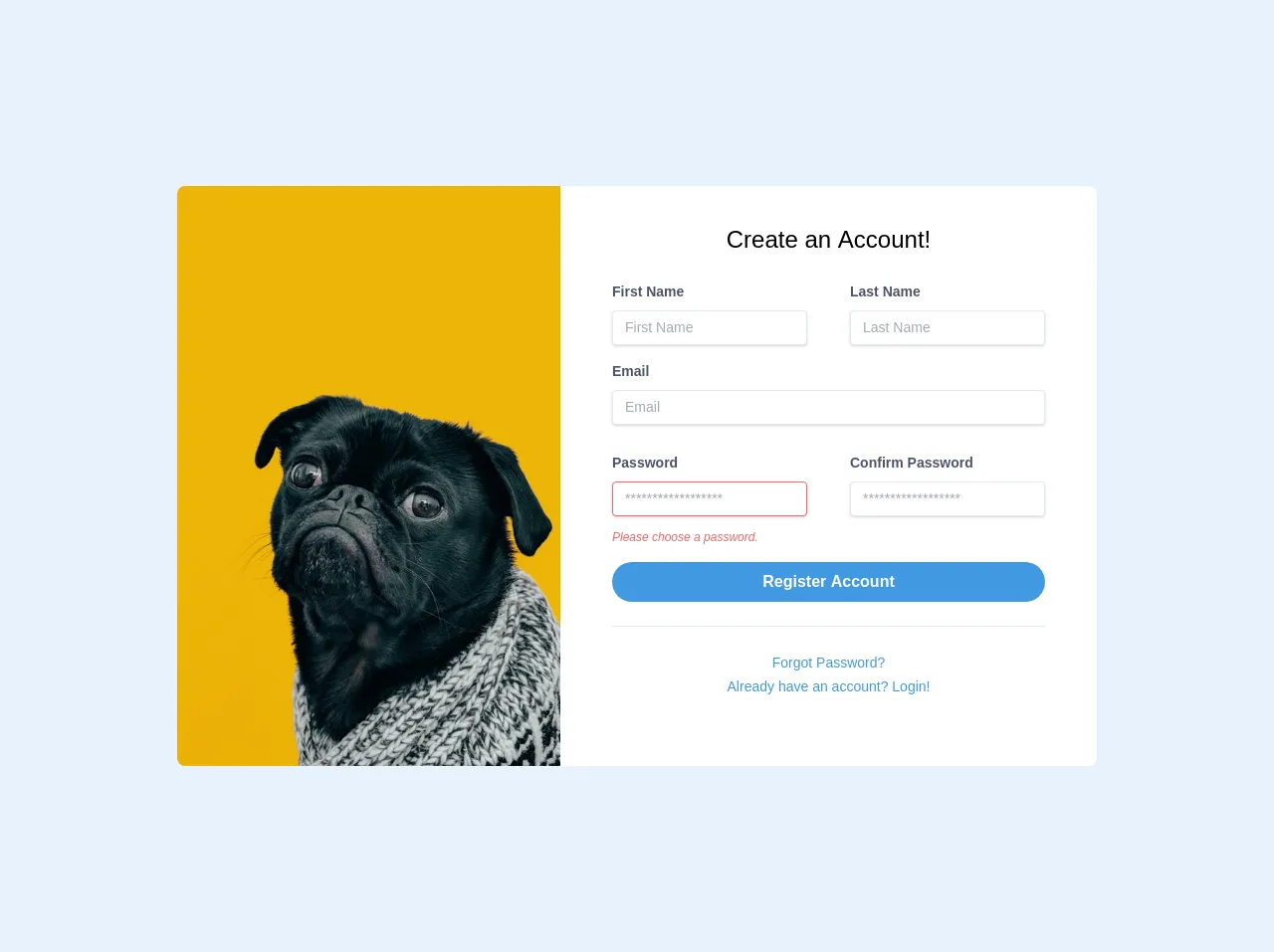
The SB Admin 2: Register Page UI component is a pre-built HTML and CSS template that you can use to create a register page for your admin dashboard. It comes with a variety of form fields, including name, email, password, and confirmation password, as well as a submit button.
Why use Tailwind CSS to create a SB Admin 2: Register Page UI component?
Tailwind CSS is an excellent choice for creating a SB Admin 2: Register Page UI component for several reasons. First, it provides a set of pre-defined CSS classes that you can use to style your form fields quickly and easily. Second, it is highly customizable, allowing you to adjust the colors, fonts, and other design elements to match your brand. Finally, it is lightweight and fast, which means that your register page will load quickly and provide a great user experience.
The preview of SB Admin 2: Register Page UI component
To give you an idea of what the SB Admin 2: Register Page UI component looks like, here is a preview of the template:
Free download of the SB Admin 2: Register Page's source code
The source code of SB Admin 2: Register Page UI component
If you want to see the source code of the SB Admin 2: Register Page UI component, here is a sample HTML and CSS code:
<body class="font-mono bg-gray-400">
		<!-- Container -->
		<div class="container mx-auto">
			<div class="flex justify-center px-6 my-12">
				<!-- Row -->
				<div class="w-full xl:w-3/4 lg:w-11/12 flex">
					<!-- Col -->
					<div
						class="w-full h-auto bg-gray-400 hidden lg:block lg:w-5/12 bg-cover rounded-l-lg"
						style="background-image: url('https://source.unsplash.com/Mv9hjnEUHR4/600x800')"
					></div>
					<!-- Col -->
					<div class="w-full lg:w-7/12 bg-white p-5 rounded-lg lg:rounded-l-none">
						<h3 class="pt-4 text-2xl text-center">Create an Account!</h3>
						<form class="px-8 pt-6 pb-8 mb-4 bg-white rounded">
							<div class="mb-4 md:flex md:justify-between">
								<div class="mb-4 md:mr-2 md:mb-0">
									<label class="block mb-2 text-sm font-bold text-gray-700" for="firstName">
										First Name
									</label>
									<input
										class="w-full px-3 py-2 text-sm leading-tight text-gray-700 border rounded shadow appearance-none focus:outline-none focus:shadow-outline"
										id="firstName"
										type="text"
										placeholder="First Name"
									/>
								</div>
								<div class="md:ml-2">
									<label class="block mb-2 text-sm font-bold text-gray-700" for="lastName">
										Last Name
									</label>
									<input
										class="w-full px-3 py-2 text-sm leading-tight text-gray-700 border rounded shadow appearance-none focus:outline-none focus:shadow-outline"
										id="lastName"
										type="text"
										placeholder="Last Name"
									/>
								</div>
							</div>
							<div class="mb-4">
								<label class="block mb-2 text-sm font-bold text-gray-700" for="email">
									Email
								</label>
								<input
									class="w-full px-3 py-2 mb-3 text-sm leading-tight text-gray-700 border rounded shadow appearance-none focus:outline-none focus:shadow-outline"
									id="email"
									type="email"
									placeholder="Email"
								/>
							</div>
							<div class="mb-4 md:flex md:justify-between">
								<div class="mb-4 md:mr-2 md:mb-0">
									<label class="block mb-2 text-sm font-bold text-gray-700" for="password">
										Password
									</label>
									<input
										class="w-full px-3 py-2 mb-3 text-sm leading-tight text-gray-700 border border-red-500 rounded shadow appearance-none focus:outline-none focus:shadow-outline"
										id="password"
										type="password"
										placeholder="******************"
									/>
									<p class="text-xs italic text-red-500">Please choose a password.</p>
								</div>
								<div class="md:ml-2">
									<label class="block mb-2 text-sm font-bold text-gray-700" for="c_password">
										Confirm Password
									</label>
									<input
										class="w-full px-3 py-2 mb-3 text-sm leading-tight text-gray-700 border rounded shadow appearance-none focus:outline-none focus:shadow-outline"
										id="c_password"
										type="password"
										placeholder="******************"
									/>
								</div>
							</div>
							<div class="mb-6 text-center">
								<button
									class="w-full px-4 py-2 font-bold text-white bg-blue-500 rounded-full hover:bg-blue-700 focus:outline-none focus:shadow-outline"
									type="button"
								>
									Register Account
								</button>
							</div>
							<hr class="mb-6 border-t" />
							<div class="text-center">
								<a
									class="inline-block text-sm text-blue-500 align-baseline hover:text-blue-800"
									href="#"
								>
									Forgot Password?
								</a>
							</div>
							<div class="text-center">
								<a
									class="inline-block text-sm text-blue-500 align-baseline hover:text-blue-800"
									href="./index.html"
								>
									Already have an account? Login!
								</a>
							</div>
						</form>
					</div>
				</div>
			</div>
		</div>
	</body>
How to create a SB Admin 2: Register Page with Tailwind CSS?
Now that you understand the benefits of using Tailwind CSS to create a SB Admin 2: Register Page UI component, let's walk through the process of creating one step-by-step.
Step 1: Install Tailwind CSS
The first step is to install Tailwind CSS in your project. You can do this by using a package manager like npm or yarn. Here is an example of how to install Tailwind CSS using npm:
npm install tailwindcss
Step 2: Create a new HTML file
Next, create a new HTML file for your register page. You can use any text editor or IDE to do this. Here is an example of what your HTML file might look like:
<!DOCTYPE html>
<html lang="en">
  <head>
    <meta charset="UTF-8" />
    <meta name="viewport" content="width=device-width, initial-scale=1.0" />
    <title>Register Page</title>
    <link rel="stylesheet" href="styles.css" />
  </head>
  <body>
    <div class="container mx-auto">
      <div class="max-w-md mx-auto my-10 bg-white p-5 rounded-md shadow-sm">
        <h2 class="text-center font-bold text-2xl mb-5">Register</h2>
        <form>
          <div class="mb-4">
            <label class="block text-gray-700 font-bold mb-2" for="name">
              Name
            </label>
            <input
              class="appearance-none border rounded w-full py-2 px-3 text-gray-700 leading-tight focus:outline-none focus:shadow-outline"
              id="name"
              type="text"
              placeholder="Enter your name"
            />
          </div>
          <div class="mb-4">
            <label class="block text-gray-700 font-bold mb-2" for="email">
              Email
            </label>
            <input
              class="appearance-none border rounded w-full py-2 px-3 text-gray-700 leading-tight focus:outline-none focus:shadow-outline"
              id="email"
              type="email"
              placeholder="Enter your email"
            />
          </div>
          <div class="mb-4">
            <label class="block text-gray-700 font-bold mb-2" for="password">
              Password
            </label>
            <input
              class="appearance-none border rounded w-full py-2 px-3 text-gray-700 leading-tight focus:outline-none focus:shadow-outline"
              id="password"
              type="password"
              placeholder="Enter your password"
            />
          </div>
          <div class="mb-4">
            <label
              class="block text-gray-700 font-bold mb-2"
              for="confirm-password"
            >
              Confirm Password
            </label>
            <input
              class="appearance-none border rounded w-full py-2 px-3 text-gray-700 leading-tight focus:outline-none focus:shadow-outline"
              id="confirm-password"
              type="password"
              placeholder="Confirm your password"
            />
          </div>
          <div class="flex items-center justify-between">
            <button
              class="bg-blue-500 hover:bg-blue-700 text-white font-bold py-2 px-4 rounded focus:outline-none focus:shadow-outline"
              type="button"
            >
              Register
            </button>
          </div>
        </form>
      </div>
    </div>
  </body>
</html>
Step 3: Add Tailwind CSS classes
Now that you have your HTML file, you can start adding Tailwind CSS classes to style your form fields. Here is an example of how to add Tailwind CSS classes to the name input field:
<input
  class="appearance-none border rounded w-full py-2 px-3 text-gray-700 leading-tight focus:outline-none focus:shadow-outline"
  id="name"
  type="text"
  placeholder="Enter your name"
/>
In this example, we added the following Tailwind CSS classes:
appearance-none: removes the default appearance of the input fieldborder: adds a border to the input fieldrounded: rounds the corners of the input fieldw-full: sets the width of the input field to 100%py-2: adds padding to the top and bottom of the input fieldpx-3: adds padding to the left and right of the input fieldtext-gray-700: sets the text color of the input field to grayleading-tight: sets the line height of the input field to be tightfocus:outline-none: removes the default outline when the input field is focusedfocus:shadow-outline: adds a shadow to the input field when it is focused
You can add similar Tailwind CSS classes to the other form fields to style them as well.
Step 4: Customize the design
Once you have added the Tailwind CSS classes to your form fields, you can customize the design to match your brand. You can adjust the colors, fonts, and other design elements by modifying the tailwind.config.js file. Here is an example of how to change the primary color to blue:
// tailwind.config.js
module.exports = {
  theme: {
    extend: {
      colors: {
        blue: {
          500: "#007ace",
        },
      },
    },
  },
  variants: {},
  plugins: [],
};
Step 5: Add responsive design
Finally, you can add responsive design to your register page to ensure that it looks great on all devices. You can use Tailwind CSS's responsive design classes to achieve this. Here is an example of how to make the register form fields stack on top of each other on small screens:
<div class="mb-4 sm:flex sm:justify-between">
  <div class="sm:w-1/2 sm:mr-2">
    <label class="block text-gray-700 font-bold mb-2" for="name">
      Name
    </label>
    <input
      class="appearance-none border rounded w-full py-2 px-3 text-gray-700 leading-tight focus:outline-none focus:shadow-outline"
      id="name"
      type="text"
      placeholder="Enter your name"
    />
  </div>
  <div class="sm:w-1/2 sm:ml-2">
    <label class="block text-gray-700 font-bold mb-2" for="email">
      Email
    </label>
    <input
      class="appearance-none border rounded w-full py-2 px-3 text-gray-700 leading-tight focus:outline-none focus:shadow-outline"
      id="email"
      type="email"
      placeholder="Enter your email"
    />
  </div>
</div>
In this example, we added the sm:flex and sm:justify-between classes to the parent div element to make the form fields display side-by-side on screens larger than the small breakpoint. We also added the sm:w-1/2, sm:mr-2, and sm:ml-2 classes to the child div elements to make them take up half of the width of the parent div element and add some margin between them.
Conclusion
In this article, we walked through the process of creating a SB Admin 2: Register Page UI component with Tailwind CSS. We discussed the benefits of using Tailwind CSS, provided a preview of the template, and shared the source code for the template. We also walked through the steps of creating the template, including installing Tailwind CSS, adding Tailwind CSS classes, customizing the design, and adding responsive design. With these tips, you can create beautiful and responsive UI components quickly and easily with Tailwind CSS.