- Published on
Ways To Build A SB Admin 2: Login Page With Tailwind CSS In 60 Minutes
- What is Tailwind CSS?
- The description of SB Admin 2: Login Page ui component
- Why use Tailwind CSS to create a SB Admin 2: Login Page ui component?
- The preview of SB Admin 2: Login Page ui component.
- The source code of SB Admin 2: Login Page ui component.
- How to create a SB Admin 2: Login Page with Tailwind CSS?
- Step 1: Set up the environment
- Step 2: Create the form
- Step 3: Add the input fields
- Step 4: Add the checkbox
- Step 5: Add the button
- Step 6: Customize the design
- Conclusion
As a FrontEnd developer, building a Login Page is one of the most common tasks that we encounter. In this article, we will explore how to build a Login Page using the popular CSS framework, Tailwind CSS. We will also use the SB Admin 2: Login Page ui component as an example.
What is Tailwind CSS?
Tailwind CSS is a utility-first CSS framework that provides a set of pre-defined classes to build a responsive and customizable user interface. It allows developers to create complex designs quickly and easily without writing custom CSS code.
The description of SB Admin 2: Login Page ui component
SB Admin 2: Login Page is a popular UI component used to create a Login Page for web applications. It provides a clean and modern design that is easy to use and customize. The Login Page contains a form with input fields for username and password, a checkbox for remembering the user, and a button to submit the form.
Why use Tailwind CSS to create a SB Admin 2: Login Page ui component?
Tailwind CSS provides a set of pre-defined classes that make it easy to create complex designs quickly and easily. It also allows developers to customize the design by adding or modifying the existing classes. Using Tailwind CSS to create a Login Page with SB Admin 2 ui component will save time and effort and result in a clean and modern design.
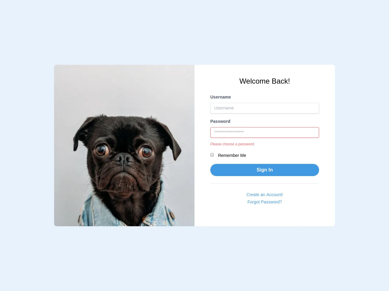
The preview of SB Admin 2: Login Page ui component.
To create a Login Page with SB Admin 2 ui component, we will use Tailwind CSS classes to style the form, input fields, and button. The result will be a clean and modern Login Page with a responsive design.
Free download of the SB Admin 2: Login Page's source code
The source code of SB Admin 2: Login Page ui component.
To create a Login Page with SB Admin 2 ui component, we will use HTML and Tailwind CSS classes. The source code will include the form, input fields, and button with the corresponding Tailwind CSS classes.
<body class="font-mono bg-gray-400">
		<!-- Container -->
		<div class="container mx-auto">
			<div class="flex justify-center px-6 my-12">
				<!-- Row -->
				<div class="w-full xl:w-3/4 lg:w-11/12 flex">
					<!-- Col -->
					<div
						class="w-full h-auto bg-gray-400 hidden lg:block lg:w-1/2 bg-cover rounded-l-lg"
						style="background-image: url('https://source.unsplash.com/K4mSJ7kc0As/600x800')"
					></div>
					<!-- Col -->
					<div class="w-full lg:w-1/2 bg-white p-5 rounded-lg lg:rounded-l-none">
						<h3 class="pt-4 text-2xl text-center">Welcome Back!</h3>
						<form class="px-8 pt-6 pb-8 mb-4 bg-white rounded">
							<div class="mb-4">
								<label class="block mb-2 text-sm font-bold text-gray-700" for="username">
									Username
								</label>
								<input
									class="w-full px-3 py-2 text-sm leading-tight text-gray-700 border rounded shadow appearance-none focus:outline-none focus:shadow-outline"
									id="username"
									type="text"
									placeholder="Username"
								/>
							</div>
							<div class="mb-4">
								<label class="block mb-2 text-sm font-bold text-gray-700" for="password">
									Password
								</label>
								<input
									class="w-full px-3 py-2 mb-3 text-sm leading-tight text-gray-700 border border-red-500 rounded shadow appearance-none focus:outline-none focus:shadow-outline"
									id="password"
									type="password"
									placeholder="******************"
								/>
								<p class="text-xs italic text-red-500">Please choose a password.</p>
							</div>
							<div class="mb-4">
								<input class="mr-2 leading-tight" type="checkbox" id="checkbox_id" />
								<label class="text-sm" for="checkbox_id">
									Remember Me
								</label>
							</div>
							<div class="mb-6 text-center">
								<button
									class="w-full px-4 py-2 font-bold text-white bg-blue-500 rounded-full hover:bg-blue-700 focus:outline-none focus:shadow-outline"
									type="button"
								>
									Sign In
								</button>
							</div>
							<hr class="mb-6 border-t" />
							<div class="text-center">
								<a
									class="inline-block text-sm text-blue-500 align-baseline hover:text-blue-800"
									href="./register.html"
								>
									Create an Account!
								</a>
							</div>
							<div class="text-center">
								<a
									class="inline-block text-sm text-blue-500 align-baseline hover:text-blue-800"
									href="./forgot-password.html"
								>
									Forgot Password?
								</a>
							</div>
						</form>
					</div>
				</div>
			</div>
		</div>
	</body>
How to create a SB Admin 2: Login Page with Tailwind CSS?
To create a SB Admin 2: Login Page with Tailwind CSS, follow these steps:
Step 1: Set up the environment
Create a new HTML file and include the Tailwind CSS stylesheet in the head section.
<!DOCTYPE html>
<html>
  <head>
    <link rel="stylesheet" href="https://cdn.jsdelivr.net/npm/[email protected]/dist/tailwind.min.css">
  </head>
  <body>
  </body>
</html>
Step 2: Create the form
Create a form element with the corresponding Tailwind CSS classes for the width, margin, and padding.
<form class="w-full max-w-sm mx-auto mt-16 p-4 bg-white rounded-lg shadow-md">
</form>
Step 3: Add the input fields
Add the input fields for username and password with the corresponding Tailwind CSS classes for the width, margin, padding, and border.
<form class="w-full max-w-sm mx-auto mt-16 p-4 bg-white rounded-lg shadow-md">
  <div class="mb-4">
    <label class="block text-gray-700 font-bold mb-2" for="username">
      Username
    </label>
    <input class="appearance-none border rounded w-full py-2 px-3 text-gray-700 leading-tight focus:outline-none focus:shadow-outline" id="username" type="text" placeholder="Username">
  </div>
  <div class="mb-6">
    <label class="block text-gray-700 font-bold mb-2" for="password">
      Password
    </label>
    <input class="appearance-none border rounded w-full py-2 px-3 text-gray-700 leading-tight focus:outline-none focus:shadow-outline" id="password" type="password" placeholder="Password">
  </div>
</form>
Step 4: Add the checkbox
Add the checkbox for remembering the user with the corresponding Tailwind CSS classes for the width, margin, and padding.
<form class="w-full max-w-sm mx-auto mt-16 p-4 bg-white rounded-lg shadow-md">
  <div class="mb-4">
    <label class="block text-gray-700 font-bold mb-2" for="username">
      Username
    </label>
    <input class="appearance-none border rounded w-full py-2 px-3 text-gray-700 leading-tight focus:outline-none focus:shadow-outline" id="username" type="text" placeholder="Username">
  </div>
  <div class="mb-6">
    <label class="block text-gray-700 font-bold mb-2" for="password">
      Password
    </label>
    <input class="appearance-none border rounded w-full py-2 px-3 text-gray-700 leading-tight focus:outline-none focus:shadow-outline" id="password" type="password" placeholder="Password">
  </div>
  <div class="mb-6">
    <label class="inline-flex items-center">
      <input type="checkbox" class="form-checkbox h-4 w-4 text-indigo-600 transition duration-150 ease-in-out">
      <span class="ml-2 text-gray-700">Remember me</span>
    </label>
  </div>
</form>
Step 5: Add the button
Add the button to submit the form with the corresponding Tailwind CSS classes for the width, margin, padding, and background color.
<form class="w-full max-w-sm mx-auto mt-16 p-4 bg-white rounded-lg shadow-md">
  <div class="mb-4">
    <label class="block text-gray-700 font-bold mb-2" for="username">
      Username
    </label>
    <input class="appearance-none border rounded w-full py-2 px-3 text-gray-700 leading-tight focus:outline-none focus:shadow-outline" id="username" type="text" placeholder="Username">
  </div>
  <div class="mb-6">
    <label class="block text-gray-700 font-bold mb-2" for="password">
      Password
    </label>
    <input class="appearance-none border rounded w-full py-2 px-3 text-gray-700 leading-tight focus:outline-none focus:shadow-outline" id="password" type="password" placeholder="Password">
  </div>
  <div class="mb-6">
    <label class="inline-flex items-center">
      <input type="checkbox" class="form-checkbox h-4 w-4 text-indigo-600 transition duration-150 ease-in-out">
      <span class="ml-2 text-gray-700">Remember me</span>
    </label>
  </div>
  <div class="flex items-center justify-center">
    <button class="bg-blue-500 hover:bg-blue-700 text-white font-bold py-2 px-4 rounded focus:outline-none focus:shadow-outline" type="button">
      Sign In
    </button>
  </div>
</form>
Step 6: Customize the design
Customize the design by adding or modifying the existing Tailwind CSS classes. For example, you can change the background color of the form or the font size of the input fields.
Conclusion
In this article, we have explored how to create a Login Page using Tailwind CSS and the SB Admin 2 ui component. We have seen how Tailwind CSS provides a set of pre-defined classes that make it easy to create complex designs quickly and easily. By following the steps outlined in this article, you can create a clean and modern Login Page with a responsive design in just 60 minutes.