- Published on
What You Need To Make A Sample Profile Page With Tailwind CSS
- What is Tailwind CSS?
- The description of Sample Profile Page ui component
- Why use Tailwind CSS to create a Sample Profile Page ui component?
- The preview of Sample Profile Page ui component
- The source code of Sample Profile Page ui component
- How to create a Sample Profile Page with Tailwind CSS?
- Conclusion
What is Tailwind CSS?
Tailwind CSS is a utility-first CSS framework that provides a set of pre-defined CSS classes that can be used to style HTML elements. It is designed to make it easier to create custom and responsive user interfaces.
Tailwind CSS is a popular choice for web developers because it allows them to create complex layouts and designs without having to write custom CSS code from scratch. With Tailwind CSS, developers can focus on the functionality of their application rather than the appearance.
The description of Sample Profile Page ui component
A Sample Profile Page is a user interface component that provides information about a user. It typically includes a profile picture, a brief bio, and links to the user's social media accounts.
The Sample Profile Page ui component is an essential part of any social media or networking application. It provides users with an easy way to share information about themselves and connect with others.
Why use Tailwind CSS to create a Sample Profile Page ui component?
Tailwind CSS is an excellent choice for creating a Sample Profile Page ui component because it provides a set of pre-defined CSS classes that can be used to style the page quickly. These classes can be used to create a responsive design that looks great on any device.
Tailwind CSS also makes it easy to customize the design of the Sample Profile Page ui component. Developers can easily modify the CSS classes to create a unique design that matches the branding of their application.
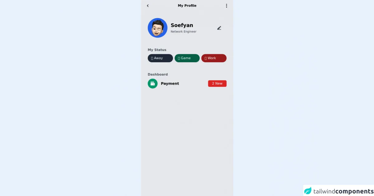
The preview of Sample Profile Page ui component
To create a Sample Profile Page ui component with Tailwind CSS, we will use a combination of HTML and CSS classes. The result will be a clean and modern design that is easy to read and navigate.
Free download of the Sample Profile Page's source code
The source code of Sample Profile Page ui component
The source code for the Sample Profile Page ui component is relatively simple. We will use HTML to structure the page and Tailwind CSS classes to style it.
<div class="min-h-screen flex flex-col max-w-md mx-auto bg-gray-200 opacity-100 font-poppins px-4 bg-no-repeat bg-cover bg-center">
  <div class="flex justify-between px-1 pt-4 items-center">
    <div>
      <svg xmlns="http://www.w3.org/2000/svg" viewBox="0 0 24 24" width="24" height="24"><path fill="none" d="M0 0h24v24H0z"/><path d="M10.828 12l4.95 4.95-1.414 1.414L8 12l6.364-6.364 1.414 1.414z"/></svg>
    </div>
    <div>
      <p class="font-semibold">My Profile</p>
    </div>
    <div>
      <svg xmlns="http://www.w3.org/2000/svg" viewBox="0 0 24 24" width="24" height="24"><path fill="none" d="M0 0h24v24H0z"/><path d="M12 3c-1.1 0-2 .9-2 2s.9 2 2 2 2-.9 2-2-.9-2-2-2zm0 14c-1.1 0-2 .9-2 2s.9 2 2 2 2-.9 2-2-.9-2-2-2zm0-7c-1.1 0-2 .9-2 2s.9 2 2 2 2-.9 2-2-.9-2-2-2z"/></svg>
    </div>
  </div>
  <div class="flex items-center px-4 pt-12 justify-between">
    <div class="w-24 h-24 bg-blue-600 flex items-center rounded-full">
      <img class="h-20 w-20 mx-auto" src="https://lnmlpexiwaspywjbwwvd.supabase.in/storage/v1/object/sign/assets/boy.png?token=eyJhbGciOiJIUzI1NiIsInR5cCI6IkpXVCJ9.eyJ1cmwiOiJhc3NldHMvYm95LnBuZyIsImlhdCI6MTYzMzUzMzk2NywiZXhwIjoxOTQ4ODkzOTY3fQ.HL6DqbdJMCZI6dqEN-ZQAu5EwtblW7r8YNuud4_kHV8">
    </div>
    <div class="w-9/12 flex items-center">
      <div class="w-10/12 flex flex-col leading-none pl-4">
        <p class="text-2xl font-bold">Soefyan</p>
        <p class="text-sm pt-1 font-light text-gray-700">Network Engineer</p>
      </div>
      <div class="w-2/12">
        <div>
          <svg xmlns="http://www.w3.org/2000/svg" class="text-gray-700" fill="currentColor" viewBox="0 0 24 24" width="24" height="24"><path fill="none" d="M0 0h24v24H0z"/><path d="M9.243 19H21v2H3v-4.243l9.9-9.9 4.242 4.244L9.242 19zm5.07-13.556l2.122-2.122a1 1 0 0 1 1.414 0l2.829 2.829a1 1 0 0 1 0 1.414l-2.122 2.121-4.242-4.242z"/></svg>
        </div>
      </div>
    </div>
  </div>
  <div class="pt-12 px-4 w-full flex flex-col">
    <p class="font-semibold text-gray-600">My Status</p>
    <div class="flex w-full pt-2 space-x-2">
      <button class="bg-gray-800 w-32 rounded-full px-4 py-2 font-ligth text-white flex">🤠 Away</button>
      <button class="bg-green-800 w-32 rounded-full px-4 py-2 font-ligth text-white flex">🎮 Game</button>
      <button class="bg-red-800 w-32 rounded-full px-4 py-2 font-ligth text-white flex">👷 Work</button>
    </div>
  </div>
  <div class="pt-12 px-4 w-full flex flex-col">
    <p class="font-semibold text-gray-600">Dashboard</p>
    <div class="flex flex-col w-full pt-2 space-y-2">
      <div class="flex w-full h-12">
        <div class="w-2/12 h-full">
          <div class="h-12 w-12 bg-green-600 rounded-full flex items-center">
            <svg xmlns="http://www.w3.org/2000/svg" class="mx-auto text-white" fill="currentColor" viewBox="0 0 24 24" width="24" height="24"><path fill="none" d="M0 0h24v24H0z"/><path d="M2 9h19a1 1 0 0 1 1 1v10a1 1 0 0 1-1 1H3a1 1 0 0 1-1-1V9zm1-6h15v4H2V4a1 1 0 0 1 1-1zm12 11v2h3v-2h-3z"/></svg>
          </div>
        </div>
        <div class="w-6/12 h-full flex items-start">
          <p class="my-auto text-lg font-semibold">Payment</p>
        </div>
        <div class="w-4/12 h-full flex justify-end items-end">
          <button class="flex bg-red-600 rounded-md my-auto px-5 py-1 float-right text-white font-medium">2 New</button>
        </div>
      </div>
    </div>
  </div>
</div>
<style>
.bg-gelap{
  background-color: #001E26;
}
.bg-btn{
  background-color: #FF6446;
}
</style>
How to create a Sample Profile Page with Tailwind CSS?
To create a Sample Profile Page with Tailwind CSS, follow these steps:
Create a new HTML file and add the necessary HTML elements, such as a header, main section, and footer.
Add a profile picture to the header section.
Add a brief bio to the main section, including the user's name, job title, and a short description.
Add links to the user's social media accounts, such as Twitter, LinkedIn, and Facebook.
Use Tailwind CSS classes to style the page, including fonts, colors, and layout.
Test the Sample Profile Page on different devices to ensure that it is responsive and looks great on all screen sizes.
Conclusion
In conclusion, creating a Sample Profile Page ui component with Tailwind CSS is a straightforward process that can be completed in just a few steps. By using Tailwind CSS, developers can create a responsive and customizable design that looks great on any device. With its pre-defined CSS classes and easy-to-use syntax, Tailwind CSS is an excellent choice for any web development project.