- Published on
The Ultimate Guide To Help You Create A Sample cards With Tailwind CSS
- What is Tailwind CSS?
- The description of Sample Cards UI component
- Why use Tailwind CSS to create a Sample Cards UI component?
- The preview of Sample Cards UI component
- The source code of Sample Cards UI component
- How to create a Sample Cards with Tailwind CSS?
- Conclusion
What is Tailwind CSS?
Tailwind CSS is a utility-first CSS framework that provides pre-defined classes to create custom designs. It is a popular choice among developers because it allows them to create responsive and customizable designs quickly.
The description of Sample Cards UI component
Sample cards are a common UI component used in web development. They are used to display information in a visually appealing way. Sample cards typically consist of an image, a title, and a description.
Why use Tailwind CSS to create a Sample Cards UI component?
Tailwind CSS provides a set of pre-defined classes that can be used to create sample cards quickly and easily. These classes can be customized to match the design of your website or application. Using Tailwind CSS can save you time and effort in creating sample cards from scratch.
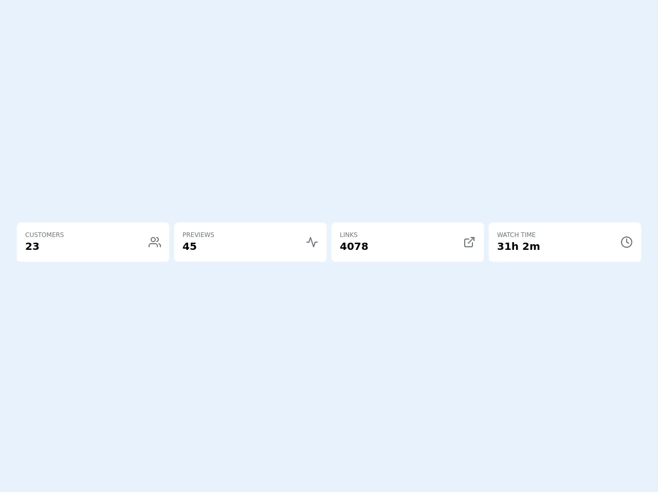
The preview of Sample Cards UI component
Sample cards are a great way to display information in a visually appealing way. They typically consist of an image, a title, and a description.
Free download of the Sample cards's source code
The source code of Sample Cards UI component
To create a sample card using Tailwind CSS, you can use the following code as a starting point:
<div class="h-screen flex items-center">
    <div class="max-w-7xl w-full mx-auto py-6 sm:px-6 lg:px-8">
        <div class="flex flex-col lg:flex-row w-full lg:space-x-2 space-y-2 lg:space-y-0 mb-2 lg:mb-4">
            <div class="w-full lg:w-1/4">
                <div class="widget w-full p-4 rounded-lg bg-white border border-gray-100 dark:bg-gray-900 dark:border-gray-800">
                    <div class="flex flex-row items-center justify-between">
                        <div class="flex flex-col">
                            <div class="text-xs uppercase font-light text-gray-500">
                                Customers
                            </div>
                            <div class="text-xl font-bold">
                                23
                            </div>
                        </div>
                        <svg class="stroke-current text-gray-500" fill="none" height="24" stroke="currentColor" stroke-linecap="round" stroke-linejoin="round" stroke-width="2" viewbox="0 0 24 24" width="24" xmlns="http://www.w3.org/2000/svg">
                            <path d="M17 21v-2a4 4 0 0 0-4-4H5a4 4 0 0 0-4 4v2">
                            </path>
                            <circle cx="9" cy="7" r="4">
                            </circle>
                            <path d="M23 21v-2a4 4 0 0 0-3-3.87">
                            </path>
                            <path d="M16 3.13a4 4 0 0 1 0 7.75">
                            </path>
                        </svg>
                    </div>
                </div>
            </div>
            <div class="w-full lg:w-1/4">
                <div class="widget w-full p-4 rounded-lg bg-white border border-gray-100 dark:bg-gray-900 dark:border-gray-800">
                    <div class="flex flex-row items-center justify-between">
                        <div class="flex flex-col">
                            <div class="text-xs uppercase font-light text-gray-500">
                                PREVIEWS
                            </div>
                            <div class="text-xl font-bold">
                                45
                            </div>
                        </div>
                        <svg class="stroke-current text-gray-500" fill="none" height="24" stroke="currentColor" stroke-linecap="round" stroke-linejoin="round" stroke-width="2" viewbox="0 0 24 24" width="24" xmlns="http://www.w3.org/2000/svg">
                            <polyline points="22 12 18 12 15 21 9 3 6 12 2 12">
                            </polyline>
                        </svg>
                    </div>
                </div>
            </div>
            <div class="w-full lg:w-1/4">
                <div class="widget w-full p-4 rounded-lg bg-white border border-gray-100 dark:bg-gray-900 dark:border-gray-800">
                    <div class="flex flex-row items-center justify-between">
                        <div class="flex flex-col">
                            <div class="text-xs uppercase font-light text-gray-500">
                                Links
                            </div>
                            <div class="text-xl font-bold">
                                4078
                            </div>
                        </div>
                        <svg class="stroke-current text-gray-500" fill="none" height="24" stroke="currentColor" stroke-linecap="round" stroke-linejoin="round" stroke-width="2" viewbox="0 0 24 24" width="24" xmlns="http://www.w3.org/2000/svg">
                            <path d="M18 13v6a2 2 0 0 1-2 2H5a2 2 0 0 1-2-2V8a2 2 0 0 1 2-2h6">
                            </path>
                            <polyline points="15 3 21 3 21 9">
                            </polyline>
                            <line x1="10" x2="21" y1="14" y2="3">
                            </line>
                        </svg>
                    </div>
                </div>
            </div>
            <div class="w-full lg:w-1/4">
                <div class="widget w-full p-4 rounded-lg bg-white border border-gray-100 dark:bg-gray-900 dark:border-gray-800">
                    <div class="flex flex-row items-center justify-between">
                        <div class="flex flex-col">
                            <div class="text-xs uppercase font-light text-gray-500">
                                Watch Time
                            </div>
                            <div class="text-xl font-bold">
                                31h 2m
                            </div>
                        </div>
                        <svg class="stroke-current text-gray-500" fill="none" height="24" stroke="currentColor" stroke-linecap="round" stroke-linejoin="round" stroke-width="2" viewbox="0 0 24 24" width="24" xmlns="http://www.w3.org/2000/svg">
                            <circle cx="12" cy="12" r="10">
                            </circle>
                            <polyline points="12 6 12 12 16 14">
                            </polyline>
                        </svg>
                    </div>
                </div>
            </div>
        </div>
    </div>
</div>
How to create a Sample Cards with Tailwind CSS?
To create a sample card with Tailwind CSS, follow these steps:
- Create a container for the sample card. You can use the
divelement for this.
<div class="bg-white rounded-lg shadow-lg">
  <!-- Sample Card Content -->
</div>
- Add an image to the sample card. You can use the
imgelement for this.
<div class="bg-white rounded-lg shadow-lg">
  <img src="image.jpg" alt="Sample Image" class="w-full h-48 object-cover object-center rounded-t-lg">
  <!-- Sample Card Content -->
</div>
- Add a title to the sample card. You can use the
h2element for this.
<div class="bg-white rounded-lg shadow-lg">
  <img src="image.jpg" alt="Sample Image" class="w-full h-48 object-cover object-center rounded-t-lg">
  <h2 class="text-lg font-semibold text-gray-900 px-4 py-2">Sample Title</h2>
  <!-- Sample Card Content -->
</div>
- Add a description to the sample card. You can use the
pelement for this.
<div class="bg-white rounded-lg shadow-lg">
  <img src="image.jpg" alt="Sample Image" class="w-full h-48 object-cover object-center rounded-t-lg">
  <h2 class="text-lg font-semibold text-gray-900 px-4 py-2">Sample Title</h2>
  <p class="text-gray-700 px-4 py-2">Sample Description</p>
</div>
- Customize the sample card using Tailwind CSS classes. You can use classes like
bg-gray-100,text-gray-700,px-4, andpy-2to customize the background color, text color, padding, and margin of the sample card.
<div class="bg-white rounded-lg shadow-lg">
  <img src="image.jpg" alt="Sample Image" class="w-full h-48 object-cover object-center rounded-t-lg">
  <h2 class="text-lg font-semibold text-gray-900 px-4 py-2">Sample Title</h2>
  <p class="text-gray-700 px-4 py-2">Sample Description</p>
  <div class="bg-gray-100 px-4 py-2">
    <a href="#" class="text-indigo-500 font-semibold">Read More</a>
  </div>
</div>
- Add a link to the sample card. You can use the
aelement for this.
<div class="bg-white rounded-lg shadow-lg">
  <img src="image.jpg" alt="Sample Image" class="w-full h-48 object-cover object-center rounded-t-lg">
  <h2 class="text-lg font-semibold text-gray-900 px-4 py-2">Sample Title</h2>
  <p class="text-gray-700 px-4 py-2">Sample Description</p>
  <div class="bg-gray-100 px-4 py-2">
    <a href="#" class="text-indigo-500 font-semibold">Read More</a>
  </div>
</div>
- Customize the link using Tailwind CSS classes. You can use classes like
text-indigo-500andfont-semiboldto customize the color and font weight of the link.
<div class="bg-white rounded-lg shadow-lg">
  <img src="image.jpg" alt="Sample Image" class="w-full h-48 object-cover object-center rounded-t-lg">
  <h2 class="text-lg font-semibold text-gray-900 px-4 py-2">Sample Title</h2>
  <p class="text-gray-700 px-4 py-2">Sample Description</p>
  <div class="bg-gray-100 px-4 py-2">
    <a href="#" class="text-indigo-500 font-semibold">Read More</a>
  </div>
</div>
- Repeat the above steps to create multiple sample cards.
Conclusion
Creating sample cards with Tailwind CSS is a quick and easy way to display information in a visually appealing way. By using pre-defined classes, you can customize the design of your sample cards to match the style of your website or application. With the steps outlined in this guide, you can create sample cards with ease.