- Published on
6 Ideas To Help You Create A Responsive Vertical Timeline With Tailwind CSS Like A Pro
- What is Tailwind CSS?
- The description of Responsive Vertical Timeline ui component
- Why use Tailwind CSS to create a Responsive Vertical Timeline ui component?
- The preview of Responsive Vertical Timeline ui component
- The source code of Responsive Vertical Timeline ui component
- How to create a Responsive Vertical Timeline with Tailwind CSS?
- 1. Use flexbox to align the dots
- 2. Use grid to layout the event details
- 3. Use Tailwind CSS classes to style the dots and timeline
- 4. Use media queries to make the timeline responsive
- 5. Use Tailwind CSS utilities to style the event details
- 6. Use custom CSS to add additional styling
- Conclusion
What is Tailwind CSS?
Tailwind CSS is a utility-first CSS framework that allows you to quickly build custom user interfaces. It provides a set of pre-defined classes that you can use to style your HTML elements. With Tailwind CSS, you can create responsive designs that work well on all devices.
The description of Responsive Vertical Timeline ui component
A responsive vertical timeline is a UI component that displays events or milestones in chronological order. It is a great way to showcase your company's history, product roadmap, or personal achievements. The timeline is vertical, which means that the events are displayed in a column from top to bottom. Each event is represented by a dot or a circle, and the timeline connects the dots to show the order of the events.
Why use Tailwind CSS to create a Responsive Vertical Timeline ui component?
Tailwind CSS is an excellent choice for creating a responsive vertical timeline UI component. It provides a set of pre-defined classes that you can use to style your timeline quickly. Tailwind CSS is also mobile-first, which means that your timeline will look great on all devices, including smartphones and tablets. Additionally, Tailwind CSS is easy to use and customize, so you can create a timeline that matches your brand's style.
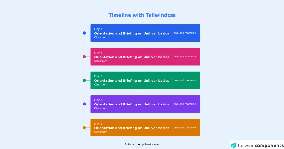
The preview of Responsive Vertical Timeline ui component
To create a responsive vertical timeline with Tailwind CSS, you can use a combination of flexbox and grid. The timeline is divided into two columns: the left column contains the dots, and the right column contains the event details. Here is a preview of what the timeline might look like:
Free download of the Responsive Vertical Timeline's source code
The source code of Responsive Vertical Timeline ui component
To create a responsive vertical timeline with Tailwind CSS, you can use the following HTML and CSS code:
<div class="w-10/12 md:w-7/12 lg:6/12 mx-auto relative py-20">
      <h1 class="text-3xl text-center font-bold text-blue-500">Timeline with Tailwindcss</h1>
      <div class="border-l-2 mt-10">
        <!-- Card 1 -->
        <div class="transform transition cursor-pointer hover:-translate-y-2 ml-10 relative flex items-center px-6 py-4 bg-blue-600 text-white rounded mb-10 flex-col md:flex-row space-y-4 md:space-y-0">
          <!-- Dot Follwing the Left Vertical Line -->
          <div class="w-5 h-5 bg-blue-600 absolute -left-10 transform -translate-x-2/4 rounded-full z-10 mt-2 md:mt-0"></div>

          <!-- Line that connecting the box with the vertical line -->
          <div class="w-10 h-1 bg-blue-300 absolute -left-10 z-0"></div>

          <!-- Content that showing in the box -->
          <div class="flex-auto">
            <h1 class="text-lg">Day 1</h1>
            <h1 class="text-xl font-bold">Orientation and Briefing on Uniliver basics</h1>
            <h3>Classroom</h3>
          </div>
          <a href="#" class="text-center text-white hover:text-gray-300">Download materials</a>
        </div>

        <!-- Card 2 -->
        <div class="transform transition cursor-pointer hover:-translate-y-2 ml-10 relative flex items-center px-6 py-4 bg-pink-600 text-white rounded mb-10 flex-col md:flex-row space-y-4 md:space-y-0">
          <!-- Dot Follwing the Left Vertical Line -->
          <div class="w-5 h-5 bg-pink-600 absolute -left-10 transform -translate-x-2/4 rounded-full z-10 mt-2 md:mt-0"></div>

          <!-- Line that connecting the box with the vertical line -->
          <div class="w-10 h-1 bg-pink-300 absolute -left-10 z-0"></div>

          <!-- Content that showing in the box -->
          <div class="flex-auto">
            <h1 class="text-lg">Day 1</h1>
            <h1 class="text-xl font-bold">Orientation and Briefing on Uniliver basics</h1>
            <h3>Classroom</h3>
          </div>
          <a href="#" class="text-center text-white hover:text-gray-300">Download materials</a>
        </div>

        <!-- Card 3 -->
        <div class="transform transition cursor-pointer hover:-translate-y-2 ml-10 relative flex items-center px-6 py-4 bg-green-600 text-white rounded mb-10 flex-col md:flex-row space-y-4 md:space-y-0">
          <!-- Dot Follwing the Left Vertical Line -->
          <div class="w-5 h-5 bg-green-600 absolute -left-10 transform -translate-x-2/4 rounded-full z-10 mt-2 md:mt-0"></div>

          <!-- Line that connecting the box with the vertical line -->
          <div class="w-10 h-1 bg-green-300 absolute -left-10 z-0"></div>

          <!-- Content that showing in the box -->
          <div class="flex-auto">
            <h1 class="text-lg">Day 1</h1>
            <h1 class="text-xl font-bold">Orientation and Briefing on Uniliver basics</h1>
            <h3>Classroom</h3>
          </div>
          <a href="#" class="text-center text-white hover:text-gray-300">Download materials</a>
        </div>

        <!-- Card 4 -->
        <div class="transform transition cursor-pointer hover:-translate-y-2 ml-10 relative flex items-center px-6 py-4 bg-purple-600 text-white rounded mb-10 flex-col md:flex-row space-y-4 md:space-y-0">
          <!-- Dot Follwing the Left Vertical Line -->
          <div class="w-5 h-5 bg-purple-600 absolute -left-10 transform -translate-x-2/4 rounded-full z-10 mt-2 md:mt-0"></div>

          <!-- Line that connecting the box with the vertical line -->
          <div class="w-10 h-1 bg-purple-300 absolute -left-10 z-0"></div>

          <!-- Content that showing in the box -->
          <div class="flex-auto">
            <h1 class="text-lg">Day 1</h1>
            <h1 class="text-xl font-bold">Orientation and Briefing on Uniliver basics</h1>
            <h3>Classroom</h3>
          </div>
          <a href="#" class="text-center text-white hover:text-gray-300">Download materials</a>
        </div>

        <!-- Card 5 -->
        <div class="transform transition cursor-pointer hover:-translate-y-2 ml-10 relative flex items-center px-6 py-4 bg-yellow-600 text-white rounded mb-10 flex-col md:flex-row">
          <!-- Dot Follwing the Left Vertical Line -->
          <div class="w-5 h-5 bg-yellow-600 absolute -left-10 transform -translate-x-2/4 rounded-full z-10 -mt-2 md:mt-0"></div>

          <!-- Line that connecting the box with the vertical line -->
          <div class="w-10 h-1 bg-yellow-300 absolute -left-10 z-0"></div>

          <!-- Content that showing in the box -->
          <div class="flex-auto">
            <h1 class="text-lg">Day 1</h1>
            <h1 class="text-xl font-bold">Orientation and Briefing on Uniliver basics</h1>
            <h3>Classroom</h3>
          </div>
          <a href="#" class="text-center text-white hover:text-gray-300">Download materials</a>
        </div>
      </div>
    <section class="mt-4 text-center">Build with ❤️ by <a href="https://github.com/saadh393" target="_blank">Saad Hasan </a></section>
    </div>
How to create a Responsive Vertical Timeline with Tailwind CSS?
Here are six ideas to help you create a responsive vertical timeline with Tailwind CSS like a pro:
1. Use flexbox to align the dots
To align the dots vertically, you can use flexbox. Set the display property of the container to flex, and the flex-direction property to column. This will stack the dots on top of each other. Then, set the justify-content property to center to align the dots horizontally.
2. Use grid to layout the event details
To layout the event details, you can use grid. Set the display property of the container to grid, and the grid-template-columns property to define the width of the columns. You can use the repeat function to create multiple columns of the same width.
3. Use Tailwind CSS classes to style the dots and timeline
Tailwind CSS provides a set of pre-defined classes that you can use to style the dots and timeline. For example, you can use the bg-gray-300 class to set the background color of the dots to gray, and the border-l-2 class to add a 2-pixel border to the left of the timeline.
4. Use media queries to make the timeline responsive
To make the timeline responsive, you can use media queries to adjust the layout and styling of the timeline based on the screen size. For example, you can use the sm:grid-cols-2 class to change the number of columns in the grid when the screen size is small.
5. Use Tailwind CSS utilities to style the event details
Tailwind CSS provides a set of utilities that you can use to style the event details. For example, you can use the text-xl class to set the font size of the event title to extra-large, and the text-gray-500 class to set the text color to gray.
6. Use custom CSS to add additional styling
If you need to add additional styling to the timeline, you can use custom CSS. Tailwind CSS makes it easy to add custom CSS by providing a set of utilities that you can use to define your own styles. For example, you can use the @apply directive to apply a set of styles to an element.
Conclusion
Creating a responsive vertical timeline with Tailwind CSS is easy and fun. With the right combination of flexbox, grid, and Tailwind CSS utilities, you can create a timeline that looks great on all devices. Use the six ideas in this article to help you create a timeline that showcases your company's history, product roadmap, or personal achievements.