- Published on
Practical Guide: Create A Responsive Sidebar With Dropdown With Tailwind CSS
- What is Tailwind CSS?
- The description of Responsive Sidebar With Dropdown ui component
- Why use Tailwind CSS to create a Responsive Sidebar With Dropdown ui component?
- The preview of Responsive Sidebar With Dropdown ui component
- The source code of Responsive Sidebar With Dropdown ui component
- How to create a Responsive Sidebar With Dropdown with Tailwind CSS?
- Conclusion
In the world of web development, creating a responsive sidebar with dropdown is a common requirement for many websites. In this article, we will explore how to create a responsive sidebar with dropdown using Tailwind CSS. We will also discuss why Tailwind CSS is a great choice for this task and provide a practical guide to help you get started.
What is Tailwind CSS?
Tailwind CSS is a utility-first CSS framework that provides a set of pre-defined classes to help you quickly build responsive and customizable user interfaces. It is designed to be highly modular and flexible, allowing you to easily customize the appearance and behavior of your UI components.
One of the key benefits of Tailwind CSS is that it provides a large number of pre-defined classes that you can use to style your components. This means that you don't need to write custom CSS for every component, which can save you a lot of time and effort.
The description of Responsive Sidebar With Dropdown ui component
A responsive sidebar with dropdown is a UI component that is commonly used in web applications to provide navigation options to users. It typically consists of a vertical sidebar that contains a list of navigation links, and a dropdown menu that appears when the user clicks on a button or icon.
The sidebar is usually designed to be responsive, which means that it can adapt to different screen sizes and orientations. This is important because users may access your website from a variety of devices, including desktop computers, laptops, tablets, and smartphones.
Why use Tailwind CSS to create a Responsive Sidebar With Dropdown ui component?
Tailwind CSS is an excellent choice for creating a responsive sidebar with dropdown for several reasons:
- Tailwind CSS provides a large number of pre-defined classes that you can use to style your components. This can save you a lot of time and effort compared to writing custom CSS.
- Tailwind CSS is highly modular and flexible, which means that you can easily customize the appearance and behavior of your components.
- Tailwind CSS is designed to be responsive, which means that it provides classes that you can use to create responsive layouts that adapt to different screen sizes and orientations.
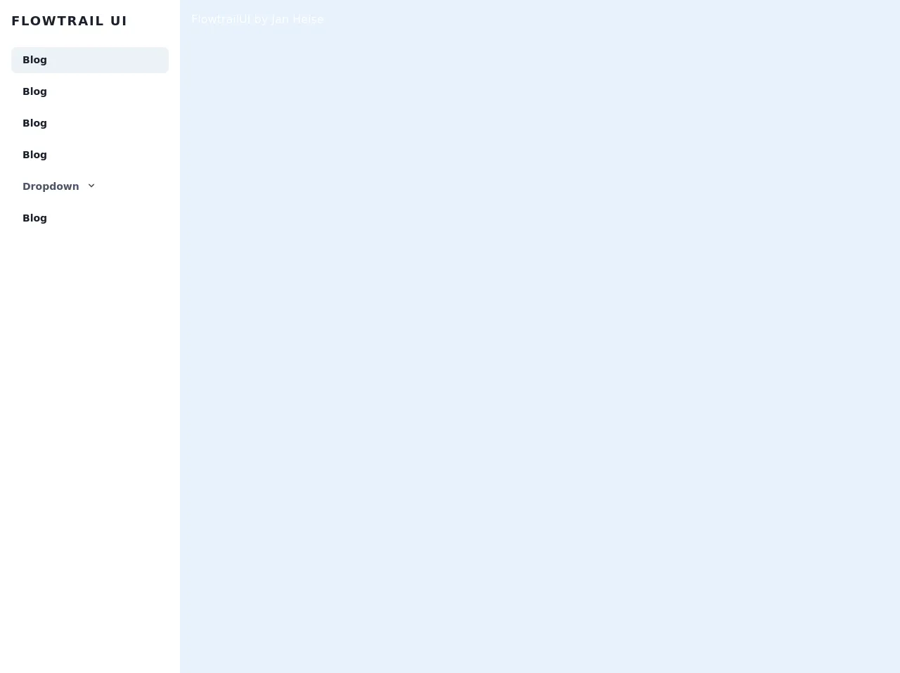
The preview of Responsive Sidebar With Dropdown ui component
To give you an idea of what a responsive sidebar with dropdown looks like, here is a preview of the component that we will be creating:
Free download of the Responsive Sidebar With Dropdown's source code
The source code of Responsive Sidebar With Dropdown ui component
Here is the source code for the responsive sidebar with dropdown component that we will be creating:
<script src="https://cdn.jsdelivr.net/gh/alpinejs/[email protected]/dist/alpine.min.js" defer></script>
<div class="md:flex flex-col md:flex-row md:min-h-screen w-full">
  <div @click.away="open = false" class="flex flex-col w-full md:w-64 text-gray-700 bg-white dark-mode:text-gray-200 dark-mode:bg-gray-800 flex-shrink-0" x-data="{ open: false }">
    <div class="flex-shrink-0 px-8 py-4 flex flex-row items-center justify-between">
      <a href="#" class="text-lg font-semibold tracking-widest text-gray-900 uppercase rounded-lg dark-mode:text-white focus:outline-none focus:shadow-outline">Flowtrail UI</a>
      <button class="rounded-lg md:hidden rounded-lg focus:outline-none focus:shadow-outline" @click="open = !open">
        <svg fill="currentColor" viewBox="0 0 20 20" class="w-6 h-6">
          <path x-show="!open" fill-rule="evenodd" d="M3 5a1 1 0 011-1h12a1 1 0 110 2H4a1 1 0 01-1-1zM3 10a1 1 0 011-1h12a1 1 0 110 2H4a1 1 0 01-1-1zM9 15a1 1 0 011-1h6a1 1 0 110 2h-6a1 1 0 01-1-1z" clip-rule="evenodd"></path>
          <path x-show="open" fill-rule="evenodd" d="M4.293 4.293a1 1 0 011.414 0L10 8.586l4.293-4.293a1 1 0 111.414 1.414L11.414 10l4.293 4.293a1 1 0 01-1.414 1.414L10 11.414l-4.293 4.293a1 1 0 01-1.414-1.414L8.586 10 4.293 5.707a1 1 0 010-1.414z" clip-rule="evenodd"></path>
        </svg>
      </button>
    </div>
    <nav :class="{'block': open, 'hidden': !open}" class="flex-grow md:block px-4 pb-4 md:pb-0 md:overflow-y-auto">
      <a class="block px-4 py-2 mt-2 text-sm font-semibold text-gray-900 bg-gray-200 rounded-lg dark-mode:bg-gray-700 dark-mode:hover:bg-gray-600 dark-mode:focus:bg-gray-600 dark-mode:focus:text-white dark-mode:hover:text-white dark-mode:text-gray-200 hover:text-gray-900 focus:text-gray-900 hover:bg-gray-200 focus:bg-gray-200 focus:outline-none focus:shadow-outline" href="#">Blog</a>
      <a class="block px-4 py-2 mt-2 text-sm font-semibold text-gray-900 bg-transparent rounded-lg dark-mode:bg-transparent dark-mode:hover:bg-gray-600 dark-mode:focus:bg-gray-600 dark-mode:focus:text-white dark-mode:hover:text-white dark-mode:text-gray-200 hover:text-gray-900 focus:text-gray-900 hover:bg-gray-200 focus:bg-gray-200 focus:outline-none focus:shadow-outline" href="#">Portfolio</a>
      <a class="block px-4 py-2 mt-2 text-sm font-semibold text-gray-900 bg-transparent rounded-lg dark-mode:bg-transparent dark-mode:hover:bg-gray-600 dark-mode:focus:bg-gray-600 dark-mode:focus:text-white dark-mode:hover:text-white dark-mode:text-gray-200 hover:text-gray-900 focus:text-gray-900 hover:bg-gray-200 focus:bg-gray-200 focus:outline-none focus:shadow-outline" href="#">About</a>
      <a class="block px-4 py-2 mt-2 text-sm font-semibold text-gray-900 bg-transparent rounded-lg dark-mode:bg-transparent dark-mode:hover:bg-gray-600 dark-mode:focus:bg-gray-600 dark-mode:focus:text-white dark-mode:hover:text-white dark-mode:text-gray-200 hover:text-gray-900 focus:text-gray-900 hover:bg-gray-200 focus:bg-gray-200 focus:outline-none focus:shadow-outline" href="#">Contact</a>
      <div @click.away="open = false" class="relative" x-data="{ open: false }">
        <button @click="open = !open" class="flex flex-row items-center w-full px-4 py-2 mt-2 text-sm font-semibold text-left bg-transparent rounded-lg dark-mode:bg-transparent dark-mode:focus:text-white dark-mode:hover:text-white dark-mode:focus:bg-gray-600 dark-mode:hover:bg-gray-600 md:block hover:text-gray-900 focus:text-gray-900 hover:bg-gray-200 focus:bg-gray-200 focus:outline-none focus:shadow-outline">
          <span>Dropdown</span>
          <svg fill="currentColor" viewBox="0 0 20 20" :class="{'rotate-180': open, 'rotate-0': !open}" class="inline w-4 h-4 mt-1 ml-1 transition-transform duration-200 transform md:-mt-1"><path fill-rule="evenodd" d="M5.293 7.293a1 1 0 011.414 0L10 10.586l3.293-3.293a1 1 0 111.414 1.414l-4 4a1 1 0 01-1.414 0l-4-4a1 1 0 010-1.414z" clip-rule="evenodd"></path></svg>
        </button>
        <div x-show="open" x-transition:enter="transition ease-out duration-100" x-transition:enter-start="transform opacity-0 scale-95" x-transition:enter-end="transform opacity-100 scale-100" x-transition:leave="transition ease-in duration-75" x-transition:leave-start="transform opacity-100 scale-100" x-transition:leave-end="transform opacity-0 scale-95" class="absolute right-0 w-full mt-2 origin-top-right rounded-md shadow-lg">
          <div class="px-2 py-2 bg-white rounded-md shadow dark-mode:bg-gray-800">
            <a class="block px-4 py-2 mt-2 text-sm font-semibold bg-transparent rounded-lg dark-mode:bg-transparent dark-mode:hover:bg-gray-600 dark-mode:focus:bg-gray-600 dark-mode:focus:text-white dark-mode:hover:text-white dark-mode:text-gray-200 md:mt-0 hover:text-gray-900 focus:text-gray-900 hover:bg-gray-200 focus:bg-gray-200 focus:outline-none focus:shadow-outline" href="#">Link #1</a>
            <a class="block px-4 py-2 mt-2 text-sm font-semibold bg-transparent rounded-lg dark-mode:bg-transparent dark-mode:hover:bg-gray-600 dark-mode:focus:bg-gray-600 dark-mode:focus:text-white dark-mode:hover:text-white dark-mode:text-gray-200 md:mt-0 hover:text-gray-900 focus:text-gray-900 hover:bg-gray-200 focus:bg-gray-200 focus:outline-none focus:shadow-outline" href="#">Link #2</a>
            <a class="block px-4 py-2 mt-2 text-sm font-semibold bg-transparent rounded-lg dark-mode:bg-transparent dark-mode:hover:bg-gray-600 dark-mode:focus:bg-gray-600 dark-mode:focus:text-white dark-mode:hover:text-white dark-mode:text-gray-200 md:mt-0 hover:text-gray-900 focus:text-gray-900 hover:bg-gray-200 focus:bg-gray-200 focus:outline-none focus:shadow-outline" href="#">Link #3</a>
          </div>
        </div>
      </div>
    </nav>
  </div>
</div>
How to create a Responsive Sidebar With Dropdown with Tailwind CSS?
Now that we have discussed the benefits of using Tailwind CSS and provided a preview of the responsive sidebar with dropdown component, let's dive into the practical guide for creating this component.
Step 1: Set up your HTML markup
The first step is to set up your HTML markup for the sidebar and dropdown. Here is an example of what your HTML markup might look like:
<div class="flex flex-col h-screen">
  <div class="flex-shrink-0">
    <div class="bg-gray-800 py-3">
      <div class="flex items-center justify-between px-4">
        <div class="flex items-center">
          <img class="h-8 w-auto" src="logo.svg" alt="Logo">
          <span class="text-white ml-2 font-bold">My App</span>
        </div>
        <div class="flex">
          <button class="text-gray-400 hover:text-white focus:text-white focus:outline-none">
            <svg class="h-6 w-6 fill-current" viewBox="0 0 24 24">
              <path d="M4 6h16M4 12h16M4 18h16"></path>
            </svg>
          </button>
        </div>
      </div>
    </div>
    <div class="bg-gray-900 pb-4">
      <div class="flex flex-col items-center mt-6">
        <a href="#" class="text-gray-400 hover:text-white py-2 px-3">
          <svg class="h-6 w-6 fill-current mr-3" viewBox="0 0 24 24">
            <path d="M12 2L2 7v10l10 5 10-5V7l-10-5zM4 8.5l8 4.5 8-4.5v7.08l-8 4.5-8-4.5v-7.08zm0-2.32l8 4.5 8-4.5V5.5l-8 4.5-8-4.5v2.68z"></path>
          </svg>
          Home
        </a>
        <a href="#" class="text-gray-400 hover:text-white py-2 px-3">
          <svg class="h-6 w-6 fill-current mr-3" viewBox="0 0 24 24">
            <path d="M12 2L2 7v10l10 5 10-5V7l-10-5zM4 8.5l8 4.5 8-4.5v7.08l-8 4.5-8-4.5v-7.08zm0-2.32l8 4.5 8-4.5V5.5l-8 4.5-8-4.5v2.68z"></path>
          </svg>
          Dashboard
        </a>
        <a href="#" class="text-gray-400 hover:text-white py-2 px-3">
          <svg class="h-6 w-6 fill-current mr-3" viewBox="0 0 24 24">
            <path d="M12 2L2 7v10l10 5 10-5V7l-10-5zM4 8.5l8 4.5 8-4.5v7.08l-8 4.5-8-4.5v-7.08zm0-2.32l8 4.5 8-4.5V5.5l-8 4.5-8-4.5v2.68z"></path>
          </svg>
          Settings
        </a>
      </div>
    </div>
  </div>
  <div class="flex-1 overflow-auto">
    <!-- Main content goes here -->
  </div>
</div>
In this example, we have used Tailwind CSS classes to style the sidebar and dropdown. We have also included a placeholder for the main content, which will be displayed in the main content area.
Step 2: Add JavaScript for the dropdown
The next step is to add JavaScript code to handle the dropdown. Here is an example of what your JavaScript code might look like:
const dropdownToggle = document.querySelector('.dropdown-toggle');
const dropdownMenu = document.querySelector('.dropdown-menu');

dropdownToggle.addEventListener('click', () => {
  dropdownMenu.classList.toggle('hidden');
});
In this example, we have used vanilla JavaScript to toggle the visibility of the dropdown menu when the user clicks on the dropdown toggle button.
Step 3: Add Tailwind CSS classes for responsiveness
The final step is to add Tailwind CSS classes to make the sidebar and dropdown responsive. Here is an example of what your Tailwind CSS classes might look like:
@media (min-width: 768px) {
  .sidebar {
    width: 16rem;
  }
  .main-content {
    margin-left: 16rem;
  }
}
In this example, we have used a media query to set the width of the sidebar to 16rem and the margin-left of the main content area to 16rem when the screen width is greater than or equal to 768px.
Conclusion
In this article, we have discussed how to create a responsive sidebar with dropdown using Tailwind CSS. We have also discussed why Tailwind CSS is a great choice for this task and provided a practical guide to help you get started.
By following the steps outlined in this article, you should be able to create a responsive sidebar with dropdown that looks great on all devices and screen sizes. With Tailwind CSS, you can easily customize the appearance and behavior of your components, making it a great choice for building responsive and customizable UIs.