- Published on
Imagine You Make A Responsive sidebar With Tailwind CSS Like An Expert. Follow These 6 Steps To Get There
- What is Tailwind CSS?
- The description of Responsive sidebar ui component
- Why use Tailwind CSS to create a Responsive sidebar ui component?
- The preview of Responsive sidebar ui component
- The source code of Responsive sidebar ui component
- How to create a Responsive sidebar with Tailwind CSS?
- Step 1: Create a new HTML file and add the required HTML code for the sidebar.
- Step 2: Add the Tailwind CSS CDN to your HTML file.
- Step 3: Add the required Tailwind CSS classes to your HTML code.
- Step 4: Customize the sidebar by adding your own content and styles.
- Step 5: Test the sidebar on different screen sizes to ensure it is responsive.
- Step 6: Deploy your application and enjoy your new responsive sidebar!
- Conclusion
What is Tailwind CSS?
Tailwind CSS is a utility-first CSS framework that helps you quickly build custom designs without having to write any CSS. It provides a set of pre-defined classes that you can use to style your HTML elements. With Tailwind CSS, you can create responsive designs that work on all screen sizes.
The description of Responsive sidebar ui component
A responsive sidebar is a UI component that is commonly used in web applications. It is a vertical menu that appears on the left or right side of the screen and contains links to different sections of the application. The sidebar is usually hidden on smaller screens and can be toggled by clicking on a button.
Why use Tailwind CSS to create a Responsive sidebar ui component?
Tailwind CSS makes it easy to create a responsive sidebar UI component because it provides pre-defined classes for common layout and styling tasks. You can use these classes to quickly build a sidebar that works on all screen sizes without having to write any CSS.
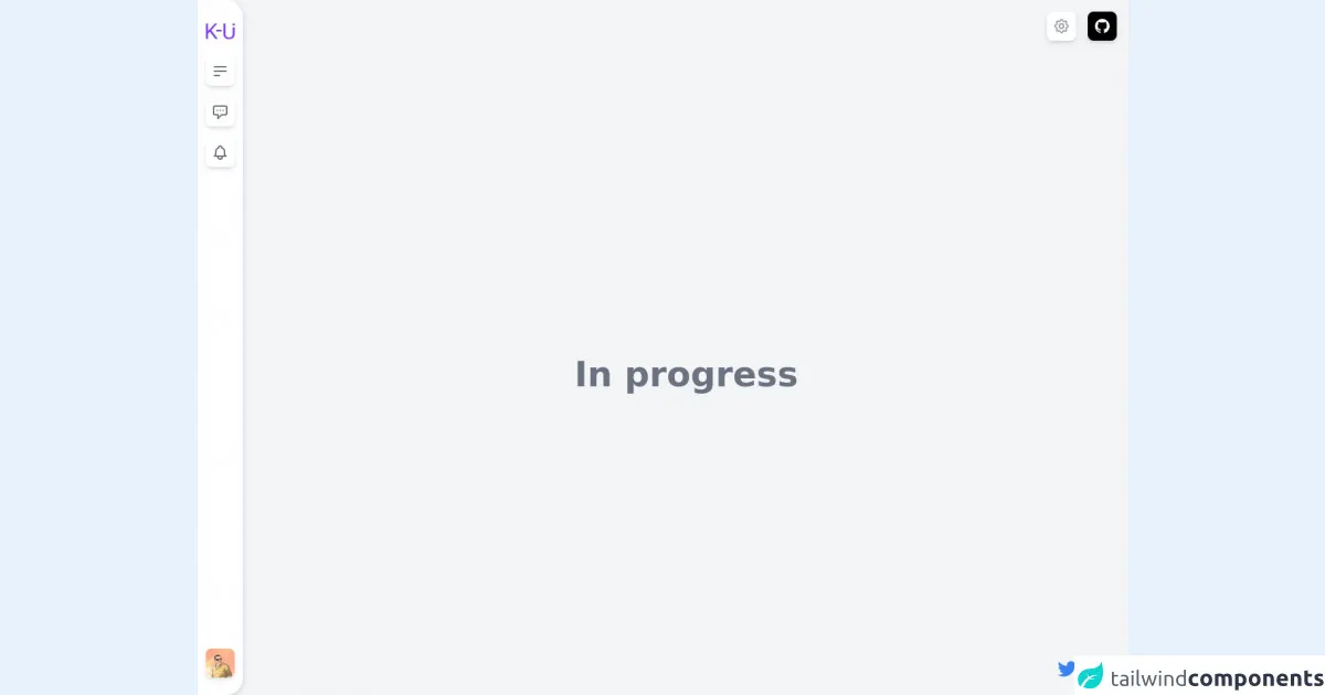
The preview of Responsive sidebar ui component
To create a responsive sidebar with Tailwind CSS, you can use the following classes:
fixed: sets the position of the sidebar to fixedinset-y-0: sets the sidebar to the top and bottom of the screenw-64: sets the width of the sidebar to 64 pixelsbg-gray-800: sets the background color of the sidebar to graytext-white: sets the text color of the sidebar to whiteflex: sets the display property of the sidebar to flexflex-col: sets the flex-direction property of the sidebar to columnh-screen: sets the height of the sidebar to the height of the screenoverflow-y-auto: adds a scrollbar to the sidebar when the content overflows
Free download of the Responsive sidebar's source code
The source code of Responsive sidebar ui component
To create a responsive sidebar with Tailwind CSS, you can use the following HTML and CSS code:
<div class="fixed inset-y-0 w-64 bg-gray-800 text-white flex flex-col h-screen overflow-y-auto">
  <div class="flex-shrink-0 px-4 py-6">
    <h1 class="text-2xl font-bold">My App</h1>
  </div>
  <div class="flex-1 px-4 py-2 overflow-y-auto">
    <nav>
      <ul>
        <li><a href="#" class="block py-2 px-4 text-sm hover:bg-gray-700">Dashboard</a></li>
        <li><a href="#" class="block py-2 px-4 text-sm hover:bg-gray-700">Projects</a></li>
        <li><a href="#" class="block py-2 px-4 text-sm hover:bg-gray-700">Tasks</a></li>
        <li><a href="#" class="block py-2 px-4 text-sm hover:bg-gray-700">Calendar</a></li>
      </ul>
    </nav>
  </div>
</div>
/* No custom CSS required */
<div x-data="setup()" x-init="$refs.loading.classList.add('hidden');" @resize.window="watchScreen()">
<div class="flex h-screen antialiased text-gray-900 bg-gray-100 dark:bg-dark dark:text-light">
<!-- Loading screen -->
<div
x-ref="loading"
class="fixed inset-0 z-50 flex items-center justify-center text-2xl font-semibold text-white bg-indigo-800"
>
Loading.....
</div>
<!-- Sidebar -->
<div class="flex flex-shrink-0 transition-all">
<div
x-show="isSidebarOpen"
@click="isSidebarOpen = false"
class="fixed inset-0 z-10 bg-black bg-opacity-50 lg:hidden"
></div>
<div x-show="isSidebarOpen" class="fixed inset-y-0 z-10 w-16 bg-white"></div>
<!-- Mobile bottom bar -->
<nav
aria-label="Options"
class="fixed inset-x-0 bottom-0 flex flex-row-reverse items-center justify-between px-4 py-2 bg-white border-t border-indigo-100 sm:hidden shadow-t rounded-t-3xl"
>
<!-- Menu button -->
<button
@click="(isSidebarOpen && currentSidebarTab == 'linksTab') ? isSidebarOpen = false : isSidebarOpen = true; currentSidebarTab = 'linksTab'"
class="p-2 transition-colors rounded-lg shadow-md hover:bg-indigo-800 hover:text-white focus:outline-none focus:ring focus:ring-indigo-600 focus:ring-offset-white focus:ring-offset-2"
:class="(isSidebarOpen && currentSidebarTab == 'linksTab') ? 'text-white bg-indigo-600' : 'text-gray-500 bg-white'"
>
<span class="sr-only">Toggle sidebar</span>
<svg
aria-hidden="true"
class="w-6 h-6"
xmlns="http://www.w3.org/2000/svg"
fill="none"
viewBox="0 0 24 24"
stroke="currentColor"
>
<path stroke-linecap="round" stroke-linejoin="round" stroke-width="2" d="M4 6h16M4 12h16M4 18h7" />
</svg>
</button>
<!-- Logo -->
<a href="#">
<img
class="w-10 h-auto"
src="https://raw.githubusercontent.com/kamona-ui/dashboard-alpine/main/public/assets/images/logo.png"
alt="K-UI"
/>
</a>
<!-- User avatar button -->
<div class="relative flex items-center flex-shrink-0 p-2" x-data="{ isOpen: false }">
<button
@click="isOpen = !isOpen; $nextTick(() => {isOpen ? $refs.userMenu.focus() : null})"
class="transition-opacity rounded-lg opacity-80 hover:opacity-100 focus:outline-none focus:ring focus:ring-indigo-600 focus:ring-offset-white focus:ring-offset-2"
>
<img
class="w-8 h-8 rounded-lg shadow-md"
src="https://avatars.githubusercontent.com/u/57622665?s=460&u=8f581f4c4acd4c18c33a87b3e6476112325e8b38&v=4"
alt="Ahmed Kamel"
/>
<span class="sr-only">User menu</span>
</button>
<div
x-show="isOpen"
@click.away="isOpen = false"
@keydown.escape="isOpen = false"
x-ref="userMenu"
tabindex="-1"
class="absolute w-48 py-1 mt-2 origin-bottom-left bg-white rounded-md shadow-lg left-10 bottom-14 focus:outline-none"
role="menu"
aria-orientation="vertical"
aria-label="user menu"
>
<a href="#" class="block px-4 py-2 text-sm text-gray-700 hover:bg-gray-100" role="menuitem"
>Your Profile</a
>
<a href="#" class="block px-4 py-2 text-sm text-gray-700 hover:bg-gray-100" role="menuitem">Settings</a>
<a href="#" class="block px-4 py-2 text-sm text-gray-700 hover:bg-gray-100" role="menuitem">Sign out</a>
</div>
</div>
</nav>
<!-- Left mini bar -->
<nav
aria-label="Options"
class="z-20 flex-col items-center flex-shrink-0 hidden w-16 py-4 bg-white border-r-2 border-indigo-100 shadow-md sm:flex rounded-tr-3xl rounded-br-3xl"
>
<!-- Logo -->
<div class="flex-shrink-0 py-4">
<a href="#">
<img
class="w-10 h-auto"
src="https://raw.githubusercontent.com/kamona-ui/dashboard-alpine/main/public/assets/images/logo.png"
alt="K-UI"
/>
</a>
</div>
<div class="flex flex-col items-center flex-1 p-2 space-y-4">
<!-- Menu button -->
<button
@click="(isSidebarOpen && currentSidebarTab == 'linksTab') ? isSidebarOpen = false : isSidebarOpen = true; currentSidebarTab = 'linksTab'"
class="p-2 transition-colors rounded-lg shadow-md hover:bg-indigo-800 hover:text-white focus:outline-none focus:ring focus:ring-indigo-600 focus:ring-offset-white focus:ring-offset-2"
:class="(isSidebarOpen && currentSidebarTab == 'linksTab') ? 'text-white bg-indigo-600' : 'text-gray-500 bg-white'"
>
<span class="sr-only">Toggle sidebar</span>
<svg
aria-hidden="true"
class="w-6 h-6"
xmlns="http://www.w3.org/2000/svg"
fill="none"
viewBox="0 0 24 24"
stroke="currentColor"
>
<path stroke-linecap="round" stroke-linejoin="round" stroke-width="2" d="M4 6h16M4 12h16M4 18h7" />
</svg>
</button>
<!-- Messages button -->
<button
@click="(isSidebarOpen && currentSidebarTab == 'messagesTab') ? isSidebarOpen = false : isSidebarOpen = true; currentSidebarTab = 'messagesTab'"
class="p-2 transition-colors rounded-lg shadow-md hover:bg-indigo-800 hover:text-white focus:outline-none focus:ring focus:ring-indigo-600 focus:ring-offset-white focus:ring-offset-2"
:class="(isSidebarOpen && currentSidebarTab == 'messagesTab') ? 'text-white bg-indigo-600' : 'text-gray-500 bg-white'"
>
<span class="sr-only">Toggle message panel</span>
<svg
aria-hidden="true"
class="w-6 h-6"
xmlns="http://www.w3.org/2000/svg"
fill="none"
viewBox="0 0 24 24"
stroke="currentColor"
>
<path
stroke-linecap="round"
stroke-linejoin="round"
stroke-width="2"
d="M8 10h.01M12 10h.01M16 10h.01M9 16H5a2 2 0 01-2-2V6a2 2 0 012-2h14a2 2 0 012 2v8a2 2 0 01-2 2h-5l-5 5v-5z"
/>
</svg>
</button>
<!-- Notifications button -->
<button
@click="(isSidebarOpen && currentSidebarTab == 'notificationsTab') ? isSidebarOpen = false : isSidebarOpen = true; currentSidebarTab = 'notificationsTab'"
class="p-2 transition-colors rounded-lg shadow-md hover:bg-indigo-800 hover:text-white focus:outline-none focus:ring focus:ring-indigo-600 focus:ring-offset-white focus:ring-offset-2"
:class="(isSidebarOpen && currentSidebarTab == 'notificationsTab') ? 'text-white bg-indigo-600' : 'text-gray-500 bg-white'"
>
<span class="sr-only">Toggle notifications panel</span>
<svg
aria-hidden="true"
class="w-6 h-6"
xmlns="http://www.w3.org/2000/svg"
fill="none"
viewBox="0 0 24 24"
stroke="currentColor"
>
<path
stroke-linecap="round"
stroke-linejoin="round"
stroke-width="2"
d="M15 17h5l-1.405-1.405A2.032 2.032 0 0118 14.158V11a6.002 6.002 0 00-4-5.659V5a2 2 0 10-4 0v.341C7.67 6.165 6 8.388 6 11v3.159c0 .538-.214 1.055-.595 1.436L4 17h5m6 0v1a3 3 0 11-6 0v-1m6 0H9"
/>
</svg>
</button>
</div>
<!-- User avatar -->
<div class="relative flex items-center flex-shrink-0 p-2" x-data="{ isOpen: false }">
<button
@click="isOpen = !isOpen; $nextTick(() => {isOpen ? $refs.userMenu.focus() : null})"
class="transition-opacity rounded-lg opacity-80 hover:opacity-100 focus:outline-none focus:ring focus:ring-indigo-600 focus:ring-offset-white focus:ring-offset-2"
>
<img
class="w-10 h-10 rounded-lg shadow-md"
src="https://avatars.githubusercontent.com/u/57622665?s=460&u=8f581f4c4acd4c18c33a87b3e6476112325e8b38&v=4"
alt="Ahmed Kamel"
/>
<span class="sr-only">User menu</span>
</button>
<div
x-show="isOpen"
@click.away="isOpen = false"
@keydown.escape="isOpen = false"
x-ref="userMenu"
tabindex="-1"
class="absolute w-48 py-1 mt-2 origin-bottom-left bg-white rounded-md shadow-lg left-10 bottom-14 focus:outline-none"
role="menu"
aria-orientation="vertical"
aria-label="user menu"
>
<a href="#" class="block px-4 py-2 text-sm text-gray-700 hover:bg-gray-100" role="menuitem"
>Your Profile</a
>
<a href="#" class="block px-4 py-2 text-sm text-gray-700 hover:bg-gray-100" role="menuitem">Settings</a>
<a href="#" class="block px-4 py-2 text-sm text-gray-700 hover:bg-gray-100" role="menuitem">Sign out</a>
</div>
</div>
</nav>
<div
x-transition:enter="transform transition-transform duration-300"
x-transition:enter-start="-translate-x-full"
x-transition:enter-end="translate-x-0"
x-transition:leave="transform transition-transform duration-300"
x-transition:leave-start="translate-x-0"
x-transition:leave-end="-translate-x-full"
x-show="isSidebarOpen"
class="fixed inset-y-0 left-0 z-10 flex-shrink-0 w-64 bg-white border-r-2 border-indigo-100 shadow-lg sm:left-16 rounded-tr-3xl rounded-br-3xl sm:w-72 lg:static lg:w-64"
>
<nav x-show="currentSidebarTab == 'linksTab'" aria-label="Main" class="flex flex-col h-full">
<!-- Logo -->
<div class="flex items-center justify-center flex-shrink-0 py-10">
<a href="#">
<!-- <svg
class="text-indigo-600"
width="96"
height="53"
fill="currentColor"
xmlns="http://www.w3.org/2000/svg"
>
<path
fill-rule="evenodd"
clip-rule="evenodd"
d="M7.691 34.703L13.95 28.2 32.09 52h8.087L18.449 23.418 38.594.813h-8.157L7.692 26.125V.812H.941V52h6.75V34.703zm27.61-7.793h17.156v-5.308H35.301v5.308zM89.19 13v22.512c0 3.703-1.02 6.574-3.058 8.613-2.016 2.04-4.934 3.059-8.754 3.059-3.773 0-6.68-1.02-8.719-3.059-2.039-2.063-3.058-4.945-3.058-8.648V.813h-6.68v34.874c.047 5.297 1.734 9.458 5.062 12.481 3.328 3.023 7.793 4.535 13.395 4.535l1.793-.07c5.156-.375 9.234-2.098 12.234-5.168 3.024-3.07 4.547-7.02 4.57-11.848V13h-6.785zM89 8h7V1h-7v7z"
/>
</svg> -->
<img
class="w-24 h-auto"
src="https://raw.githubusercontent.com/kamona-ui/dashboard-alpine/main/public/assets/images/logo.png"
alt="K-UI"
/>
</a>
</div>
<!-- Links -->
<div class="flex-1 px-4 space-y-2 overflow-hidden hover:overflow-auto">
<a href="#" class="flex items-center w-full space-x-2 text-white bg-indigo-600 rounded-lg">
<span aria-hidden="true" class="p-2 bg-indigo-700 rounded-lg">
<svg
class="w-6 h-6"
xmlns="http://www.w3.org/2000/svg"
fill="none"
viewBox="0 0 24 24"
stroke="currentColor"
>
<path
stroke-linecap="round"
stroke-linejoin="round"
stroke-width="2"
d="M3 12l2-2m0 0l7-7 7 7M5 10v10a1 1 0 001 1h3m10-11l2 2m-2-2v10a1 1 0 01-1 1h-3m-6 0a1 1 0 001-1v-4a1 1 0 011-1h2a1 1 0 011 1v4a1 1 0 001 1m-6 0h6"
/>
</svg>
</span>
<span>Home</span>
</a>
<a
href="#"
class="flex items-center space-x-2 text-indigo-600 transition-colors rounded-lg group hover:bg-indigo-600 hover:text-white"
>
<span
aria-hidden="true"
class="p-2 transition-colors rounded-lg group-hover:bg-indigo-700 group-hover:text-white"
>
<svg
class="w-6 h-6"
xmlns="http://www.w3.org/2000/svg"
fill="none"
viewBox="0 0 24 24"
stroke="currentColor"
>
<path
stroke-linecap="round"
stroke-linejoin="round"
stroke-width="2"
d="M7 21h10a2 2 0 002-2V9.414a1 1 0 00-.293-.707l-5.414-5.414A1 1 0 0012.586 3H7a2 2 0 00-2 2v14a2 2 0 002 2z"
/>
</svg>
</span>
<span>Pages</span>
</a>
</div>
<div class="flex-shrink-0 p-4 mt-10">
<div class="hidden p-2 space-y-6 bg-gray-100 rounded-lg md:block">
<img
aria-hidden="true"
class="-mt-10"
src="https://raw.githubusercontent.com/kamona-ui/dashboard-alpine/52b4b4abb92ef251f6610be416038b48209d7a81/public/assets/images/undraw_web_developer_p3e5.svg"
/>
<p class="text-sm text-indigo-600">
Use our <span class="text-base text-indigo-700er">Premium</span> features now! <br />
</p>
<button
class="w-full px-4 py-2 text-center text-white transition-colors bg-indigo-600 rounded-lg hover:bg-indigo-700 focus:outline-none focus:ring focus:ring-indigo-600 focus:ring-offset-2 focus:ring-offset-gray-100"
>
Upgrade to pro
</button>
</div>
<button
class="w-full px-4 py-2 text-center text-white transition-colors bg-indigo-600 rounded-lg md:hidden hover:bg-indigo-700 focus:outline-none focus:ring focus:ring-indigo-600 focus:ring-offset-2 focus:ring-offset-gray-100"
>
Upgrade to pro
</button>
</div>
</nav>
<section x-show="currentSidebarTab == 'messagesTab'" class="px-4 py-6">
<h2 class="text-xl">Messages</h2>
</section>
<section x-show="currentSidebarTab == 'notificationsTab'" class="px-4 py-6">
<h2 class="text-xl">Notifications</h2>
</section>
</div>
</div>
<div class="flex flex-col flex-1">
<header class="relative flex items-center justify-between flex-shrink-0 p-4">
<form action="#" class="flex-1">
<!-- -->
</form>
<div class="items-center hidden ml-4 sm:flex">
<button
@click="isSettingsPanelOpen = true"
class="p-2 mr-4 text-gray-400 bg-white rounded-lg shadow-md hover:text-gray-600 focus:outline-none focus:ring focus:ring-white focus:ring-offset-gray-100 focus:ring-offset-4"
>
<span class="sr-only">Settings</span>
<svg
aria-hidden="true"
class="w-6 h-6"
xmlns="http://www.w3.org/2000/svg"
fill="none"
viewBox="0 0 24 24"
stroke="currentColor"
>
<path
stroke-linecap="round"
stroke-linejoin="round"
stroke-width="2"
d="M10.325 4.317c.426-1.756 2.924-1.756 3.35 0a1.724 1.724 0 002.573 1.066c1.543-.94 3.31.826 2.37 2.37a1.724 1.724 0 001.065 2.572c1.756.426 1.756 2.924 0 3.35a1.724 1.724 0 00-1.066 2.573c.94 1.543-.826 3.31-2.37 2.37a1.724 1.724 0 00-2.572 1.065c-.426 1.756-2.924 1.756-3.35 0a1.724 1.724 0 00-2.573-1.066c-1.543.94-3.31-.826-2.37-2.37a1.724 1.724 0 00-1.065-2.572c-1.756-.426-1.756-2.924 0-3.35a1.724 1.724 0 001.066-2.573c-.94-1.543.826-3.31 2.37-2.37.996.608 2.296.07 2.572-1.065z"
/>
<path
stroke-linecap="round"
stroke-linejoin="round"
stroke-width="2"
d="M15 12a3 3 0 11-6 0 3 3 0 016 0z"
/>
</svg>
</button>
<!-- Github link -->
<a
href="https://github.com/kamona-ui/dashboard-alpine"
target="_blank"
class="p-2 text-white bg-black rounded-lg shadow-md hover:text-gray-200 focus:outline-none focus:ring focus:ring-black focus:ring-offset-gray-100 focus:ring-offset-2"
>
<span class="sr-only">github link</span>
<svg
aria-hidden="true"
class="w-6 h-6"
fill="currentColor"
xmlns="http://www.w3.org/2000/svg"
viewBox="0 0 24 24"
>
<path
fill-rule="evenodd"
clip-rule="evenodd"
d="M12.026,2c-5.509,0-9.974,4.465-9.974,9.974c0,4.406,2.857,8.145,6.821,9.465 c0.499,0.09,0.679-0.217,0.679-0.481c0-0.237-0.008-0.865-0.011-1.696c-2.775,0.602-3.361-1.338-3.361-1.338 c-0.452-1.152-1.107-1.459-1.107-1.459c-0.905-0.619,0.069-0.605,0.069-0.605c1.002,0.07,1.527,1.028,1.527,1.028 c0.89,1.524,2.336,1.084,2.902,0.829c0.091-0.645,0.351-1.085,0.635-1.334c-2.214-0.251-4.542-1.107-4.542-4.93 c0-1.087,0.389-1.979,1.024-2.675c-0.101-0.253-0.446-1.268,0.099-2.64c0,0,0.837-0.269,2.742,1.021 c0.798-0.221,1.649-0.332,2.496-0.336c0.849,0.004,1.701,0.115,2.496,0.336c1.906-1.291,2.742-1.021,2.742-1.021 c0.545,1.372,0.203,2.387,0.099,2.64c0.64,0.696,1.024,1.587,1.024,2.675c0,3.833-2.33,4.675-4.552,4.922 c0.355,0.308,0.675,0.916,0.675,1.846c0,1.334-0.012,2.41-0.012,2.737c0,0.267,0.178,0.577,0.687,0.479 C19.146,20.115,22,16.379,22,11.974C22,6.465,17.535,2,12.026,2z"
></path>
</svg>
</a>
</div>
<!-- Mobile sub header button -->
<button
@click="isSubHeaderOpen = !isSubHeaderOpen"
class="p-2 text-gray-400 bg-white rounded-lg shadow-md sm:hidden hover:text-gray-600 focus:outline-none focus:ring focus:ring-white focus:ring-offset-gray-100 focus:ring-offset-4"
>
<span class="sr-only">More</span>
<svg
aria-hidden="true"
class="w-6 h-6"
xmlns="http://www.w3.org/2000/svg"
fill="none"
viewBox="0 0 24 24"
stroke="currentColor"
>
<path
stroke-linecap="round"
stroke-linejoin="round"
stroke-width="2"
d="M12 5v.01M12 12v.01M12 19v.01M12 6a1 1 0 110-2 1 1 0 010 2zm0 7a1 1 0 110-2 1 1 0 010 2zm0 7a1 1 0 110-2 1 1 0 010 2z"
/>
</svg>
</button>
<!-- Mobile sub header -->
<div
x-transition:enter="transform transition-transform"
x-transition:enter-start="translate-y-full opacity-0"
x-transition:enter-end="translate-y-0 opacity-100"
x-transition:leave="transform transition-transform"
x-transition:leave-start="translate-y-0 opacity-100"
x-transition:leave-end="translate-y-full opacity-0"
x-show="isSubHeaderOpen"
@click.away="isSubHeaderOpen = false"
class="absolute flex items-center justify-between p-2 bg-white rounded-md shadow-lg sm:hidden top-16 left-5 right-5"
>
<!-- Seetings button -->
<button
@click="isSettingsPanelOpen = true; isSubHeaderOpen = false"
class="p-2 text-gray-400 bg-white rounded-lg shadow-md hover:text-gray-600 focus:outline-none focus:ring focus:ring-white focus:ring-offset-gray-100 focus:ring-offset-4"
>
<span class="sr-only">Settings</span>
<svg
aria-hidden="true"
class="w-6 h-6"
xmlns="http://www.w3.org/2000/svg"
fill="none"
viewBox="0 0 24 24"
stroke="currentColor"
>
<path
stroke-linecap="round"
stroke-linejoin="round"
stroke-width="2"
d="M10.325 4.317c.426-1.756 2.924-1.756 3.35 0a1.724 1.724 0 002.573 1.066c1.543-.94 3.31.826 2.37 2.37a1.724 1.724 0 001.065 2.572c1.756.426 1.756 2.924 0 3.35a1.724 1.724 0 00-1.066 2.573c.94 1.543-.826 3.31-2.37 2.37a1.724 1.724 0 00-2.572 1.065c-.426 1.756-2.924 1.756-3.35 0a1.724 1.724 0 00-2.573-1.066c-1.543.94-3.31-.826-2.37-2.37a1.724 1.724 0 00-1.065-2.572c-1.756-.426-1.756-2.924 0-3.35a1.724 1.724 0 001.066-2.573c-.94-1.543.826-3.31 2.37-2.37.996.608 2.296.07 2.572-1.065z"
/>
<path
stroke-linecap="round"
stroke-linejoin="round"
stroke-width="2"
d="M15 12a3 3 0 11-6 0 3 3 0 016 0z"
/>
</svg>
</button>
<!-- Messages button -->
<button
@click="isSidebarOpen = true; currentSidebarTab = 'messagesTab'; isSubHeaderOpen = false"
class="p-2 text-gray-400 bg-white rounded-lg shadow-md hover:text-gray-600 focus:outline-none focus:ring focus:ring-white focus:ring-offset-gray-100 focus:ring-offset-4"
>
<span class="sr-only">Toggle message panel</span>
<svg
aria-hidden="true"
class="w-6 h-6"
xmlns="http://www.w3.org/2000/svg"
fill="none"
viewBox="0 0 24 24"
stroke="currentColor"
>
<path
stroke-linecap="round"
stroke-linejoin="round"
stroke-width="2"
d="M8 10h.01M12 10h.01M16 10h.01M9 16H5a2 2 0 01-2-2V6a2 2 0 012-2h14a2 2 0 012 2v8a2 2 0 01-2 2h-5l-5 5v-5z"
/>
</svg>
</button>
<!-- Notifications button -->
<button
@click="isSidebarOpen = true; currentSidebarTab = 'notificationsTab'; isSubHeaderOpen = false"
class="p-2 text-gray-400 bg-white rounded-lg shadow-md hover:text-gray-600 focus:outline-none focus:ring focus:ring-white focus:ring-offset-gray-100 focus:ring-offset-4"
>
<span class="sr-only">Toggle notifications panel</span>
<svg
aria-hidden="true"
class="w-6 h-6"
xmlns="http://www.w3.org/2000/svg"
fill="none"
viewBox="0 0 24 24"
stroke="currentColor"
>
<path
stroke-linecap="round"
stroke-linejoin="round"
stroke-width="2"
d="M15 17h5l-1.405-1.405A2.032 2.032 0 0118 14.158V11a6.002 6.002 0 00-4-5.659V5a2 2 0 10-4 0v.341C7.67 6.165 6 8.388 6 11v3.159c0 .538-.214 1.055-.595 1.436L4 17h5m6 0v1a3 3 0 11-6 0v-1m6 0H9"
/>
</svg>
</button>
<!-- Github link -->
<a
href="https://github.com/kamona-ui/dashboard-alpine"
target="_blank"
class="p-2 text-white bg-black rounded-lg shadow-md hover:text-gray-200 focus:outline-none focus:ring focus:ring-black focus:ring-offset-gray-100 focus:ring-offset-2"
>
<span class="sr-only">github link</span>
<svg
aria-hidden="true"
class="w-6 h-6"
fill="currentColor"
xmlns="http://www.w3.org/2000/svg"
viewBox="0 0 24 24"
>
<path
fill-rule="evenodd"
clip-rule="evenodd"
d="M12.026,2c-5.509,0-9.974,4.465-9.974,9.974c0,4.406,2.857,8.145,6.821,9.465 c0.499,0.09,0.679-0.217,0.679-0.481c0-0.237-0.008-0.865-0.011-1.696c-2.775,0.602-3.361-1.338-3.361-1.338 c-0.452-1.152-1.107-1.459-1.107-1.459c-0.905-0.619,0.069-0.605,0.069-0.605c1.002,0.07,1.527,1.028,1.527,1.028 c0.89,1.524,2.336,1.084,2.902,0.829c0.091-0.645,0.351-1.085,0.635-1.334c-2.214-0.251-4.542-1.107-4.542-4.93 c0-1.087,0.389-1.979,1.024-2.675c-0.101-0.253-0.446-1.268,0.099-2.64c0,0,0.837-0.269,2.742,1.021 c0.798-0.221,1.649-0.332,2.496-0.336c0.849,0.004,1.701,0.115,2.496,0.336c1.906-1.291,2.742-1.021,2.742-1.021 c0.545,1.372,0.203,2.387,0.099,2.64c0.64,0.696,1.024,1.587,1.024,2.675c0,3.833-2.33,4.675-4.552,4.922 c0.355,0.308,0.675,0.916,0.675,1.846c0,1.334-0.012,2.41-0.012,2.737c0,0.267,0.178,0.577,0.687,0.479 C19.146,20.115,22,16.379,22,11.974C22,6.465,17.535,2,12.026,2z"
></path>
</svg>
</a>
</div>
</header>
<div class="flex flex-1">
<!-- Main -->
<main class="flex items-center justify-center flex-1 px-4 py-8">
<h1 class="text-5xl font-bold text-gray-500">In progress</h1>
<!-- Content -->
</main>
</div>
</div>
</div>
<!-- Panels -->
<!-- Settings Panel -->
<!-- Backdrop -->
<div
x-show="isSettingsPanelOpen"
class="fixed inset-0 bg-black bg-opacity-50"
@click="isSettingsPanelOpen = false"
aria-hidden="true"
></div>
<!-- Panel -->
<section
x-transition:enter="transform transition-transform duration-300"
x-transition:enter-start="translate-x-full"
x-transition:enter-end="translate-x-0"
x-transition:leave="transform transition-transform duration-300"
x-transition:leave-start="translate-x-0"
x-transition:leave-end="translate-x-full"
x-show="isSettingsPanelOpen"
class="fixed inset-y-0 right-0 w-64 bg-white border-l border-indigo-100 rounded-l-3xl"
>
<div class="px-4 py-8">
<h2 class="text-lg font-semibold">Settings</h2>
</div>
</section>
<!-- Author links -->
<div class="fixed flex items-center space-x-4 bottom-20 right-5 sm:bottom-5">
<a href="https://twitter.com/ak_kamona" target="_blank" class="transition-transform transform hover:scale-125">
<span class="sr-only">Twitter</span>
<svg
aria-hidden="true"
class="w-8 h-8 text-blue-500"
fill="currentColor"
xmlns="http://www.w3.org/2000/svg"
viewBox="0 0 24 24"
>
<path
d="M19.633,7.997c0.013,0.175,0.013,0.349,0.013,0.523c0,5.325-4.053,11.461-11.46,11.461c-2.282,0-4.402-0.661-6.186-1.809 c0.324,0.037,0.636,0.05,0.973,0.05c1.883,0,3.616-0.636,5.001-1.721c-1.771-0.037-3.255-1.197-3.767-2.793 c0.249,0.037,0.499,0.062,0.761,0.062c0.361,0,0.724-0.05,1.061-0.137c-1.847-0.374-3.23-1.995-3.23-3.953v-0.05 c0.537,0.299,1.16,0.486,1.82,0.511C3.534,9.419,2.823,8.184,2.823,6.787c0-0.748,0.199-1.434,0.548-2.032 c1.983,2.443,4.964,4.04,8.306,4.215c-0.062-0.3-0.1-0.611-0.1-0.923c0-2.22,1.796-4.028,4.028-4.028 c1.16,0,2.207,0.486,2.943,1.272c0.91-0.175,1.782-0.512,2.556-0.973c-0.299,0.935-0.936,1.721-1.771,2.22 c0.811-0.088,1.597-0.312,2.319-0.624C21.104,6.712,20.419,7.423,19.633,7.997z"
></path>
</svg>
</a>
<a href="https://github.com/Kamona-WD" target="_blank" class="transition-transform transform hover:scale-125">
<span class="sr-only">Github</span>
<svg
aria-hidden="true"
class="w-8 h-8 text-black"
fill="currentColor"
xmlns="http://www.w3.org/2000/svg"
viewBox="0 0 24 24"
>
<path
fill-rule="evenodd"
clip-rule="evenodd"
d="M12.026,2c-5.509,0-9.974,4.465-9.974,9.974c0,4.406,2.857,8.145,6.821,9.465 c0.499,0.09,0.679-0.217,0.679-0.481c0-0.237-0.008-0.865-0.011-1.696c-2.775,0.602-3.361-1.338-3.361-1.338 c-0.452-1.152-1.107-1.459-1.107-1.459c-0.905-0.619,0.069-0.605,0.069-0.605c1.002,0.07,1.527,1.028,1.527,1.028 c0.89,1.524,2.336,1.084,2.902,0.829c0.091-0.645,0.351-1.085,0.635-1.334c-2.214-0.251-4.542-1.107-4.542-4.93 c0-1.087,0.389-1.979,1.024-2.675c-0.101-0.253-0.446-1.268,0.099-2.64c0,0,0.837-0.269,2.742,1.021 c0.798-0.221,1.649-0.332,2.496-0.336c0.849,0.004,1.701,0.115,2.496,0.336c1.906-1.291,2.742-1.021,2.742-1.021 c0.545,1.372,0.203,2.387,0.099,2.64c0.64,0.696,1.024,1.587,1.024,2.675c0,3.833-2.33,4.675-4.552,4.922 c0.355,0.308,0.675,0.916,0.675,1.846c0,1.334-0.012,2.41-0.012,2.737c0,0.267,0.178,0.577,0.687,0.479 C19.146,20.115,22,16.379,22,11.974C22,6.465,17.535,2,12.026,2z"
></path>
</svg>
</a>
</div>
</div>
</div>
<script src="https://cdn.jsdelivr.net/gh/alpinejs/[email protected]/dist/alpine.min.js" defer></script>
<script>
const setup = () => {
return {
isSidebarOpen: false,
currentSidebarTab: null,
isSettingsPanelOpen: false,
isSubHeaderOpen: false,
watchScreen() {
if (window.innerWidth <= 1024) {
this.isSidebarOpen = false
}
},
}
}
</script>
How to create a Responsive sidebar with Tailwind CSS?
To create a responsive sidebar with Tailwind CSS, follow these 6 steps:
- Create a new HTML file and add the required HTML code for the sidebar.
- Add the Tailwind CSS CDN to your HTML file.
- Add the required Tailwind CSS classes to your HTML code.
- Customize the sidebar by adding your own content and styles.
- Test the sidebar on different screen sizes to ensure it is responsive.
- Deploy your application and enjoy your new responsive sidebar!
Here is a step-by-step guide on how to create a responsive sidebar with Tailwind CSS:
Step 1: Create a new HTML file and add the required HTML code for the sidebar.
Create a new HTML file and add the following code to create the basic structure of the sidebar:
<!DOCTYPE html>
<html>
  <head>
    <title>My App</title>
    <link rel="stylesheet" href="https://cdn.jsdelivr.net/npm/[email protected]/dist/tailwind.min.css">
  </head>
  <body>
    <div class="fixed inset-y-0 w-64 bg-gray-800 text-white flex flex-col h-screen overflow-y-auto">
      <div class="flex-shrink-0 px-4 py-6">
        <h1 class="text-2xl font-bold">My App</h1>
      </div>
      <div class="flex-1 px-4 py-2 overflow-y-auto">
        <nav>
          <ul>
            <li><a href="#" class="block py-2 px-4 text-sm hover:bg-gray-700">Dashboard</a></li>
            <li><a href="#" class="block py-2 px-4 text-sm hover:bg-gray-700">Projects</a></li>
            <li><a href="#" class="block py-2 px-4 text-sm hover:bg-gray-700">Tasks</a></li>
            <li><a href="#" class="block py-2 px-4 text-sm hover:bg-gray-700">Calendar</a></li>
          </ul>
        </nav>
      </div>
    </div>
  </body>
</html>
This code creates a fixed sidebar with a width of 64 pixels, a gray background, and white text. It also includes a header with the text "My App" and a navigation menu with links to different sections of the application.
Step 2: Add the Tailwind CSS CDN to your HTML file.
To use Tailwind CSS, you need to add the Tailwind CSS CDN to your HTML file. You can do this by adding the following code to the head section of your HTML file:
<link rel="stylesheet" href="https://cdn.jsdelivr.net/npm/[email protected]/dist/tailwind.min.css">
This code loads the Tailwind CSS framework from a CDN (Content Delivery Network) and makes it available for use in your HTML file.
Step 3: Add the required Tailwind CSS classes to your HTML code.
To make the sidebar responsive, you need to add the required Tailwind CSS classes to your HTML code. These classes include:
fixed: sets the position of the sidebar to fixedinset-y-0: sets the sidebar to the top and bottom of the screenw-64: sets the width of the sidebar to 64 pixelsbg-gray-800: sets the background color of the sidebar to graytext-white: sets the text color of the sidebar to whiteflex: sets the display property of the sidebar to flexflex-col: sets the flex-direction property of the sidebar to columnh-screen: sets the height of the sidebar to the height of the screenoverflow-y-auto: adds a scrollbar to the sidebar when the content overflows
Add these classes to the HTML code for the sidebar as shown below:
<div class="fixed inset-y-0 w-64 bg-gray-800 text-white flex flex-col h-screen overflow-y-auto">
  <div class="flex-shrink-0 px-4 py-6">
    <h1 class="text-2xl font-bold">My App</h1>
  </div>
  <div class="flex-1 px-4 py-2 overflow-y-auto">
    <nav>
      <ul>
        <li><a href="#" class="block py-2 px-4 text-sm hover:bg-gray-700">Dashboard</a></li>
        <li><a href="#" class="block py-2 px-4 text-sm hover:bg-gray-700">Projects</a></li>
        <li><a href="#" class="block py-2 px-4 text-sm hover:bg-gray-700">Tasks</a></li>
        <li><a href="#" class="block py-2 px-4 text-sm hover:bg-gray-700">Calendar</a></li>
      </ul>
    </nav>
  </div>
</div>
Step 4: Customize the sidebar by adding your own content and styles.
You can customize the sidebar by adding your own content and styles. For example, you can change the background color, text color, font size, and font family of the sidebar by adding custom CSS code.
.sidebar {
  background-color: #333;
  color: #fff;
  font-size: 16px;
  font-family: Arial, sans-serif;
}
Step 5: Test the sidebar on different screen sizes to ensure it is responsive.
To ensure that the sidebar is responsive, you should test it on different screen sizes. You can do this by resizing your browser window or using a tool like the Chrome DevTools.
Step 6: Deploy your application and enjoy your new responsive sidebar!
Once you are happy with your responsive sidebar, you can deploy your application and enjoy your new UI component!
Conclusion
In this article, we have discussed how to create a responsive sidebar UI component with Tailwind CSS. We have covered the benefits of using Tailwind CSS, the required HTML and CSS code, and the steps to create a responsive sidebar. By following these steps, you can create a responsive sidebar like an expert and enhance the user experience of your web application.