- Published on
6 Easy Ways To Build A Responsive Navbar With Dropdown With Tailwind CSS Without Even Thinking About It
- What is Tailwind CSS?
- The description of Responsive Navbar With Dropdown ui component
- Why use Tailwind CSS to create a Responsive Navbar With Dropdown ui component?
- The preview of Responsive Navbar With Dropdown ui component.
- The source code of Responsive Navbar With Dropdown ui component.
- How to create a Responsive Navbar With Dropdown with Tailwind CSS?
- Step 1: Create the HTML structure
- Step 2: Add Tailwind CSS classes
- Step 3: Add dropdown menu
- Step 4: Add JavaScript for dropdown toggle
- Conclusion
As a FrontEnd technology blogger, you must have heard of Tailwind CSS. It is a utility-first CSS framework that can help you quickly build responsive and customizable user interfaces. In this article, we will show you how to use Tailwind CSS to create a responsive navbar with dropdown without even thinking about it.
What is Tailwind CSS?
Tailwind CSS is a utility-first CSS framework that provides a set of pre-defined CSS classes to help you quickly build user interfaces. It is different from other CSS frameworks like Bootstrap or Foundation because it doesn't have pre-designed components. Instead, it provides low-level utility classes that you can use to build custom components.
The description of Responsive Navbar With Dropdown ui component
A responsive navbar with dropdown is a UI component that is commonly used in web applications. It consists of a navigation bar that collapses into a dropdown menu on smaller screens. This component is essential for providing a good user experience on mobile devices.
Why use Tailwind CSS to create a Responsive Navbar With Dropdown ui component?
Tailwind CSS provides a set of utility classes that can help you quickly build a responsive navbar with dropdown. You don't need to write any custom CSS or JavaScript code. Tailwind CSS also provides a mobile-first approach, which means that you can easily create a responsive design that works well on all devices.
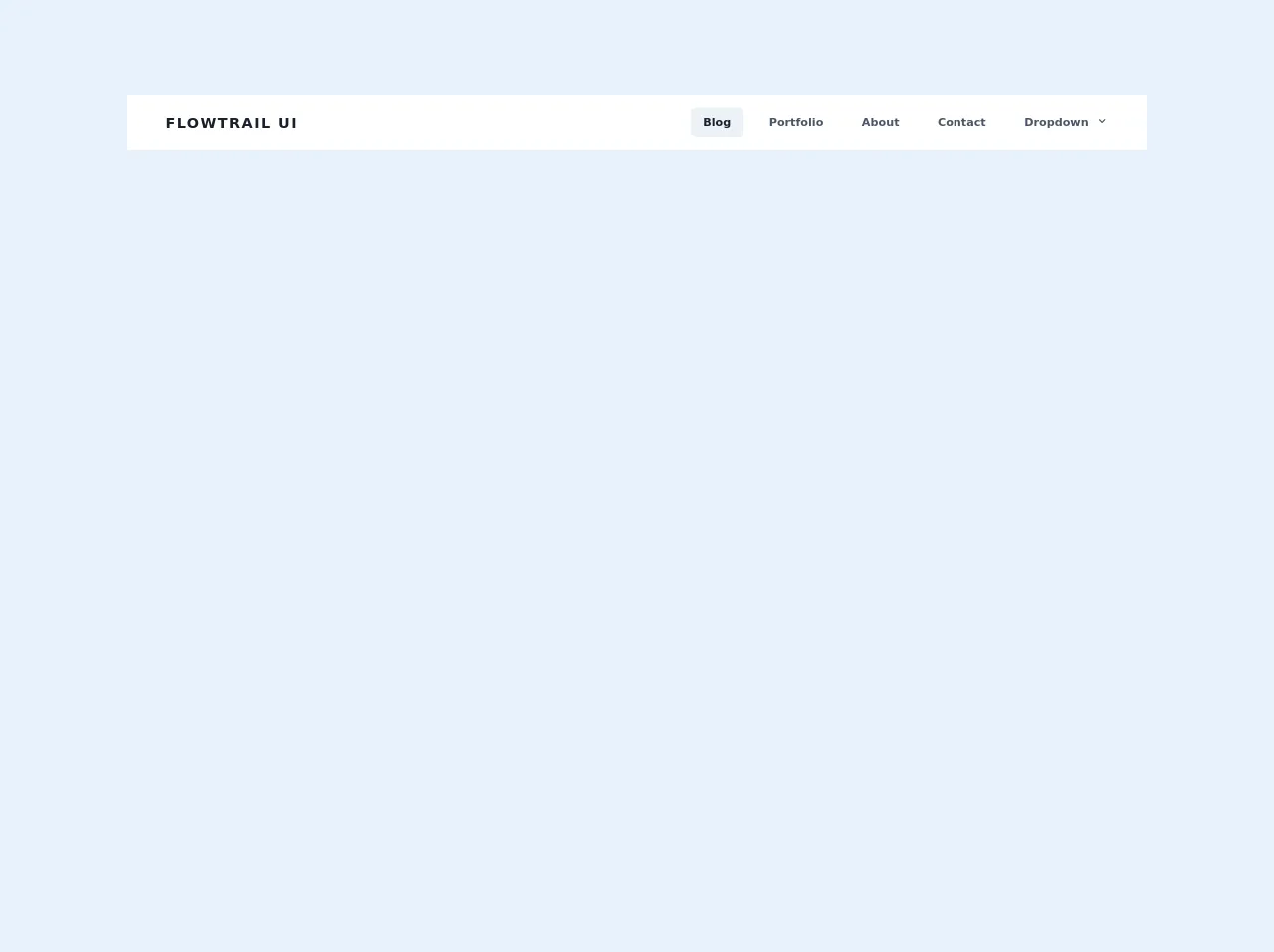
The preview of Responsive Navbar With Dropdown ui component.
To create a responsive navbar with dropdown, we will use Tailwind CSS. The final result will look like this:
Free download of the Responsive Navbar With Dropdown's source code
The source code of Responsive Navbar With Dropdown ui component.
To create a responsive navbar with dropdown, we will use HTML and Tailwind CSS. Here is the source code:
<script src="https://cdn.jsdelivr.net/gh/alpinejs/[email protected]/dist/alpine.min.js" defer></script>
<div class="w-full text-gray-700 bg-white dark-mode:text-gray-200 dark-mode:bg-gray-800">
  <div x-data="{ open: false }" class="flex flex-col max-w-screen-xl px-4 mx-auto md:items-center md:justify-between md:flex-row md:px-6 lg:px-8">
    <div class="p-4 flex flex-row items-center justify-between">
      <a href="#" class="text-lg font-semibold tracking-widest text-gray-900 uppercase rounded-lg dark-mode:text-white focus:outline-none focus:shadow-outline">Flowtrail UI</a>
      <button class="md:hidden rounded-lg focus:outline-none focus:shadow-outline" @click="open = !open">
        <svg fill="currentColor" viewBox="0 0 20 20" class="w-6 h-6">
          <path x-show="!open" fill-rule="evenodd" d="M3 5a1 1 0 011-1h12a1 1 0 110 2H4a1 1 0 01-1-1zM3 10a1 1 0 011-1h12a1 1 0 110 2H4a1 1 0 01-1-1zM9 15a1 1 0 011-1h6a1 1 0 110 2h-6a1 1 0 01-1-1z" clip-rule="evenodd"></path>
          <path x-show="open" fill-rule="evenodd" d="M4.293 4.293a1 1 0 011.414 0L10 8.586l4.293-4.293a1 1 0 111.414 1.414L11.414 10l4.293 4.293a1 1 0 01-1.414 1.414L10 11.414l-4.293 4.293a1 1 0 01-1.414-1.414L8.586 10 4.293 5.707a1 1 0 010-1.414z" clip-rule="evenodd"></path>
        </svg>
      </button>
    </div>
    <nav :class="{'flex': open, 'hidden': !open}" class="flex-col flex-grow pb-4 md:pb-0 hidden md:flex md:justify-end md:flex-row">
      <a class="px-4 py-2 mt-2 text-sm font-semibold text-gray-900 bg-gray-200 rounded-lg dark-mode:bg-gray-700 dark-mode:hover:bg-gray-600 dark-mode:focus:bg-gray-600 dark-mode:focus:text-white dark-mode:hover:text-white dark-mode:text-gray-200 md:mt-0 hover:text-gray-900 focus:text-gray-900 hover:bg-gray-200 focus:bg-gray-200 focus:outline-none focus:shadow-outline" href="#">Blog</a>
      <a class="px-4 py-2 mt-2 text-sm font-semibold bg-transparent rounded-lg dark-mode:bg-transparent dark-mode:hover:bg-gray-600 dark-mode:focus:bg-gray-600 dark-mode:focus:text-white dark-mode:hover:text-white dark-mode:text-gray-200 md:mt-0 md:ml-4 hover:text-gray-900 focus:text-gray-900 hover:bg-gray-200 focus:bg-gray-200 focus:outline-none focus:shadow-outline" href="#">Portfolio</a>
      <a class="px-4 py-2 mt-2 text-sm font-semibold bg-transparent rounded-lg dark-mode:bg-transparent dark-mode:hover:bg-gray-600 dark-mode:focus:bg-gray-600 dark-mode:focus:text-white dark-mode:hover:text-white dark-mode:text-gray-200 md:mt-0 md:ml-4 hover:text-gray-900 focus:text-gray-900 hover:bg-gray-200 focus:bg-gray-200 focus:outline-none focus:shadow-outline" href="#">About</a>
      <a class="px-4 py-2 mt-2 text-sm font-semibold bg-transparent rounded-lg dark-mode:bg-transparent dark-mode:hover:bg-gray-600 dark-mode:focus:bg-gray-600 dark-mode:focus:text-white dark-mode:hover:text-white dark-mode:text-gray-200 md:mt-0 md:ml-4 hover:text-gray-900 focus:text-gray-900 hover:bg-gray-200 focus:bg-gray-200 focus:outline-none focus:shadow-outline" href="#">Contact</a>
      <div @click.away="open = false" class="relative" x-data="{ open: false }">
        <button @click="open = !open" class="flex flex-row items-center w-full px-4 py-2 mt-2 text-sm font-semibold text-left bg-transparent rounded-lg dark-mode:bg-transparent dark-mode:focus:text-white dark-mode:hover:text-white dark-mode:focus:bg-gray-600 dark-mode:hover:bg-gray-600 md:w-auto md:inline md:mt-0 md:ml-4 hover:text-gray-900 focus:text-gray-900 hover:bg-gray-200 focus:bg-gray-200 focus:outline-none focus:shadow-outline">
          <span>Dropdown</span>
          <svg fill="currentColor" viewBox="0 0 20 20" :class="{'rotate-180': open, 'rotate-0': !open}" class="inline w-4 h-4 mt-1 ml-1 transition-transform duration-200 transform md:-mt-1"><path fill-rule="evenodd" d="M5.293 7.293a1 1 0 011.414 0L10 10.586l3.293-3.293a1 1 0 111.414 1.414l-4 4a1 1 0 01-1.414 0l-4-4a1 1 0 010-1.414z" clip-rule="evenodd"></path></svg>
        </button>
        <div x-show="open" x-transition:enter="transition ease-out duration-100" x-transition:enter-start="transform opacity-0 scale-95" x-transition:enter-end="transform opacity-100 scale-100" x-transition:leave="transition ease-in duration-75" x-transition:leave-start="transform opacity-100 scale-100" x-transition:leave-end="transform opacity-0 scale-95" class="absolute right-0 w-full mt-2 origin-top-right rounded-md shadow-lg md:w-48">
          <div class="px-2 py-2 bg-white rounded-md shadow dark-mode:bg-gray-800">
            <a class="block px-4 py-2 mt-2 text-sm font-semibold bg-transparent rounded-lg dark-mode:bg-transparent dark-mode:hover:bg-gray-600 dark-mode:focus:bg-gray-600 dark-mode:focus:text-white dark-mode:hover:text-white dark-mode:text-gray-200 md:mt-0 hover:text-gray-900 focus:text-gray-900 hover:bg-gray-200 focus:bg-gray-200 focus:outline-none focus:shadow-outline" href="#">Link #1</a>
            <a class="block px-4 py-2 mt-2 text-sm font-semibold bg-transparent rounded-lg dark-mode:bg-transparent dark-mode:hover:bg-gray-600 dark-mode:focus:bg-gray-600 dark-mode:focus:text-white dark-mode:hover:text-white dark-mode:text-gray-200 md:mt-0 hover:text-gray-900 focus:text-gray-900 hover:bg-gray-200 focus:bg-gray-200 focus:outline-none focus:shadow-outline" href="#">Link #2</a>
            <a class="block px-4 py-2 mt-2 text-sm font-semibold bg-transparent rounded-lg dark-mode:bg-transparent dark-mode:hover:bg-gray-600 dark-mode:focus:bg-gray-600 dark-mode:focus:text-white dark-mode:hover:text-white dark-mode:text-gray-200 md:mt-0 hover:text-gray-900 focus:text-gray-900 hover:bg-gray-200 focus:bg-gray-200 focus:outline-none focus:shadow-outline" href="#">Link #3</a>
          </div>
        </div>
      </div>
    </nav>
  </div>
</div>
How to create a Responsive Navbar With Dropdown with Tailwind CSS?
Now, let's dive into the steps to create a responsive navbar with dropdown using Tailwind CSS.
Step 1: Create the HTML structure
The first step is to create the HTML structure for the navbar. We will use a nav element with a ul element for the navigation links. We will also add a button element for the dropdown toggle.
<nav class="bg-gray-800">
  <div class="max-w-7xl mx-auto px-2 sm:px-6 lg:px-8">
    <div class="relative flex items-center justify-between h-16">
      <div class="flex-1 flex items-center justify-center sm:items-stretch sm:justify-start">
        <div class="flex-shrink-0">
          <a href="#" class="text-white font-bold text-xl">Logo</a>
        </div>
        <div class="hidden sm:block sm:ml-6">
          <ul class="flex space-x-4">
            <li><a href="#" class="text-gray-300 hover:bg-gray-700 hover:text-white px-3 py-2 rounded-md text-sm font-medium">Home</a></li>
            <li><a href="#" class="text-gray-300 hover:bg-gray-700 hover:text-white px-3 py-2 rounded-md text-sm font-medium">About</a></li>
            <li><a href="#" class="text-gray-300 hover:bg-gray-700 hover:text-white px-3 py-2 rounded-md text-sm font-medium">Contact</a></li>
          </ul>
        </div>
      </div>
      <div class="hidden sm:block sm:ml-6">
        <button class="bg-gray-800 hover:bg-gray-700 text-white font-bold py-2 px-4 rounded">
          Dropdown
        </button>
      </div>
    </div>
  </div>
</nav>
Step 2: Add Tailwind CSS classes
Next, we will add Tailwind CSS classes to style the navbar. We will use the bg-gray-800 class for the background color, max-w-7xl class for the maximum width, and px-2 sm:px-6 lg:px-8 class for the padding.
We will also use the relative class for the parent element, flex class for the flexbox layout, and items-center and justify-between classes for the alignment.
For the logo and navigation links, we will use the flex-1 class to make them take up the remaining space. We will also use the hidden class to hide the dropdown toggle on larger screens.
<nav class="bg-gray-800">
  <div class="max-w-7xl mx-auto px-2 sm:px-6 lg:px-8">
    <div class="relative flex items-center justify-between h-16">
      <div class="flex-1 flex items-center justify-center sm:items-stretch sm:justify-start">
        <div class="flex-shrink-0">
          <a href="#" class="text-white font-bold text-xl">Logo</a>
        </div>
        <div class="hidden sm:block sm:ml-6">
          <ul class="flex space-x-4">
            <li><a href="#" class="text-gray-300 hover:bg-gray-700 hover:text-white px-3 py-2 rounded-md text-sm font-medium">Home</a></li>
            <li><a href="#" class="text-gray-300 hover:bg-gray-700 hover:text-white px-3 py-2 rounded-md text-sm font-medium">About</a></li>
            <li><a href="#" class="text-gray-300 hover:bg-gray-700 hover:text-white px-3 py-2 rounded-md text-sm font-medium">Contact</a></li>
          </ul>
        </div>
      </div>
      <div class="hidden sm:block sm:ml-6">
        <button class="bg-gray-800 hover:bg-gray-700 text-white font-bold py-2 px-4 rounded">
          Dropdown
        </button>
      </div>
    </div>
  </div>
</nav>
Step 3: Add dropdown menu
Now, we will add the dropdown menu. We will use the absolute class to position the dropdown menu relative to the parent element. We will also use the hidden class to hide the dropdown menu by default.
<nav class="bg-gray-800">
  <div class="max-w-7xl mx-auto px-2 sm:px-6 lg:px-8">
    <div class="relative flex items-center justify-between h-16">
      <div class="flex-1 flex items-center justify-center sm:items-stretch sm:justify-start">
        <div class="flex-shrink-0">
          <a href="#" class="text-white font-bold text-xl">Logo</a>
        </div>
        <div class="hidden sm:block sm:ml-6">
          <ul class="flex space-x-4">
            <li><a href="#" class="text-gray-300 hover:bg-gray-700 hover:text-white px-3 py-2 rounded-md text-sm font-medium">Home</a></li>
            <li><a href="#" class="text-gray-300 hover:bg-gray-700 hover:text-white px-3 py-2 rounded-md text-sm font-medium">About</a></li>
            <li><a href="#" class="text-gray-300 hover:bg-gray-700 hover:text-white px-3 py-2 rounded-md text-sm font-medium">Contact</a></li>
          </ul>
        </div>
      </div>
      <div class="hidden sm:block sm:ml-6 relative">
        <button class="bg-gray-800 hover:bg-gray-700 text-white font-bold py-2 px-4 rounded">
          Dropdown
        </button>
        <div class="absolute right-0 mt-2 w-48 bg-gray-800 rounded-md overflow-hidden z-10 hidden">
          <a href="#" class="block px-4 py-2 text-sm text-gray-200 hover:bg-gray-700">Link 1</a>
          <a href="#" class="block px-4 py-2 text-sm text-gray-200 hover:bg-gray-700">Link 2</a>
          <a href="#" class="block px-4 py-2 text-sm text-gray-200 hover:bg-gray-700">Link 3</a>
        </div>
      </div>
    </div>
  </div>
</nav>
Step 4: Add JavaScript for dropdown toggle
Finally, we will add JavaScript to toggle the visibility of the dropdown menu. We will use the click event to toggle the hidden class on the dropdown menu.
<nav class="bg-gray-800">
  <div class="max-w-7xl mx-auto px-2 sm:px-6 lg:px-8">
    <div class="relative flex items-center justify-between h-16">
      <div class="flex-1 flex items-center justify-center sm:items-stretch sm:justify-start">
        <div class="flex-shrink-0">
          <a href="#" class="text-white font-bold text-xl">Logo</a>
        </div>
        <div class="hidden sm:block sm:ml-6">
          <ul class="flex space-x-4">
            <li><a href="#" class="text-gray-300 hover:bg-gray-700 hover:text-white px-3 py-2 rounded-md text-sm font-medium">Home</a></li>
            <li><a href="#" class="text-gray-300 hover:bg-gray-700 hover:text-white px-3 py-2 rounded-md text-sm font-medium">About</a></li>
            <li><a href="#" class="text-gray-300 hover:bg-gray-700 hover:text-white px-3 py-2 rounded-md text-sm font-medium">Contact</a></li>
          </ul>
        </div>
      </div>
      <div class="hidden sm:block sm:ml-6 relative">
        <button class="bg-gray-800 hover:bg-gray-700 text-white font-bold py-2 px-4 rounded">
          Dropdown
        </button>
        <div class="absolute right-0 mt-2 w-48 bg-gray-800 rounded-md overflow-hidden z-10 hidden">
          <a href="#" class="block px-4 py-2 text-sm text-gray-200 hover:bg-gray-700">Link 1</a>
          <a href="#" class="block px-4 py-2 text-sm text-gray-200 hover:bg-gray-700">Link 2</a>
          <a href="#" class="block px-4 py-2 text-sm text-gray-200 hover:bg-gray-700">Link 3</a>
        </div>
      </div>
    </div>
  </div>
</nav>

<script>
  const dropdownToggle = document.querySelector('.sm\\:ml-6 > button');
  const dropdownMenu = document.querySelector('.sm\\:ml-6 > div');

  dropdownToggle.addEventListener('click', () => {
    dropdownMenu.classList.toggle('hidden');
  });
</script>
Conclusion
In this article, we have shown you how to create a responsive navbar with dropdown using Tailwind CSS. We have used HTML, Tailwind CSS, and JavaScript to create this component. With Tailwind CSS, you can easily create responsive and customizable user interfaces without even thinking about it. We hope you found this article helpful and informative.