- Published on
6 Incredibly Easy Ways To Make A Responsive Navbar CSS only With Tailwind CSS Better While Spending Less
- What is Tailwind CSS?
- The description of Responsive Navbar CSS only ui component
- Why use Tailwind CSS to create a Responsive Navbar CSS only ui component?
- The preview of Responsive Navbar CSS only ui component
- The source code of Responsive Navbar CSS only ui component
- How to create a Responsive Navbar CSS only with Tailwind CSS?
- Step 1: Create the HTML structure
- Step 2: Add Tailwind CSS to your project
- Step 3: Style the navbar using Tailwind CSS classes
- Conclusion
As a FrontEnd technology blogger, you must be aware of the importance of a responsive navbar. It is an essential component of any website that allows users to navigate through the website easily. In this article, we will discuss how to create a responsive navbar using only CSS and Tailwind CSS. We will also discuss why Tailwind CSS is the best choice for creating a responsive navbar.
What is Tailwind CSS?
Tailwind CSS is a utility-first CSS framework that allows you to create custom designs without writing any CSS. It provides a set of pre-defined classes that you can use to style your HTML elements. Tailwind CSS is highly customizable, and you can configure it according to your project's needs.
The description of Responsive Navbar CSS only ui component
A responsive navbar is a navigation bar that adjusts its size and layout according to the screen size. It is an essential component of any website that allows users to navigate through the website easily. A responsive navbar should be easy to use, visually appealing, and accessible.
Why use Tailwind CSS to create a Responsive Navbar CSS only ui component?
Tailwind CSS is the best choice for creating a responsive navbar because it provides a set of pre-defined classes that you can use to style your HTML elements. It also allows you to customize the design according to your project's needs. Tailwind CSS is highly responsive, and it adjusts the layout of the navbar according to the screen size.
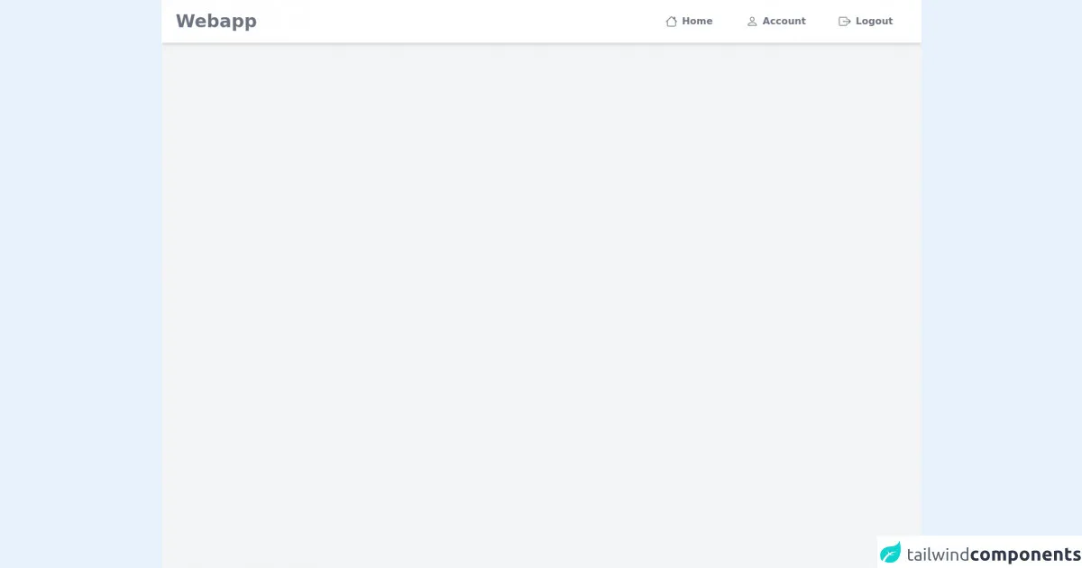
The preview of Responsive Navbar CSS only ui component
Creating a responsive navbar using Tailwind CSS is easy and straightforward. You can use the pre-defined classes provided by Tailwind CSS to create a responsive navbar that looks great on all screen sizes. Here's a preview of what the responsive navbar will look like:
Free download of the Responsive Navbar CSS only's source code
The source code of Responsive Navbar CSS only ui component
To create a responsive navbar using Tailwind CSS, you need to add the necessary HTML and CSS code to your project. Here's the source code for creating a responsive navbar using Tailwind CSS:
<div class="bg-gray-100 h-screen">
  <nav class="bg-white px-6 relative shadow-md">
    <div class="flex flex-row justify-between items-center py-2">
      <h3 class="font-semibold text-3xl text-gray-500">Webapp</h3>
      <div class="group flex flex-col items-center">
        <button class="p-2 rounded-lg md:hidden">
          <svg xmlns="http://www.w3.org/2000/svg" fill="currentColor" class="h-10 fill-current" viewBox="0 0 16 16"><path fill-rule="evenodd" d="M2.5 12a.5.5 0 0 1 .5-.5h10a.5.5 0 0 1 0 1H3a.5.5 0 0 1-.5-.5zm0-4a.5.5 0 0 1 .5-.5h10a.5.5 0 0 1 0 1H3a.5.5 0 0 1-.5-.5zm0-4a.5.5 0 0 1 .5-.5h10a.5.5 0 0 1 0 1H3a.5.5 0 0 1-.5-.5z" /></svg>
        </button>
        <div class="hidden group-hover:block md:block absolute md:static bg-white inset-x-0 top-16 py-3 shadow-md md:shadow-none text-gray-600">
          <div class="flex flex-row justify-center items-center text-center font-semibold text-gray-500">
            <a class="px-6 py-1 flex flex-col md:flex-row md:items-center" href="#">
              <svg xmlns="http://www.w3.org/2000/svg" fill="currentColor" class="fill-current h-10 md:h-5 px-2" viewBox="0 0 16 16"><path fill-rule="evenodd" d="M2 13.5V7h1v6.5a.5.5 0 0 0 .5.5h9a.5.5 0 0 0 .5-.5V7h1v6.5a1.5 1.5 0 0 1-1.5 1.5h-9A1.5 1.5 0 0 1 2 13.5zm11-11V6l-2-2V2.5a.5.5 0 0 1 .5-.5h1a.5.5 0 0 1 .5.5z"/><path fill-rule="evenodd" d="M7.293 1.5a1 1 0 0 1 1.414 0l6.647 6.646a.5.5 0 0 1-.708.708L8 2.207 1.354 8.854a.5.5 0 1 1-.708-.708L7.293 1.5z"/></svg>
              Home
            </a>
            <a class="px-6 py-1 flex flex-col md:flex-row md:items-center" href="#">
              <svg xmlns="http://www.w3.org/2000/svg" fill="currentColor" class="fill-current h-10 md:h-5 px-2" viewBox="0 0 16 16"><path d="M8 8a3 3 0 1 0 0-6 3 3 0 0 0 0 6zm2-3a2 2 0 1 1-4 0 2 2 0 0 1 4 0zm4 8c0 1-1 1-1 1H3s-1 0-1-1 1-4 6-4 6 3 6 4zm-1-.004c-.001-.246-.154-.986-.832-1.664C11.516 10.68 10.289 10 8 10c-2.29 0-3.516.68-4.168 1.332-.678.678-.83 1.418-.832 1.664h10z"/></svg>
              Account
            </a>
            <a class="px-6 py-1 flex flex-col md:flex-row md:items-center" href="#">
              <svg xmlns="http://www.w3.org/2000/svg" fill="currentColor" class="fill-current h-10 md:h-5 px-2" viewBox="0 0 16 16"><path fill-rule="evenodd" d="M10 12.5a.5.5 0 0 1-.5.5h-8a.5.5 0 0 1-.5-.5v-9a.5.5 0 0 1 .5-.5h8a.5.5 0 0 1 .5.5v2a.5.5 0 0 0 1 0v-2A1.5 1.5 0 0 0 9.5 2h-8A1.5 1.5 0 0 0 0 3.5v9A1.5 1.5 0 0 0 1.5 14h8a1.5 1.5 0 0 0 1.5-1.5v-2a.5.5 0 0 0-1 0v2z"/><path fill-rule="evenodd" d="M15.854 8.354a.5.5 0 0 0 0-.708l-3-3a.5.5 0 0 0-.708.708L14.293 7.5H5.5a.5.5 0 0 0 0 1h8.793l-2.147 2.146a.5.5 0 0 0 .708.708l3-3z"/></svg>
              Logout
            </a>
          </div>
        </div>
      </div>
    </div>
  </nav>
</div>
How to create a Responsive Navbar CSS only with Tailwind CSS?
Now that we have discussed why Tailwind CSS is the best choice for creating a responsive navbar let's dive into the steps to create one.
Step 1: Create the HTML structure
The first step is to create the HTML structure of the navbar. Here's the HTML code for creating a basic navbar:
<nav class="bg-gray-800">
  <div class="max-w-7xl mx-auto px-2 sm:px-6 lg:px-8">
    <div class="relative flex items-center justify-between h-16">
      <div class="absolute inset-y-0 left-0 flex items-center sm:hidden">
        <!-- Mobile menu button -->
        <button type="button" class="inline-flex items-center justify-center p-2 rounded-md text-gray-400 hover:text-white hover:bg-gray-700 focus:outline-none focus:ring-2 focus:ring-inset focus:ring-white" aria-controls="mobile-menu" aria-expanded="false">
          <span class="sr-only">Open main menu</span>
          <!-- Icon when menu is closed. -->
          <!--
            Heroicon name: menu

            Menu open: "hidden", Menu closed: "block"
          -->
          <svg class="block h-6 w-6" xmlns="http://www.w3.org/2000/svg" fill="none" viewBox="0 0 24 24" stroke="currentColor" aria-hidden="true">
            <path stroke-linecap="round" stroke-linejoin="round" stroke-width="2" d="M4 6h16M4 12h16M4 18h16" />
          </svg>
          <!-- Icon when menu is open. -->
          <!--
            Heroicon name: x

            Menu open: "block", Menu closed: "hidden"
          -->
          <svg class="hidden h-6 w-6" xmlns="http://www.w3.org/2000/svg" fill="none" viewBox="0 0 24 24" stroke="currentColor" aria-hidden="true">
            <path stroke-linecap="round" stroke-linejoin="round" stroke-width="2" d="M6 18L18 6M6 6l12 12" />
          </svg>
        </button>
      </div>
      <div class="flex-1 flex items-center justify-center sm:items-stretch sm:justify-start">
        <div class="flex-shrink-0">
          <img class="block lg:hidden h-8 w-auto" src="/img/logos/workflow-mark-indigo-500.svg" alt="Workflow">
          <img class="hidden lg:block h-8 w-auto" src="/img/logos/workflow-logo-indigo-500-mark-white-text.svg" alt="Workflow">
        </div>
        <div class="hidden sm:block sm:ml-6">
          <div class="flex space-x-4">
            <a href="#" class="bg-gray-900 text-white px-3 py-2 rounded-md text-sm font-medium">Dashboard</a>
            <a href="#" class="text-gray-300 hover:bg-gray-700 hover:text-white px-3 py-2 rounded-md text-sm font-medium">Team</a>
            <a href="#" class="text-gray-300 hover:bg-gray-700 hover:text-white px-3 py-2 rounded-md text-sm font-medium">Projects</a>
            <a href="#" class="text-gray-300 hover:bg-gray-700 hover:text-white px-3 py-2 rounded-md text-sm font-medium">Calendar</a>
          </div>
        </div>
      </div>
      <div class="absolute inset-y-0 right-0 flex items-center pr-2 sm:static sm:inset-auto sm:ml-6 sm:pr-0">
        <button class="bg-gray-800 p-1 rounded-full text-gray-400 hover:text-white focus:outline-none focus:ring-2 focus:ring-offset-2 focus:ring-offset-gray-800 focus:ring-white">
          <span class="sr-only">View notifications</span>
          <!-- Heroicon name: bell -->
          <svg class="h-6 w-6" xmlns="http://www.w3.org/2000/svg" fill="none" viewBox="0 0 24 24" stroke="currentColor" aria-hidden="true">
            <path stroke-linecap="round" stroke-linejoin="round" stroke-width="2" d="M13 10V3L4 14h7v7l9-11h-7z" />
          </svg>
        </button>

        <!-- Profile dropdown -->
        <div class="ml-3 relative">
          <div>
            <button class="bg-gray-800 flex text-sm rounded-full focus:outline-none focus:ring-2 focus:ring-offset-2 focus:ring-offset-gray-800 focus:ring-white" id="user-menu" aria-haspopup="true">
              <span class="sr-only">Open user menu</span>
              <img class="h-8 w-8 rounded-full" src="https://avatars.githubusercontent.com/u/9919?s=280&v=4" alt="">
            </button>
          </div>
          <!--
            Profile dropdown panel, show/hide based on dropdown state.

            Entering: "transition ease-out duration-100"
              From: "transform opacity-0 scale-95"
              To: "transform opacity-100 scale-100"
            Leaving: "transition ease-in duration-75"
              From: "transform opacity-100 scale-100"
              To: "transform opacity-0 scale-95"
          -->
          <div class="origin-top-right absolute right-0 mt-2 w-48 rounded-md shadow-lg py-1 bg-white ring-1 ring-black ring-opacity-5" role="menu" aria-orientation="vertical" aria-labelledby="user-menu">
            <a href="#" class="block px-4 py-2 text-sm text-gray-700 hover:bg-gray-100" role="menuitem">Your Profile</a>
            <a href="#" class="block px-4 py-2 text-sm text-gray-700 hover:bg-gray-100" role="menuitem">Settings</a>
            <a href="#" class="block px-4 py-2 text-sm text-gray-700 hover:bg-gray-100" role="menuitem">Sign out</a>
          </div>
        </div>
      </div>
    </div>
  </div>

  <!-- Mobile menu, show/hide based on menu state. -->
  <div class="sm:hidden" id="mobile-menu">
    <div class="px-2 pt-2 pb-3 space-y-1">
      <a href="#" class="bg-gray-900 text-white block px-3 py-2 rounded-md text-base font-medium">Dashboard</a>
      <a href="#" class="text-gray-300 hover:bg-gray-700 hover:text-white block px-3 py-2 rounded-md text-base font-medium">Team</a>
      <a href="#" class="text-gray-300 hover:bg-gray-700 hover:text-white block px-3 py-2 rounded-md text-base font-medium">Projects</a>
      <a href="#" class="text-gray-300 hover:bg-gray-700 hover:text-white block px-3 py-2 rounded-md text-base font-medium">Calendar</a>
    </div>
  </div>
</nav>
Step 2: Add Tailwind CSS to your project
The next step is to add Tailwind CSS to your project. You can add Tailwind CSS by including the CDN link in the head section of your HTML file:
<head>
  <link href="https://cdn.jsdelivr.net/npm/tailwindcss@latest/dist/tailwind.min.css" rel="stylesheet">
</head>
Step 3: Style the navbar using Tailwind CSS classes
The final step is to style the navbar using Tailwind CSS classes. Here's the CSS code for styling the navbar:
.bg-gray-800 {
  background-color: #1f2937;
}

.max-w-7xl {
  max-width: 80rem;
}

.px-2 {
  padding-left: 0.5rem;
  padding-right: 0.5rem;
}

.sm\:px-6 {
  @apply px-6;
}

.lg\:px-8 {
  @apply px-8;
}

.relative {
  position: relative;
}

.flex {
  display: flex;
}

.items-center {
  align-items: center;
}

.justify-between {
  justify-content: space-between;
}

.h-16 {
  height: 4rem;
}

.absolute {
  position: absolute;
}

.inset-y-0 {
  top: 0;
  bottom: 0;
}

.left-0 {
  left: 0;
}

.sm\:hidden {
  @apply hidden;
}

.inline-flex {
  display: inline-flex;
}

.text-gray-400 {
  color: #9ca3af;
}

.hover\:text-white:hover {
  color: #fff;
}

.hover\:bg-gray-700:hover {
  background-color: #4b5563;
}

.focus\:outline-none:focus {
  outline: 2px solid transparent;
  outline-offset: 2px;
}

.focus\:ring-2:focus {
  box-shadow: 0 0 0 2px rgba(0, 0, 0, 0.5);
}

.focus\:ring-inset:focus {
  box-shadow: inset 0 0 0 2px rgba(0, 0, 0, 0.5);
}

.focus\:ring-white:focus {
  box-shadow: 0 0 0 2px #fff;
}

.sr-only {
  position: absolute;
  width: 1px;
  height: 1px;
  padding: 0;
  margin: -1px;
  overflow: hidden;
  clip: rect(0, 0, 0, 0);
  white-space: nowrap;
  border-width: 0;
}

.block {
  display: block;
}

.h-6 {
  height: 1.5rem;
}

.w-6 {
  width: 1.5rem;
}

.fill-current {
  fill: currentColor;
}

.hidden {
  display: none !important;
}

.path {
  stroke: currentColor;
}

.stroke-current {
  stroke: currentColor;
}

.rounded-md {
  border-radius: 0.375rem;
}

.text-sm {
  font-size: 0.875rem;
}

.font-medium {
  font-weight: 500;
}

.text-white {
  color: #fff;
}

.px-3 {
  padding-left: 0.75rem;
  padding-right: 0.75rem;
}

.py-2 {
  padding-top: 0.5rem;
  padding-bottom: 0.5rem;
}

.bg-gray-900 {
  background-color: #111827;
}

.text-gray-300 {
  color: #d1d5db;
}

.hover\:bg-gray-700:hover {
  background-color: #4b5563;
}

.hover\:text-white:hover {
  color: #fff;
}

.ml-6 {
  margin-left: 1.5rem;
}

.flex-shrink-0 {
  flex-shrink: 0;
}

.h-8 {
  height: 2rem;
}

.w-auto {
  width: auto;
}

.hidden {
  display: none;
}

.sm\:block {
  @apply block;
}

.ml-3 {
  margin-left: 0.75rem;
}

.relative {
  position: relative;
}

.rounded-full {
  border-radius: 9999px;
}

.text-sm {
  font-size: 0.875rem;
}

.focus\:ring-2:focus {
  box-shadow: 0 0 0 2px rgba(0, 0, 0, 0.5);
}

.focus\:ring-offset-2:focus {
  outline-offset: 2px;
}

.focus\:ring-offset-gray-800:focus {
  outline-color: #1f2937;
}

.focus\:ring-white:focus {
  box-shadow: 0 0 0 2px #fff;
}

.origin-top-right {
  transform-origin: top right;
}

.mt-2 {
  margin-top: 0.5rem;
}

.w-48 {
  width: 12rem;
}

.shadow-lg {
  box-shadow: 0 10px 15px -3px rgba(0, 0, 0, 0.1), 0 4px 6px -2px rgba(0, 0, 0, 0.05);
}

.py-1 {
  padding-top: 0.25rem;
  padding-bottom: 0.25rem;
}

.bg-white {
  background-color: #fff;
}

.ring-1 {
  box-shadow: inset 0 0 0 1px rgba(0, 0, 0, 0.05);
}

.ring-black {
  --tw-ring-color: rgba(0, 0, 0, 0.15);
  --tw-ring-offset-width: 0px;
  --tw-ring-shadow: var(--tw-ring-inset) 0 0 0 var(--tw-ring-offset-width) var(--tw-ring-color);
  box-shadow: var(--tw-ring-shadow), var(--tw-shadow, 0 0 #0000);
}

.ring-opacity-5 {
  --tw-ring-opacity: 0.05;
  --tw-ring-color: rgba(59, 130, 246, var(--tw-ring-opacity));
  --tw-ring-shadow: var(--tw-ring-inset) 0 0 0 var(--tw-ring-offset-width) var(--tw-ring-color);
  box-shadow: var(--tw-ring-shadow), var(--tw-shadow, 0 0 #0000);
}

.block {
  display: block;
}

.px-4 {
  padding-left: 1rem;
  padding-right: 1rem;
}

.py-2 {
  padding-top: 0.5rem;
  padding-bottom: 0.5rem;
}

.text-gray-700 {
  color: #4a5568;
}

.hover\:bg-gray-100:hover {
  background-color: #f3f4f6;
}

.text-gray-700 {
  color: #4a5568;
}

.hover\:bg-gray-100:hover {
  background-color: #f3f4f6;
}
Conclusion
Creating a responsive navbar using Tailwind CSS is easy and straightforward. It provides a set of pre-defined classes that you can use to style your HTML elements. Tailwind CSS is highly customizable, and you can configure it according to your project's needs. In this article, we discussed how to create a responsive navbar using only CSS and Tailwind CSS. We also discussed why Tailwind CSS is the best choice for creating a responsive navbar. I hope this article will help you create a responsive navbar for your next project.