- Published on
6 Incredibly Easy Ways To Build A Responsive Blog Cards #2 - Light Mode With Tailwind CSS Better While Spending Less
- What is Tailwind CSS?
- The description of Responsive Blog Cards #2 - Light Mode ui component
- Why use Tailwind CSS to create a Responsive Blog Cards #2 - Light Mode ui component?
- The preview of Responsive Blog Cards #2 - Light Mode ui component
- The source code of Responsive Blog Cards #2 - Light Mode ui component
- How to create a Responsive Blog Cards #2 - Light Mode with Tailwind CSS?
- Step 1: Set up your HTML structure
- Step 2: Style your blog cards
- Step 3: Add responsive classes
- Conclusion
As a FrontEnd technology blogger, I am always on the lookout for ways to improve my website's user interface and experience. One of the most effective ways to do this is by using responsive blog cards. In this article, we will discuss how to build a responsive blog card with Tailwind CSS, one of the most popular CSS frameworks available.
What is Tailwind CSS?
Tailwind CSS is a utility-first CSS framework that allows you to quickly build custom user interfaces. It provides a set of pre-defined classes that you can use to style your HTML elements. With Tailwind CSS, you can create responsive designs, customize your colors and fonts, and more.
The description of Responsive Blog Cards #2 - Light Mode ui component
Responsive Blog Cards #2 - Light Mode is a UI component that displays blog posts in a card format. It is designed to be responsive, meaning it will adjust its layout based on the screen size of the device it is being viewed on. The Light Mode version of the component is perfect for websites that have a light color scheme.
Why use Tailwind CSS to create a Responsive Blog Cards #2 - Light Mode ui component?
Tailwind CSS is an excellent choice for creating a responsive blog card because it provides a set of pre-defined classes that make it easy to style your HTML elements. With Tailwind CSS, you can create a beautiful, responsive design without having to write a lot of custom CSS code. This can save you time and effort, and make your website more efficient.
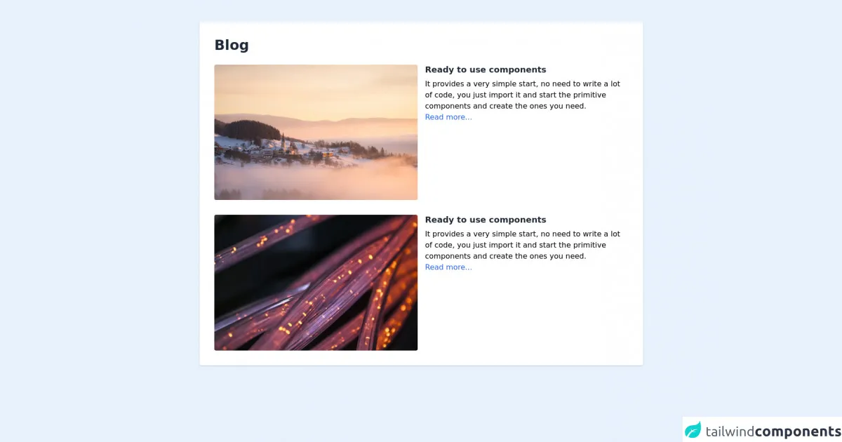
The preview of Responsive Blog Cards #2 - Light Mode ui component
Free download of the Responsive Blog Cards #2 - Light Mode's source code
The source code of Responsive Blog Cards #2 - Light Mode ui component
<div class="w-full my-12">
    <div class="max-w-5xl mx-auto px-6 sm:px-6 lg:px-8">
            <div class="bg-white w-full shadow rounded p-8">
                <h1 class="md:text-3xl text-2xl font-bold text-gray-800">Blog</h1>
                <div class="grid grid-cols-1 gap-8 mt-6">
                    <div class="flex flex-col md:flex-row">
                        <div class="w-full md:w-6/12 rounded overflow-hidden">
                            <img class="object w-full h-auto" src="https://images.unsplash.com/photo-1626169740183-702d6421beeb?ixid=MnwxMjA3fDB8MHxwaG90by1wYWdlfHx8fGVufDB8fHx8&ixlib=rb-1.2.1&auto=format&fit=crop&w=1170&q=80" alt="">
                        </div>
                        <div class="w-full md:w-6/12 mt-4 md:mt-0 md:ml-4">
                            <h2 class="text-lg font-semibold leading-tight text-gray-800">Ready to use components</h2>
                            <p class="leading-normal pt-2">It provides a very simple start, no need to write a lot of code, you just import it and start the primitive components and create the ones you need.</p>
                            <a class="leading-normal pt-2 hover:underline text-blue-600" href="">Read more...</a>
                        </div>
                    </div>
                    <div class="flex flex-col md:flex-row">
                        <div class="w-full md:w-6/12 rounded overflow-hidden">
                            <img class="object w-full h-auto" src="https://cdn.pixabay.com/photo/2020/02/03/00/12/fiber-4814456_960_720.jpg" alt="">
                        </div>
                        <div class="w-full md:w-6/12 mt-4 md:mt-0 md:ml-4">
                            <h2 class="text-lg font-semibold leading-tight text-gray-800">Ready to use components</h2>
                            <p class="leading-normal pt-2">It provides a very simple start, no need to write a lot of code, you just import it and start the primitive components and create the ones you need.</p>
                            <a class="leading-normal pt-2 hover:underline text-blue-600" href="">Read more...</a>
                        </div>
                    </div>
                </div>
            </div>
        </div>
    </div>
</div>
How to create a Responsive Blog Cards #2 - Light Mode with Tailwind CSS?
Now that we understand what Tailwind CSS is and why it is a good choice for creating a responsive blog card, let's take a look at how to create a Responsive Blog Cards #2 - Light Mode with Tailwind CSS.
Step 1: Set up your HTML structure
The first step is to set up your HTML structure. You will need to create a container element that will hold your blog cards. Inside this container, you will create a div element for each blog post.
<div class="container mx-auto">
  <div class="flex flex-wrap -mx-4">
    <div class="w-full md:w-1/2 lg:w-1/3 xl:w-1/4 px-4 mb-8">
      <!-- Blog card 1 -->
    </div>
    <div class="w-full md:w-1/2 lg:w-1/3 xl:w-1/4 px-4 mb-8">
      <!-- Blog card 2 -->
    </div>
    <div class="w-full md:w-1/2 lg:w-1/3 xl:w-1/4 px-4 mb-8">
      <!-- Blog card 3 -->
    </div>
    <div class="w-full md:w-1/2 lg:w-1/3 xl:w-1/4 px-4 mb-8">
      <!-- Blog card 4 -->
    </div>
  </div>
</div>
In this example, we are using Tailwind CSS's grid system to create a responsive layout. The container element has a max-width of 1000px and is centered using the mx-auto class. The flex and flex-wrap classes are used to create a flexible grid that will wrap to multiple rows on smaller screens. The w-full, md:w-1/2, lg:w-1/3, and xl:w-1/4 classes are used to set the width of each blog card based on the screen size. The px-4 and mb-8 classes are used to add padding and margin to each blog card.
Step 2: Style your blog cards
The next step is to style your blog cards. You can use Tailwind CSS's pre-defined classes to style your HTML elements. Here is an example of how to style a blog card:
<div class="w-full md:w-1/2 lg:w-1/3 xl:w-1/4 px-4 mb-8">
  <div class="bg-white rounded-lg overflow-hidden shadow-md">
    <img class="w-full h-48 object-cover" src="https://via.placeholder.com/640x360.png" alt="Blog post image">
    <div class="p-4">
      <h2 class="text-lg font-medium text-gray-800 mb-2">Blog post title</h2>
      <p class="text-gray-600 text-sm">Lorem ipsum dolor sit amet, consectetur adipiscing elit. Sed at est euismod, dapibus velit vel, vestibulum ipsum. Nullam euismod, sapien vel mattis maximus, velit massa elementum elit, sed pharetra orci ex non nisl.</p>
      <a href="#" class="text-blue-500 text-sm font-medium mt-2 inline-block">Read more</a>
    </div>
  </div>
</div>
In this example, we are using the bg-white, rounded-lg, overflow-hidden, and shadow-md classes to style the blog card container. The img element has a width of 100% and a height of 48%, and is using the object-cover class to ensure that the image covers the entire container. The p-4 class is used to add padding to the content area, and the text-lg, font-medium, text-gray-800, mb-2, text-gray-600, and text-sm classes are used to style the title and content of the blog post. The text-blue-500, text-sm, font-medium, and mt-2 classes are used to style the "Read more" link.
Step 3: Add responsive classes
The final step is to add responsive classes to your blog cards. This will ensure that your blog cards look great on all screen sizes. Here is an example of how to add responsive classes to a blog card:
<div class="w-full md:w-1/2 lg:w-1/3 xl:w-1/4 px-4 mb-8">
  <div class="bg-white rounded-lg overflow-hidden shadow-md">
    <img class="w-full h-48 object-cover" src="https://via.placeholder.com/640x360.png" alt="Blog post image">
    <div class="p-4">
      <h2 class="text-lg font-medium text-gray-800 mb-2">Blog post title</h2>
      <p class="text-gray-600 text-sm">Lorem ipsum dolor sit amet, consectetur adipiscing elit. Sed at est euismod, dapibus velit vel, vestibulum ipsum. Nullam euismod, sapien vel mattis maximus, velit massa elementum elit, sed pharetra orci ex non nisl.</p>
      <a href="#" class="text-blue-500 text-sm font-medium mt-2 inline-block">Read more</a>
    </div>
  </div>
</div>
In this example, we are using the w-full, md:w-1/2, lg:w-1/3, and xl:w-1/4 classes to set the width of the blog card based on the screen size.
Conclusion
In this article, we have discussed how to create a responsive blog card with Tailwind CSS. We have learned what Tailwind CSS is, why it is a good choice for creating a responsive blog card, and how to create a Responsive Blog Cards #2 - Light Mode with Tailwind CSS. By following these steps, you can create a beautiful, responsive blog card that will enhance your website's user interface and experience.