- Published on
6 Critical Skills To Make A Responsive Blog Cards #1 With Tailwind CSS Remarkably Well
- What is Tailwind CSS?
- The description of Responsive Blog Cards #1 ui component
- Why use Tailwind CSS to create a Responsive Blog Cards #1 ui component?
- The preview of Responsive Blog Cards #1 ui component
- The source code of Responsive Blog Cards #1 ui component
- How to create a Responsive Blog Cards #1 with Tailwind CSS?
- Step 1: Create an HTML structure for the blog card component
- Step 2: Add Tailwind CSS to your project
- Step 3: Add the required Tailwind CSS classes to style the blog card component
- Step 4: Test the blog card component on different screen sizes and devices
- Step 5: Refine the design and layout of the blog card component as needed
- Conclusion
As a FrontEnd technology blogger, it is essential to keep up with the latest trends and technologies. One of the most popular CSS frameworks for building responsive and mobile-first websites is Tailwind CSS. In this article, we will explore how to create a Responsive Blog Cards #1 ui component with Tailwind CSS and discuss the critical skills needed to make it remarkably well.
What is Tailwind CSS?
Tailwind CSS is a utility-first CSS framework that provides a set of pre-defined classes to style HTML elements. It allows developers to create custom designs and layouts without writing CSS from scratch. Tailwind CSS is highly customizable, and it offers a lot of flexibility in terms of design and functionality.
The description of Responsive Blog Cards #1 ui component
A blog card is a UI component that displays a summary of a blog post. It usually includes an image, title, author, date, and a short description. A responsive blog card is a blog card that adjusts its layout and design based on the screen size and device type. Responsive blog cards are essential for providing a seamless user experience across different devices.
Why use Tailwind CSS to create a Responsive Blog Cards #1 ui component?
Tailwind CSS is an excellent choice for creating a responsive blog card UI component for several reasons:
- Tailwind CSS provides a set of pre-defined responsive classes that make it easy to create responsive designs.
- Tailwind CSS allows developers to customize the design and layout of UI components without writing CSS from scratch.
- Tailwind CSS is highly modular, which makes it easy to reuse and maintain code.
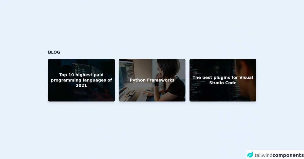
The preview of Responsive Blog Cards #1 ui component
To create a responsive blog card UI component with Tailwind CSS, we will use the following HTML structure:
<div class="blog-card">
  <div class="blog-card-image">
    <img src="https://via.placeholder.com/150" alt="Blog post image">
  </div>
  <div class="blog-card-content">
    <h2 class="blog-card-title">Blog post title</h2>
    <p class="blog-card-author">By Author Name</p>
    <p class="blog-card-date">January 1, 2022</p>
    <p class="blog-card-description">Short description of the blog post.</p>
  </div>
</div>
We will use Tailwind CSS classes to style this HTML structure and make it responsive.
Free download of the Responsive Blog Cards #1's source code
The source code of Responsive Blog Cards #1 ui component
To create a responsive blog card UI component with Tailwind CSS, we will use the following CSS classes:
/* Blog card container */
.blog-card {
  display: flex;
  flex-direction: column;
  border: 1px solid #ccc;
  border-radius: 4px;
  overflow: hidden;
}

/* Blog card image */
.blog-card-image img {
  width: 100%;
  height: auto;
  object-fit: cover;
}

/* Blog card content */
.blog-card-content {
  padding: 1rem;
}

/* Blog card title */
.blog-card-title {
  font-size: 1.25rem;
  font-weight: 600;
  margin-bottom: 0.5rem;
}

/* Blog card author */
.blog-card-author {
  font-size: 0.875rem;
  font-weight: 400;
  margin-bottom: 0.25rem;
}

/* Blog card date */
.blog-card-date {
  font-size: 0.875rem;
  font-weight: 400;
  margin-bottom: 0.5rem;
}

/* Blog card description */
.blog-card-description {
  font-size: 0.875rem;
  font-weight: 400;
  margin-bottom: 0;
}
We will use these classes to style the HTML structure and make it responsive.
<section class="max-w-7xl mx-auto px-4 sm:px-6 lg:px-4 mb-12">
    <article>
        <h2 class="text-2xl font-extrabold text-gray-900">BLOG</h2>
        <section class="mt-6 grid grid-cols-1 md:grid-cols-1 lg:grid-cols-3 gap-x-6 gap-y-8">
            <article class="relative w-full h-64 bg-cover bg-center group rounded-lg overflow-hidden shadow-lg hover:shadow-2xl  transition duration-300 ease-in-out"
                style="background-image: url('https://images.unsplash.com/photo-1623479322729-28b25c16b011?ixid=MnwxMjA3fDB8MHxwaG90by1wYWdlfHx8fGVufDB8fHx8&ixlib=rb-1.2.1&auto=format&fit=crop&w=1740&q=80');">
                <div class="absolute inset-0 bg-black bg-opacity-50 group-hover:opacity-75 transition duration-300 ease-in-out"></div>
                <div class="relative w-full h-full px-4 sm:px-6 lg:px-4 flex justify-center items-center">
                    <h3 class="text-center">
                        <a class="text-white text-2xl font-bold text-center" href="#">
                            <span class="absolute inset-0"></span>
                            Top 10 highest paid programming languages of 2021
                        </a>
                    </h3>
                </div>
            </article>
            <article class="relative w-full h-64 bg-cover bg-center group rounded-lg overflow-hidden shadow-lg hover:shadow-2xl  transition duration-300 ease-in-out"
                style="background-image: url('https://images.unsplash.com/photo-1569012871812-f38ee64cd54c?ixlib=rb-1.2.1&ixid=MnwxMjA3fDB8MHxwaG90by1wYWdlfHx8fGVufDB8fHx8&auto=format&fit=crop&w=1170&q=80');">
                <div class="absolute inset-0 bg-black bg-opacity-50 group-hover:opacity-75 transition duration-300 ease-in-out"></div>
                <div class="relative w-full h-full px-4 sm:px-6 lg:px-4 flex justify-center items-center">
                    <h3 class="text-center">
                        <a class="text-white text-2xl font-bold text-center" href="#">
                            <span class="absolute inset-0"></span>
                            Python Frameworks
                        </a>
                    </h3>
                </div>
            </article>
            <article class="relative w-full h-64 bg-cover bg-center group rounded-lg overflow-hidden shadow-lg hover:shadow-2xl  transition duration-300 ease-in-out"
                style="background-image: url('https://images.unsplash.com/photo-1511376777868-611b54f68947?ixid=MnwxMjA3fDB8MHxwaG90by1wYWdlfHx8fGVufDB8fHx8&ixlib=rb-1.2.1&auto=format&fit=crop&w=1170&q=80');">
                <div class="absolute inset-0 bg-black bg-opacity-50 group-hover:opacity-75 transition duration-300 ease-in-out"></div>
                <div class="relative w-full h-full px-4 sm:px-6 lg:px-4 flex justify-center items-center">
                    <h3 class="text-center">
                        <a class="text-white text-2xl font-bold text-center" href="#">
                            <span class="absolute inset-0"></span>
                            The best plugins for Visual Studio Code
                        </a>
                    </h3>
                </div>
            </article>
        </section>
    </article>
</section>
How to create a Responsive Blog Cards #1 with Tailwind CSS?
To create a responsive blog card UI component with Tailwind CSS, follow these steps:
- Create an HTML structure for the blog card component.
- Add Tailwind CSS to your project.
- Add the required Tailwind CSS classes to style the blog card component.
- Test the blog card component on different screen sizes and devices.
- Refine the design and layout of the blog card component as needed.
Let's go through each step in detail.
Step 1: Create an HTML structure for the blog card component
We have already created an HTML structure for the blog card component in the preview section. You can use this structure or create your own.
Step 2: Add Tailwind CSS to your project
To use Tailwind CSS, you need to add it to your project. You can either download the CSS file or use a CDN.
Here's how to use the CDN:
<link rel="stylesheet" href="https://cdn.tailwindcss.com" />
Step 3: Add the required Tailwind CSS classes to style the blog card component
We have already defined the required Tailwind CSS classes in the source code section. You can copy and paste these classes into your project or customize them as needed.
Here's an example of how to use the classes:
<div class="blog-card bg-white rounded-lg overflow-hidden shadow-lg">
  <div class="blog-card-image">
    <img src="https://via.placeholder.com/150" alt="Blog post image" class="w-full h-auto object-cover">
  </div>
  <div class="blog-card-content p-4">
    <h2 class="blog-card-title text-lg font-semibold mb-2">Blog post title</h2>
    <p class="blog-card-author text-sm font-medium mb-1">By Author Name</p>
    <p class="blog-card-date text-sm font-medium mb-2">January 1, 2022</p>
    <p class="blog-card-description text-sm font-normal">Short description of the blog post.</p>
  </div>
</div>
Step 4: Test the blog card component on different screen sizes and devices
To ensure that the blog card component is responsive, you need to test it on different screen sizes and devices. You can use the browser's developer tools to simulate different screen sizes and devices.
Step 5: Refine the design and layout of the blog card component as needed
If you're not satisfied with the design and layout of the blog card component, you can refine it by customizing the Tailwind CSS classes or adding new ones.
Conclusion
Creating a responsive blog card UI component with Tailwind CSS requires some critical skills, such as HTML, CSS, and responsive design. By following the steps outlined in this article, you can create a responsive blog card UI component that looks great on any device. Remember to test your component on different screen sizes and devices and refine the design and layout as needed. With Tailwind CSS, you can create custom designs and layouts without writing CSS from scratch, making it an excellent choice for building responsive and mobile-first websites.