- Published on
The 5 Really Obvious Ways To Create A Progress Steps With Tailwind CSS Better That You Ever Did
- What is Tailwind CSS?
- The description of Progress steps UI component
- Why use Tailwind CSS to create a Progress steps UI component?
- The preview of Progress steps UI component
- The source code of Progress steps UI component
- How to create a Progress steps with Tailwind CSS?
- Conclusion
As a FrontEnd technology blogger, you must be familiar with Tailwind CSS. It is a utility-first CSS framework that allows you to create custom designs quickly and easily. In this article, we will discuss how to create a Progress steps UI component with Tailwind CSS.
What is Tailwind CSS?
Tailwind CSS is a utility-first CSS framework that provides a set of pre-defined classes that you can use to create custom designs quickly and easily. It is different from other CSS frameworks like Bootstrap and Foundation because it does not provide pre-designed components. Instead, it gives you the tools to create your own custom designs.
The description of Progress steps UI component
A Progress steps UI component is a visual representation of a process that consists of several steps. It is commonly used in forms, registration processes, and checkout flows. The Progress steps UI component provides a clear indication of the progress made and the remaining steps.
Why use Tailwind CSS to create a Progress steps UI component?
Tailwind CSS provides a set of pre-defined classes that you can use to create a Progress steps UI component quickly and easily. It also allows you to customize the design to match your brand's style guide. Tailwind CSS is also lightweight and fast, which means that your website will load quickly.
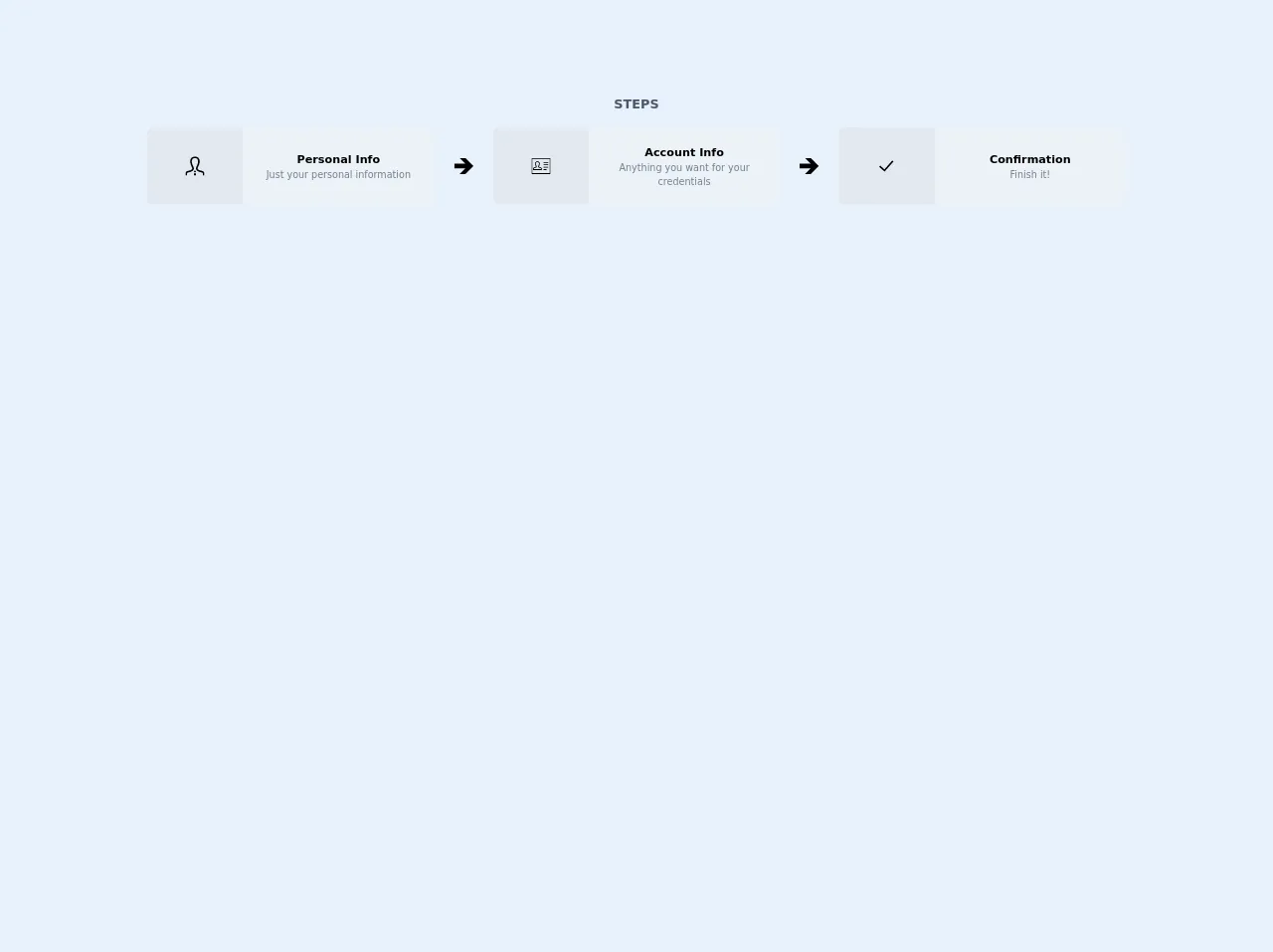
The preview of Progress steps UI component
To create a Progress steps UI component with Tailwind CSS, you can use a combination of flexbox and border classes. The component will consist of several circles that represent the steps, with a line connecting them to show the progress. Here's a preview of what the component will look like:
Free download of the Progress steps's source code
The source code of Progress steps UI component
To create the Progress steps UI component, you can use the following HTML and CSS code:
<div>
    <h1 class="mb-4 text-center font-black text-gray-700">STEPS</h1>
    <div class="flex">
      <div class="w-1/3 text-center px-6">
        <div
          class="bg-gray-300 rounded-lg flex items-center justify-center border border-gray-200"
        >
          <div
            class="w-1/3 bg-transparent h-20 flex items-center justify-center icon-step"
          >
            <svg xmlns="http://www.w3.org/2000/svg" width="24" height="24" viewBox="0 0 24 24"><path d="M23.995 24h-1.995c0-3.104.119-3.55-1.761-3.986-2.877-.664-5.594-1.291-6.584-3.458-.361-.791-.601-2.095.31-3.814 2.042-3.857 2.554-7.165 1.403-9.076-1.341-2.229-5.413-2.241-6.766.034-1.154 1.937-.635 5.227 1.424 9.025.93 1.712.697 3.02.338 3.815-.982 2.178-3.675 2.799-6.525 3.456-1.964.454-1.839.87-1.839 4.004h-1.995l-.005-1.241c0-2.52.199-3.975 3.178-4.663 3.365-.777 6.688-1.473 5.09-4.418-4.733-8.729-1.35-13.678 3.732-13.678 4.983 0 8.451 4.766 3.732 13.678-1.551 2.928 1.65 3.624 5.09 4.418 2.979.688 3.178 2.143 3.178 4.663l-.005 1.241zm-13.478-6l.91 2h1.164l.92-2h-2.994zm2.995 6l-.704-3h-1.615l-.704 3h3.023z"/></svg>
          </div>
          <div
            class="w-2/3 bg-gray-200 h-24 flex flex-col items-center justify-center px-1 rounded-r-lg body-step"
          >
            <h2 class="font-bold text-sm">Personal Info</h2>
            <p class="text-xs text-gray-600">
              Just your personal information
            </p>
          </div>
        </div>
      </div>
      <div class="flex-1 flex items-center justify-center">
        <svg xmlns="http://www.w3.org/2000/svg" width="24" height="24" viewBox="0 0 24 24"><path d="M14 2h-7.229l7.014 7h-13.785v6h13.785l-7.014 7h7.229l10-10z"/></svg>
      </div>
      <div class="w-1/3 text-center px-6">
        <div
          class="bg-gray-300 rounded-lg flex items-center justify-center border border-gray-200"
        >
          <div class="w-1/3 bg-transparent h-20 flex items-center justify-center icon-step">
            <svg width="24" height="24" xmlns="http://www.w3.org/2000/svg" fill-rule="evenodd" clip-rule="evenodd"><path d="M24 22h-24v-20h24v20zm-1-19h-22v18h22v-18zm-4 13v1h-4v-1h4zm-6.002 1h-10.997l-.001-.914c-.004-1.05-.007-2.136 1.711-2.533.789-.182 1.753-.404 1.892-.709.048-.108-.04-.301-.098-.407-1.103-2.036-1.305-3.838-.567-5.078.514-.863 1.448-1.359 2.562-1.359 1.105 0 2.033.488 2.545 1.339.737 1.224.542 3.033-.548 5.095-.057.106-.144.301-.095.41.14.305 1.118.531 1.83.696 1.779.41 1.773 1.503 1.767 2.56l-.001.9zm-9.998-1h8.999c.003-1.014-.055-1.27-.936-1.473-1.171-.27-2.226-.514-2.57-1.267-.174-.381-.134-.816.119-1.294.921-1.739 1.125-3.199.576-4.111-.332-.551-.931-.855-1.688-.855-.764 0-1.369.31-1.703.871-.542.91-.328 2.401.587 4.09.259.476.303.912.13 1.295-.342.757-1.387.997-2.493 1.252-.966.222-1.022.478-1.021 1.492zm18-3v1h-6v-1h6zm0-3v1h-6v-1h6zm0-3v1h-6v-1h6z"/></svg>
          </div>
          <div
            class="w-2/3 bg-gray-200 h-24 flex flex-col items-center justify-center px-1 rounded-r-lg body-step"
          >
            <h2 class="font-bold text-sm">Account Info</h2>
            <p class="text-xs text-gray-600">
              Anything you want for your credentials
            </p>
          </div>
        </div>
      </div>
      <div class="flex-1 flex items-center justify-center">
        <svg xmlns="http://www.w3.org/2000/svg" width="24" height="24" viewBox="0 0 24 24"><path d="M14 2h-7.229l7.014 7h-13.785v6h13.785l-7.014 7h7.229l10-10z"/></svg>
      </div>
      <div class="w-1/3 text-center px-6">
        <div
          class="bg-gray-300 rounded-lg flex items-center justify-center border border-gray-200"
        >
          <div class="w-1/3 bg-transparent h-20 flex items-center justify-center icon-step">
            <svg width="24" height="24" xmlns="http://www.w3.org/2000/svg" fill-rule="evenodd" clip-rule="evenodd"><path d="M21 6.285l-11.16 12.733-6.84-6.018 1.319-1.49 5.341 4.686 9.865-11.196 1.475 1.285z"/></svg>
          </div>
          <div
            class="w-2/3 bg-gray-200 h-24 flex flex-col items-center justify-center px-1 rounded-r-lg body-step"
          >
            <h2 class="font-bold text-sm">Confirmation</h2>
            <p class="text-xs text-gray-600">
              Finish it!
            </p>
          </div>
        </div>
      </div>
    </div>
  </div>
How to create a Progress steps with Tailwind CSS?
To create a Progress steps UI component with Tailwind CSS, follow these steps:
- Create a container element to hold the Progress steps UI component.
<div class="flex justify-between items-center">
    <!-- Progress steps UI component goes here -->
</div>
- Create a circle element for each step.
<div class="flex justify-between items-center">
    <div class="w-8 h-8 rounded-full border-2 border-gray-400"></div>
    <div class="w-8 h-8 rounded-full border-2 border-gray-400"></div>
    <div class="w-8 h-8 rounded-full border-2 border-gray-400"></div>
</div>
- Add a line element between each circle to show the progress.
<div class="flex justify-between items-center">
    <div class="w-8 h-8 rounded-full border-2 border-gray-400"></div>
    <div class="w-8 h-8 rounded-full border-2 border-gray-400"></div>
    <div class="w-8 h-8 rounded-full border-2 border-gray-400"></div>
</div>

<div class="flex justify-between items-center mt-2">
    <div class="w-1/3 h-1 border-t border-gray-400"></div>
    <div class="w-1/3 h-1 border-t border-gray-400"></div>
    <div class="w-1/3 h-1 border-t border-gray-400"></div>
</div>
- Add a class to the active circle to show the progress.
<div class="flex justify-between items-center">
    <div class="w-8 h-8 rounded-full border-2 border-gray-400"></div>
    <div class="w-8 h-8 rounded-full border-2 border-gray-400"></div>
    <div class="w-8 h-8 rounded-full border-2 border-gray-400"></div>
</div>

<div class="flex justify-between items-center mt-2">
    <div class="w-1/3 h-1 border-t border-gray-400"></div>
    <div class="w-1/3 h-1 border-t border-gray-400"></div>
    <div class="w-1/3 h-1 border-t border-gray-400"></div>
</div>
- Customize the design to match your brand's style guide.
<div class="flex justify-between items-center">
    <div class="w-8 h-8 rounded-full border-2 border-gray-400"></div>
    <div class="w-8 h-8 rounded-full border-2 border-gray-400 bg-blue-500"></div>
    <div class="w-8 h-8 rounded-full border-2 border-gray-400"></div>
</div>

<div class="flex justify-between items-center mt-2">
    <div class="w-1/3 h-1 border-t border-gray-400"></div>
    <div class="w-1/3 h-1 border-t border-blue-500"></div>
    <div class="w-1/3 h-1 border-t border-gray-400"></div>
</div>
Conclusion
Creating a Progress steps UI component with Tailwind CSS is easy and straightforward. By using a combination of flexbox and border classes, you can create a custom design that matches your brand's style guide. Tailwind CSS provides a set of pre-defined classes that make it easy to create custom designs quickly and easily. So, if you're looking to create a Progress steps UI component, give Tailwind CSS a try!