- Published on
The Ultimate Guide To Help You Create A Progress Steps Bar UX With Tailwind CSS
- What is Tailwind CSS?
- The description of Progress steps bar UX ui component
- Why use Tailwind CSS to create a Progress steps bar UX ui component?
- The preview of Progress steps bar UX ui component
- The source code of Progress steps bar UX ui component
- How to create a Progress steps bar UX with Tailwind CSS?
- Conclusion
As a FrontEnd technology blogger, it's important to stay up-to-date with the latest tools and trends in the industry. One tool that has been gaining popularity in recent years is Tailwind CSS. Tailwind CSS is a utility-first CSS framework that allows you to quickly and easily create custom designs without having to write a lot of custom CSS. In this article, we'll be discussing how to create a Progress steps bar UX with Tailwind CSS.
What is Tailwind CSS?
Tailwind CSS is a utility-first CSS framework that allows you to quickly and easily create custom designs without having to write a lot of custom CSS. It provides a set of pre-defined CSS classes that you can use to style your HTML elements. These classes are designed to be easy to understand and use, making it a great choice for developers of all skill levels.
The description of Progress steps bar UX ui component
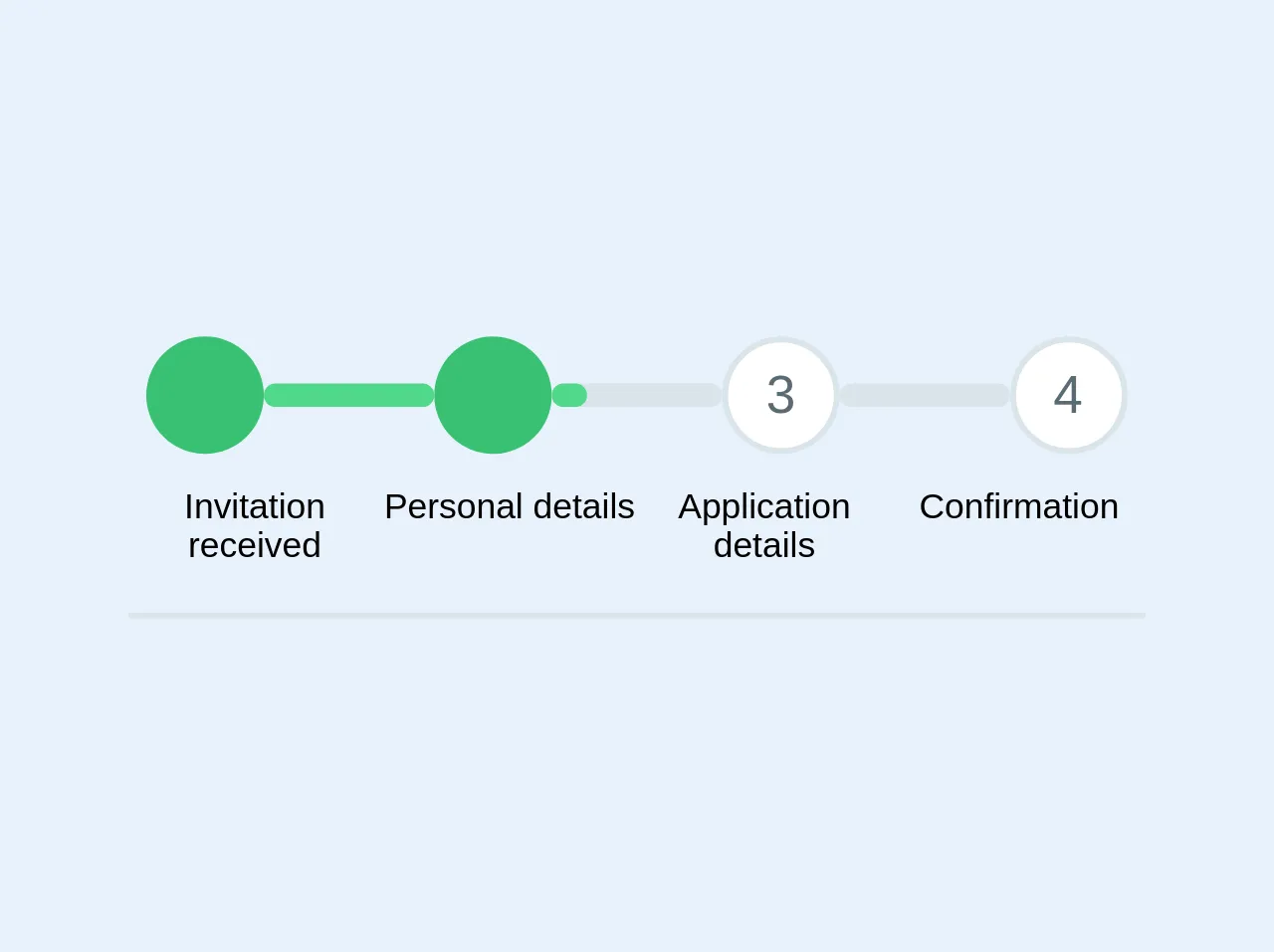
A Progress steps bar UX is a UI component that is used to show the progress of a user through a series of steps. It typically consists of a horizontal bar with a series of circles or icons that represent each step in the process. As the user completes each step, the corresponding circle or icon is filled in to indicate progress.
Why use Tailwind CSS to create a Progress steps bar UX ui component?
Tailwind CSS is a great choice for creating a Progress steps bar UX UI component because it provides a set of pre-defined CSS classes that make it easy to style the component. Additionally, Tailwind CSS is highly customizable, allowing you to easily modify the styles to match your specific design requirements.
The preview of Progress steps bar UX ui component
To create a Progress steps bar UX with Tailwind CSS, we'll be using a combination of HTML and CSS. The HTML will define the structure of the component, while the CSS will be used to style it.
Free download of the Progress steps bar UX's source code
The source code of Progress steps bar UX ui component
To create a Progress steps bar UX with Tailwind CSS, we'll be using a combination of HTML and CSS. The HTML will define the structure of the component, while the CSS will be used to style it.
<div class="max-w-xl mx-auto my-4 border-b-2 pb-4">
	<div class="flex pb-3">
		<div class="flex-1">
		</div>

		<div class="flex-1">
			<div class="w-10 h-10 bg-green mx-auto rounded-full text-lg text-white flex items-center">
				<span class="text-white text-center w-full"><i class="fa fa-check w-full fill-current white"></i></span>
			</div>
		</div>


		<div class="w-1/6 align-center items-center align-middle content-center flex">
			<div class="w-full bg-grey-light rounded items-center align-middle align-center flex-1">
			 	<div class="bg-green-light text-xs leading-none py-1 text-center text-grey-darkest rounded " style="width: 100%"></div>
			</div>
		</div>


		<div class="flex-1">
			<div class="w-10 h-10 bg-green mx-auto rounded-full text-lg text-white flex items-center">
				<span class="text-white text-center w-full"><i class="fa fa-check w-full fill-current white"></i></span>
			</div>
		</div>

		<div class="w-1/6 align-center items-center align-middle content-center flex">
			<div class="w-full bg-grey-light rounded items-center align-middle align-center flex-1">
			 	<div class="bg-green-light text-xs leading-none py-1 text-center text-grey-darkest rounded " style="width: 20%"></div>
			</div>
		</div>

		<div class="flex-1">
			<div class="w-10 h-10 bg-white border-2 border-grey-light mx-auto rounded-full text-lg text-white flex items-center">
				<span class="text-grey-darker text-center w-full">3</span>
			</div>
		</div>


		<div class="w-1/6 align-center items-center align-middle content-center flex">
			<div class="w-full bg-grey-light rounded items-center align-middle align-center flex-1">
			 	<div class="bg-green-light text-xs leading-none py-1 text-center text-grey-darkest rounded " style="width: 0%"></div>
			</div>
		</div>


		<div class="flex-1">
			<div class="w-10 h-10 bg-white border-2 border-grey-light mx-auto rounded-full text-lg text-white flex items-center">
				<span class="text-grey-darker text-center w-full">4</span>
			</div>
		</div>


		<div class="flex-1">
		</div>
	</div>

	<div class="flex text-xs content-center text-center">
		<div class="w-1/4">
			Invitation received
		</div>

		<div class="w-1/4">
			Personal details
		</div>

		<div class="w-1/4">
			Application details
		</div>

		<div class="w-1/4">
			Confirmation
		</div>
	</div>
</div>
How to create a Progress steps bar UX with Tailwind CSS?
To create a Progress steps bar UX with Tailwind CSS, follow these steps:
Create the HTML structure for the component. This will typically consist of a container element with a series of child elements that represent each step in the process.
Apply the appropriate Tailwind CSS classes to each element to style the component. This will typically involve using classes like
bg-gray-200to set the background color of the component, andtext-gray-600to set the text color.Use CSS to style the component further. This may involve using custom CSS classes to modify the styles of specific elements, or using Tailwind CSS utilities to modify the styles of existing classes.
Test the component to ensure that it works as expected.
Conclusion
Creating a Progress steps bar UX with Tailwind CSS is a great way to add visual interest to your website or application. By using Tailwind CSS, you can quickly and easily create custom designs without having to write a lot of custom CSS. If you're new to Tailwind CSS, be sure to check out the official documentation for more information on how to get started.