- Published on
Most Effective Ways To Build A Profile Page With Tailwind CSS
- What is Tailwind CSS?
- The description of Profile Page ui component
- Why use Tailwind CSS to create a Profile Page ui component?
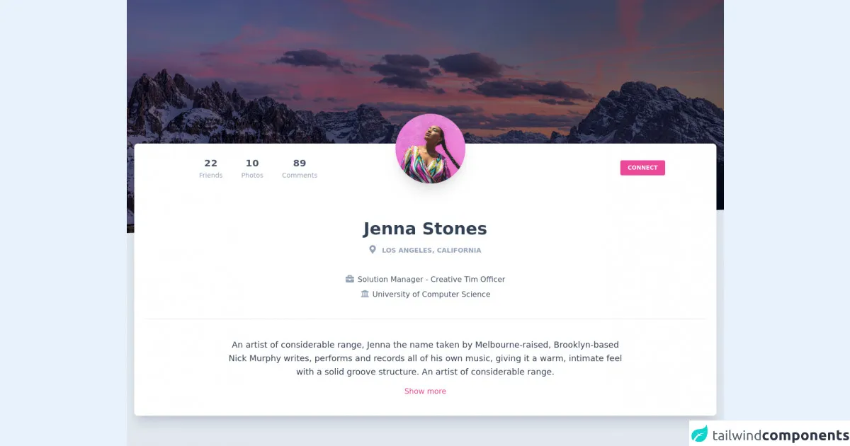
- The preview of Profile Page ui component
- The source code of Profile Page ui component
- How to create a Profile Page with Tailwind CSS?
- Conclusion
As a FrontEnd technology blogger, you must be aware of the importance of creating a user-friendly and visually appealing profile page. A profile page is a crucial component of any website that allows users to showcase their personal information, skills, and achievements. With the help of Tailwind CSS, you can easily create a stunning profile page that will impress your visitors. In this article, we will discuss the most effective ways to build a profile page with Tailwind CSS.
What is Tailwind CSS?
Tailwind CSS is a utility-first CSS framework that provides a set of pre-defined classes to create responsive and customizable user interfaces. It allows developers to build complex layouts and designs without writing custom CSS. With Tailwind CSS, you can easily create a beautiful and functional profile page with minimal effort.
The description of Profile Page ui component
A profile page is a web page that displays information about a user or organization. It typically includes a profile picture, name, bio, contact information, and social media links. A well-designed profile page can help users establish their online presence and showcase their skills and achievements.
Why use Tailwind CSS to create a Profile Page ui component?
Tailwind CSS provides a set of pre-defined classes that can be used to create a responsive and customizable profile page. It eliminates the need for writing custom CSS, which saves time and effort. With Tailwind CSS, you can easily create a visually appealing and user-friendly profile page that will impress your visitors.
The preview of Profile Page ui component
To create a profile page with Tailwind CSS, you can use the following classes:
bg-gray-100: sets the background color of the page to gray.flex: sets the display property of the element to flex.justify-center: centers the element horizontally.items-center: centers the element vertically.h-screen: sets the height of the element to the height of the screen.text-4xl: sets the font size of the text to 4xl.text-gray-800: sets the color of the text to gray.font-bold: sets the font weight of the text to bold.mx-auto: centers the element horizontally.w-1/2: sets the width of the element to half of the parent element.rounded-full: sets the border radius of the element to full.
Free download of the Profile Page's source code
The source code of Profile Page ui component
To create a profile page with Tailwind CSS, you can use the following HTML code:
<div class="bg-gray-100 flex justify-center items-center h-screen">
  <div class="text-4xl text-gray-800 font-bold">Profile Page</div>
  <div class="mx-auto w-1/2">
    <img src="profile.jpg" alt="Profile Picture" class="rounded-full">
    <div class="text-2xl text-gray-800 font-bold">John Doe</div>
    <div class="text-lg text-gray-600">Web Developer</div>
    <div class="my-4">
      <a href="#" class="text-blue-500">www.johndoe.com</a>
    </div>
    <div class="my-4">
      <a href="#" class="text-blue-500">Facebook</a>
      <a href="#" class="text-blue-500 ml-4">Twitter</a>
      <a href="#" class="text-blue-500 ml-4">LinkedIn</a>
    </div>
  </div>
</div>
<link rel="stylesheet" href="https://demos.creative-tim.com/notus-js/assets/styles/tailwind.css">
<link rel="stylesheet" href="https://demos.creative-tim.com/notus-js/assets/vendor/@fortawesome/fontawesome-free/css/all.min.css">
<main class="profile-page">
<section class="relative block h-500-px">
<div class="absolute top-0 w-full h-full bg-center bg-cover" style="
background-image: url('https://images.unsplash.com/photo-1499336315816-097655dcfbda?ixlib=rb-1.2.1&ixid=eyJhcHBfaWQiOjEyMDd9&auto=format&fit=crop&w=2710&q=80');
">
<span id="blackOverlay" class="w-full h-full absolute opacity-50 bg-black"></span>
</div>
<div class="top-auto bottom-0 left-0 right-0 w-full absolute pointer-events-none overflow-hidden h-70-px" style="transform: translateZ(0px)">
<svg class="absolute bottom-0 overflow-hidden" xmlns="http://www.w3.org/2000/svg" preserveAspectRatio="none" version="1.1" viewBox="0 0 2560 100" x="0" y="0">
<polygon class="text-blueGray-200 fill-current" points="2560 0 2560 100 0 100"></polygon>
</svg>
</div>
</section>
<section class="relative py-16 bg-blueGray-200">
<div class="container mx-auto px-4">
<div class="relative flex flex-col min-w-0 break-words bg-white w-full mb-6 shadow-xl rounded-lg -mt-64">
<div class="px-6">
<div class="flex flex-wrap justify-center">
<div class="w-full lg:w-3/12 px-4 lg:order-2 flex justify-center">
<div class="relative">
<img alt="..." src="https://demos.creative-tim.com/notus-js/assets/img/team-2-800x800.jpg" class="shadow-xl rounded-full h-auto align-middle border-none absolute -m-16 -ml-20 lg:-ml-16 max-w-150-px">
</div>
</div>
<div class="w-full lg:w-4/12 px-4 lg:order-3 lg:text-right lg:self-center">
<div class="py-6 px-3 mt-32 sm:mt-0">
<button class="bg-pink-500 active:bg-pink-600 uppercase text-white font-bold hover:shadow-md shadow text-xs px-4 py-2 rounded outline-none focus:outline-none sm:mr-2 mb-1 ease-linear transition-all duration-150" type="button">
Connect
</button>
</div>
</div>
<div class="w-full lg:w-4/12 px-4 lg:order-1">
<div class="flex justify-center py-4 lg:pt-4 pt-8">
<div class="mr-4 p-3 text-center">
<span class="text-xl font-bold block uppercase tracking-wide text-blueGray-600">22</span><span class="text-sm text-blueGray-400">Friends</span>
</div>
<div class="mr-4 p-3 text-center">
<span class="text-xl font-bold block uppercase tracking-wide text-blueGray-600">10</span><span class="text-sm text-blueGray-400">Photos</span>
</div>
<div class="lg:mr-4 p-3 text-center">
<span class="text-xl font-bold block uppercase tracking-wide text-blueGray-600">89</span><span class="text-sm text-blueGray-400">Comments</span>
</div>
</div>
</div>
</div>
<div class="text-center mt-12">
<h3 class="text-4xl font-semibold leading-normal mb-2 text-blueGray-700 mb-2">
Jenna Stones
</h3>
<div class="text-sm leading-normal mt-0 mb-2 text-blueGray-400 font-bold uppercase">
<i class="fas fa-map-marker-alt mr-2 text-lg text-blueGray-400"></i>
Los Angeles, California
</div>
<div class="mb-2 text-blueGray-600 mt-10">
<i class="fas fa-briefcase mr-2 text-lg text-blueGray-400"></i>Solution Manager - Creative Tim Officer
</div>
<div class="mb-2 text-blueGray-600">
<i class="fas fa-university mr-2 text-lg text-blueGray-400"></i>University of Computer Science
</div>
</div>
<div class="mt-10 py-10 border-t border-blueGray-200 text-center">
<div class="flex flex-wrap justify-center">
<div class="w-full lg:w-9/12 px-4">
<p class="mb-4 text-lg leading-relaxed text-blueGray-700">
An artist of considerable range, Jenna the name taken by
Melbourne-raised, Brooklyn-based Nick Murphy writes,
performs and records all of his own music, giving it a
warm, intimate feel with a solid groove structure. An
artist of considerable range.
</p>
<a href="#pablo" class="font-normal text-pink-500">Show more</a>
</div>
</div>
</div>
</div>
</div>
</div>
<footer class="relative bg-blueGray-200 pt-8 pb-6 mt-8">
<div class="container mx-auto px-4">
<div class="flex flex-wrap items-center md:justify-between justify-center">
<div class="w-full md:w-6/12 px-4 mx-auto text-center">
<div class="text-sm text-blueGray-500 font-semibold py-1">
Made with <a href="https://www.creative-tim.com/product/notus-js" class="text-blueGray-500 hover:text-gray-800" target="_blank">Notus JS</a> by <a href="https://www.creative-tim.com" class="text-blueGray-500 hover:text-blueGray-800" target="_blank"> Creative Tim</a>.
</div>
</div>
</div>
</div>
</footer>
</section>
</main>
How to create a Profile Page with Tailwind CSS?
To create a profile page with Tailwind CSS, follow these steps:
- Create a new HTML file and add the necessary HTML code.
- Link the Tailwind CSS stylesheet to your HTML file.
- Add the required Tailwind CSS classes to your HTML elements.
- Customize the styles according to your preferences.
- Save the file and open it in your web browser to preview the profile page.
Conclusion
Creating a profile page with Tailwind CSS is an easy and efficient way to showcase your personal information, skills, and achievements. With the help of pre-defined classes and utilities, you can create a visually appealing and user-friendly profile page in no time. By following the steps outlined in this article, you can create a stunning profile page that will impress your visitors and establish your online presence.