- Published on
Best Ways To Create A Profile Page With Image And Form With Tailwind CSS
- What is Tailwind CSS?
- The Description of Profile Page With Image and Form UI Component
- Why Use Tailwind CSS to Create a Profile Page With Image and Form UI Component?
- The Preview of Profile Page With Image and Form UI Component
- The Source Code of Profile Page With Image and Form UI Component
- How to Create a Profile Page With Image and Form with Tailwind CSS?
- Step 1: Set Up Your HTML
- Step 2: Add Tailwind CSS Classes
- Step 3: Customize the Styles
- Conclusion
Are you looking to create a stunning profile page with an image and form using Tailwind CSS? Look no further! In this article, we will guide you through the best ways to create a profile page with image and form using Tailwind CSS.
What is Tailwind CSS?
Tailwind CSS is a utility-first CSS framework that helps you quickly build custom designs without writing any CSS. It provides a set of pre-defined classes that you can use to style your HTML elements. With Tailwind CSS, you can create complex designs with ease and speed up your development process.
The Description of Profile Page With Image and Form UI Component
A profile page with an image and form is a common UI component used in many web applications. It allows users to upload their profile picture and update their personal information. The UI component typically consists of an image, a form, and some buttons.
Why Use Tailwind CSS to Create a Profile Page With Image and Form UI Component?
Tailwind CSS provides a set of pre-defined classes that you can use to style your HTML elements. This makes it easy to create a profile page with an image and form without writing any custom CSS. Additionally, Tailwind CSS is highly customizable, so you can easily modify the styles to match your design requirements.
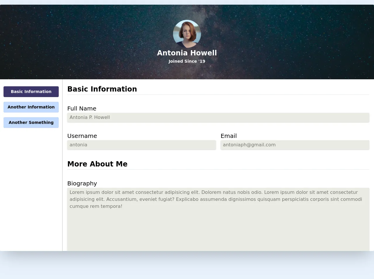
The Preview of Profile Page With Image and Form UI Component
To create a profile page with an image and form using Tailwind CSS, we will use a combination of HTML and Tailwind CSS classes. Here is a preview of what the final UI component will look like:
Free download of the Profile Page With Image and Form's source code
The Source Code of Profile Page With Image and Form UI Component
To create the profile page with an image and form, we will use HTML and Tailwind CSS classes. Here is the source code for the UI component:
<div class="w-full relative mt-4 shadow-2xl rounded my-24 overflow-hidden">
  <div class="top h-64 w-full bg-blue-600 overflow-hidden relative" >
    <img src="https://images.unsplash.com/photo-1503264116251-35a269479413?ixlib=rb-1.2.1&ixid=eyJhcHBfaWQiOjEyMDd9&auto=format&fit=crop&w=1050&q=80" alt="" class="bg w-full h-full object-cover object-center absolute z-0">
    <div class="flex flex-col justify-center items-center relative h-full bg-black bg-opacity-50 text-white">
      <img src="https://images.unsplash.com/photo-1438761681033-6461ffad8d80?ixlib=rb-1.2.1&ixid=eyJhcHBfaWQiOjEyMDd9&auto=format&fit=crop&w=1050&q=80" class="h-24 w-24 object-cover rounded-full">
      <h1 class="text-2xl font-semibold">Antonia Howell</h1>
      <h4 class="text-sm font-semibold">Joined Since '19</h4>
    </div>
  </div>
  <div class="grid grid-cols-12 bg-white ">

    <div class="col-span-12 w-full px-3 py-6 justify-center flex space-x-4 border-b border-solid md:space-x-0 md:space-y-4 md:flex-col md:col-span-2 md:justify-start ">

      <a href="#" class="text-sm p-2 bg-indigo-900 text-white text-center rounded font-bold">Basic Information</a>

      <a href="#" class="text-sm p-2 bg-indigo-200 text-center rounded font-semibold hover:bg-indigo-700 hover:text-gray-200">Another Information</a>

      <a href="#" class="text-sm p-2 bg-indigo-200 text-center rounded font-semibold hover:bg-indigo-700 hover:text-gray-200">Another Something</a>

    </div>

    <div class="col-span-12 md:border-solid md:border-l md:border-black md:border-opacity-25 h-full pb-12 md:col-span-10">
      <div class="px-4 pt-4">
        <form action="#" class="flex flex-col space-y-8">

          <div>
            <h3 class="text-2xl font-semibold">Basic Information</h3>
            <hr>
          </div>

          <div class="form-item">
            <label class="text-xl ">Full Name</label>
            <input type="text" value="Antonia P. Howell" class="w-full appearance-none text-black text-opacity-50 rounded shadow py-1 px-2  mr-2 focus:outline-none focus:shadow-outline focus:border-blue-200" disabled>
          </div>

          <div class="flex flex-col space-y-4 md:space-y-0 md:flex-row md:space-x-4">

            <div class="form-item w-full">
              <label class="text-xl ">Username</label>
              <input type="text" value="antonia" class="w-full appearance-none text-black text-opacity-50 rounded shadow py-1 px-2 mr-2 focus:outline-none focus:shadow-outline focus:border-blue-200 text-opacity-25 " disabled>
            </div>

            <div class="form-item w-full">
              <label class="text-xl ">Email</label>
              <input type="text" value="[email protected]" class="w-full appearance-none text-black text-opacity-50 rounded shadow py-1 px-2 mr-2 focus:outline-none focus:shadow-outline focus:border-blue-200 text-opacity-25 " disabled>
            </div>
          </div>

          <div>
            <h3 class="text-2xl font-semibold ">More About Me</h3>
            <hr>
          </div>

          <div class="form-item w-full">
            <label class="text-xl ">Biography</label>
            <textarea cols="30" rows="10" class="w-full appearance-none text-black text-opacity-50 rounded shadow py-1 px-2 mr-2 focus:outline-none focus:shadow-outline focus:border-blue-200 text-opacity-25 " disabled>Lorem ipsum dolor sit amet consectetur adipisicing elit. Dolorem natus nobis odio. Lorem ipsum dolor sit amet consectetur adipisicing elit. Accusantium, eveniet fugiat? Explicabo assumenda dignissimos quisquam perspiciatis corporis sint commodi cumque rem tempora!</textarea>
          </div>

          <div>
            <h3 class="text-2xl font-semibold">My Social Media</h3>
            <hr>
          </div>

          <div class="form-item">
            <label class="text-xl ">Instagram</label>
            <input type="text" value="https://instagram.com/" class="w-full appearance-none text-black text-opacity-50 rounded shadow py-1 px-2 mr-2 focus:outline-none focus:shadow-outline focus:border-blue-200 text-opacity-25 " disabled>
          </div>
          <div class="form-item">
            <label class="text-xl ">Facebook</label>
            <input type="text" value="https://facebook.com/" class="w-full appearance-none text-black text-opacity-50 rounded shadow py-1 px-2 mr-2 focus:outline-none focus:shadow-outline focus:border-blue-200 text-opacity-25 " disabled>
          </div>
          <div class="form-item">
            <label class="text-xl ">Twitter</label>
            <input type="text" value="https://twitter.com/" class="w-full appearance-none text-black text-opacity-50 rounded shadow py-1 px-2  mr-2 focus:outline-none focus:shadow-outline focus:border-blue-200  " disabled>
          </div>

        </form>
      </div>
    </div>


  </div>
</div>
How to Create a Profile Page With Image and Form with Tailwind CSS?
Now that we have a preview and source code for the profile page with an image and form UI component, let's walk through the steps to create it using Tailwind CSS.
Step 1: Set Up Your HTML
First, we will create the HTML structure for the profile page with an image and form. We will use a combination of HTML tags and Tailwind CSS classes to create the UI component. Here is the HTML code:
<div class="flex flex-col items-center">
  <div class="w-full max-w-md">
    <div class="bg-white shadow-md rounded-lg px-8 pt-6 pb-8 mb-4">
      <div class="mb-4">
        <img class="h-48 w-full object-cover rounded" src="https://via.placeholder.com/150" alt="Profile Picture">
      </div>
      <form>
        <div class="mb-4">
          <label class="block text-gray-700 font-bold mb-2" for="username">
            Username
          </label>
          <input class="shadow appearance-none border rounded w-full py-2 px-3 text-gray-700 leading-tight focus:outline-none focus:shadow-outline" id="username" type="text" placeholder="Username">
        </div>
        <div class="mb-4">
          <label class="block text-gray-700 font-bold mb-2" for="email">
            Email
          </label>
          <input class="shadow appearance-none border rounded w-full py-2 px-3 text-gray-700 leading-tight focus:outline-none focus:shadow-outline" id="email" type="email" placeholder="Email">
        </div>
        <div class="mb-4">
          <label class="block text-gray-700 font-bold mb-2" for="password">
            Password
          </label>
          <input class="shadow appearance-none border rounded w-full py-2 px-3 text-gray-700 leading-tight focus:outline-none focus:shadow-outline" id="password" type="password" placeholder="Password">
        </div>
        <div class="mb-4">
          <label class="block text-gray-700 font-bold mb-2" for="confirm-password">
            Confirm Password
          </label>
          <input class="shadow appearance-none border rounded w-full py-2 px-3 text-gray-700 leading-tight focus:outline-none focus:shadow-outline" id="confirm-password" type="password" placeholder="Confirm Password">
        </div>
        <div class="flex items-center justify-between">
          <button class="bg-blue-500 hover:bg-blue-700 text-white font-bold py-2 px-4 rounded focus:outline-none focus:shadow-outline" type="button">
            Save
          </button>
          <button class="bg-red-500 hover:bg-red-700 text-white font-bold py-2 px-4 rounded focus:outline-none focus:shadow-outline" type="button">
            Cancel
          </button>
        </div>
      </form>
    </div>
  </div>
</div>
Step 2: Add Tailwind CSS Classes
Next, we will add Tailwind CSS classes to the HTML tags to style the UI component. We will use classes such as bg-white, shadow-md, rounded-lg, px-8, pt-6, pb-8, mb-4, h-48, w-full, object-cover, rounded, shadow, appearance-none, border, py-2, px-3, text-gray-700, leading-tight, focus:outline-none, focus:shadow-outline, flex, items-center, justify-between, bg-blue-500, hover:bg-blue-700, text-white, font-bold, bg-red-500, and hover:bg-red-700. Here is the updated HTML code:
<div class="flex flex-col items-center">
  <div class="w-full max-w-md">
    <div class="bg-white shadow-md rounded-lg px-8 pt-6 pb-8 mb-4">
      <div class="mb-4">
        <img class="h-48 w-full object-cover rounded" src="https://via.placeholder.com/150" alt="Profile Picture">
      </div>
      <form>
        <div class="mb-4">
          <label class="block text-gray-700 font-bold mb-2" for="username">
            Username
          </label>
          <input class="shadow appearance-none border rounded w-full py-2 px-3 text-gray-700 leading-tight focus:outline-none focus:shadow-outline" id="username" type="text" placeholder="Username">
        </div>
        <div class="mb-4">
          <label class="block text-gray-700 font-bold mb-2" for="email">
            Email
          </label>
          <input class="shadow appearance-none border rounded w-full py-2 px-3 text-gray-700 leading-tight focus:outline-none focus:shadow-outline" id="email" type="email" placeholder="Email">
        </div>
        <div class="mb-4">
          <label class="block text-gray-700 font-bold mb-2" for="password">
            Password
          </label>
          <input class="shadow appearance-none border rounded w-full py-2 px-3 text-gray-700 leading-tight focus:outline-none focus:shadow-outline" id="password" type="password" placeholder="Password">
        </div>
        <div class="mb-4">
          <label class="block text-gray-700 font-bold mb-2" for="confirm-password">
            Confirm Password
          </label>
          <input class="shadow appearance-none border rounded w-full py-2 px-3 text-gray-700 leading-tight focus:outline-none focus:shadow-outline" id="confirm-password" type="password" placeholder="Confirm Password">
        </div>
        <div class="flex items-center justify-between">
          <button class="bg-blue-500 hover:bg-blue-700 text-white font-bold py-2 px-4 rounded focus:outline-none focus:shadow-outline" type="button">
            Save
          </button>
          <button class="bg-red-500 hover:bg-red-700 text-white font-bold py-2 px-4 rounded focus:outline-none focus:shadow-outline" type="button">
            Cancel
          </button>
        </div>
      </form>
    </div>
  </div>
</div>
Step 3: Customize the Styles
Finally, we can customize the styles to match our design requirements. We can modify the colors, font sizes, and other properties using the Tailwind CSS classes. Here is an example of how we can customize the styles:
<div class="flex flex-col items-center">
  <div class="w-full max-w-md">
    <div class="bg-gray-100 shadow-md rounded-lg px-8 pt-6 pb-8 mb-4">
      <div class="mb-4">
        <img class="h-48 w-full object-cover rounded" src="https://via.placeholder.com/150" alt="Profile Picture">
      </div>
      <form>
        <div class="mb-4">
          <label class="block text-gray-700 font-bold mb-2" for="username">
            Username
          </label>
          <input class="shadow appearance-none border rounded w-full py-2 px-3 text-gray-700 leading-tight focus:outline-none focus:shadow-outline" id="username" type="text" placeholder="Username">
        </div>
        <div class="mb-4">
          <label class="block text-gray-700 font-bold mb-2" for="email">
            Email
          </label>
          <input class="shadow appearance-none border rounded w-full py-2 px-3 text-gray-700 leading-tight focus:outline-none focus:shadow-outline" id="email" type="email" placeholder="Email">
        </div>
        <div class="mb-4">
          <label class="block text-gray-700 font-bold mb-2" for="password">
            Password
          </label>
          <input class="shadow appearance-none border rounded w-full py-2 px-3 text-gray-700 leading-tight focus:outline-none focus:shadow-outline" id="password" type="password" placeholder="Password">
        </div>
        <div class="mb-4">
          <label class="block text-gray-700 font-bold mb-2" for="confirm-password">
            Confirm Password
          </label>
          <input class="shadow appearance-none border rounded w-full py-2 px-3 text-gray-700 leading-tight focus:outline-none focus:shadow-outline" id="confirm-password" type="password" placeholder="Confirm Password">
        </div>
        <div class="flex items-center justify-between">
          <button class="bg-blue-500 hover:bg-blue-700 text-white font-bold py-2 px-4 rounded focus:outline-none focus:shadow-outline" type="button">
            Save
          </button>
          <button class="bg-red-500 hover:bg-red-700 text-white font-bold py-2 px-4 rounded focus:outline-none focus:shadow-outline" type="button">
            Cancel
          </button>
        </div>
      </form>
    </div>
  </div>
</div>
Conclusion
Creating a profile page with an image and form using Tailwind CSS is easy and efficient. With the pre-defined classes provided by Tailwind CSS, you can quickly build custom designs without writing any CSS. Additionally, Tailwind CSS is highly customizable, so you can easily modify the styles to match your design requirements. We hope this article has helped you create a stunning profile page with an image and form using Tailwind CSS.