- Published on
What You Need To Make A Password Generator And Strength Score With Tailwind CSS
- What is Tailwind CSS?
- The description of Password Generator and Strength Score ui component
- Why use Tailwind CSS to create a Password Generator and Strength Score ui component?
- The preview of Password Generator and Strength Score ui component
- The source code of Password Generator and Strength Score ui component
- How to create a Password Generator and Strength Score with Tailwind CSS?
- Conclusion
What is Tailwind CSS?
Tailwind CSS is a utility-first CSS framework that provides a set of pre-defined CSS classes to help you quickly build custom user interfaces. It is designed to be highly customizable and easy to use, making it a popular choice for front-end developers.
The description of Password Generator and Strength Score ui component
A password generator and strength score UI component is a tool that allows users to generate a secure password and measure its strength. This component typically includes a password input field, a button to generate a password, and a strength score indicator that shows how strong the password is.
Why use Tailwind CSS to create a Password Generator and Strength Score ui component?
Tailwind CSS provides a set of pre-defined CSS classes that can be used to quickly build custom user interfaces. This makes it an ideal choice for creating a password generator and strength score UI component, as it allows you to easily style and customize the component to match your design requirements.
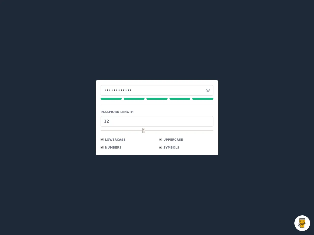
The preview of Password Generator and Strength Score ui component
To create a password generator and strength score UI component with Tailwind CSS, you can use the following HTML and CSS code:
<div class="flex flex-col items-center justify-center h-screen">
  <div class="w-full max-w-md">
    <label class="block mb-2 font-bold text-gray-700" for="password">
      Password
    </label>
    <div class="relative">
      <input
        class="w-full px-4 py-2 mb-4 leading-tight text-gray-700 border rounded shadow appearance-none focus:outline-none focus:shadow-outline"
        id="password"
        type="password"
        placeholder="Enter your password"
      />
      <button
        class="absolute top-0 right-0 px-4 py-2 font-bold text-white bg-blue-500 rounded hover:bg-blue-700 focus:outline-none focus:shadow-outline"
        type="button"
      >
        Generate
      </button>
    </div>
    <div class="flex mb-4">
      <div class="w-1/2">
        <div class="h-2 mb-1 bg-red-400 rounded"></div>
        <div>Password Strength: <span class="font-bold text-red-400">{{__placeholder1__}}</span></div>
      </div>
      <div class="w-1/2 text-right">
        <button class="px-4 py-2 font-bold text-white bg-blue-500 rounded hover:bg-blue-700 focus:outline-none focus:shadow-outline">
          Copy
        </button>
      </div>
    </div>
  </div>
</div>
Free download of the Password Generator and Strength Score's source code
The source code of Password Generator and Strength Score ui component
To create a password generator and strength score UI component with Tailwind CSS, you can use the following HTML and CSS code:
<div class="flex flex-col items-center justify-center h-screen">
  <div class="w-full max-w-md">
    <label class="block mb-2 font-bold text-gray-700" for="password">
      Password
    </label>
    <div class="relative">
      <input
        class="w-full px-4 py-2 mb-4 leading-tight text-gray-700 border rounded shadow appearance-none focus:outline-none focus:shadow-outline"
        id="password"
        type="password"
        placeholder="Enter your password"
      />
      <button
        class="absolute top-0 right-0 px-4 py-2 font-bold text-white bg-blue-500 rounded hover:bg-blue-700 focus:outline-none focus:shadow-outline"
        type="button"
      >
        Generate
      </button>
    </div>
    <div class="flex mb-4">
      <div class="w-1/2">
        <div class="h-2 mb-1 bg-red-400 rounded"></div>
        <div>Password Strength: <span class="font-bold text-red-400">{{__placeholder1__}}</span></div>
      </div>
      <div class="w-1/2 text-right">
        <button class="px-4 py-2 font-bold text-white bg-blue-500 rounded hover:bg-blue-700 focus:outline-none focus:shadow-outline">
          Copy
        </button>
      </div>
    </div>
  </div>
</div>
<script src="https://cdn.jsdelivr.net/gh/alpinejs/[email protected]/dist/alpine.js" defer></script>
<script src="https://cdnjs.cloudflare.com/ajax/libs/zxcvbn/4.4.2/zxcvbn.js"></script>
<style>@import url(https://cdnjs.cloudflare.com/ajax/libs/MaterialDesign-Webfont/5.3.45/css/materialdesignicons.min.css);</style>

<div class="min-w-screen min-h-screen bg-gray-800 flex items-center justify-center px-5 py-5">
    <div class="w-full mx-auto rounded-lg bg-white shadow p-5 text-gray-800" style="max-width: 500px" x-data="app()" x-init="generatePassword()">
        <div class="relative mb-2">
            <input :type="showPasswordField?'password':'text'" id="password" x-model="password" class="w-full pl-3 pr-10 py-2 border-2 border-gray-200 rounded-md focus:outline-none focus:border-indigo-500 transition-colors" placeholder="Password" @input="checkStrength()">
            <button class="block w-7 h-7 text-center text-xl leading-0 absolute top-2 right-2 text-gray-400 focus:outline-none hover:text-indigo-500 transition-colors" @click.prevent="showPasswordField=!showPasswordField"><i class="mdi" :class="`mdi-${showPasswordField?'eye-outline':'eye-off-outline'}`"></i></button>
        </div>
        <div class="flex -mx-1">
            <template x-for="(v,i) in 5">
                <div class="w-1/5 px-1">
                    <div class="h-2 rounded-xl transition-colors" :class="i<passwordScore?(passwordScore<=2?'bg-red-400':(passwordScore<=4?'bg-yellow-400':'bg-green-500')):'bg-gray-200'"></div>
                </div>
            </template>
        </div>
        <hr class="my-5 border border-gray-200">
        <div class="mb-2">
            <label class="block text-xs font-semibold text-gray-500 mb-2">PASSWORD LENGTH</label>
            <input class="w-full px-3 py-2 mb-1 border-2 border-gray-200 rounded-md focus:outline-none focus:border-indigo-500 transition-colors" placeholder="Length" type="number" min="1" max="30" step="1" x-model="charsLength" @input="generatePassword()"/>
            <input class="w-full" type="range" x-model="charsLength" min="1" max="30" step="1" @input="generatePassword()">
        </div>
        <div class="flex -mx-2 mb-2">
            <div class="w-1/2 px-2">
                <label for="charsLower">
                    <input type="checkbox" class="align-middle" id="charsLower" @input="generatePassword()" checked>
                    <span class="text-xs font-semibold text-gray-500">LOWERCASE</span>
                </label>
            </div>
            <div class="w-1/2 px-2">
                <label for="charsUpper">
                    <input type="checkbox" class="align-middle" id="charsUpper" @input="generatePassword()" checked>
                    <span class="text-xs font-semibold text-gray-500">UPPERCASE</span>
                </label>
            </div>
        </div>
        <div class="flex -mx-2">
            <div class="w-1/2 px-2">
                <label for="charsNumeric">
                    <input type="checkbox" class="align-middle" id="charsNumeric" @input="generatePassword()" checked>
                    <span class="text-xs font-semibold text-gray-500">NUMBERS</span>
                </label>
            </div>
            <div class="w-1/2 px-2">
                <label for="charsSymbols">
                    <input type="checkbox" class="align-middle" id="charsSymbols" @input="generatePassword()" checked>
                    <span class="text-xs font-semibold text-gray-500">SYMBOLS</span>
                </label>
            </div>
        </div>
    </div>
</div>

<script>
function app(){
    return {
        showPasswordField: true,
        passwordScore: 0,
        password: '',
        chars: {
            lower: 'abcdefghijklmnopqrstuvwxyz',
            upper: 'ABCDEFGHIJKLMNOPQRSTUVWXYZ',
            numeric: '0123456789',
            symbols: '!"#$%&\'()*+,-./:;<=>?@[\\]^_`{|}~'
        },
        charsLength: 12,
        checkStrength: function() {
            if(!this.password) return this.passwordScore = 0;
            this.passwordScore = zxcvbn(this.password).score + 1;
        },
        generatePassword: function() {
            console.log(document.getElementById('charsSymbols').checked);
            this.password = this.shuffleArray(
                ((document.getElementById('charsLower').checked?this.chars.lower:'')+(document.getElementById('charsUpper').checked?this.chars.upper:'')+(document.getElementById('charsNumeric').checked?this.chars.numeric:'')+(document.getElementById('charsSymbols').checked?this.chars.symbols:'')).split('')
            ).join('').substring(0, this.charsLength);
            this.checkStrength();
        },
        shuffleArray(array) {
            for (let i = array.length - 1; i > 0; i--) {
                const j = Math.floor(Math.random() * (i + 1));
                [array[i], array[j]] = [array[j], array[i]];
            }
            return array;
        }
    }
}
</script>

<!-- BUY ME A BEER AND HELP SUPPORT OPEN-SOURCE RESOURCES -->
<div class="flex items-end justify-end fixed bottom-0 right-0 mb-4 mr-4 z-10">
    <div>
        <a title="Buy me a beer" href="https://www.buymeacoffee.com/scottwindon" target="_blank" class="block w-16 h-16 rounded-full transition-all shadow hover:shadow-lg transform hover:scale-110 hover:rotate-12">
            <img class="object-cover object-center w-full h-full rounded-full" src="https://i.pinimg.com/originals/60/fd/e8/60fde811b6be57094e0abc69d9c2622a.jpg"/>
        </a>
    </div>
</div>
How to create a Password Generator and Strength Score with Tailwind CSS?
To create a password generator and strength score UI component with Tailwind CSS, you can follow these steps:
- Create a new HTML file and add the above HTML code to it.
- Add the Tailwind CSS stylesheet to your HTML file by adding the following code to the head section of your HTML file:
<link rel="stylesheet" href="https://cdn.jsdelivr.net/npm/[email protected]/dist/tailwind.min.css">
- Add the JavaScript code to generate a random password and calculate its strength. You can use a library like zxcvbn to calculate the strength of the password.
- Customize the styles of the component by modifying the CSS classes in the HTML code.
Conclusion
In this article, we have discussed how to create a password generator and strength score UI component with Tailwind CSS. We have seen that Tailwind CSS provides a set of pre-defined CSS classes that can be used to quickly build custom user interfaces, making it an ideal choice for creating this type of component. By following the steps outlined in this article, you can create a password generator and strength score UI component that is both functional and visually appealing.