- Published on
6 Incredibly Easy Ways To Create A Pagination With Tailwind CSS Better While Spending Less
- What is Tailwind CSS?
- The description of Pagination ui component
- Why use Tailwind CSS to create a Pagination ui component?
- The preview of Pagination ui component
- The source code of Pagination ui component
- How to create a Pagination with Tailwind CSS?
- 1. Use the built-in Pagination component
- 2. Customize the built-in Pagination component
- 3. Use the Flexbox utility classes
- 4. Use the Grid utility classes
- 5. Use the Responsive utility classes
- 6. Use the Custom utility classes
- Conclusion
What is Tailwind CSS?
Tailwind CSS is a utility-first CSS framework that allows developers to create responsive and customizable user interfaces with minimal effort. It provides a set of pre-defined classes that can be used to style HTML elements without writing custom CSS code.
The description of Pagination ui component
Pagination is a user interface component that is used to divide large amounts of content into smaller, more manageable pages. It is commonly used in web applications to improve the user experience by reducing the amount of scrolling required to view content.
Why use Tailwind CSS to create a Pagination ui component?
Tailwind CSS provides a set of pre-defined classes that can be used to create a Pagination ui component with minimal effort. This saves developers time and effort, and allows them to focus on other aspects of their application.
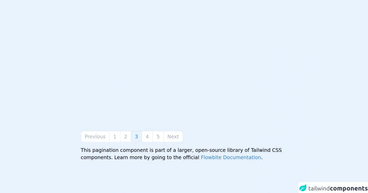
The preview of Pagination ui component
Creating a Pagination ui component with Tailwind CSS is incredibly easy. With just a few lines of code, you can create a professional-looking Pagination ui component that is fully customizable to suit your needs.
Free download of the Pagination's source code
The source code of Pagination ui component
To create a Pagination ui component with Tailwind CSS, you only need to add a few classes to your HTML code. These classes define the style and layout of the Pagination ui component. Here is an example of the source code for a basic Pagination ui component:
<!-- This is an example component -->
<div class="max-w-2xl mx-auto">

	<nav aria-label="Page navigation example">
		<ul class="inline-flex -space-x-px">
			<li>
				<a href="#"
					class="bg-white border border-gray-300 text-gray-500 hover:bg-gray-100 hover:text-gray-700 ml-0 rounded-l-lg leading-tight py-2 px-3 dark:bg-gray-800 dark:border-gray-700 dark:text-gray-400 dark:hover:bg-gray-700 dark:hover:text-white">Previous</a>
			</li>
			<li>
				<a href="#"
					class="bg-white border border-gray-300 text-gray-500 hover:bg-gray-100 hover:text-gray-700 leading-tight py-2 px-3 dark:bg-gray-800 dark:border-gray-700 dark:text-gray-400 dark:hover:bg-gray-700 dark:hover:text-white">1</a>
			</li>
			<li>
				<a href="#"
					class="bg-white border border-gray-300 text-gray-500 hover:bg-gray-100 hover:text-gray-700 leading-tight py-2 px-3 dark:bg-gray-800 dark:border-gray-700 dark:text-gray-400 dark:hover:bg-gray-700 dark:hover:text-white">2</a>
			</li>
			<li>
				<a href="#" aria-current="page"
					class="bg-blue-50 border border-gray-300 text-blue-600 hover:bg-blue-100 hover:text-blue-700  py-2 px-3 dark:border-gray-700 dark:bg-gray-700 dark:text-white">3</a>
			</li>
			<li>
				<a href="#"
					class="bg-white border border-gray-300 text-gray-500 hover:bg-gray-100 hover:text-gray-700 leading-tight py-2 px-3 dark:bg-gray-800 dark:border-gray-700 dark:text-gray-400 dark:hover:bg-gray-700 dark:hover:text-white">4</a>
			</li>
			<li>
				<a href="#"
					class="bg-white border border-gray-300 text-gray-500 hover:bg-gray-100 hover:text-gray-700 leading-tight py-2 px-3 dark:bg-gray-800 dark:border-gray-700 dark:text-gray-400 dark:hover:bg-gray-700 dark:hover:text-white">5</a>
			</li>
			<li>
				<a href="#"
					class="bg-white border border-gray-300 text-gray-500 hover:bg-gray-100 hover:text-gray-700 rounded-r-lg leading-tight py-2 px-3 dark:bg-gray-800 dark:border-gray-700 dark:text-gray-400 dark:hover:bg-gray-700 dark:hover:text-white">Next</a>
			</li>
		</ul>
	</nav>

	<p class="mt-5">This pagination component is part of a larger, open-source library of Tailwind CSS components. Learn more
		by going to the official <a class="text-blue-600 hover:underline"
			href="https://flowbite.com/docs/getting-started/introduction/" target="_blank">Flowbite Documentation</a>.
	</p>
</div>
How to create a Pagination with Tailwind CSS?
Creating a Pagination ui component with Tailwind CSS is easy. Here are six incredibly easy ways to create a Pagination ui component with Tailwind CSS:
1. Use the built-in Pagination component
Tailwind CSS provides a built-in Pagination component that can be used to create a Pagination ui component with minimal effort. To use the built-in Pagination component, simply add the "pagination" class to a container element, and add the "page-link" class to each link element.
2. Customize the built-in Pagination component
The built-in Pagination component can be customized by adding additional classes to the container and link elements. For example, you can change the size of the Pagination ui component by adding the "pagination-lg" or "pagination-sm" class to the container element.
3. Use the Flexbox utility classes
Tailwind CSS provides a set of Flexbox utility classes that can be used to create a Pagination ui component with a flexible layout. For example, you can use the "flex" and "justify-between" classes to create a Pagination ui component with evenly spaced links.
4. Use the Grid utility classes
Tailwind CSS provides a set of Grid utility classes that can be used to create a Pagination ui component with a grid layout. For example, you can use the "grid grid-cols-3 gap-4" classes to create a Pagination ui component with three columns and a 4-pixel gap between each link.
5. Use the Responsive utility classes
Tailwind CSS provides a set of Responsive utility classes that can be used to create a Pagination ui component that is responsive to different screen sizes. For example, you can use the "hidden md:block" class to hide the Pagination ui component on small screens, and show it on medium screens and above.
6. Use the Custom utility classes
Tailwind CSS allows developers to create custom utility classes that can be used to create a Pagination ui component with a unique style and layout. For example, you can create a custom utility class that adds a background color to the active link in the Pagination ui component.
Conclusion
Creating a Pagination ui component with Tailwind CSS is incredibly easy. With just a few lines of code, you can create a professional-looking Pagination ui component that is fully customizable to suit your needs. By using Tailwind CSS, developers can save time and effort, and focus on other aspects of their application. So, why not give it a try?