- Published on
Practical Guide: Create A Pan-Zoom Control With Tailwind CSS
- What is Tailwind CSS?
- The description of Pan-Zoom Control ui component
- Why use Tailwind CSS to create a Pan-Zoom Control ui component?
- The preview of Pan-Zoom Control ui component
- The source code of Pan-Zoom Control ui component
- How to create a Pan-Zoom Control with Tailwind CSS?
- Conclusion
What is Tailwind CSS?
Tailwind CSS is a utility-first CSS framework that provides a set of pre-defined classes to help developers quickly build custom user interfaces. It is designed to be highly customizable, allowing developers to easily create unique designs without writing any CSS code.
The description of Pan-Zoom Control ui component
A Pan-Zoom Control is a user interface component that allows users to zoom in and out of an image or map, as well as pan around the image or map. This control is commonly used in applications such as online maps, photo editors, and document viewers.
Why use Tailwind CSS to create a Pan-Zoom Control ui component?
Tailwind CSS provides a set of pre-defined classes that can be used to create a Pan-Zoom Control with minimal CSS code. This saves developers time and effort, allowing them to focus on the functionality of the control rather than the styling.
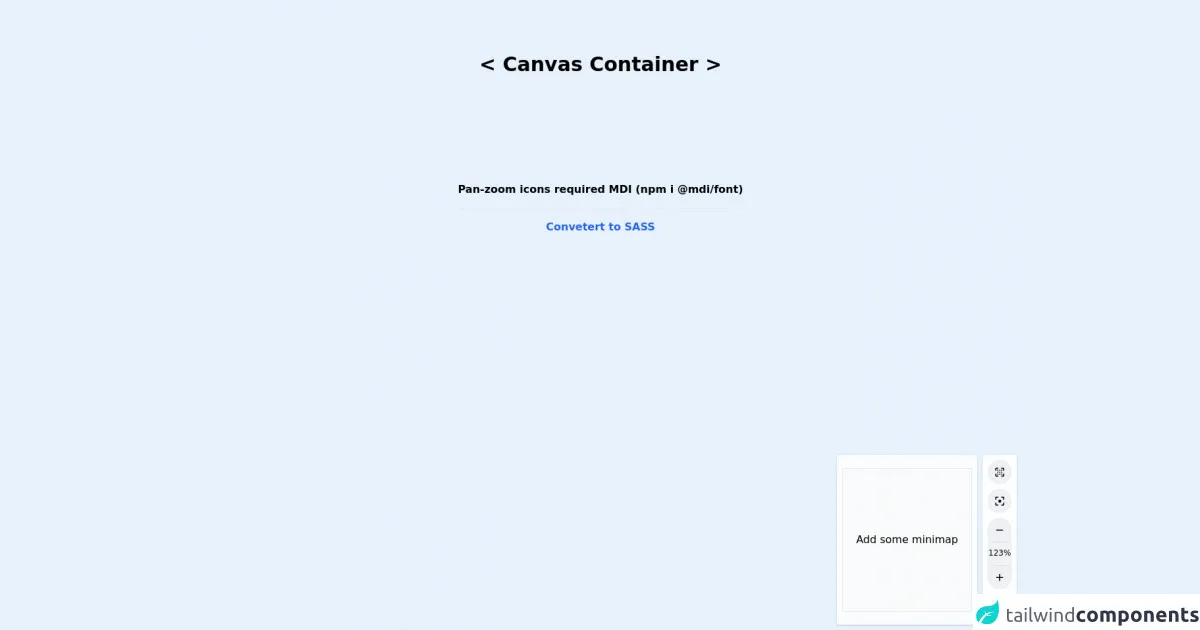
The preview of Pan-Zoom Control ui component
To create a Pan-Zoom Control with Tailwind CSS, we will use a combination of HTML and CSS. The resulting control will be a simple interface that allows users to zoom in and out of an image or map, as well as pan around the image or map.
Free download of the Pan-Zoom Control's source code
The source code of Pan-Zoom Control ui component
The source code for the Pan-Zoom Control is relatively simple, consisting of HTML and CSS code that can be easily customized to fit your specific needs.
<!-- MDI Icons -->
<link rel="stylesheet" href="https://cdn.materialdesignicons.com/6.5.95/css/materialdesignicons.min.css">


<h1 class="text-center text-3xl font-bold my-20">
    < Canvas Container >
</h1>

<div class="flex">
    <span class="text-center font-bold my-20 mx-auto">
        Pan-zoom icons required MDI (npm i @mdi/font)

        <hr class="my-4">

        <a href="https://egoistdeveloper.github.io/twcss-to-sass-playground/" target="_blank" class="text-blue-600">
            Convetert to SASS
        </a>
    </span>
</div>

<!-- Panzoom Area -->
<div class="flex fixed right-2 bottom-2 cursor-default">
    <!-- Minimap -->
    <div class="ngn-minimap">
        <div class="flex-initial relative
            bg-white bg-opacity-80
            rounded shadow
            p-2 py-5 mr-2">
            <div class="h-full w-full">
                <div class="bg-gray-50 border border-gray-200
                    py-24 px-5">
                    Add some minimap
                </div>
            </div>
        </div>
    </div>

    <!-- Pan Controls -->
    <div class="flex-initial bg-white bg-opacity-90
        rounded shadow p-2 py-2
        cursor-default flex flex-col
        hover:bg-opacity-100
        lg:bottom-3 lg:right-3
        transition duration-200 ease-in-out">

    <!-- Pan Only -->
    <button class="w-9 h-9 min-w-min
            rounded-full text-lg mb-2
            bg-gray-300 bg-opacity-30
            border border-gray-300 border-opacity-30
            hover:bg-yellow-400 hover:bg-opacity-50
            outline-none hover:shadow-md
            transition duration-200 ease-in-out"
        title="Pan-only Mode">
        <i class="mdi mdi-focus-field"></i>
    </button>

    <!-- Pan Reset -->
    <button class="w-9 h-9 min-w-min
            rounded-full text-lg mb-2
            bg-gray-300 bg-opacity-30
            border border-gray-300 border-opacity-30
            hover:bg-yellow-400 hover:bg-opacity-50
            outline-none hover:shadow-md
            transition duration-200 ease-in-out"
        title="Reset Pan View">
        <i class="mdi mdi-image-filter-center-focus"></i>
    </button>

    <!-- Zoom Controls-->
    <div class="flex flex-col">
        <button class="w-9 h-9 min-w-min
            rounded-none rounded-t-full text-lg
            bg-gray-300 bg-opacity-30
            border border-gray-300 border-opacity-30
            hover:bg-yellow-400 hover:bg-opacity-50
            outline-none hover:shadow-md
            transition duration-200 ease-in-out
            mb-0 border
            border-gray-300 border-opacity-30
            hover:border-yellow-200"
        title="Zoom In">
        <i class="mdi mdi-minus"></i>
        </button>

        <div class="bg-gray-300 bg-opacity-30
            border border-b border-gray-300 border-opacity-30
            font-medium py-2 cursor-default
            w-9 h-9 min-w-min
            text-xs text-center
            inline-block align-baseline">
            123%
        </div>

        <button class="w-9 h-9 min-w-min
            rounded-none rounded-b-full text-lg
            bg-gray-300 bg-opacity-30
            border border-gray-300 border-opacity-30
            hover:bg-yellow-400 hover:bg-opacity-50
            outline-none hover:shadow-md
            transition duration-200 ease-in-out
            mb-0 border
            border-gray-300 border-opacity-30
            hover:border-yellow-200"
        title="Zoom Out">
        <i class="mdi mdi-plus"></i>
        </button>
    </div>

    <!-- Show Minimap -->
    <button class="w-9 h-9 min-w-min
            rounded-full text-lg mt-2
            bg-gray-300 bg-opacity-30
            border border-gray-300 border-opacity-30
            hover:bg-yellow-400 hover:bg-opacity-50
            outline-none hover:shadow-md
            transition duration-200 ease-in-out"
        title="Show Mini Map">
        <i class="mdi mdi-map-outline"></i>
    </button>
    </div>
</div>
How to create a Pan-Zoom Control with Tailwind CSS?
To create a Pan-Zoom Control with Tailwind CSS, follow these steps:
- Create a new HTML file and add the following code to create the basic structure of the control:
<div class="pan-zoom-control">
  <button class="zoom-in">+</button>
  <button class="zoom-out">-</button>
  <button class="pan-up">↑</button>
  <button class="pan-down">↓</button>
  <button class="pan-left">←</button>
  <button class="pan-right">→</button>
</div>
- Add the following CSS code to style the control:
.pan-zoom-control {
  position: absolute;
  top: 10px;
  left: 10px;
  z-index: 100;
}

.pan-zoom-control button {
  display: block;
  width: 30px;
  height: 30px;
  margin-bottom: 5px;
  font-size: 20px;
  font-weight: bold;
  color: #fff;
  background-color: #333;
  border: none;
  border-radius: 5px;
  cursor: pointer;
  transition: background-color 0.2s ease-in-out;
}

.pan-zoom-control button:hover {
  background-color: #555;
}

.pan-zoom-control button:active {
  background-color: #777;
}

.pan-zoom-control button:first-child {
  border-top-right-radius: 0;
  border-top-left-radius: 0;
}

.pan-zoom-control button:last-child {
  border-bottom-right-radius: 0;
  border-bottom-left-radius: 0;
}
- Customize the CSS code to fit your specific needs, such as changing the position or color of the control.
Conclusion
In this article, we have shown how to create a Pan-Zoom Control with Tailwind CSS. By using pre-defined classes and minimal CSS code, developers can quickly create a custom user interface component that allows users to zoom in and out of an image or map, as well as pan around the image or map. With Tailwind CSS, creating custom user interfaces has never been easier.