- Published on
How To Make A Input Number / Counter With Tailwind CSS From Scratch
- What is Tailwind CSS?
- The description of Input Number / Counter ui component
- Why use Tailwind CSS to create an Input Number / Counter ui component?
- The preview of Input Number / Counter ui component
- The source code of Input Number / Counter ui component
- How to create an Input Number / Counter with Tailwind CSS?
- Conclusion
What is Tailwind CSS?
Tailwind CSS is a utility-first CSS framework that allows you to quickly and easily create custom designs without writing any CSS. With Tailwind CSS, you can write HTML that is easy to read and understand, and then use the pre-defined classes to style your elements.
The description of Input Number / Counter ui component
An input number/counter is a UI component that allows users to input a number or increment/decrement an existing number. This component is commonly used in forms, shopping carts, and other applications where numeric input is required.
Why use Tailwind CSS to create an Input Number / Counter ui component?
Tailwind CSS makes it easy to create custom UI components without writing any CSS. With pre-defined classes for colors, typography, spacing, and more, you can quickly create a professional-looking input number/counter that matches your design.
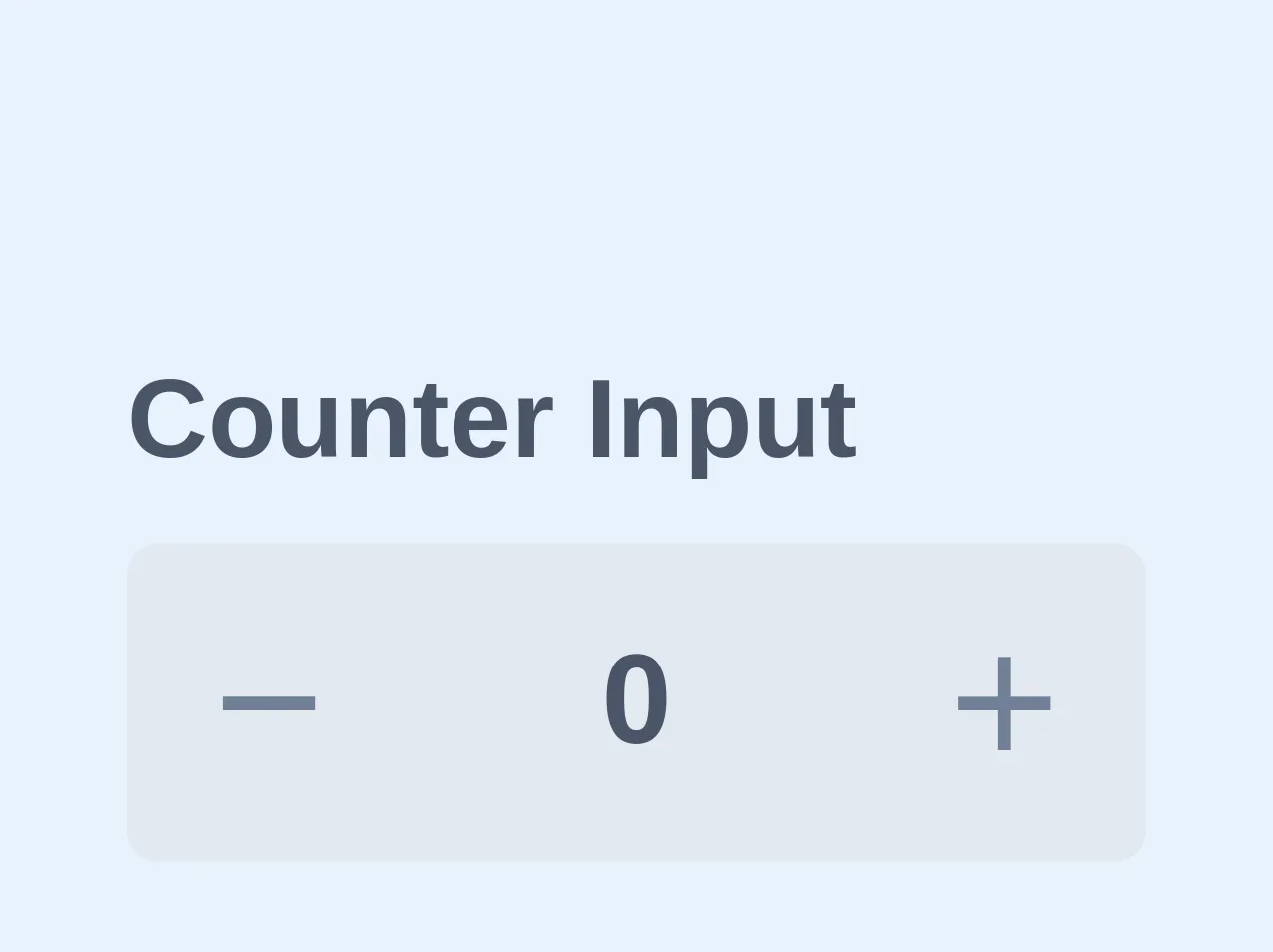
The preview of Input Number / Counter ui component
To create an input number/counter with Tailwind CSS, we will use the following classes:
border: to add a border to the inputrounded: to round the corners of the inputpy: to add padding to the top and bottom of the inputpx: to add padding to the left and right of the inputtext-center: to center the text inside the inputoutline-none: to remove the default focus outlinetext-sm: to set the font size of the inputbg-white: to set the background color of the input to whitew-16: to set the width of the input to 16rem
Free download of the Input Number / Counter's source code
The source code of Input Number / Counter ui component
To create an input number/counter with Tailwind CSS, we will use the following HTML:
<div class="flex items-center justify-center">
  <button class="bg-gray-200 hover:bg-gray-300 rounded-l px-4 py-2">
    -
  </button>
  <input type="number" class="border rounded py-2 px-4 text-center outline-none text-sm bg-white w-16" value="0">
  <button class="bg-gray-200 hover:bg-gray-300 rounded-r px-4 py-2">
    +
  </button>
</div>
<div class="custom-number-input h-10 w-32">
  <label for="custom-input-number" class="w-full text-gray-700 text-sm font-semibold">Counter Input
  </label>
  <div class="flex flex-row h-10 w-full rounded-lg relative bg-transparent mt-1">
    <button data-action="decrement" class=" bg-gray-300 text-gray-600 hover:text-gray-700 hover:bg-gray-400 h-full w-20 rounded-l cursor-pointer outline-none">
      <span class="m-auto text-2xl font-thin">−</span>
    </button>
    <input type="number" class="outline-none focus:outline-none text-center w-full bg-gray-300 font-semibold text-md hover:text-black focus:text-black  md:text-basecursor-default flex items-center text-gray-700  outline-none" name="custom-input-number" value="0"></input>
  <button data-action="increment" class="bg-gray-300 text-gray-600 hover:text-gray-700 hover:bg-gray-400 h-full w-20 rounded-r cursor-pointer">
    <span class="m-auto text-2xl font-thin">+</span>
  </button>
</div>

<style>
  input[type='number']::-webkit-inner-spin-button,
  input[type='number']::-webkit-outer-spin-button {
    -webkit-appearance: none;
    margin: 0;
  }

  .custom-number-input input:focus {
    outline: none !important;
  }

  .custom-number-input button:focus {
    outline: none !important;
  }
</style>

<script>
  function decrement(e) {
    const btn = e.target.parentNode.parentElement.querySelector(
      'button[data-action="decrement"]'
    );
    const target = btn.nextElementSibling;
    let value = Number(target.value);
    value--;
    target.value = value;
  }

  function increment(e) {
    const btn = e.target.parentNode.parentElement.querySelector(
      'button[data-action="decrement"]'
    );
    const target = btn.nextElementSibling;
    let value = Number(target.value);
    value++;
    target.value = value;
  }

  const decrementButtons = document.querySelectorAll(
    `button[data-action="decrement"]`
  );

  const incrementButtons = document.querySelectorAll(
    `button[data-action="increment"]`
  );

  decrementButtons.forEach(btn => {
    btn.addEventListener("click", decrement);
  });

  incrementButtons.forEach(btn => {
    btn.addEventListener("click", increment);
  });
</script>
How to create an Input Number / Counter with Tailwind CSS?
- First, create a new HTML file and add the following code:
<!DOCTYPE html>
<html lang="en">
<head>
  <meta charset="UTF-8">
  <title>Input Number / Counter</title>
  <link rel="stylesheet" href="https://cdn.jsdelivr.net/npm/[email protected]/dist/tailwind.min.css">
</head>
<body>
  <div class="flex items-center justify-center">
    <button class="bg-gray-200 hover:bg-gray-300 rounded-l px-4 py-2">
      -
    </button>
    <input type="number" class="border rounded py-2 px-4 text-center outline-none text-sm bg-white w-16" value="0">
    <button class="bg-gray-200 hover:bg-gray-300 rounded-r px-4 py-2">
      +
    </button>
  </div>
</body>
</html>
Save the file and open it in your browser. You should see the input number/counter.
To customize the input number/counter, you can modify the classes used in the HTML. For example, you can change the background color by changing the
bg-whiteclass tobg-blue-500.You can also add additional styles to the input number/counter by creating your own CSS classes and applying them to the HTML.
Conclusion
In this article, we learned how to create an input number/counter with Tailwind CSS. By using pre-defined classes, we were able to quickly and easily create a professional-looking UI component without writing any CSS. With Tailwind CSS, you can create custom designs that match your brand and style, and save time and effort in the process.