- Published on
Beginners Guide: Build A Section With Tailwind CSS
- What is Tailwind CSS?
- The description of Section UI component
- Why use Tailwind CSS to create a Section UI component?
- The preview of Section UI component
- The source code of Section UI component
- How to create a Section with Tailwind CSS?
- Step 1: Set up your project
- Step 2: Create the HTML structure
- Step 3: Add Tailwind CSS utility classes
- Step 4: Customize the styles
- Conclusion
As a beginner in FrontEnd development, it can be overwhelming to choose a CSS framework to work with. Tailwind CSS is a utility-first CSS framework that allows you to quickly build custom user interfaces. In this article, we will guide you through building a Section UI component with Tailwind CSS.
What is Tailwind CSS?
Tailwind CSS is a CSS framework that provides a set of pre-defined utility classes that can be used to style HTML elements. It is a utility-first framework, meaning that it focuses on providing low-level utility classes that can be combined to create custom styles. Tailwind CSS is highly customizable and can be configured to fit the needs of any project.
The description of Section UI component
A Section UI component is a container that groups related content together. It is commonly used to organize content on a webpage and improve its readability. A Section component typically contains a heading and some content.
Why use Tailwind CSS to create a Section UI component?
Tailwind CSS provides a set of utility classes that can be used to quickly style a Section UI component. This makes it easy for beginners to create custom user interfaces without having to write a lot of CSS code. Additionally, Tailwind CSS is highly customizable, allowing you to create unique styles for your Section UI component.
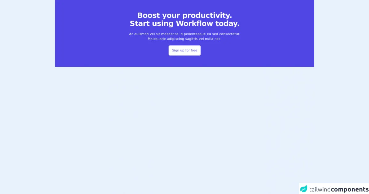
The preview of Section UI component
To create a Section UI component with Tailwind CSS, we will use a combination of utility classes to style the container, heading, and content. Here is a preview of what our Section UI component will look like:
Free download of the Section's source code
The source code of Section UI component
To create our Section UI component, we will use HTML and Tailwind CSS utility classes. Here is the source code for our Section UI component:
<div class="bg-indigo-600">
        <div class="flex items-center justify-center">
            <div class="py-14 text-center px-5 sm:px-0">
                <h2 class="text-3xl sm:text-4xl text-white font-extrabold tracking-tight">
                    <span class="block">Boost your productivity.</span>
                    <span class="block">Start using Workflow today.</span>
                </h2>
                <h2 class="text-gray-50 mt-5 tracking-wide text-sm sm:text-base">
                    <span class="block">Ac euismod vel sit maecenas id pellentesque eu sed consectetur.</span>
                    <span class="block">Malesuade adipiscing sagittis vel nulla nec.</span>
                </h2>
                <div class="shadow inline-flex mt-5">
                    <a href="#" class="inline-flex items-center justify-center bg-white hover:bg-indigo-200 px-4 py-3 border border-transparent rounded-md text-indigo-500 font-medium">Sign up for free</a>
                </div>
            </div>
        </div>
    </div>
How to create a Section with Tailwind CSS?
Now that we have an idea of what our Section UI component will look like and what code we will use to create it, let's dive into the steps to create it.
Step 1: Set up your project
To use Tailwind CSS, you need to install it in your project. You can install Tailwind CSS using npm or yarn. Here is an example of how to install Tailwind CSS using npm:
npm install tailwindcss
After installing Tailwind CSS, you need to create a configuration file. You can create a configuration file using the following command:
npx tailwindcss init
This will create a tailwind.config.js file in your project directory.
Step 2: Create the HTML structure
To create our Section UI component, we will use HTML. Here is the HTML structure for our Section UI component:
<section class="bg-gray-100 py-8">
  <div class="container mx-auto px-4">
    <h2 class="text-2xl font-bold mb-2">Section Title</h2>
    <p class="mb-4">Section content goes here.</p>
  </div>
</section>
In this code, we have created a section element with a gray background color and a padding of 8. Inside the section element, we have a div element with a container class that centers the content and adds some padding. Inside the div element, we have a h2 element with a font size of 2xl and a bold font weight. We also have a p element with some margin at the bottom.
Step 3: Add Tailwind CSS utility classes
To style our Section UI component, we will use Tailwind CSS utility classes. Here is the updated HTML code with Tailwind CSS utility classes:
<section class="bg-gray-100 py-8">
  <div class="container mx-auto px-4">
    <h2 class="text-2xl font-bold mb-2">Section Title</h2>
    <p class="mb-4">Section content goes here.</p>
  </div>
</section>
In this code, we have added utility classes to the section element to set the background color and padding. We have also added utility classes to the div element to center the content and add some padding. Finally, we have added utility classes to the h2 and p elements to set the font size, font weight, and margin.
Step 4: Customize the styles
Tailwind CSS is highly customizable, allowing you to create unique styles for your Section UI component. You can customize the styles by editing the tailwind.config.js file. Here is an example of how to customize the font sizes:
module.exports = {
  theme: {
    extend: {
      fontSize: {
        '2xl': '1.5rem',
        '3xl': '1.875rem',
      },
    },
  },
  variants: {},
  plugins: [],
}
In this code, we have added two custom font sizes to the fontSize section of the configuration file.
Conclusion
In this article, we have shown you how to create a Section UI component with Tailwind CSS. We have explained what Tailwind CSS is, why it is a good choice for beginners, and how to use it to create a Section UI component. We hope you found this article helpful and that it inspires you to continue learning about FrontEnd development.