- Published on
6 Ideas To Help You Create A Notification (modal) With Tailwind CSS Like A Pro
- What is Tailwind CSS?
- The description of Notification (modal) ui component
- Why use Tailwind CSS to create a Notification (modal) ui component?
- The preview of Notification (modal) ui component.
- The source code of Notification (modal) ui component.
- How to create a Notification (modal) with Tailwind CSS?
- Conclusion
As a FrontEnd technology blogger, you must be familiar with Tailwind CSS, which is a utility-first CSS framework that helps you quickly create custom designs. In this article, we will discuss how to create a Notification (modal) ui component with Tailwind CSS and share some tips to help you create it like a pro.
What is Tailwind CSS?
Tailwind CSS is a utility-first CSS framework that provides pre-defined classes to help you quickly create custom designs. Instead of writing custom CSS, you can use Tailwind CSS classes to style your HTML elements. Tailwind CSS has gained popularity among developers due to its flexibility and ease of use.
The description of Notification (modal) ui component
A Notification (modal) is a UI component that displays a message to the user. It is usually used to provide feedback or alert the user of an action that has been performed. The Notification (modal) UI component can be displayed as a pop-up window or a modal that appears on top of the current page.
Why use Tailwind CSS to create a Notification (modal) ui component?
Tailwind CSS provides pre-defined classes that can help you quickly create a Notification (modal) UI component. The pre-defined classes can be easily customized to match your design requirements. Using Tailwind CSS can save you time and effort in writing custom CSS.
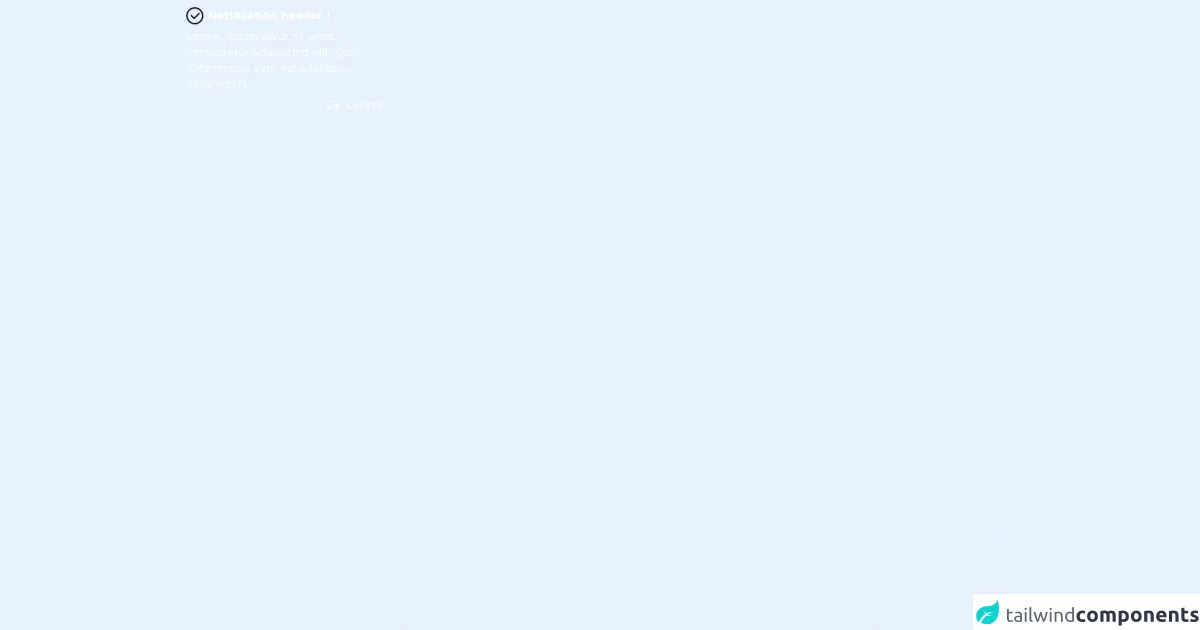
The preview of Notification (modal) ui component.
To create a Notification (modal) UI component with Tailwind CSS, you can use the following classes:
fixed: This class sets the position of the Notification (modal) to fixed, which means it will stay in the same position even if the user scrolls the page.inset-0: This class sets the Notification (modal) to cover the entire screen.bg-gray-900: This class sets the background color of the Notification (modal) to gray.opacity-50: This class sets the opacity of the Notification (modal) to 50%, which makes it semi-transparent.z-40: This class sets the z-index of the Notification (modal) to 40, which ensures that it appears on top of other elements on the page.
Free download of the Notification (modal)'s source code
The source code of Notification (modal) ui component.
To create a Notification (modal) UI component with Tailwind CSS, you can use the following HTML and CSS code:
<div class="fixed inset-0 bg-gray-900 opacity-50 z-40"></div>
<div class="fixed inset-0 z-50 flex items-center justify-center">
  <div class="bg-white rounded-lg p-6">
    <div class="mb-4">
      <h2 class="text-gray-900 font-bold text-2xl">Notification Title</h2>
      <p class="text-gray-600">Notification message goes here.</p>
    </div>
    <div class="flex justify-end">
      <button class="bg-gray-600 hover:bg-gray-700 text-white font-bold py-2 px-4 rounded">
        Close
      </button>
    </div>
  </div>
</div>
/* Customize the styles as per your requirement */
<div class="text-white flex flex-col rounded-md bg-emerald-500 p-2 fixed z-10 max-w-xs">
    <div class="flex flex-row items-center">
        <svg class="fill-lime-400" xmlns="http://www.w3.org/2000/svg" xmlns:xlink="http://www.w3.org/1999/xlink" version="1.1" width="32" height="32">
            <path d="M 16 3 C 8.832031 3 3 8.832031 3 16 C 3 23.167969 8.832031 29 16 29 C 23.167969 29 29 23.167969 29 16 C 29 8.832031 23.167969 3 16 3 Z M 16 5 C 22.085938 5 27 9.914063 27 16 C 27 22.085938 22.085938 27 16 27 C 9.914063 27 5 22.085938 5 16 C 5 9.914063 9.914063 5 16 5 Z M 22.28125 11.28125 L 15 18.5625 L 10.71875 14.28125 L 9.28125 15.71875 L 14.28125 20.71875 L 15 21.40625 L 15.71875 20.71875 L 23.71875 12.71875 Z "/>
        </svg>
        <div class="mx-1 font-bold">Notification header !</div>
    </div>
    <div class="text-left m-1">
        <a> Lorem, ipsum dolor sit amet consectetur adipisicing elit. Cum doloremque vero voluptatibus, assumenda </a>
    </div>
    <div class="flex flex-row-reverse gap-2">
        <button class="rounded-md hover:bg-opacity-30 hover:bg-gray-500 transition-all ease-in p-1">Cancel</button>
        <button class="rounded-md hover:bg-opacity-30 hover:bg-gray-500 transition-all ease-in p-1">Ok</button>
    </div>
</div>
How to create a Notification (modal) with Tailwind CSS?
To create a Notification (modal) with Tailwind CSS, you can follow these steps:
Create a
divelement and add thefixed,inset-0,bg-gray-900,opacity-50, andz-40classes to it. This will create a semi-transparent overlay that covers the entire screen.Create another
divelement and add thefixed,inset-0, andz-50classes to it. This will create a container for the Notification (modal) UI component.Add the
flex,items-center, andjustify-centerclasses to the containerdiv. This will center the Notification (modal) vertically and horizontally.Add a
divelement inside the containerdivand add thebg-white,rounded-lg, andp-6classes to it. This will create a white box that contains the Notification (modal) content.Add a
divelement inside the contentdivand add themb-4class to it. This will create a margin at the bottom of the Notification (modal) content.Add a
h2element inside the margindivand add thetext-gray-900,font-bold, andtext-2xlclasses to it. This will create a bold and large title for the Notification (modal).Add a
pelement inside the margindivand add thetext-gray-600class to it. This will create a gray text for the Notification (modal) message.Add another
divelement inside the contentdivand add theflexandjustify-endclasses to it. This will create a container for the close button.Add a
buttonelement inside the containerdivand add thebg-gray-600,hover:bg-gray-700,text-white,font-bold,py-2,px-4, androundedclasses to it. This will create a gray button with white text and rounded corners.Customize the styles as per your requirement by adding your own CSS classes or modifying the existing Tailwind CSS classes.
Conclusion
Creating a Notification (modal) UI component with Tailwind CSS is easy and can save you time and effort in writing custom CSS. By following the above steps and tips, you can create a Notification (modal) UI component like a pro. Happy coding!