- Published on
Ultimate Guide: Create A Notification With Tailwind CSS
- What is Tailwind CSS?
- The description of Notification UI component
- Why use Tailwind CSS to create a Notification UI component?
- The preview of Notification UI component
- The source code of Notification UI component
- How to create a Notification with Tailwind CSS?
- Conclusion
Notifications are an essential part of any application or website. They inform users about important events, errors, or updates. Creating a notification UI component can be challenging, but with the help of Tailwind CSS, it becomes much easier. In this article, we will guide you through creating a notification with Tailwind CSS.
What is Tailwind CSS?
Tailwind CSS is a utility-first CSS framework that allows developers to quickly build responsive and custom user interfaces. It provides a set of pre-defined CSS classes that can be used to style HTML elements. Tailwind CSS is highly customizable and allows developers to create unique designs without writing any CSS code.
The description of Notification UI component
A notification UI component is a small pop-up window that appears on the screen to inform users about important events, errors, or updates. It usually contains a short message, an icon, and a close button.
Why use Tailwind CSS to create a Notification UI component?
Tailwind CSS provides a set of pre-defined CSS classes that can be used to create a notification UI component quickly. It also allows developers to customize the design of the component without writing any CSS code. This makes the development process faster and more efficient.
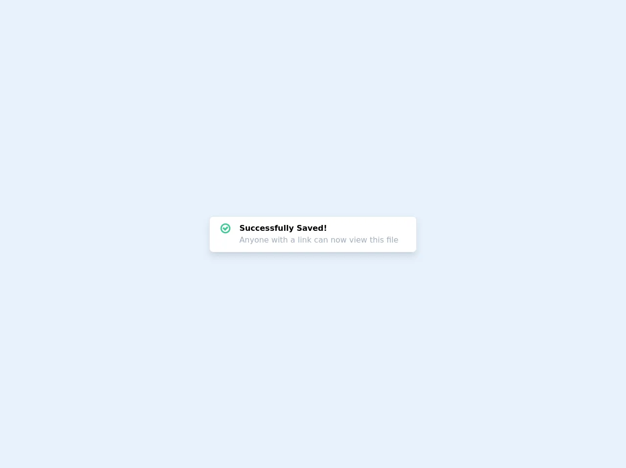
The preview of Notification UI component
To create a notification UI component with Tailwind CSS, we can use the following classes:
<div class="bg-blue-500 text-white font-bold rounded-lg border shadow-lg p-4">
    <div class="flex items-center justify-between">
        <div class="flex items-center">
            <svg class="h-6 w-6 fill-current mr-4" viewBox="0 0 20 20" xmlns="http://www.w3.org/2000/svg">
                <path d="M10 0C4.477 0 0 4.477 0 10s4.477 10 10 10 10-4.477 10-10S15.523 0 10 0zm0 18.75c-4.142 0-7.5-3.358-7.5-7.5S5.858 3.75 10 3.75s7.5 3.358 7.5 7.5-3.358 7.5-7.5 7.5zm.625-10.625h-1.25v5h1.25v-5zm0 6.875h-1.25v1.25h1.25v-1.25z"/>
            </svg>
            <span>{{__placeholder1__}}</span>
        </div>
        <button class="text-white hover:text-gray-200">
            <svg class="h-5 w-5 fill-current" viewBox="0 0 20 20" xmlns="http://www.w3.org/2000/svg">
                <path d="M14.348 5.652c-.293-.293-.768-.293-1.06 0L10 8.94 6.712 5.652c-.293-.293-.768-.293-1.06 0-.293.293-.293.768 0 1.06L8.94 10l-3.288 3.288c-.293.293-.293.768 0 1.06.146.146.338.22.53.22s.384-.073.53-.22L10 11.06l3.288 3.288c.146.146.338.22.53.22s.384-.073.53-.22c.293-.293.293-.768 0-1.06L11.06 10l3.288-3.288c.293-.293.293-.768 0-1.06z"/>
            </svg>
        </button>
    </div>
</div>
Free download of the Notification's source code
The source code of Notification UI component
To create a notification UI component with Tailwind CSS, we can use the following HTML code:
<div class="bg-blue-500 text-white font-bold rounded-lg border shadow-lg p-4">
    <div class="flex items-center justify-between">
        <div class="flex items-center">
            <svg class="h-6 w-6 fill-current mr-4" viewBox="0 0 20 20" xmlns="http://www.w3.org/2000/svg">
                <path d="M10 0C4.477 0 0 4.477 0 10s4.477 10 10 10 10-4.477 10-10S15.523 0 10 0zm0 18.75c-4.142 0-7.5-3.358-7.5-7.5S5.858 3.75 10 3.75s7.5 3.358 7.5 7.5-3.358 7.5-7.5 7.5zm.625-10.625h-1.25v5h1.25v-5zm0 6.875h-1.25v1.25h1.25v-1.25z"/>
            </svg>
            <span>{{__placeholder1__}}</span>
        </div>
        <button class="text-white hover:text-gray-200">
            <svg class="h-5 w-5 fill-current" viewBox="0 0 20 20" xmlns="http://www.w3.org/2000/svg">
                <path d="M14.348 5.652c-.293-.293-.768-.293-1.06 0L10 8.94 6.712 5.652c-.293-.293-.768-.293-1.06 0-.293.293-.293.768 0 1.06L8.94 10l-3.288 3.288c-.293.293-.293.768 0 1.06.146.146.338.22.53.22s.384-.073.53-.22L10 11.06l3.288 3.288c.146.146.338.22.53.22s.384-.073.53-.22c.293-.293.293-.768 0-1.06L11.06 10l3.288-3.288c.293-.293.293-.768 0-1.06z"/>
            </svg>
        </button>
    </div>
</div>
{{__placeholder2__}}
<!-- This is an example component -->
<div class="flex h-screen">
  <div class="m-auto">
    <div class="bg-white rounded-lg border-gray-300 border p-3 shadow-lg">
      <div class="flex flex-row">
        <div class="px-2">
          <svg width="24" height="24" viewBox="0 0 1792 1792" fill="#44C997" xmlns="http://www.w3.org/2000/svg">
            <path d="M1299 813l-422 422q-19 19-45 19t-45-19l-294-294q-19-19-19-45t19-45l102-102q19-19 45-19t45 19l147 147 275-275q19-19 45-19t45 19l102 102q19 19 19 45t-19 45zm141 83q0-148-73-273t-198-198-273-73-273 73-198 198-73 273 73 273 198 198 273 73 273-73 198-198 73-273zm224 0q0 209-103 385.5t-279.5 279.5-385.5 103-385.5-103-279.5-279.5-103-385.5 103-385.5 279.5-279.5 385.5-103 385.5 103 279.5 279.5 103 385.5z"/>
            </svg>
        </div>
        <div class="ml-2 mr-6">
          <span class="font-semibold">Successfully Saved!</span>
          <span class="block text-gray-500">Anyone with a link can now view this file</span>
        </div>
      </div>
    </div>
  </div>
</div>
How to create a Notification with Tailwind CSS?
To create a notification with Tailwind CSS, follow these steps:
- Create a new HTML file and add the above HTML code to it.
- Replace the
{{__placeholder1__}}placeholder with the message you want to display in the notification. - Replace the
{{__placeholder2__}}placeholder with the following CSS code:
.bg-blue-500 {
    background-color: #3b82f6;
}

.text-white {
    color: #fff;
}

.font-bold {
    font-weight: 700;
}

.rounded-lg {
    border-radius: 0.5rem;
}

.border {
    border-width: 1px;
}

.shadow-lg {
    box-shadow: 0 10px 15px -3px rgba(0, 0, 0, 0.1), 0 4px 6px -2px rgba(0, 0, 0, 0.05);
}

.p-4 {
    padding: 1rem;
}

.flex {
    display: flex;
}

.items-center {
    align-items: center;
}

.justify-between {
    justify-content: space-between;
}

.h-6 {
    height: 1.5rem;
}

.w-6 {
    width: 1.5rem;
}

.fill-current {
    fill: currentColor;
}

.mr-4 {
    margin-right: 1rem;
}

.text-gray-200 {
    color: #edf2f7;
}

.hover\:text-gray-200:hover {
    color: #edf2f7;
}
- Save the file and open it in a web browser.
Conclusion
Creating a notification UI component with Tailwind CSS is a straightforward process. Tailwind CSS provides a set of pre-defined CSS classes that can be used to style HTML elements quickly. With the help of this guide, you can create a notification UI component in no time.