- Published on
Imagine You Make A Nice Looking Button With Tailwind CSS Like An Expert. Follow These 6 Steps To Get There
- What is Tailwind CSS?
- The description of Nice looking button ui component
- Why use Tailwind CSS to create a Nice looking button ui component?
- The preview of Nice looking button ui component.
- The source code of Nice looking button ui component.
- How to create a Nice looking button with Tailwind CSS?
- Conclusion
What is Tailwind CSS?
Tailwind CSS is a utility-first CSS framework that allows you to rapidly build custom user interfaces. It provides a set of pre-defined CSS classes that you can use to style your HTML elements. With Tailwind CSS, you can easily create responsive and mobile-first designs.
The description of Nice looking button ui component
A nice looking button is a UI component that is visually appealing and easy to use. It should be easy to identify as a button, and it should be clear what action it performs when clicked. A nice looking button should also be consistent with the overall design of the website or application.
Why use Tailwind CSS to create a Nice looking button ui component?
Tailwind CSS provides a set of pre-defined classes that you can use to style your HTML elements. This makes it easy to create a nice looking button without having to write a lot of custom CSS. Tailwind CSS also provides responsive design classes, which makes it easy to create buttons that look good on all screen sizes.
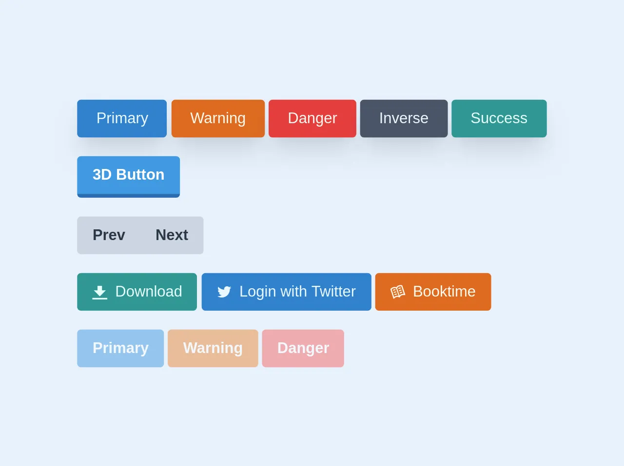
The preview of Nice looking button ui component.
To create a nice looking button with Tailwind CSS, you can use the bg-blue-500 class for the background color, the text-white class for the text color, and the rounded-lg class for rounded corners. You can also add a hover effect by using the hover:bg-blue-700 class.
Free download of the Nice looking button's source code
The source code of Nice looking button ui component.
To create a nice looking button with Tailwind CSS, you can use the following HTML code:
<button class="bg-blue-500 hover:bg-blue-700 text-white font-bold py-2 px-4 rounded-lg">
  Click me
</button>
This code uses the bg-blue-500 class for the background color, the hover:bg-blue-700 class for the hover effect, the text-white class for the text color, the font-bold class for bold text, the py-2 class for vertical padding, the px-4 class for horizontal padding, and the rounded-lg class for rounded corners.
<main class="p-4">
        <div class="mb-5">
            <a href="#" class="cursor-pointer bg-blue-600 hover:bg-blue-500 shadow-xl px-5 py-2 inline-block text-blue-100 hover:text-white rounded">Primary</a>
            <button type="submit" class="cursor-pointer bg-orange-600 hover:bg-orange-500 shadow-xl px-5 py-2 inline-block text-orange-100 hover:text-white rounded">Warning</button>
            <input type="button" class="cursor-pointer bg-red-600 hover:bg-red-500 shadow-xl px-5 py-2 inline-block text-orange-100 hover:text-white rounded" value="Danger">
            <a href="#" class="cursor-pointer bg-gray-700 hover:bg-gray-600 shadow-xl px-5 py-2 inline-block text-blue-100 hover:text-white rounded">Inverse</a>
            <a href="#" class="cursor-pointer bg-teal-600 hover:bg-teal-500 shadow-xl px-5 py-2 inline-block text-teal-100 hover:text-white rounded">Success</a>
        </div>
        <div class="mb-5">
            <button class="bg-blue-500 hover:bg-blue-400 text-white font-semibold py-2 px-4 border-b-4 border-blue-700 hover:border-blue-500 rounded">3D Button</button>
        </div>
        <div class="mb-5">
            <div class="inline-flex">
                <button class="bg-gray-400 hover:bg-gray-500 text-gray-800 font-bold py-2 px-4 rounded-l">
                    Prev
                </button>
                <button class="bg-gray-400 hover:bg-gray-500 text-gray-800 font-bold py-2 px-4 rounded-r">
                    Next
                </button>
            </div>
        </div>
        <div class="mb-5">
            <button class="cursor-pointer bg-teal-600 hover:bg-teal-500 text-teal-100 py-2 px-4 rounded inline-flex items-center">
                <svg class="fill-current w-4 h-4 mr-2" xmlns="http://www.w3.org/2000/svg" viewBox="0 0 20 20"><path d="M13 8V2H7v6H2l8 8 8-8h-5zM0 18h20v2H0v-2z"/></svg>
                <span>Download</span>
            </button>
            <a href="#" class="cursor-pointer bg-blue-600 hover:bg-blue-500 text-blue-100 py-2 px-4 rounded inline-flex items-center">
                <svg class="fill-current w-4 h-4 mr-2" xmlns="http://www.w3.org/2000/svg" xmlns:xlink="http://www.w3.org/1999/xlink" x="0px" y="0px"viewBox="0 0 20 20" enable-background="new 0 0 20 20" xml:space="preserve"> <path d="M17.316,6.246c0.008,0.162,0.011,0.326,0.011,0.488c0,4.99-3.797,10.742-10.74,10.742c-2.133,0-4.116-0.625-5.787-1.697 c0.296,0.035,0.596,0.053,0.9,0.053c1.77,0,3.397-0.604,4.688-1.615c-1.651-0.031-3.046-1.121-3.526-2.621 c0.23,0.043,0.467,0.066,0.71,0.066c0.345,0,0.679-0.045,0.995-0.131c-1.727-0.348-3.028-1.873-3.028-3.703c0-0.016,0-0.031,0-0.047 c0.509,0.283,1.092,0.453,1.71,0.473c-1.013-0.678-1.68-1.832-1.68-3.143c0-0.691,0.186-1.34,0.512-1.898 C3.942,5.498,6.725,7,9.862,7.158C9.798,6.881,9.765,6.594,9.765,6.297c0-2.084,1.689-3.773,3.774-3.773 c1.086,0,2.067,0.457,2.756,1.191c0.859-0.17,1.667-0.484,2.397-0.916c-0.282,0.881-0.881,1.621-1.66,2.088 c0.764-0.092,1.49-0.293,2.168-0.594C18.694,5.051,18.054,5.715,17.316,6.246z"/> </svg>
                <span>Login with Twitter</span>
            </a>
            <a class="cursor-pointer bg-orange-600 hover:bg-orange-500 text-orange-100 py-2 px-4 rounded inline-flex items-center">
                <svg class="fill-current w-4 h-4 mr-2" version="1.1" id="Open_book" xmlns="http://www.w3.org/2000/svg" xmlns:xlink="http://www.w3.org/1999/xlink" x="0px" y="0px"viewBox="0 0 20 20" enable-background="new 0 0 20 20" xml:space="preserve"> <path d="M10.595,5.196l0.446,1.371c0.369-0.316,0.835-0.599,1.441-0.795c0.59-0.192,1.111-0.3,1.582-0.362l-0.43-1.323 c-0.476,0.069-1.001,0.18-1.58,0.368C11.476,4.643,10.999,4.905,10.595,5.196z M11.522,8.051l0.446,1.371 c0.369-0.316,0.835-0.599,1.441-0.795c0.59-0.192,1.111-0.3,1.582-0.362l-0.43-1.323c-0.476,0.069-1.001,0.18-1.58,0.368 C12.403,7.497,11.927,7.759,11.522,8.051z M12.45,10.905l0.446,1.371c0.369-0.316,0.835-0.599,1.441-0.795 c0.59-0.192,1.111-0.3,1.582-0.362l-0.43-1.323c-0.476,0.069-1.001,0.18-1.58,0.368C13.33,10.351,12.854,10.614,12.45,10.905z M5.388,13.077l0.43,1.323c0.417-0.226,0.902-0.445,1.492-0.636c0.606-0.197,1.149-0.242,1.633-0.203l-0.446-1.371 c-0.499,0.002-1.038,0.07-1.615,0.257C6.303,12.635,5.813,12.853,5.388,13.077z M3.533,7.368l0.43,1.323 C4.38,8.465,4.865,8.247,5.455,8.055c0.606-0.197,1.149-0.242,1.633-0.203L6.643,6.48C6.144,6.483,5.605,6.55,5.027,6.738 C4.448,6.926,3.958,7.144,3.533,7.368z M4.46,10.223l0.43,1.323c0.417-0.226,0.902-0.445,1.492-0.636 c0.606-0.197,1.149-0.242,1.633-0.203L7.57,9.335c-0.499,0.002-1.038,0.07-1.615,0.257C5.376,9.78,4.885,9.999,4.46,10.223z M11.064,1.41C9.341,1.97,8.441,3.162,8.011,3.969c-0.822-0.4-2.25-0.835-3.973-0.275c-2.523,0.82-3.969,2.627-3.969,2.627 l4.095,12.587c0.126,0.387,0.646,0.477,0.878,0.143c0.499-0.719,1.46-1.658,3.257-2.242c1.718-0.558,2.969,0.054,3.655,0.578 c0.272,0.208,0.662,0.06,0.762-0.268c0.252-0.827,0.907-2.04,2.61-2.593c1.799-0.585,3.129-0.389,3.956-0.1 c0.385,0.134,0.75-0.242,0.625-0.629L15.819,1.203C15.819,1.203,13.587,0.591,11.064,1.41z M10.951,15.256 c-0.819-0.244-1.901-0.358-3.141,0.044c-1.251,0.406-2.127,0.949-2.699,1.404L1.866,6.722C2.224,6.364,3.053,5.68,4.528,5.201 c1.389-0.451,2.528-0.065,3.279,0.378L10.951,15.256z M17.845,12.567c-0.731-0.032-1.759,0.044-3.01,0.451 c-1.24,0.403-2.048,1.132-2.567,1.81L9.124,5.151c0.346-0.8,1.04-1.782,2.43-2.233c1.474-0.479,2.547-0.413,3.047-0.334 L17.845,12.567z"/> </svg>
                <span>Booktime</span>
            </a>
        </div>
        <div>
            <button class="bg-blue-500 text-white font-semibold py-2 px-4 rounded opacity-50 cursor-not-allowed">
                Primary
            </button>
            <button class="bg-orange-500 text-white font-semibold py-2 px-4 rounded opacity-50 cursor-not-allowed">
                Warning
            </button>
            <button class="bg-red-500 text-white font-semibold py-2 px-4 rounded opacity-50 cursor-not-allowed">
                Danger
            </button>
        </div>
    </main>
How to create a Nice looking button with Tailwind CSS?
To create a nice looking button with Tailwind CSS, follow these 6 steps:
- Create a new HTML file and add a button element.
- Add the
bg-blue-500class to the button element to set the background color to blue. - Add the
text-whiteclass to the button element to set the text color to white. - Add the
rounded-lgclass to the button element to set rounded corners. - Add the
hover:bg-blue-700class to the button element to add a hover effect. - Add any additional classes or styles to customize the button as needed.
Here is an example of the HTML code for a nice looking button:
<button class="bg-blue-500 hover:bg-blue-700 text-white font-bold py-2 px-4 rounded-lg">
  Click me
</button>
You can customize the button by changing the classes or adding your own styles. For example, you could change the background color to red by using the bg-red-500 class, or you could add a border by using the border class.
Conclusion
Creating a nice looking button with Tailwind CSS is easy and straightforward. By using pre-defined CSS classes, you can quickly create a button that looks great and is easy to use. With Tailwind CSS, you can also easily customize the button to fit your specific needs. So why not give it a try and see how easy it is to create a nice looking button with Tailwind CSS?