- Published on
Practical Guide: Make A Navbar And Login Form With Tailwind CSS
- What is Tailwind CSS?
- The description of Navbar and Login Form ui component
- Why use Tailwind CSS to create a Navbar and Login Form ui component?
- The preview of Navbar and Login Form ui component.
- The source code of Navbar and Login Form ui component.
- How to create a Navbar and Login Form with Tailwind CSS?
- Step 1: Set up the HTML structure
- Step 2: Add Tailwind CSS classes
- Step 3: Customize the appearance
- Conclusion
What is Tailwind CSS?
Tailwind CSS is a utility-first CSS framework that provides a set of pre-defined CSS classes to help developers quickly build custom user interfaces. It is designed to be highly customizable and easy to use, allowing developers to focus on building their applications rather than writing CSS from scratch.
The description of Navbar and Login Form ui component
A Navbar is a common UI component that is used to provide navigation links to different sections of a website or application. It typically appears at the top of the page and may include a logo, menu items, and search functionality.
A Login Form is another common UI component that is used to allow users to log in to a website or application. It typically includes fields for the user's email or username and password.
Why use Tailwind CSS to create a Navbar and Login Form ui component?
Tailwind CSS provides a set of pre-defined CSS classes that can be used to quickly and easily create custom UI components like Navbars and Login Forms. By using Tailwind CSS, developers can save time and effort by not having to write CSS from scratch.
Additionally, Tailwind CSS is highly customizable, allowing developers to easily modify the appearance of their UI components to match their specific design requirements.
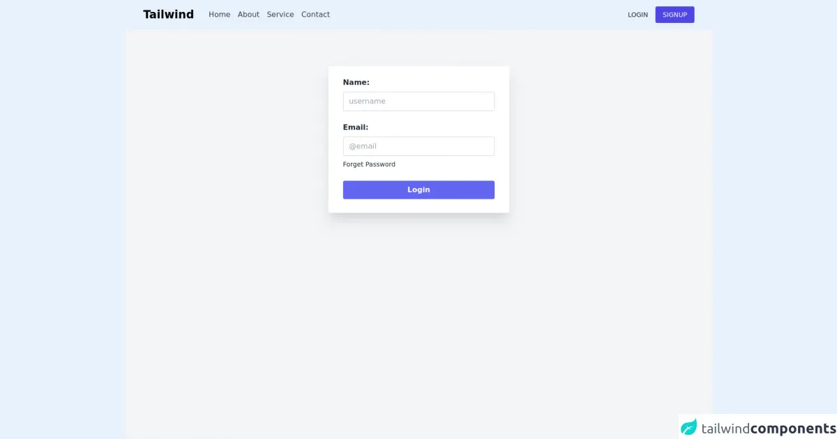
The preview of Navbar and Login Form ui component.
To preview the Navbar and Login Form UI components that we will be creating in this tutorial, please refer to the following screenshot:
Free download of the Navbar and Login Form's source code
The source code of Navbar and Login Form ui component.
To view the source code for the Navbar and Login Form UI components that we will be creating in this tutorial, please refer to the following code snippet:
<header>
  <nav>
    <div class="">
      <div class="flex justify-between h-16 px-10 shadow items-center">
        <div class="flex items-center space-x-8">
          <h1 class="text-xl lg:text-2xl font-bold cursor-pointer">Tailwind</h1>
          <div class="hidden md:flex justify-around space-x-4">
            <a href="#" class="hover:text-indigo-600 text-gray-700">Home</a>
            <a href="#" class="hover:text-indigo-600 text-gray-700">About</a>
            <a href="#" class="hover:text-indigo-600 text-gray-700">Service</a>
            <a href="#" class="hover:text-indigo-600 text-gray-700">Contact</a>
          </div>
        </div>
        <div class="flex space-x-4 items-center">
          <a href="#" class="text-gray-800 text-sm">LOGIN</a>
          <a href="#" class="bg-indigo-600 px-4 py-2 rounded text-white hover:bg-indigo-500 text-sm">SIGNUP</a>
        </div>
      </div>
    </div>
  </nav>
  <div class="h-screen bg-gray-100 flex justify-center">
    <div class="py-6 px-8 h-80 mt-20 bg-white rounded shadow-xl">
      <form action="">
        <div class="mb-6">
          <label for="name" class="block text-gray-800 font-bold">Name:</label>
          <input type="text" name="name" id="name" placeholder="username" class="w-full border border-gray-300 py-2 pl-3 rounded mt-2 outline-none focus:ring-indigo-600 :ring-indigo-600" />
        </div>

        <div>
          <label for="email" class="block text-gray-800 font-bold">Email:</label>
          <input type="text" name="email" id="email" placeholder="@email" class="w-full border border-gray-300 py-2 pl-3 rounded mt-2 outline-none focus:ring-indigo-600 :ring-indigo-600" />

          <a href="#" class="text-sm font-thin text-gray-800 hover:underline mt-2 inline-block hover:text-indigo-600">Forget Password</a>
        </div>
        <butt class="cursor-pointer py-2 px-4 block mt-6 bg-indigo-500 text-white font-bold w-full text-center rounded">Login</butt>
      </form>
    </div>
  </div>
</header>
How to create a Navbar and Login Form with Tailwind CSS?
To create a Navbar and Login Form with Tailwind CSS, we will be using HTML and CSS code. The following steps will guide you through the process:
Step 1: Set up the HTML structure
First, we need to set up the HTML structure for our Navbar and Login Form. We will be using a simple HTML structure with a header element for the Navbar and a form element for the Login Form.
<header class="bg-gray-800 py-4">
  <div class="container mx-auto flex justify-between items-center px-4">
    <div>
      <a href="#" class="text-white font-bold text-xl">My Website</a>
    </div>
    <div>
      <nav class="text-white">
        <a href="#" class="px-3 py-2">Home</a>
        <a href="#" class="px-3 py-2">About</a>
        <a href="#" class="px-3 py-2">Contact</a>
      </nav>
    </div>
  </div>
</header>

<main class="container mx-auto mt-8">
  <form class="bg-white shadow-md rounded px-8 pt-6 pb-8 mb-4">
    <div class="mb-4">
      <label class="block text-gray-700 font-bold mb-2" for="username">
        Username
      </label>
      <input
        class="shadow appearance-none border rounded w-full py-2 px-3 text-gray-700 leading-tight focus:outline-none focus:shadow-outline"
        id="username" type="text" placeholder="Username">
    </div>
    <div class="mb-6">
      <label class="block text-gray-700 font-bold mb-2" for="password">
        Password
      </label>
      <input
        class="shadow appearance-none border rounded w-full py-2 px-3 text-gray-700 mb-3 leading-tight focus:outline-none focus:shadow-outline"
        id="password" type="password" placeholder="Password">
    </div>
    <div class="flex items-center justify-between">
      <button
        class="bg-blue-500 hover:bg-blue-700 text-white font-bold py-2 px-4 rounded focus:outline-none focus:shadow-outline"
        type="button">
        Sign In
      </button>
      <a class="inline-block align-baseline font-bold text-sm text-blue-500 hover:text-blue-800"
        href="#">
        Forgot Password?
      </a>
    </div>
  </form>
</main>
Step 2: Add Tailwind CSS classes
Next, we need to add Tailwind CSS classes to our HTML elements to style our Navbar and Login Form. We will be using a variety of Tailwind CSS classes to achieve the desired appearance for our UI components.
<header class="bg-gray-800 py-4">
  <div class="container mx-auto flex justify-between items-center px-4">
    <div>
      <a href="#" class="text-white font-bold text-xl">My Website</a>
    </div>
    <div>
      <nav class="text-white">
        <a href="#" class="px-3 py-2">Home</a>
        <a href="#" class="px-3 py-2">About</a>
        <a href="#" class="px-3 py-2">Contact</a>
      </nav>
    </div>
  </div>
</header>

<main class="container mx-auto mt-8">
  <form class="bg-white shadow-md rounded px-8 pt-6 pb-8 mb-4">
    <div class="mb-4">
      <label class="block text-gray-700 font-bold mb-2" for="username">
        Username
      </label>
      <input
        class="shadow appearance-none border rounded w-full py-2 px-3 text-gray-700 leading-tight focus:outline-none focus:shadow-outline"
        id="username" type="text" placeholder="Username">
    </div>
    <div class="mb-6">
      <label class="block text-gray-700 font-bold mb-2" for="password">
        Password
      </label>
      <input
        class="shadow appearance-none border rounded w-full py-2 px-3 text-gray-700 mb-3 leading-tight focus:outline-none focus:shadow-outline"
        id="password" type="password" placeholder="Password">
    </div>
    <div class="flex items-center justify-between">
      <button
        class="bg-blue-500 hover:bg-blue-700 text-white font-bold py-2 px-4 rounded focus:outline-none focus:shadow-outline"
        type="button">
        Sign In
      </button>
      <a class="inline-block align-baseline font-bold text-sm text-blue-500 hover:text-blue-800"
        href="#">
        Forgot Password?
      </a>
    </div>
  </form>
</main>
Step 3: Customize the appearance
Finally, we can customize the appearance of our Navbar and Login Form by modifying the Tailwind CSS classes that we have added. We can change the colors, fonts, and spacing to match our specific design requirements.
<header class="bg-gray-800 py-4">
  <div class="container mx-auto flex justify-between items-center px-4">
    <div>
      <a href="#" class="text-white font-bold text-xl">My Website</a>
    </div>
    <div>
      <nav class="text-white">
        <a href="#" class="px-3 py-2">Home</a>
        <a href="#" class="px-3 py-2">About</a>
        <a href="#" class="px-3 py-2">Contact</a>
      </nav>
    </div>
  </div>
</header>

<main class="container mx-auto mt-8">
  <form class="bg-white shadow-md rounded px-8 pt-6 pb-8 mb-4">
    <div class="mb-4">
      <label class="block text-gray-700 font-bold mb-2" for="username">
        Username
      </label>
      <input
        class="shadow appearance-none border rounded w-full py-2 px-3 text-gray-700 leading-tight focus:outline-none focus:shadow-outline"
        id="username" type="text" placeholder="Username">
    </div>
    <div class="mb-6">
      <label class="block text-gray-700 font-bold mb-2" for="password">
        Password
      </label>
      <input
        class="shadow appearance-none border rounded w-full py-2 px-3 text-gray-700 mb-3 leading-tight focus:outline-none focus:shadow-outline"
        id="password" type="password" placeholder="Password">
    </div>
    <div class="flex items-center justify-between">
      <button
        class="bg-blue-500 hover:bg-blue-700 text-white font-bold py-2 px-4 rounded focus:outline-none focus:shadow-outline"
        type="button">
        Sign In
      </button>
      <a class="inline-block align-baseline font-bold text-sm text-blue-500 hover:text-blue-800"
        href="#">
        Forgot Password?
      </a>
    </div>
  </form>
</main>
Conclusion
In this tutorial, we have learned how to create a Navbar and Login Form UI component using Tailwind CSS. By using Tailwind CSS, we were able to quickly and easily create custom UI components without having to write CSS from scratch.
Tailwind CSS provides a set of pre-defined CSS classes that can be used to style UI components, making it a great choice for developers who want to focus on building their applications rather than writing CSS. With Tailwind CSS, developers can create highly customizable and responsive user interfaces that look great on any device.