- Published on
Best Ways To Build A Navbar Component With Tailwind CSS
- What is Tailwind CSS?
- The description of Navbar component ui component
- Why use Tailwind CSS to create a Navbar component ui component?
- The preview of Navbar component ui component.
- The source code of Navbar component ui component.
- How to create a Navbar component with Tailwind CSS?
- Step 1: Create the HTML structure
- Step 2: Add Tailwind CSS classes
- Step 3: Customize the Navbar component
- Conclusion
What is Tailwind CSS?
Tailwind CSS is a utility-first CSS framework that provides a set of pre-defined classes to create custom designs quickly. It is designed to be highly customizable and allows developers to create unique designs without having to write any CSS code from scratch.
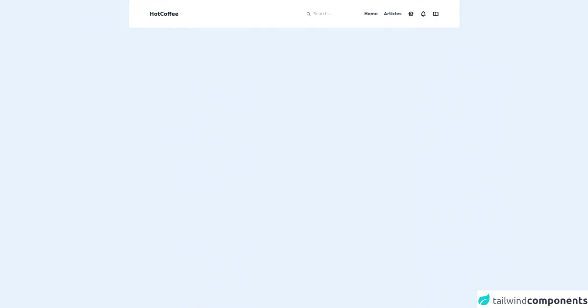
The description of Navbar component ui component
A Navbar is a user interface component that is commonly used in web applications to provide navigation links to different parts of the website. It typically appears at the top of the page and contains links to the most important pages of the website.
Why use Tailwind CSS to create a Navbar component ui component?
Tailwind CSS provides a set of pre-defined classes that can be used to create a Navbar component quickly and easily. These classes can be customized to create unique designs that match the branding of the website. Additionally, Tailwind CSS is highly responsive, which means that the Navbar component will look great on all devices.
The preview of Navbar component ui component.
To create a Navbar component with Tailwind CSS, we will use a combination of HTML and CSS. The HTML will define the structure of the Navbar, while the CSS will define the styles.
Free download of the Navbar component's source code
The source code of Navbar component ui component.
The source code for the Navbar component with Tailwind CSS is shown below. This code can be customized to create unique designs that match the branding of the website.
<nav class="flex justify-between px-20 py-10 items-center bg-white">
  <h1 class="text-xl text-gray-800 font-bold">HotCoffee</h1>
  <div class="flex items-center">
    <div class="flex items-center">
      <svg xmlns="http://www.w3.org/2000/svg" class="h-5 w-5 pt-0.5 text-gray-600" fill="none" viewBox="0 0 24 24" stroke="currentColor">
        <path stroke-linecap="round" stroke-linejoin="round" stroke-width="2" d="M21 21l-6-6m2-5a7 7 0 11-14 0 7 7 0 0114 0z" />
      </svg>
      <input class="ml-2 outline-none bg-transparent font-" type="text" name="search" id="search" placeholder="Search..." />
    </div>
    <ul class="flex items-center space-x-6">
      <li class="font-semibold text-gray-700">Home</li>
      <li class="font-semibold text-gray-700">Articles</li>
      <li>
        <svg xmlns="http://www.w3.org/2000/svg" class="h-6 w-6" fill="none" viewBox="0 0 24 24" stroke="currentColor">
          <path d="M12 14l9-5-9-5-9 5 9 5z" />
          <path d="M12 14l6.16-3.422a12.083 12.083 0 01.665 6.479A11.952 11.952 0 0012 20.055a11.952 11.952 0 00-6.824-2.998 12.078 12.078 0 01.665-6.479L12 14z" />
          <path stroke-linecap="round" stroke-linejoin="round" stroke-width="2" d="M12 14l9-5-9-5-9 5 9 5zm0 0l6.16-3.422a12.083 12.083 0 01.665 6.479A11.952 11.952 0 0012 20.055a11.952 11.952 0 00-6.824-2.998 12.078 12.078 0 01.665-6.479L12 14zm-4 6v-7.5l4-2.222" />
        </svg>
      </li>
      <li>
        <svg xmlns="http://www.w3.org/2000/svg" class="h-6 w-6" fill="none" viewBox="0 0 24 24" stroke="currentColor">
          <path stroke-linecap="round" stroke-linejoin="round" stroke-width="2" d="M15 17h5l-1.405-1.405A2.032 2.032 0 0118 14.158V11a6.002 6.002 0 00-4-5.659V5a2 2 0 10-4 0v.341C7.67 6.165 6 8.388 6 11v3.159c0 .538-.214 1.055-.595 1.436L4 17h5m6 0v1a3 3 0 11-6 0v-1m6 0H9" />
        </svg>
      </li>
      <li>
        <svg xmlns="http://www.w3.org/2000/svg" class="h-6 w-6" fill="none" viewBox="0 0 24 24" stroke="currentColor">
          <path stroke-linecap="round" stroke-linejoin="round" stroke-width="2" d="M12 6.253v13m0-13C10.832 5.477 9.246 5 7.5 5S4.168 5.477 3 6.253v13C4.168 18.477 5.754 18 7.5 18s3.332.477 4.5 1.253m0-13C13.168 5.477 14.754 5 16.5 5c1.747 0 3.332.477 4.5 1.253v13C19.832 18.477 18.247 18 16.5 18c-1.746 0-3.332.477-4.5 1.253" />
        </svg>
      </li>
    </ul>
  </div>
</nav>
How to create a Navbar component with Tailwind CSS?
To create a Navbar component with Tailwind CSS, follow the steps below:
Step 1: Create the HTML structure
The first step is to create the HTML structure of the Navbar component. This can be done using the HTML code below:
<nav class="bg-gray-800">
  <div class="max-w-7xl mx-auto px-2 sm:px-6 lg:px-8">
    <div class="relative flex items-center justify-between h-16">
      <div class="absolute inset-y-0 left-0 flex items-center sm:hidden">
        <!-- Mobile menu button -->
        <button type="button" class="inline-flex items-center justify-center p-2 rounded-md text-gray-400 hover:text-white hover:bg-gray-700 focus:outline-none focus:ring-2 focus:ring-inset focus:ring-white" aria-controls="mobile-menu" aria-expanded="false">
          <span class="sr-only">Open main menu</span>
          <!-- Icon when menu is closed. -->
          <!--
            Heroicon name: menu

            Menu open: "hidden", Menu closed: "block"
          -->
          <svg class="block h-6 w-6" xmlns="http://www.w3.org/2000/svg" fill="none" viewBox="0 0 24 24" stroke="currentColor" aria-hidden="true">
            <path stroke-linecap="round" stroke-linejoin="round" stroke-width="2" d="M4 6h16M4 12h16M4 18h16" />
          </svg>
          <!-- Icon when menu is open. -->
          <!--
            Heroicon name: x

            Menu open: "block", Menu closed: "hidden"
          -->
          <svg class="hidden h-6 w-6" xmlns="http://www.w3.org/2000/svg" fill="none" viewBox="0 0 24 24" stroke="currentColor" aria-hidden="true">
            <path stroke-linecap="round" stroke-linejoin="round" stroke-width="2" d="M6 18L18 6M6 6l12 12" />
          </svg>
        </button>
      </div>
      <div class="flex-1 flex items-center justify-center sm:items-stretch sm:justify-start">
        <div class="flex-shrink-0">
          <img class="h-8 w-auto" src="https://tailwindui.com/img/logos/workflow-mark-indigo-500.svg" alt="Workflow">
        </div>
        <div class="hidden sm:block sm:ml-6">
          <div class="flex space-x-4">
            <!-- Current: "bg-gray-900 text-white", Default: "text-gray-300 hover:bg-gray-700 hover:text-white" -->
            <a href="#" class="bg-gray-900 text-white px-3 py-2 rounded-md text-sm font-medium">Dashboard</a>

            <a href="#" class="text-gray-300 hover:bg-gray-700 hover:text-white px-3 py-2 rounded-md text-sm font-medium">Team</a>

            <a href="#" class="text-gray-300 hover:bg-gray-700 hover:text-white px-3 py-2 rounded-md text-sm font-medium">Projects</a>

            <a href="#" class="text-gray-300 hover:bg-gray-700 hover:text-white px-3 py-2 rounded-md text-sm font-medium">Calendar</a>
          </div>
        </div>
      </div>
      <div class="hidden sm:block sm:ml-6">
        <div class="flex items-center">
          <button class="bg-gray-800 p-1 rounded-full text-gray-400 hover:text-white focus:outline-none focus:ring-2 focus:ring-offset-2 focus:ring-offset-gray-800 focus:ring-white">
            <span class="sr-only">View notifications</span>
            <!-- Heroicon name: bell -->
            <svg class="h-6 w-6" xmlns="http://www.w3.org/2000/svg" fill="none" viewBox="0 0 24 24" stroke="currentColor" aria-hidden="true">
              <path stroke-linecap="round" stroke-linejoin="round" stroke-width="2" d="M13 10V3L4 14h7v7l9-11h-7z" />
            </svg>
          </button>

          <!-- Profile dropdown -->
          <div class="ml-3 relative">
            <div>
              <button type="button" class="bg-gray-800 flex text-sm rounded-full focus:outline-none focus:ring-2 focus:ring-offset-2 focus:ring-offset-gray-800 focus:ring-white" id="user-menu" aria-expanded="false" aria-haspopup="true">
                <span class="sr-only">Open user menu</span>
                <img class="h-8 w-8 rounded-full" src="https://avatars.githubusercontent.com/u/2918581?v=4" alt="">
              </button>
            </div>
            <!--
              Profile dropdown panel, show/hide based on dropdown state.

              Entering: "transition ease-out duration-100"
                From: "transform opacity-0 scale-95"
                To: "transform opacity-100 scale-100"
              Leaving: "transition ease-in duration-75"
                From: "transform opacity-100 scale-100"
                To: "transform opacity-0 scale-95"
            -->
            <div class="hidden origin-top-right absolute right-0 mt-2 w-48 rounded-md shadow-lg py-1 bg-white ring-1 ring-black ring-opacity-5" role="menu" aria-orientation="vertical" aria-labelledby="user-menu">
              <a href="#" class="block px-4 py-2 text-sm text-gray-700 hover:bg-gray-100" role="menuitem">Your Profile</a>

              <a href="#" class="block px-4 py-2 text-sm text-gray-700 hover:bg-gray-100" role="menuitem">Settings</a>

              <a href="#" class="block px-4 py-2 text-sm text-gray-700 hover:bg-gray-100" role="menuitem">Sign out</a>
            </div>
          </div>
        </div>
      </div>
    </div>
  </div>

  <!-- Mobile menu, show/hide based on menu state. -->
  <div class="sm:hidden" id="mobile-menu">
    <div class="px-2 pt-2 pb-3 space-y-1">
      <!-- Current: "bg-gray-900 text-white", Default: "text-gray-300 hover:bg-gray-700 hover:text-white" -->
      <a href="#" class="bg-gray-900 text-white block px-3 py-2 rounded-md text-base font-medium">Dashboard</a>

      <a href="#" class="text-gray-300 hover:bg-gray-700 hover:text-white block px-3 py-2 rounded-md text-base font-medium">Team</a>

      <a href="#" class="text-gray-300 hover:bg-gray-700 hover:text-white block px-3 py-2 rounded-md text-base font-medium">Projects</a>

      <a href="#" class="text-gray-300 hover:bg-gray-700 hover:text-white block px-3 py-2 rounded-md text-base font-medium">Calendar</a>
    </div>
  </div>
</nav>
Step 2: Add Tailwind CSS classes
The next step is to add Tailwind CSS classes to the HTML code to style the Navbar component. This can be done by adding the classes to the HTML elements as shown below:
<nav class="bg-gray-800">
  <div class="max-w-7xl mx-auto px-2 sm:px-6 lg:px-8">
    <div class="relative flex items-center justify-between h-16">
      <div class="absolute inset-y-0 left-0 flex items-center sm:hidden">
        <button type="button" class="inline-flex items-center justify-center p-2 rounded-md text-gray-400 hover:text-white hover:bg-gray-700 focus:outline-none focus:ring-2 focus:ring-inset focus:ring-white" aria-controls="mobile-menu" aria-expanded="false">
          <span class="sr-only">Open main menu</span>
          <svg class="block h-6 w-6" xmlns="http://www.w3.org/2000/svg" fill="none" viewBox="0 0 24 24" stroke="currentColor" aria-hidden="true">
            <path stroke-linecap="round" stroke-linejoin="round" stroke-width="2" d="M4 6h16M4 12h16M4 18h16" />
          </svg>
          <svg class="hidden h-6 w-6" xmlns="http://www.w3.org/2000/svg" fill="none" viewBox="0 0 24 24" stroke="currentColor" aria-hidden="true">
            <path stroke-linecap="round" stroke-linejoin="round" stroke-width="2" d="M6 18L18 6M6 6l12 12" />
          </svg>
        </button>
      </div>
      <div class="flex-1 flex items-center justify-center sm:items-stretch sm:justify-start">
        <div class="flex-shrink-0">
          <img class="h-8 w-auto" src="https://tailwindui.com/img/logos/workflow-mark-indigo-500.svg" alt="Workflow">
        </div>
        <div class="hidden sm:block sm:ml-6">
          <div class="flex space-x-4">
            <a href="#" class="bg-gray-900 text-white px-3 py-2 rounded-md text-sm font-medium">Dashboard</a>

            <a href="#" class="text-gray-300 hover:bg-gray-700 hover:text-white px-3 py-2 rounded-md text-sm font-medium">Team</a>

            <a href="#" class="text-gray-300 hover:bg-gray-700 hover:text-white px-3 py-2 rounded-md text-sm font-medium">Projects</a>

            <a href="#" class="text-gray-300 hover:bg-gray-700 hover:text-white px-3 py-2 rounded-md text-sm font-medium">Calendar</a>
          </div>
        </div>
      </div>
      <div class="hidden sm:block sm:ml-6">
        <div class="flex items-center">
          <button class="bg-gray-800 p-1 rounded-full text-gray-400 hover:text-white focus:outline-none focus:ring-2 focus:ring-offset-2 focus:ring-offset-gray-800 focus:ring-white">
            <span class="sr-only">View notifications</span>
            <svg class="h-6 w-6" xmlns="http://www.w3.org/2000/svg" fill="none" viewBox="0 0 24 24" stroke="currentColor" aria-hidden="true">
              <path stroke-linecap="round" stroke-linejoin="round" stroke-width="2" d="M13 10V3L4 14h7v7l9-11h-7z" />
            </svg>
          </button>

          <div class="ml-3 relative">
            <div>
              <button type="button" class="bg-gray-800 flex text-sm rounded-full focus:outline-none focus:ring-2 focus:ring-offset-2 focus:ring-offset-gray-800 focus:ring-white" id="user-menu" aria-expanded="false" aria-haspopup="true">
                <span class="sr-only">Open user menu</span>
                <img class="h-8 w-8 rounded-full" src="https://avatars.githubusercontent.com/u/2918581?v=4" alt="">
              </button>
            </div>
            <div class="hidden origin-top-right absolute right-0 mt-2 w-48 rounded-md shadow-lg py-1 bg-white ring-1 ring-black ring-opacity-5" role="menu" aria-orientation="vertical" aria-labelledby="user-menu">
              <a href="#" class="block px-4 py-2 text-sm text-gray-700 hover:bg-gray-100" role="menuitem">Your Profile</a>

              <a href="#" class="block px-4 py-2 text-sm text-gray-700 hover:bg-gray-100" role="menuitem">Settings</a>

              <a href="#" class="block px-4 py-2 text-sm text-gray-700 hover:bg-gray-100" role="menuitem">Sign out</a>
            </div>
          </div>
        </div>
      </div>
    </div>
  </div>

  <div class="sm:hidden" id="mobile-menu">
    <div class="px-2 pt-2 pb-3 space-y-1">
      <a href="#" class="bg-gray-900 text-white block px-3 py-2 rounded-md text-base font-medium">Dashboard</a>

      <a href="#" class="text-gray-300 hover:bg-gray-700 hover:text-white block px-3 py-2 rounded-md text-base font-medium">Team</a>

      <a href="#" class="text-gray-300 hover:bg-gray-700 hover:text-white block px-3 py-2 rounded-md text-base font-medium">Projects</a>

      <a href="#" class="text-gray-300 hover:bg-gray-700 hover:text-white block px-3 py-2 rounded-md text-base font-medium">Calendar</a>
    </div>
  </div>
</nav>
Step 3: Customize the Navbar component
The final step is to customize the Navbar component to match the branding of the website. This can be done by modifying the Tailwind CSS classes as needed. For example, the background color of the Navbar can be changed by modifying the bg-gray-800 class to a different color.
Conclusion
In conclusion, Tailwind CSS is an excellent choice for creating a Navbar component for your web application. It provides a set of pre-defined classes that can be customized to create unique designs that match the branding of your website. By following the steps outlined in this article, you can create a Navbar component quickly and easily with Tailwind CSS.