- Published on
What You Need To Make A Natural Post With Tailwind CSS
- What is Tailwind CSS?
- The description of Natural Post ui component
- Why use Tailwind CSS to create a Natural Post ui component?
- The preview of Natural Post ui component.
- The source code of Natural Post ui component.
- How to create a Natural Post with Tailwind CSS?
- Conclusion
What is Tailwind CSS?
Tailwind CSS is a utility-first CSS framework that provides a set of pre-defined classes to help developers quickly build custom user interfaces. It is designed to be highly customizable and easy to use, allowing developers to create beautiful and responsive designs with minimal effort.
The description of Natural Post ui component
The Natural Post UI component is a simple and elegant design that mimics the look and feel of a natural post on social media platforms. It consists of a profile picture, username, post content, and engagement buttons such as likes and comments.
Why use Tailwind CSS to create a Natural Post ui component?
Tailwind CSS is an excellent choice for creating the Natural Post UI component because it provides a set of pre-defined classes that can be easily customized to match the design requirements. It also offers a range of responsive design options, making it easy to create a design that works well on different screen sizes.
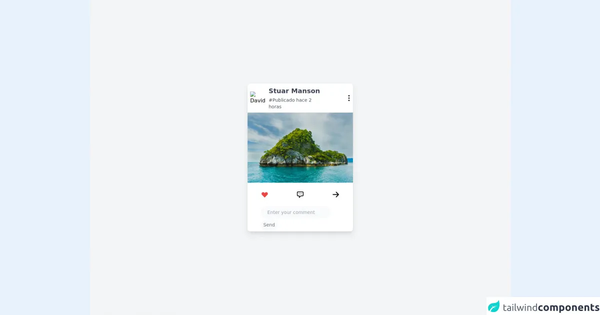
The preview of Natural Post ui component.
The Natural Post UI component is a great way to display user-generated content on your website or application. It provides users with a familiar and intuitive interface that encourages engagement and interaction.
Free download of the Natural Post's source code
The source code of Natural Post ui component.
The source code for the Natural Post UI component is relatively simple and can be easily customized to match the design requirements of your application. It consists of HTML and CSS code that can be easily modified and adapted to fit your specific needs.
<!-- Create By Joker Banny -->
<div class="min-h-screen bg-gray-100 flex items-center justify-center">
  <div class="w-80 bg-white rounded-lg py-2 shadow-lg hover:shadow-2xl transition duration-500 transform hover:scale-105 cursor-pointer">
    <div class="flex items-center mb-2 space-x-4">
      <img class="w-10 rounded-full ml-2" src="https://www.adobe.com/express/create/media_1bcd514348a568faed99e65f5249895e38b06c947.jpeg?width=2000&format=webply&optimize=medium" alt="David" />
      <div>
        <h1 class="mb-1 text-xl font-bold text-gray-700">Stuar Manson</h1>
        <p class="text-sm font-normal text-gray-600 mr-14 hover:underline">#Publicado hace 2 horas</p>
      </div>
      <span>
        <svg xmlns="http://www.w3.org/2000/svg" class="h-6 w-6 hover:text-blue-400 transition duration-200" fill="none" viewBox="0 0 24 24" stroke="currentColor">
          <path stroke-linecap="round" stroke-linejoin="round" stroke-width="2" d="M12 5v.01M12 12v.01M12 19v.01M12 6a1 1 0 110-2 1 1 0 010 2zm0 7a1 1 0 110-2 1 1 0 010 2zm0 7a1 1 0 110-2 1 1 0 010 2z" />
        </svg>
      </span>
    </div>
    <img src="https://images.unsplash.com/photo-1559128010-7c1ad6e1b6a5?ixid=MnwxMjA3fDB8MHxwaG90by1wYWdlfHx8fGVufDB8fHx8&ixlib=rb-1.2.1&auto=format&fit=crop&w=1052&q=80" alt="" />
    <div class="flex justify-between px-10 py-6">
      <span
        ><svg xmlns="http://www.w3.org/2000/svg" class="h-6 w-6 text-red-500" viewBox="0 0 20 20" fill="currentColor">
          <path fill-rule="evenodd" d="M3.172 5.172a4 4 0 015.656 0L10 6.343l1.172-1.171a4 4 0 115.656 5.656L10 17.657l-6.828-6.829a4 4 0 010-5.656z" clip-rule="evenodd" /></svg
      ></span>
      <span>
        <svg xmlns="http://www.w3.org/2000/svg" class="h-6 w-6" fill="none" viewBox="0 0 24 24" stroke="currentColor">
          <path stroke-linecap="round" stroke-linejoin="round" stroke-width="2" d="M8 10h.01M12 10h.01M16 10h.01M9 16H5a2 2 0 01-2-2V6a2 2 0 012-2h14a2 2 0 012 2v8a2 2 0 01-2 2h-5l-5 5v-5z" />
        </svg>
      </span>
      <span
        ><svg xmlns="http://www.w3.org/2000/svg" class="h-6 w-6" viewBox="0 0 20 20" fill="currentColor">
          <path fill-rule="evenodd" d="M10.293 3.293a1 1 0 011.414 0l6 6a1 1 0 010 1.414l-6 6a1 1 0 01-1.414-1.414L14.586 11H3a1 1 0 110-2h11.586l-4.293-4.293a1 1 0 010-1.414z" clip-rule="evenodd" /></svg
      ></span>
    </div>
    <div>
      <img src="" alt="" />
      <div class="px-10">
        <input class=" text-sm font-thin  px-5 py-2 mb-2 bg-gray-50 outline-none rounded-full border-1" type="text" placeholder="Enter your comment" />
        <span class="text-sm text-gray-500 bg-gray-50 p-2 rounded-full px-2 py-2 transition duration-100 hover:text-blue-400 cursor-pointer">Send</span>
      </div>
    </div>
  </div>
</div>
How to create a Natural Post with Tailwind CSS?
To create a Natural Post UI component with Tailwind CSS, you will need to follow these steps:
- Define the HTML structure of the Natural Post UI component, including the profile picture, username, post content, and engagement buttons.
- Add Tailwind CSS classes to the HTML elements to style the component according to your design requirements.
- Use the responsive design options provided by Tailwind CSS to ensure that the component looks great on different screen sizes.
- Customize the component further by adding your own custom CSS rules or modifying the existing Tailwind CSS classes.
Conclusion
Tailwind CSS is an excellent choice for creating the Natural Post UI component because it provides a set of pre-defined classes that can be easily customized to match the design requirements. It also offers a range of responsive design options, making it easy to create a design that works well on different screen sizes. By following the steps outlined in this article, you can quickly and easily create a beautiful and responsive Natural Post UI component for your website or application.