- Published on
The Ninja Guide To How To Build A Multiple Views With Collapsing With Tailwind CSS Better
- What is Tailwind CSS?
- The description of Multiple Views With Collapsing ui component
- Why use Tailwind CSS to create a Multiple Views With Collapsing ui component?
- The preview of Multiple Views With Collapsing ui component
- The source code of Multiple Views With Collapsing ui component
- How to create a Multiple Views With Collapsing with Tailwind CSS?
- Step 1: Create the HTML structure
- Step 2: Use Tailwind CSS classes to style the HTML elements
- Step 3: Add JavaScript code to handle the button clicks and the collapsing of the inactive views
- Conclusion
As a FrontEnd developer, you might have heard of Tailwind CSS, a utility-first CSS framework that helps you quickly build custom designs. In this article, we will explore how to use Tailwind CSS to create a Multiple Views With Collapsing ui component.
What is Tailwind CSS?
Tailwind CSS is a utility-first CSS framework that provides a set of pre-defined CSS classes that you can use to style your HTML elements. It is designed to be highly customizable and easy to use, allowing you to quickly build custom designs without having to write any CSS code.
The description of Multiple Views With Collapsing ui component
A Multiple Views With Collapsing ui component is a user interface element that allows users to switch between multiple views while collapsing the inactive views. This is a common design pattern used in many applications, especially those that have a lot of content or functionality.
Why use Tailwind CSS to create a Multiple Views With Collapsing ui component?
Tailwind CSS provides a set of pre-defined CSS classes that you can use to quickly style your HTML elements. This makes it easy to create a Multiple Views With Collapsing ui component without having to write any CSS code yourself. Additionally, Tailwind CSS is highly customizable, allowing you to easily modify the styles to fit your specific design requirements.
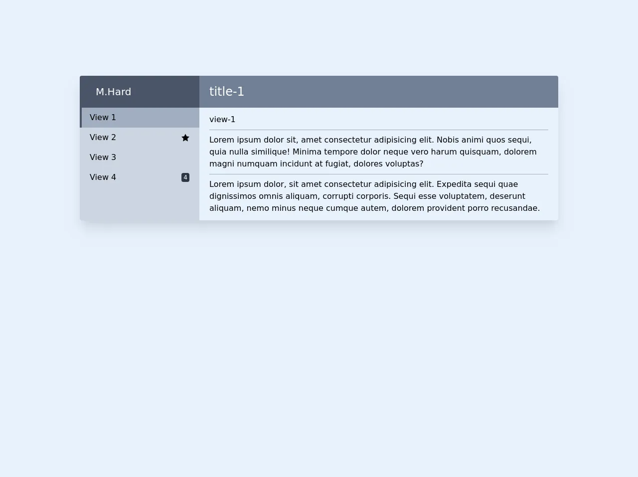
The preview of Multiple Views With Collapsing ui component
To give you an idea of what a Multiple Views With Collapsing ui component looks like, take a look at the following preview:
Free download of the Multiple Views With Collapsing's source code
The source code of Multiple Views With Collapsing ui component
To create a Multiple Views With Collapsing ui component with Tailwind CSS, you can use a combination of HTML and CSS code. Here is an example of what the code might look like:
<div class="w-full flex justify-center my-32 py-6">
        <div class="w-3/4">
            <div class="w-full flex flex-col md:flex-row rounded overflow-hidden shadow-xl">

                <div class="w-full md:w-1/4 h-auto">
                    <div class="top flex items-center px-5 h-16 bg-gray-700 text-white">
                        <div class="ml-3 flex flex-col text-xl">
                            M.Hard
                        </div>
                    </div>
                    <div class="bg-gray-400 w-full h-full sm:flex md:block">
                        <button id="button-1" onclick="showView(1)" class="w-full flex justify-between items-center px-5 py-2 hover:bg-gray-500 cursor-pointer focus:outline-none">
                            <span><i class="fa fa-inbox w-6"></i>View 1</span>
                        </button>
                        <button id="button-2" onclick="showView(2)" class="w-full flex justify-between items-center px-5 py-2 hover:bg-gray-500 cursor-pointer focus:outline-none">
                            <span><i class="fa fa-envelope w-6"></i>View 2</span>
                            <svg xmlns="http://www.w3.org/2000/svg" class="w-4 h-4" viewBox="0 0 24 24">
                                <path d="M12 .587l3.668 7.568 8.332 1.151-6.064 5.828 1.48 8.279-7.416-3.967-7.417 3.967 1.481-8.279-6.064-5.828 8.332-1.151z"/>
                            </svg>
                        </button>
                        <button id="button-3" onclick="showView(3)" class="w-full flex justify-between items-center px-5 py-2 hover:bg-gray-500 cursor-pointer focus:outline-none">
                            <span><i class="fa fa-bookmark w-6"></i>View 3</span>
                        </button>
                        <button id="button-4" onclick="showView(4)" class="w-full flex justify-between items-center px-5 py-2 hover:bg-gray-500 cursor-pointer focus:outline-none">
                            <span><i class="fa fa-trash w-6"></i>View 4</span>
                            <span class="text-xs bg-gray-800 px-1 rounded text-white">4</span>
                        </button>
                    </div>
                </div>


                <div class="w-full md:w-3/4">
                    <div class="top flex items-center px-5 h-16 bg-gray-600 text-white text-2xl">
                        <div id="title-1" class="hidden">
                            title-1
                        </div>
                        <div id="title-2" class="hidden">
                            title-2
                        </div>
                        <div id="title-3" class="hidden">
                            title-3
                        </div>
                        <div id="title-4" class="hidden">
                            title-4
                        </div>
                    </div>
                    <div class="w-full px-5 py-3 max-h-screen overflow-y-auto">
                        <div id="view-1" class="hidden">
                            view-1
                            <hr class="my-2 border-gray-500">
                            Lorem ipsum dolor sit, amet consectetur adipisicing elit. Nobis animi quos sequi, quia nulla similique!
                             Minima tempore dolor neque vero harum quisquam, dolorem magni numquam incidunt at fugiat, dolores voluptas?
                            <hr class="my-2 border-gray-500">
                            Lorem ipsum dolor, sit amet consectetur adipisicing elit. Expedita sequi quae dignissimos omnis aliquam, corrupti corporis.
                             Sequi esse voluptatem, deserunt aliquam, nemo minus neque cumque autem, dolorem provident porro recusandae.
                        </div>
                        <div id="view-2" class="hidden">
                            view-2 Lorem ipsum dolor sit amet consectetur adipisicing elit. Eos officia qui facilis consequatur nisi quas sequi placeat veniam pariatur
                             fuga! Quos libero nam ad reprehenderit distinctio deleniti necessitatibus! Sint, soluta.
                        </div>
                        <div id="view-3" class="hidden">
                            view-3
                        </div>
                        <div id="view-4" class="hidden">
                            view-4
                            <hr class="my-2 border-gray-500">
                            Lorem ipsum dolor sit amet consectetur, adipisicing elit. Dolor ratione minima praesentium, unde maxime nisi maiores temporibus fugit!
                             Ducimus aliquam commodi autem minima repudiandae dolorum aut sit dolorem laudantium odit.
                        </div>
                    </div>
                </div>

            </div>
        </div>
    </div>

    <script>
        var activeClasses = ["bg-gray-500","border-l-4","pl-4","border-gray-700"];
        var lastId = null;
        showView(1)

        function showView(id) {
            if(id == null)return
            closeLast()
            document.getElementById('view-'+id).style.display = "block"
            document.getElementById('title-'+id).style.display = "block"
            document.getElementById('button-'+id).classList.add(...activeClasses)

            lastId = id;
        }

        function closeLast() {
            if(lastId == null)return

            document.getElementById('view-'+lastId).style.display = "none"
            document.getElementById('title-'+lastId).style.display = "none"
            document.getElementById('button-'+lastId).classList.remove(...activeClasses)
        }

        /*
            //If you want to use your own identifiers replace js code

            var views = ['view-1','view-2','view-3','view-4']
            var titles = ['title-1','title-2','title-3','title-4']
            var buttons = ['button-1','button-2','button-3','button-4']
            var activeClasses = ["bg-gray-500","border-l-4","pl-4","border-gray-700"];
            close()
            showView(1)

            function showView(buttonId) {
                "use strict";

                close()
                document.getElementById(views[buttonId-1]).style.display = "block"
                document.getElementById(titles[buttonId-1]).style.display = "block"

                document.getElementById(buttons[buttonId -1]).classList.add(...activeClasses)
            }
            function close() {
                "use strict";

                views.forEach(view => {
                    document.getElementById(view).style.display = "none"
                });
                titles.forEach(title => {
                    document.getElementById(title).style.display = "none"
                });
                buttons.forEach(button => {
                    document.getElementById(button).classList.remove(...activeClasses)
                });
            }
        */
    </script>
How to create a Multiple Views With Collapsing with Tailwind CSS?
To create a Multiple Views With Collapsing ui component with Tailwind CSS, follow these steps:
- Create the HTML structure for the component, including the views and the buttons to switch between them.
- Use Tailwind CSS classes to style the HTML elements, including the buttons, the views, and the transitions between them.
- Add JavaScript code to handle the button clicks and the collapsing of the inactive views.
Let's take a closer look at each of these steps.
Step 1: Create the HTML structure
The HTML structure for a Multiple Views With Collapsing ui component typically consists of a set of views and a set of buttons to switch between them. Here is an example of what the HTML might look like:
<div class="flex">
  <button class="w-1/3 bg-gray-200 hover:bg-gray-300 py-2 px-4 font-semibold rounded-l-lg focus:outline-none">View 1</button>
  <button class="w-1/3 bg-gray-200 hover:bg-gray-300 py-2 px-4 font-semibold focus:outline-none">View 2</button>
  <button class="w-1/3 bg-gray-200 hover:bg-gray-300 py-2 px-4 font-semibold rounded-r-lg focus:outline-none">View 3</button>
</div>

<div class="mt-4">
  <div class="view1">
    <!-- content for view 1 -->
  </div>
  <div class="view2 hidden">
    <!-- content for view 2 -->
  </div>
  <div class="view3 hidden">
    <!-- content for view 3 -->
  </div>
</div>
In this example, we have three buttons to switch between the views, and three div elements to hold the content for each view.
Step 2: Use Tailwind CSS classes to style the HTML elements
Once you have created the HTML structure for the component, you can use Tailwind CSS classes to style the HTML elements. Here is an example of what the CSS might look like:
button {
  transition: all 0.2s ease-in-out;
}

button:focus {
  outline: none;
}

button:hover {
  background-color: #e2e8f0;
}

button.active {
  background-color: #4299e1;
  color: #fff;
}

.view1 {
  transition: all 0.2s ease-in-out;
}

.view2 {
  transition: all 0.2s ease-in-out;
}

.view3 {
  transition: all 0.2s ease-in-out;
}
In this example, we have defined styles for the buttons, the views, and the transitions between them. We have also defined styles for the active button, which is the button that corresponds to the currently active view.
Step 3: Add JavaScript code to handle the button clicks and the collapsing of the inactive views
Finally, you need to add JavaScript code to handle the button clicks and the collapsing of the inactive views. Here is an example of what the JavaScript might look like:
const buttons = document.querySelectorAll('button');
const views = document.querySelectorAll('.view');

buttons.forEach((button, index) => {
  button.addEventListener('click', () => {
    buttons.forEach((button) => button.classList.remove('active'));
    button.classList.add('active');
    views.forEach((view) => view.classList.add('hidden'));
    views[index].classList.remove('hidden');
  });
});
In this example, we have used JavaScript to add event listeners to the buttons, so that when a button is clicked, we can collapse the inactive views and show the active view.
Conclusion
In this article, we have explored how to use Tailwind CSS to create a Multiple Views With Collapsing ui component. We have looked at the HTML structure, the CSS styles, and the JavaScript code needed to create this component. With Tailwind CSS, you can quickly and easily create custom designs without having to write any CSS code yourself.